Lyraina's sketchbook
Yooo crimson arena is going really nice!!! I loved those silhouettes from your last post, lots of personality an all of them with their different shape designs.

I love the spikiness and threatening feel of the rough sketch you picked, honestly I think your final is starting to lose a lot of that fun energy. It seems like you're taming down a lot of the spikes and the silhouette feels more rounded. For example I really love how those diagonal negative spaces the rough sketch has between her neck and giant pauldrons, but in the final there are those cloth collars filling up all the space and making the shoulders and head are feel like a big semicircle with some points instead of an awesome jagged threatening mess of triangles all around the top of the design. Does that make sense?

That's all just my opinion though, hope you don't mind. XD
good luck, much respect for all the work you're putting into this!

Reply
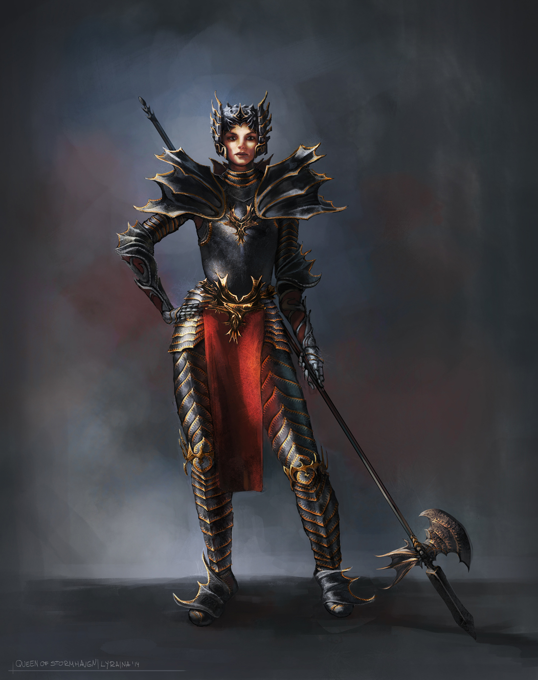
Samszym: Oh! Thanks for the catch. I was in a mode of "need moar head protection" and didn't realize that I am watering down the silhouette. Made the neck things a bit smaller, hope that this helps a bit.

Decisions, decisions! How does one know how much (detail/colors/etc) is too much? For example, I had a really hard time to decide how much gold to add this time. Didn't want it to look crammed (adding detail is a bit like eating chocolate: once I have started, it's hard to stop). But I also do not want it to be too bland, but expensive and elaborate (she's a queen, after all). Looking at real armor is not much of a help as there are many designs that are, like, 100% ornamentation (way too much) O_o I guess it comes down to doing it wrong often enough and developing a healthy gut feeling?

Anyway, it's done... I wonder what all the anatomy study is helping when my finished figures still don't turn out good, but stiff or wrong.. any way to improve on that? Doing more clothed figures on top of the anatomy/nude (both drawing and painting)?

Happy Easter guys!


SketchbookDeviantartArtblog | Portfolio
Every feedback is appreciated!
Reply
I dunno how you do it,, I love your colors! So alive!

Reply
Nice design on the armor! I like both level of detail and ornamentation! A couple of things:
Her pose and the part near the armpits suggests her torso is not facing us, though the pauldrons (and the ornamentation between them) suggests it does.
Her left-side hand seems a bit small
The background is a bit large IMO, there is just too much redundant space.. I'd possibly crop it a notch.
Her face is spot on, I really like that part! Awesome stuff altogether, and great amount of studies! Keep it up! :)

Reply
Man, <3 your sketchbook. The crimson arena thing came out great, you did a really good job rendering black metal, which is great, looks fantastic. Just a couple of notes on design (I'm sorry if this sounds like I am picking it to pieces):
- I'll start by joints in general instead of listing each indvidual one since they all suffer from the ame problems. Look at the ankles and elbows specifically. They don't look as if they give her complete mobility, the wings, while they look cool, on the feet would restrict dorsiflexion (lifting the toes toward the knee). The elbows look like she would struggle to do a bicep curl.
- The structure of the armor, the lower leg/boots, and gloves/forearm can be constructed like you have it here, but the thigh and upper arm dont seem functional. For example, this set of armor here: http://armstreet.com/catalogue/full/prin...reaves.jpg
You can see that his wrist and lower leg are completely incased but his upper arm and thick are only covered on the outer side. Never having worn armor, might want to ask Wolkenfels (I'm pretty sure he has worn armor before, or knows someone who has), but I would guess that his is because it it was completely encased in those areas, you wouldn't be able to sit or ride a horse, or have your arm by your side since the breastplate and upper arm could hit each other.
Also, this gives you a chance to use BUCKLES n.n everyone loves buckles *Looks sideways over at my design with its excessive number of buckles*

As for the detail stuff, I completely agree with you. I think eventually we will learn to judge the amount of detail to put in based on the time we have left. I read a quote from Picasso(?) that said 'Art is never finished, only abandoned.' and that basically controls details for me lol. Need to balance motivation, with details and length of the piece or deadline.

But as for when to stop ADDING detail, use the 80-20 rule, which marc Brunet explains really well here (I Think): http://youtu.be/-n94ggmsVDg

Keep kicking arse, Lyra :D

Reply
Good to see you going out of your comfort zone on the arena piece.

Reply
Really nice piece for the crimson arena, I would just point out that her face expression looks pretty calm, maybe a stronger face expression would make believe her a stronger warrior. Keep it up!

Reply
rmd: Thanks! I struggle a lot with color, so that means a lot to me :)

Kaffer: Thanks for the feedback. One day I'll hopefully get that anatomy stuff right. Background... for some reason I worked almost square on that one, so it is already cropped a bit - not enough it seems!

Jaik: Thank you! Yeah the mobility issue was a struggle - I was all the time torn between "make this look cool and fantasy" and "don't make it too restrictive/heavy/stupid". I'd actually love to wear a full set of armor one day :D

crackedskull: Thanks! Semi-out of comfort zone at least - not used to doing armor, but I think the scifi topic would have been even more tough. (but the armor studies suited me fine)

Blewzen: Thanks. Yeah, need to work on faces! D:

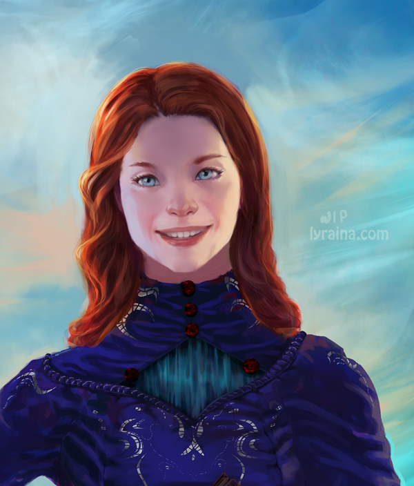
*sigh* Dear Photoshop, WHY do you have to crash despite me merging down most of the layers.. what do you want from me ;_; Anyway! It's Shallan time again. Are you bored of her yet? XD Changed the nose, reduced the length of the nose, reduced saturation (again oO), fiddled with the eyes (again). I don't think I'll get them any more asian looking as long as they have to stay blue. I think I'm done with her soon...?

One thing that increasingly troubles me is the problem that I seem to be unable to paint faces that I would consider beautiful, or even pretty. While having "character" is nice and all, I think it's very important to be able to paint a default-pretty face (which then can be varied or uglyfied or whatever). Unfortunately I can't even tell what exactly I don't like in the faces I paint... not sure what to do about this, feature studies, studying more from reference, trying to break my habits/"style"..?


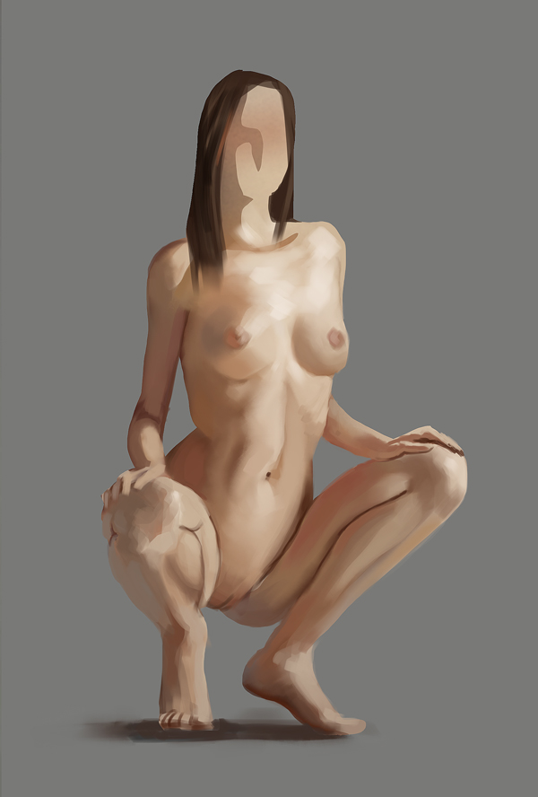
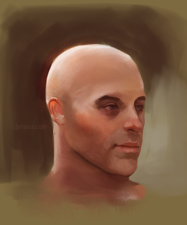
study


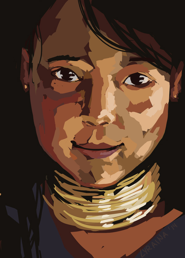
application


study


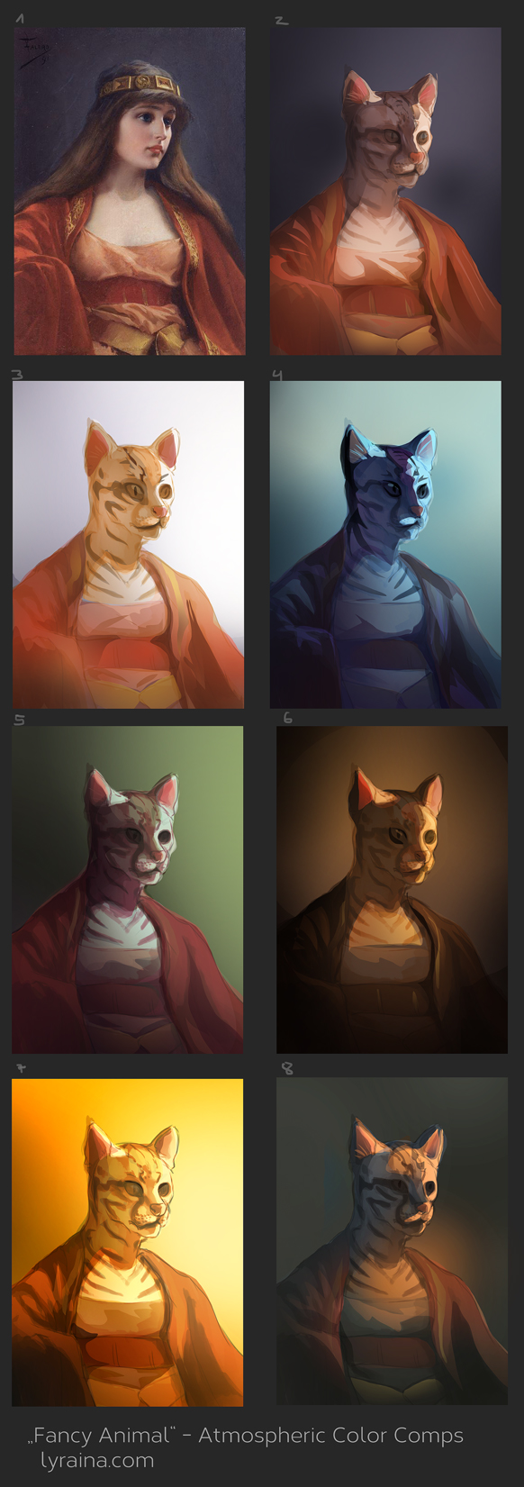
color comps for the magic box. Looking back at it now, I don't think my selection of reference images was good.


those were my refs


Attached Files Image(s)


SketchbookDeviantartArtblog | Portfolio
Every feedback is appreciated!
Reply
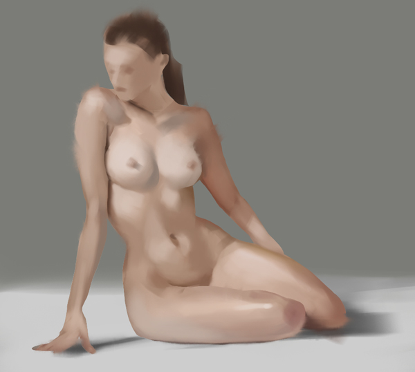
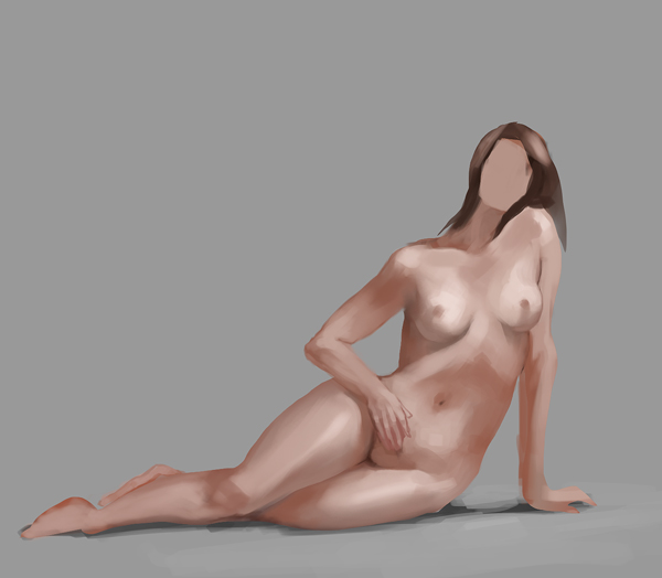
Such great updates since I visited your sketchbook the last time! I really dig the color comps and wow those skin studies! I like the colours on the Shallan piece as well, above all the lips. I'd really really like to give you good advice on your faces problem, but I'm kind of in the same situation as you, always when I try to paint realistic faces and sometimes with my stylized stuff as well. I guess studying features and faces is really the best approach as it extends your visual library and gives you security? In my case for example I noticed that I'm still very unsure how the hell for an example a nose looks and then I can't really paint it the way I want to and the image in my head how I want it to look like is very fuzzy. So I think studying would also add some clarity maybe.

I don't know if it is of any help for you but here's a pinterest collection I added to my bookmarks centered on faces and expressions: https://www.pinterest.com/paulphillipsar...pressions/ It might be a good place to find some inspiration (:

Anyway, keep up the great work!

SKY IS THE LIMIT

DeviantartSketchbook
Reply
The anatomy studies - wow.

Reply
Oh maaaan there's so much awesome work here in such a short-

BEEEEEEEEP - CRIT TIME!

I'm going to be a little direct, I hope you don't mind, Just some nitpicky stuff from a grouchy person.

(Queen of Stormhaugn)
- Regarding your details, I think you can treat it like composition - more details at the focal point and lesser on unimportant areas. Right now I feel a lot of your ornamentation is focused on the legs, but you left the breastplate really plain. Composition-wise it pulls focus to the lower part of the figure (maybe it's intentional?). Design-wise I feel like the breastplate lost a lot of it's impact.
- Tiny haaaands - especially the one on the hip (I think this was pointed out already)
- Tiny axe! Of course maybe it is a ceremonial weapon? Not really meant for combat. But I think proportionally, it does look a little on the small side especially when compared to the blade on the end.
- Great form rendering overall (I especially love the effect you you did on the red cloth.
- Design crit! Those spiky shoes aren't looking very appealing (to me). I think you're trying to echo the design of the shoulder pads but it just feels a little "forced" and out of place. (also I think if she were to bend her knee downwards she would probably stab herself with a foot-spike).

(Zoisite (Crystal Crusader))
- Ok the biggest jarring thing to me is that the crystals on her body have black outlines. At first I thought it was a stylistic choice but it seems her shoulder crystals don't have any lines either. I think it would work better without the lines
- Her hair seems a little rushed and and I think you might have added a little too much strand details. I think it would work a lot better if you added the strands on edges of the hair instead of the inside.
- The way she is holding her sword is a little awkward. Plus the sword handle is a little short.

Overall I would say that your biggest weaknesses now are currently heads and hands. Your human figure in general is really strong (as shown in your constant, mind-blowing studies) sooo I would recommend taking a break on bodies for awhile and focus on heads and hands? They really are the hardest body parts in my opinion, haha.

BUT ANYWAY, you're doing really such an amazing job. Please keep it up!

Reply
To paint beautiful faces you can start a special folder to collect photos of faces/people you think are beautiful and attractive. Then you have to sit down with those images, and really think about why each image attracts you. Take note of your observation, even if you feel an observation is embarrassing. It's not like you're required to publish a report on the findings later.

Sometimes it's not only what the face is made of that contributes to a beautiful, attractive face. It could be the lighting, the hair style, a piercing, the viewing angle of a particular photo, etc etc. Once you got it figured out you can start doing what you have been doing - lots of studies.

To paint asian look with blue eyes, just paint a regular asian, then change the eyes at the end. I think her hair color, and really pale skin tone combined with blue eyes just makes her look like one of my asian mix blood friend, but a lot more on the non-asian side.

That aside, still awed by the lots of good work! You even manage to do both bloodsport and arena! I'm amazed!


Focus.
Reply
Cyprinus: Thank you - at least I am not alone with that problem... yeah noses are tough. Always have to be careful not to paint pig-noses. That is an awesome pinterest collection, thank you for linking it! Saved it and will study from it :)

denikina: Thank you!

LongJh: Wow, thanks a lot for all that feedback! Not grouchy at all! ;) The axe is actually a halberd. You're right about the focus being on the legs... that's not good. Should have made the breastplate more ornamental, and less on the legs.
Hair: Absolutely... tried several different ways to paint that and failed, so now it is something vague inbetween. Need to practice hair! Heads and hands... yeah... need to improve! ò_ó Thanks again for taking the time to write up such an extensive crit :)

meat: Uhm... I could have thought of that myself... but I didn't so thanks for the suggestions. I am actually more and more discovering the value of writing things down and studying it like this, instead of (just) copying stuff. It's something I have neglected too much so far, I think. Thanks :)

Major text block Gurney Update inc!

Reflected Light
- Every object reflects light -> bounce light with color fill shadows
- Shadow color is sum of all reflected sources and local color
- Outside: Planes facing up get sky blue reflection, planes facing downwards warmer ground light

Spotlighting
- Sets focus of attention
- Shape of light can be used for narration: What light shines into the scene and why?
- Adjacent colored spotlights cast shadows with chromatic edges -> often 2 lights in theater
- Classic cinema used "eyelights" to place focus on eyes

Grays and Neutrals
- grey setting allows for bright color accents
- quiet, reflective mood
- include subtle variations, don't just pick 1 gray -> shift value and hue!
- best mixed from color compliments (also looks good if then placed near those colors)
- "better gray than garish" (Ingres)

Green
- often avoided in painting, covers and on stage
- often done wrong
- light shining through new leaves: "vegetable green" (highly chromatic yellow-green)
- ways to handle greens:
1. mix it yourself from blue/yellow
2. lots of variation
3. break the green overkill by using pink or red primed canvas (which shines through) or mix in reddish grays while painting

Gradation
- color gradations between hues, dull/saturated colors, values
- don't just let them happen, but think about them and pre-plan (pre-mix)
- both on small and large scale

Tints
= adding white to a color -> "pastel" color
- distant hues on a hazy day
- combine with darker colors in other parts for contrast
- adding white: makes hues a bit bluer
- glazing over white: a bit more chromatic

Warm Underpainting
- pre-toned surface: imprimatura / underpainting
- Venetian red or burnt sienna
- good for everything green, blue (sky, foliage)
- color peeking through makes colors look alive

Sky Panels
- surface prepared with a sky gradation for future use
- good for dark details/trees etc against a light sky

Monochomatic schemes
- grisaille (in gray) can be preliminary step to plan values, or part of the process (glazed over)
- draw attention in today's colorful world

Warm and cool
- cool (blue-green, blue, violets): winter, night, sky, shadow, sleep, ice; quietness, restfulness, calm
- warm (yellow-green, oranges, reds): fire, spices, blood, energy, passion; sunsets, flowers, autumn

Colored light interactions
- Two different lights: lit areas mix and create a new color
= additive color mixing (behaves differently than pigments)
- colors get blended in the eye
- results in a higher value, brighter in tone
- i.e. green+red = yellow
- two different colored light sources on one form result in colored cast shadows (of the other color, respectively)

Triads
- any three basic colors (does not have to be full-chroma)
--> see gamut masking section

Color Accents
- accent attracts the eye to the center of interest
- usually complement or near complement, more highly chromatic
- can also spice up non-focal-areas if added throughout the picture
- sneak in hints of (complementary) color for more interest (ie yellow or orange in purple image)

Gamut mapping/masks (duh, should have read that earlier)
- Subjective primaries are the colors with the highest chroma (outside corners of the triangle)
- Subjective secondaries are the lower chroma mixed colors between primaries
- Saturation cost of a mixture: intermediate mixtures have lower chroma
- !!! subjective neutral is in the middle of the gamut mask, can be shifted towards whatever hue is dominant. does NOT neccessarily have to be zero-chroma gray!!
- photography equivalent would be color filters
[- to do: try out how to achieve different mood through varying which colors are used predominantly and which as accent in a very limited palette!]

Shapes of Color Schemes
- triangle is the most common shape with 1 dominant color
- atmospheric triad: equilateral triangle shifted to one side of the wheel without overlapping the center (look what that means for the subjective neutral!)
- complementary gamut: long stretched diamond, neutral coincides with center of wheel (= stable)
- NEAR complementary gamut: diamond gets shifted a bit off-center - interesting but a bit unsettled
- mood and accent scheme: most colors stay in one area, with a little bit of complementary accent - no mixing in between!

-----

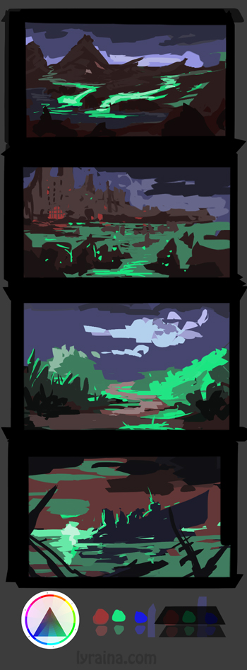
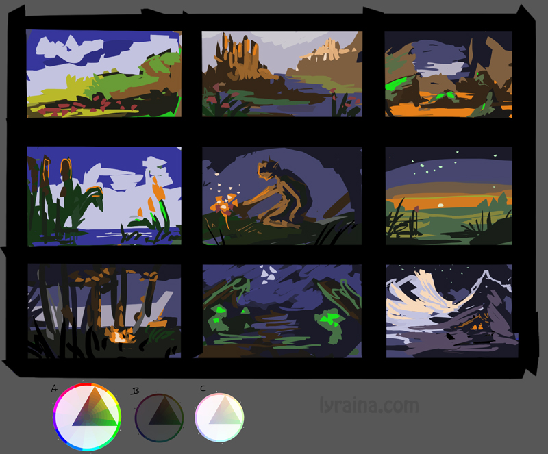
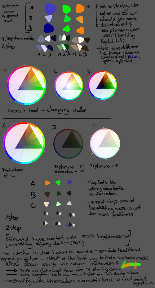
Okay, so yesterday Gurney maganed to trigger like 500 new questions for every one he answered in his chapter I read XD Don't mind the following wall of text and the color wheels, just some thoughts on my part - writing it down helps me think and understand better. If someone actually reads it and has some thoughts or corrections anyway, I'm happy to hear them.

Limited Palette (triad) testing, although at first I was not too strict with picking colors, just something along the lines of "start with three colors, and if you go darker or lighter you must decrease saturation". Not sure if that even makes sense (but in my head it does - I was thinking of adding black or white paint). Although I wonder if I am even supposed to deviate from my starting values, basically using black and white in addition to my main colors, when working with specific color schemes (be that triad, tetrad or whatever). Or if I am supposed to stick with the starting colors and everything I can mix with those. That makes a huge difference in the value range... Probably depends on the effect one wants to achieve with the painting/study. Gurney's triad example had a normal value range, so I think it is ok to use black and white as well.
Next I tried to adjust the whole color wheel/gamut mask thing instead of eyeballing it. Which led to a whole new confusion: When I make the gamut mask layer darker (with ctrl-u), saturation doesn't change on my color wheel, it only becomes darker. When I make it lighter though, saturation also decreases (a lot). On the other hand, if I darken or lighten with the levels tool (ctrl-l), the darkening seems to mess a lot more with the saturation than lightening. (although that changes the hue as well, I think?)
Bonus observation: If I change the value slider in the gamut mask tool, saturation changes in both directions, darker and lighter. The photographer in the back of my mind tells me I should understand that, but right now I'm missing a part of the puzzle.

I would like to do this in oils eventually, when I have a better grip on the medium and can concentrate on colors. Funny observation: In the first batch, I didn't even once use the intense blue. Which probably means I could (should) have chosen a different gamut mask to begin with. In the second batch, I found "three" colors (and everything that can be mixed with those) to be plenty, especially all those reds and purples I got from the orange/blue midpoint, felt like I was using a lot more than only 3 colors. Not sure if I did something wrong here or if that's the point of the exercise.

On a side note, everybody who checks their values in PS should watch (and try out) this: https://www.youtube.com/watch?v=WUt9WhZfjl8 (I also suspect that there is a connection to the topic above which I don't 100% grasp yet)


SketchbookDeviantartArtblog | Portfolio
Every feedback is appreciated!
Reply
Holy shit, you're really hitting color theory hard, you are going to improve a ton, keep it up :D

Reply
Wooo Lyraina, awesome studies. And congrats on the Arena :) Keep rocking it, those color notes are so good. Is that Magic Box subscription a good idea? I've been wondering whether I should stop being a cheapskate and cough up the money for it.

Reply
Dem cats, and dat colour theory.

I will try and answer your questions with how I understand colour theory (Yes I did an image on colour theory using no colours, so what? xP)
Basically, the 'tools' in photoshop, really only show what is happening with digital colour algorithms. They show only a bare approximation of what happens in real life. For example, if you want your picture to stay true to your gray scale, you should convert the image to grayscale in the mode tab, not desaturate it with the ctrl+u slider or a saturation layer, these all work for an approximation, but they arent 'true' or as true as converting it to greyscale. If you want to test this out you can take a colour image, convert one to greyscale, and desaturate the other, and see the difference, then try colouring them with colour layers. I think it works for 80% of colours, but there are some hues and values it messes up. I haven't done this experiment in ages, so I wouldn't be able to stand behind this 100%, I know it messes some stuff up, but not entirely sure what anymore lol.

Anyway, that was a tangent. Basically, because of how screens work and programs work, I think the computer has a lot more information to play with in the lower values, rather than the lighter values where it just seems to fade so shades of white, where as in the darker values, you can get a myriad of different colours. The colour gamut of screens is also something to consider when talking about this. For example, an IPS apple screen will show a lot more information in the blacks, than say for example a standard cheap chinese screen that comes with most computers. This is why calibration is so important.

I think it is also because of what 'saturation' is physically. Colour works by reflecting light, and a colour is when one part of the spectrum is absorbed and one part is reflected back. The purity of this is basically saturation (the simplified graphs on the left which shows what is reflected back or in the case of screens 'outputted').
Therefore, if this difference can only be between 0 and 1 (in terms of value, 0 being black and 1 being white) then the more colour that gets reflected, across the entire spectrum, means that there is less hi-end differences available. If each globe was already outputting 80% if it total output, which is about a .8 on a value scale (to test this put in 200 in each of the RGB fields in the colour picker) then the max difference you can have at this level is 20%, one or two globes can be at 100% output, but the other is at 80%, so your max saturation is one fifth of what you had to play with when a globe was at 0 for example. (This isn't entirely true, because if two were at 100 and one at 80 your value would be higher, around a .9, but for arguments sake I think this is simpler)

That explains why you cant have more saturation in the upper part. Now the bottom part.

A completely saturated blue (one globe at 100%) is a value of around .3, a green globe is around .9 and a red is about .5

This means that if you are making a colour with a value of .3 or less, so a dark colour you can use the entire strength of the blue globe, a third of the green and more than half of the red (again, this is simplified because of the additive effect of the coloured lights, but I couldnt be bothered doing the maths to work out the true value which would probably be around a .6)
So for a .3 blue, you can still reach total saturation, you can get less saturation out of a colour that require green, since you only have a third to play with until you go brighter than .3 but if you are combining reds and blues, most of their spectrum exists down there. But in order to get a bright blue, you have to go into the cyans, which are closer to green, because the blue cant give you the brightness you need on your own.

I think this wall of text makes sense, its mostly been stream of consciousness, and I don't think most of it matches up with what I originally drew in my diagram... But thats how colour works in my head... Not sure if it is right, but I haven't disproven myself yet. Someone more experienced and smarter than me will probably say its all wrong.


Attached Files Image(s)


Reply
Uhm,
I am not sure I can answer, but just add some info into the think thank: ctrl+u lighten works VERY differently than levels works; The calculations on curves was also updated in photoshop CS3 to keep some contrast aspects and works more closely to levels. Brightness/contrast was also updated on CS3 (hence the legacy option on it). So the way you're choosing to adjust the value on the color wheel may be very influencing the results you're getting.
You may be falling out of the whole gamut restriction thing.

And oh, let me add: I have tested the way to convert images to grayscale to great extent; All methods. The ones that gives me most accurate value translations to black and white is to drop a black layer on top of the image, set to color mode.

Saturation in pigments can be MUCH higher than on RGB scales.

Richard Schmid tells us to avoid mixing black and white in pigments; your colors turns chalky and muddy. If you want to lower the saturation in pigments, you will mix complimentary colors. The same is true for shadows. To go lighter, however, you do need to add white, and that does kill the saturation. You can use a very light pigment (yellow is the first example that comes to mind. Some very light and vibrant pigments there).

Ok, now about gamut masking.
Like Jaik said, it's not a color wheel but a color sphere; To properly mask it, you'd need a 3D limitation on a sphere, not a mask on a 2D plane; And since I have just finished Painting Drama 2, I can tell you we did a lot of discussion on masking gamuts.

The whole point is - color is something with 3 well distinct attributes - Value, Chroma (saturation), Hue. We tend, before ever touching color theory, to not vary one of this attributes and just run from there. It's usually saturation we keep it fairly in the middle; We try to build contrast only in value and hues. This is detrimental; The whole gamut masking thing is an exercise to use the huge shifts that saturation can achieve; grays are a powerful tool.

So the idea is to emulate the other colors outside of your gamut masking using very neutral/gray tones. It can be done, it's fun, and it gives you a rock-solid piece if done right. It's the "stop using the crayon box colors" thing.

(we have heard a LOT of how masking was NOT the way to go, it is more an exercise in perception and execution than a tool to apply to your final piece too, btw, heh).

So there is that. Color is amazingly intricate and complicated, and studying how each on the 3 aspects influence each other is a gargantuan task in itself. There is an app for the ipad called The Interactions of Color by Josef Albers that helps a lot - it has a lot of exercises designed to see all those subtleties we usually miss but are so important for painting. Take your time with those - really try to see. A lot of times its subtle, very subtle. But once you start seeing it, it's like seeing into the matrix.

Reply
Hey Lyraina, just to add: http://www.coolorus.com/ just launched and it has a gamut masking tool, complete with brightness control :) They have a free trial if you'd like to test it out.
I personally really enjoy it, so give it a try when you have time! :D

Reply
OH SH**!! You've been working super hard I see. Not just actual creating art but studying theory too which is great. Theres so much to read, I'll have to come back to this thread when I have time :) Keep up the hard work Lyraina!

Reply
Crackedskull: Thanks, I hope so ;)

pnate: Thank you! I can't really say much about the magic box so far, as I have only access to one month so far. Which has been nice because it introduced me to the lasso+gradient tool (with reduced opacity) technique, which I didn't think of before. Apart from that I also bought it because I feel like something like this course can be useful just for the assignments because assignments and deadlines are what keep me going if I am depressed/demotivated, so it is good to always have something to do. Also it makes me try out things I would not have done otherwise. A tutored course would be a ton better of course, but also a ton more expensive ;) From what I see coming up over the next months (more masking stuff, texturing, trees, environments...) I am excited however and think I'll be able to learn a lot for sure! Why don't you just give it a try and cancel if you don't like it? Payments are monthly, so you can stop any time.

Jaik: O_O Thank you for the explanation! Yeah, I just recently experimented with that desaturate/value etc issue after watching a video on the topic... so much to be aware of when working digital. I'm suddenly very glad that I have a beautiful mac screen :P
And yes, it totally makes sense, at least when I read your explanation and play with the rgb sliders at the same time, watching what happens.

Ursula: Yeah, I know that levels and ctrl-u are different (basically that the first is useful and the second ugly, haha), just for the first time actually tried to understand what exactly is happening there. What I was trying to find out was what the "correct" way to darken the colors on the gamut mask colors is, not sure how a traditional painter would do it - when experimenting with oils I avoided black (and white) as well so far, but when trying to stick to that gamut mask thing from Gurney, I don't think there is another way to darken colors? Adding a complement color to change the value would violate the gamut mask that was set up at the beginning.
The thought that in traditional media you can go darker with the help of other colored pigments, but not lighter is interesting, didn't occur to me yet...
It's interesting that you heard that masking is NOT the way to do - Gurney seems to use it a whole lot, so I concluded that it's a quite common tool to achieve harmonizing color schemes. Although I suspect that it is similar to any other helping tools (like perspective grids), once you used it for a decade or so you can do most of it in your head, adjusting on the go if neccessary.
I'll have a look at that app, thanks for the suggestion. Also, the new Coolorus is amazing O_O What an update (and even with upgrade discount, yay)!

Hypnagogic_Haze: Thank you! Yeah I love studying and learning and reading up on things and such ;)

warmup


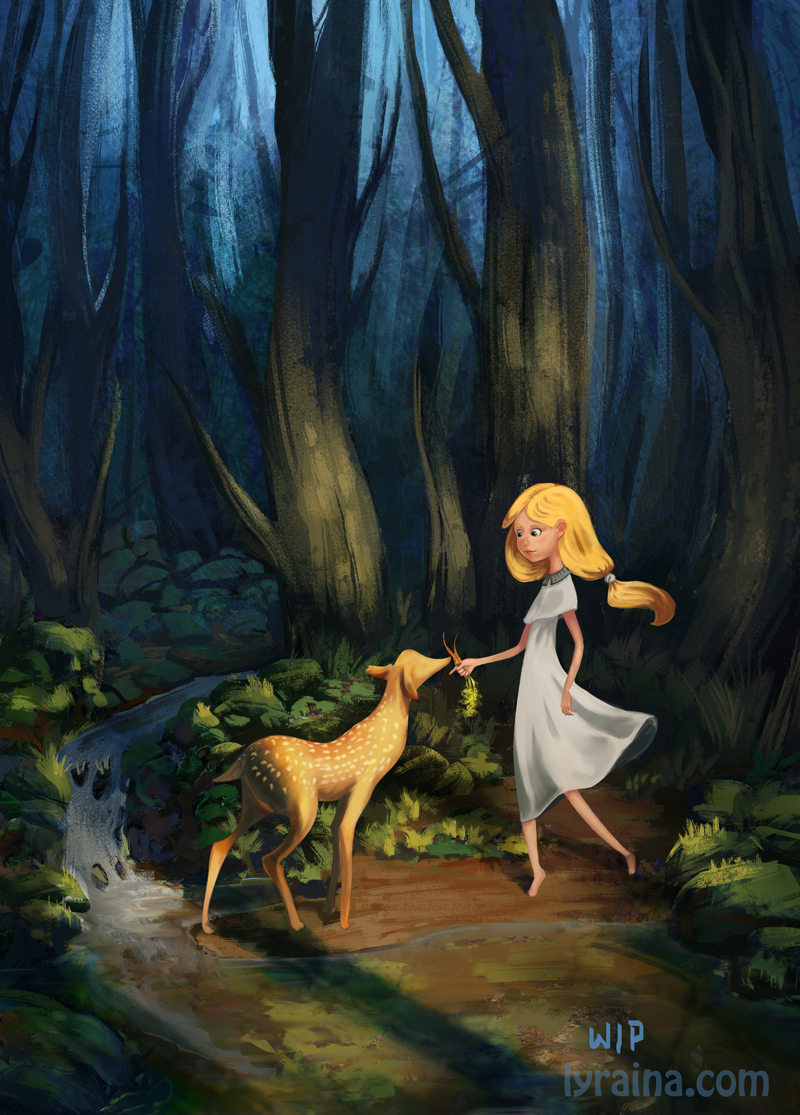
a very last minute decision to participate in the ifx monthly challenge. my attempt to do something which could be a children's cover, but might be too dark? Also, I'm soooo lost when it comes to stylization, I honestly have no idea what to look out for :P Apart from that, I try to push light/colors and a painterly/rough stlye.


SketchbookDeviantartArtblog | Portfolio
Every feedback is appreciated!
Reply


Forum Jump:


Users browsing this thread: 67 Guest(s)