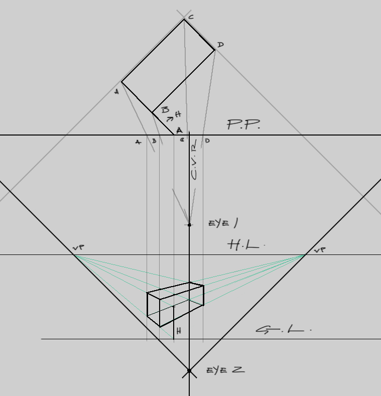
And some more.. perspective. Norling stuff for plan view. I've been doing so much perspective, I think it's fried my soul. If ever there was one worth anything. I haven't considered organic form forever. So I decided to try and make it a point to be creative.
I decided to go for the Tomb Raider contest. This is challenging not only because I have no chance of winning. But having seen most of the entries, they are all the same, some better executed then others. But so many cliche, rinse and repeat pieces. The challenge will be to do something unique. I'll fail, if this first set up thumbs is the best I can do. I was getting into the first one, but just decided to move on real quick and see what else I could do. I hope to jam out more of these, and maybe find something I can work with and pull of to the best of my abilities.
Regardless of this crap update, I'm really trying to get better. Need to do better than this.


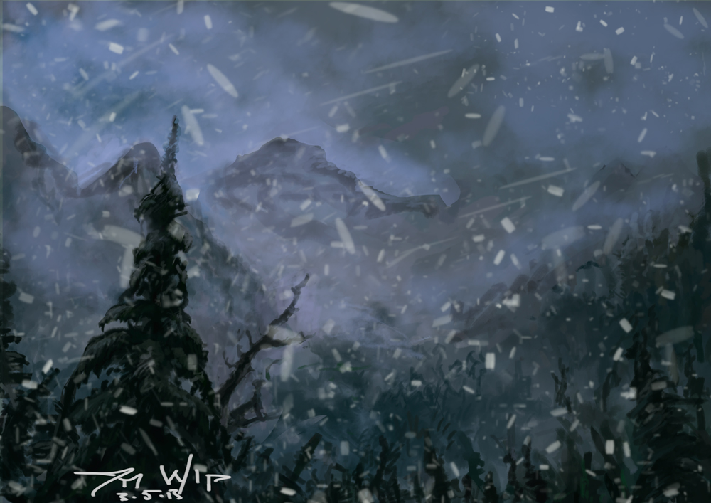
Environment WIP from today.

Posts: 1,098
Threads: 11
Joined: Aug 2012
Reputation:
34
I know that feeling, its like trying to climb the damn everest. But every step counts, we must not forget that.
Also for the tomb raider contest, who knows? just do your best mate.
Posts: 63
Threads: 1
Joined: Jun 2012
Reputation:
0
You're doing all the right studies. Keep it up man.
Posts: 155
Threads: 5
Joined: Mar 2013
Reputation:
5
Heya, I second the others, its rough but you're doing right by the studies. Little my little mate!
(03-10-2013, 04:30 PM)anzhou Wrote: Heya, I second the others, its rough but you're doing right by the studies. Little my little mate!
Hey m8's, thanks for swinging by and the assurances. Rough indeed!! I've been away because I've had my head lost somewhere up Lara Crofts bum for this contest. But I finally finished. I put like 60 hours into it. Most likely, 59 hours too many. But I got to experiment with ass loads of techniques for the first time, which I'm sure shows. It didn't come out as a 1st place piece, duh! But it was fun and am proud for sticking it out no matter how deep I got myself, it was hard as shit at times(all). Any crit is very appreciated, because I want to be better, badly. Back to some much needed studies!

Posts: 155
Threads: 5
Joined: Mar 2013
Reputation:
5
Hey man nice work. she looks hawt :) be proud mate !
Things i noticed are,
the shading on her bow looks round in some places and blocky in others, overall the read on the volume is compromised. also the bandages could be drawn to reflect volume of the bow better.
compare with the bandages you did on her left leg, you got those down to good effect :)
her back foot could be defined a little better, tip of the shoe should be in view.
Because the shading of her right kneeguard is in higher contrast compared to her left one, its coming more forward in the image plane. I could be mistakened but the left leg is in front of the right yes?
the necklace looks like its floating so a little 10% multiply under it will help it sit on her chest better.
Hope it helps :)
Keep posting!
Posts: 1,970
Threads: 22
Joined: Apr 2012
Reputation:
243
Hey man, you're really hammering on perspective, which isn't always the most fun thing to do. Well done and keep up the hard work. It will pay off. So I figure I owe you some crit on your TR piece since you did the same on mine :)
composition:
The composition works, nothing wrong with it per se but I feel that a lower viewpoint and maybe a slight angle to the log leading up to her being slightly off centre would have been a more dynamic choice.
As you're focused on perspective studies, don't forget to apply it to your work! Figures and rocks and the environment all should follow the same rule, and I think that you haven't quite nailed it wrt her figure and the midground rocks. Even the far mountains should be made to follow the perspective to reinforce it for us; they are pretty flat on.
Lara figure:
Our eye level (HL) is chest height according to the log, but her torso and upper half of legs appears flat on; while only the lower half of her legs appear below the HL. It seems like you were stuck somewhere between a distorted lens affect and a regular one point perspective. This may also account for the fact that her legs aren't in proportion to her upper half below the knee; they appear a bit too long. Pose wise it is dynamic and flows, but the slightly strange angle of her left leg (our right) throws this off a bit. From a purely practical point of view would she really be striking a model pose, while balancing on a precipitous log and trying to get ready to nock and shoot a bow at the same time? Seems very unlikely. Some of the creasing on her pants doesn't seem natural, the harsh straight diagonals leading up to her knee.
Lighting:
I think you haven't applied your source light to all the objects in your scene equally. The light is late afternoon, peach it seems, and rocks appear to be lit with a more blueish tint than I would expect. they are also lit from a higher angle than I would expect. On Lara herself the light is strong directionally on her face, but the rest of her doesn't get the same treatment. I had the same issue with mine too. How do you show direct lighting on the focal point when it's in front of the light source...you have to fake it, but fake it in a believable way...tough! Perhaps secondary sources are the answer..I don't know.
Forms:
I think you could pay more attention to rendering around forms to show volume. The forms of your rocks, most evident on the ones on the right, are very flat. The log is also quite flat in appearance. This goes for Lara too; her right arm (our left) for example. I love how you painted her other arm in all respects, that's the best part of the painting imo. Her hair is moving like a single block, which it wouldn't really. There should be some strands and you could use them to catch some highlights there as well to draw focus.
So yeah that's quite detailed, but hope it is useful. Good on you for chucking your hat in the pile...that's all we can do :)
Thanks alot for you kind words over in my sketchbook man!! Im really digging your updates!! Just keep pushing the perspetcive, now i have to catch up to you with painting. Yours is awesome man!!! Keep going!! :)
Joe, Thanks man I appreciate it. I'll take that trade if you want. Seems to me it's quicker to employment making rad vehicles and perspective environments. I might be wrong I don't know, anyways Cheers!
Anzhou, thanks for the crits man, very good catches there. The foot I knew about for sure but ran out of time. Stupid me, and it was borderline fucketness. As for the bow tape and the straps. I painted the legs ones first, then came to the others much later. And when I did I was hoping to have them be different materials. One like that surgical sports type tape while the other was a fabric. But you are correct. And I can side with you. Also the right knee(bent) is the most forward. But if it's not obvious, I blew it, haha. Anyways, very goo comments and I appreciate you leaving them for me.
Lastly, Monkeybread. Awesome crit. I not only walked away with a bald faced truth to the stuff I seriously should have nailed, without excuse. Even though I'm going to share a few, not many because I seriously can't defend some of it. I also got a glimpse of what a crit looks like, Anzhou's was solid too so I got some nice lessons there. I wish to be able to reciprocate this. Anyways to the crit.
The lighting was an accident mostly, because I painted the landscape from a happy accident approach. Because I quite simply have no knowledge of them. I used no ref for it, just painted what I though worked. Initially I did trees in the foreground, then a river, then lastly a cliff. But before tall that it was snowing and colder, alot. Because I wanted that snow I saw in the trailer. But eventually, it was boring and dull and I wanted light, and so I painted some light and at times, better then others. And thanks for noticing the arm, despite som muddy colors hidden under abused texture brush it was my favorite part, after the face. The hair sucks, period. I simply need to study hair for like always, but first I need to study perspective. Then, oh it's a huge list.
The perspective was only in the log and the pick. The log was worse, but I fixed it about 3 hours before submission, everything south of the midground was done last. And because of poor decisions all along the way. But most importantly lack of planning. Which was my greatest lesson here. But regardless, I'm content with it. I think it's improvement. I have to I guess.
The model pose, actually is dramatic right, haha. Thats one of those gut things, that happened to be guided mostly by comfort level. Actually as I post today, I had considered some more interesting things, and a low cam also. Not shown here. But it just came down to knowing the entire image was a challenge enough to take on anatomy and foreshortening I knew I could not convey. But I get exactly what your saying, and hope one day to be able to pose better.
Finally, as to the rest of your very well observed comments, in regards to the forms, pants, anatomy, etc. The only answer I have is simply lack of knowledge and ability to translate from brain/eye to pen. I work on this always, so I hope it shows, sooner then later. But I'll take either. Anyways thanks again guys, very awesome crits and I appreciate them.
Here's my some stuff related to the TR piece, some sketches and some of what the hell I had to fix in the foreground. Water, holy shit. not a good thing to try and paint with studying it some, derp. Also, a screen cap study from today. Bourne Legacy, pretty good, I recommend it.


Posts: 1,970
Threads: 22
Joined: Apr 2012
Reputation:
243
You know man, the crit is just for you to think about and apply to your future work as you choose. You don't have to defend anything. I wouldn't want you to defend anything...unless I'm totally wrong of course; then you can tell me to go to hell, or just ignore me. :) You don't have to even reciprocate the crit as long as you can use it to improve your approach that's all I care about!
I admire what I see in your work ethic, and you know where you are going wrong and you clearly have the motivation to improve. This is a lot more than others have.
It's daunting I know, but just take small steps to address your most immediate and fundamental issues first and attack those...everything else is just plain hard work.
I have no doubt I'll be seeing lots of progress in your sketchbook. Good luck mate and keep pushing!
Thanks man, sorry if it somehow came across as me defending myself. I actually never felt insulted or offended, so no need for me to defend anything. Was more so grateful and was just Monday Morning QB'ing it. Thanks all the same, it's all coconuts!
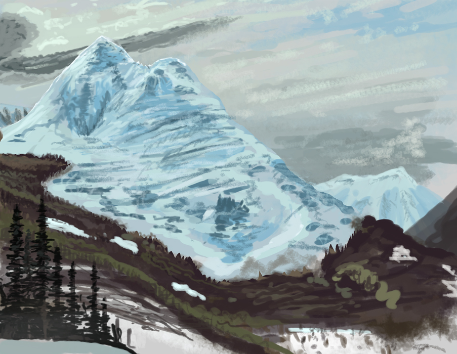
Anyways here's some stuff today, the perspective sucked it out of me as usual, but I was studying some Larry Elmore and just got the urge to paint one of his mountains. 1 hr. Meh.


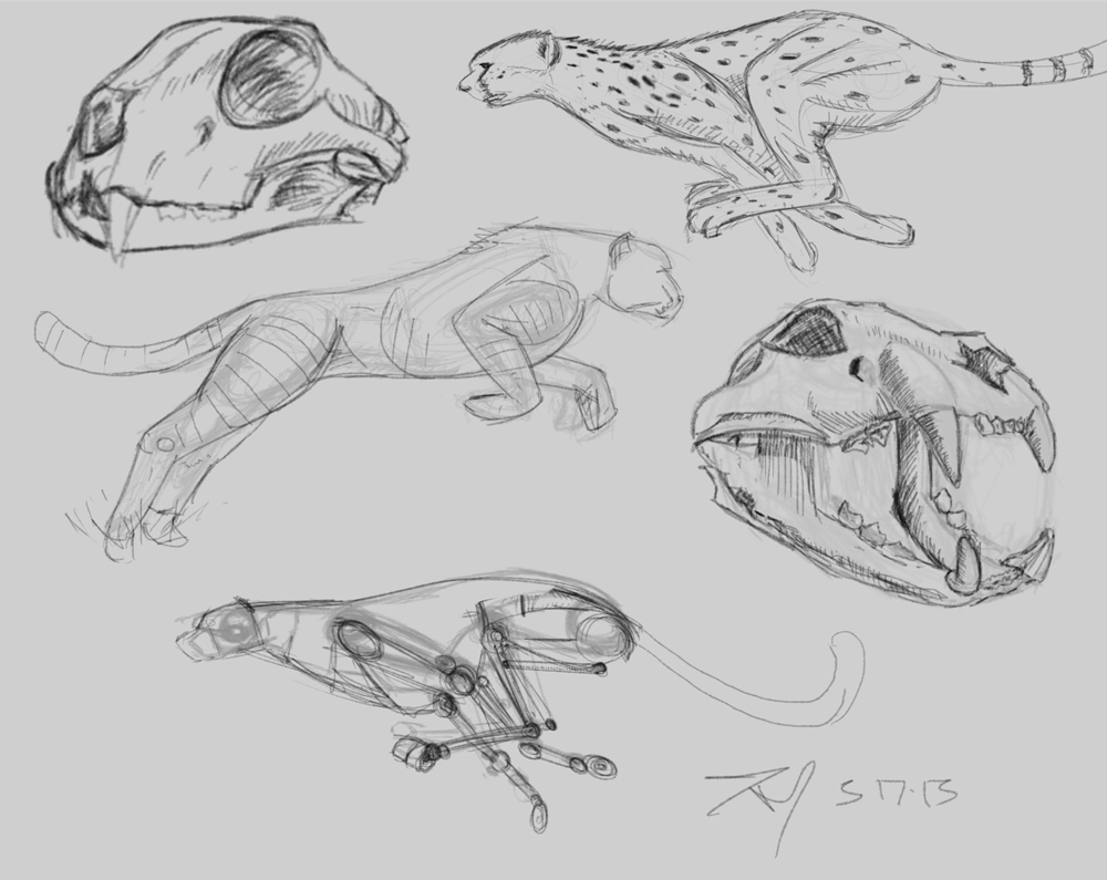
Studies, materials and some sketches of some cats.


Posts: 110
Threads: 2
Joined: Jan 2013
Reputation:
0
Fuck i love your lara croft's piece ,it's really cool !!! im not really sure if her skin tone - lighting is the best option, i would explore other options :)
i suck at perspective, i envy you haha :P
Posts: 155
Threads: 5
Joined: Mar 2013
Reputation:
5
(03-16-2013, 07:02 PM)I STRaY I Wrote: Joe, Thanks man I appreciate it. I'll take that trade if you want. Seems to me it's quicker to employment making rad vehicles and perspective environments. I might be wrong I don't know, anyways Cheers!
Anzhou, thanks for the crits man, very good catches there. The foot I knew about for sure but ran out of time. Stupid me, and it was borderline fucketness. As for the bow tape and the straps. I painted the legs ones first, then came to the others much later. And when I did I was hoping to have them be different materials. One like that surgical sports type tape while the other was a fabric. But you are correct. And I can side with you. Also the right knee(bent) is the most forward. But if it's not obvious, I blew it, haha. Anyways, very goo comments and I appreciate you leaving them for me.
Lastly, Monkeybread. Awesome crit. I not only walked away with a bald faced truth to the stuff I seriously should have nailed, without excuse. Even though I'm going to share a few, not many because I seriously can't defend some of it. I also got a glimpse of what a crit looks like, Anzhou's was solid too so I got some nice lessons there. I wish to be able to reciprocate this. Anyways to the crit.
The lighting was an accident mostly, because I painted the landscape from a happy accident approach. Because I quite simply have no knowledge of them. I used no ref for it, just painted what I though worked. Initially I did trees in the foreground, then a river, then lastly a cliff. But before tall that it was snowing and colder, alot. Because I wanted that snow I saw in the trailer. But eventually, it was boring and dull and I wanted light, and so I painted some light and at times, better then others. And thanks for noticing the arm, despite som muddy colors hidden under abused texture brush it was my favorite part, after the face. The hair sucks, period. I simply need to study hair for like always, but first I need to study perspective. Then, oh it's a huge list.
The perspective was only in the log and the pick. The log was worse, but I fixed it about 3 hours before submission, everything south of the midground was done last. And because of poor decisions all along the way. But most importantly lack of planning. Which was my greatest lesson here. But regardless, I'm content with it. I think it's improvement. I have to I guess.
The model pose, actually is dramatic right, haha. Thats one of those gut things, that happened to be guided mostly by comfort level. Actually as I post today, I had considered some more interesting things, and a low cam also. Not shown here. But it just came down to knowing the entire image was a challenge enough to take on anatomy and foreshortening I knew I could not convey. But I get exactly what your saying, and hope one day to be able to pose better.
Finally, as to the rest of your very well observed comments, in regards to the forms, pants, anatomy, etc. The only answer I have is simply lack of knowledge and ability to translate from brain/eye to pen. I work on this always, so I hope it shows, sooner then later. But I'll take either. Anyways thanks again guys, very awesome crits and I appreciate them.
Here's my some stuff related to the TR piece, some sketches and some of what the hell I had to fix in the foreground. Water, holy shit. not a good thing to try and paint with studying it some, derp. Also, a screen cap study from today. Bourne Legacy, pretty good, I recommend it.
Yea! Good shot for now, You'll get better!
Great studies mate keep them coming~
Posts: 1,527
Threads: 24
Joined: Dec 2012
Reputation:
70
Hey you,
Fantastic T.R Reborn entry! It's really cool to see the process behind the piece itself as well,
keep pushing as always! ^_^
sketchbook | pg 52
"Not a single thing in this world isn't in the process of becoming something else."
I'll be back - it's an odyssey, after all
Hey Everyone, sorry for not having responded to your much appreciated comments.
Silverkeeper thanks much man, yeah it's riddled with failure. But it's my benchmark for now, and my only competition as of now to destroy!
Anzhou, thanks man, right you are,( I hope)!
Smrrfette, thanks so much, one day the process I hope is as awesome as many of the members here flex.
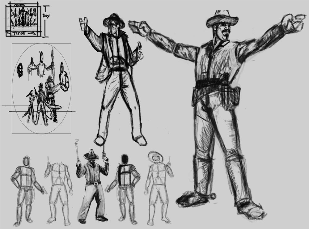
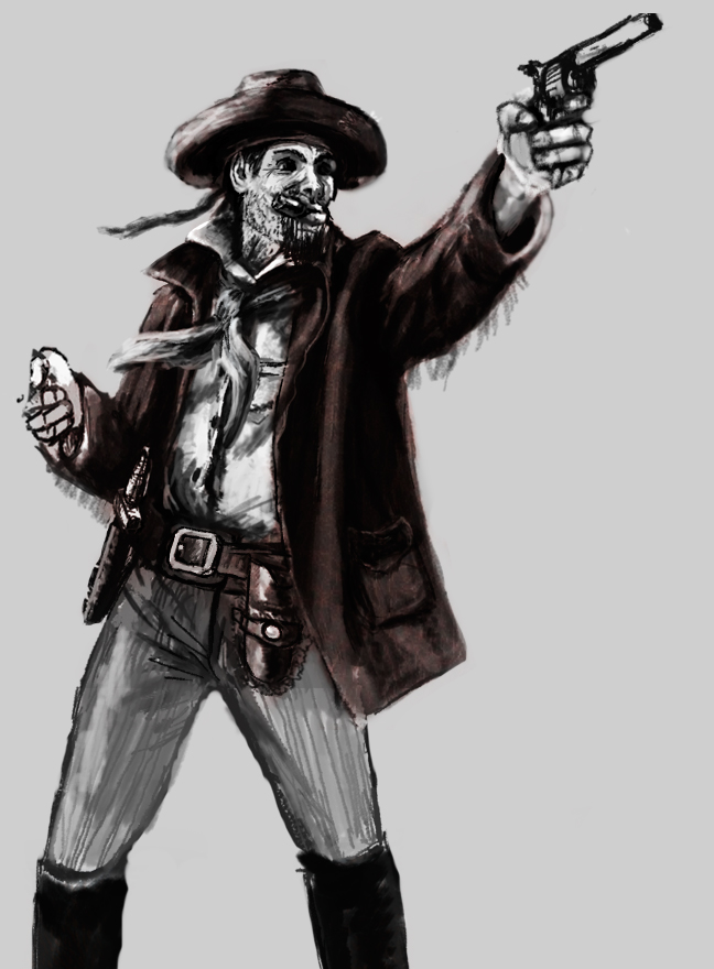
Which leads to my update. Some of this is stuff from my feeble attempt at BS 13. I had a great idea(to and for me), but lack of planning prior, and the couple days I actually had prior to the deadline forced me to suck and badly. But here is my Dillon Kobrax, this awesome Vaquero I had planned. Could just never get off the ground. And also a cap study, aimed at values. And a lizard timed at 1.5 hr. I hope to update more, and I really hope to compete in BS 14. I'm just so slow, and lack the design language to do so. But we'll see what I can muster. I can assure you I'm studying via reading and video's so much more then I can with my stylus. So if it's not here, it's not due to lack of study. Whatever, haha.


Posts: 903
Threads: 54
Joined: Feb 2012
Reputation:
18
Keep working hard man! Cool to see you tackling everything head on, like perspective. Push push pusshhh
Thanks man, for stopping by as well.
Strange man for today.

|

