09-29-2012, 12:44 PM
you have some good compositions going on
|
Mythtaken and his training collage
|
|
09-29-2012, 02:16 PM
your mars space dude is my favorite so far i love the color mix of orange and blue man keep it up your sketchbook is really showing development
09-30-2012, 04:43 AM
Thank you guys! It's always nice to hear that one is making progress, I'm staring myself blind everyday with my own work so it's hard to tell whether I'm getting better or not.
Here's the final piece, not much changed, though I had to correct the houses a bit to match the perspective better, did some color balancing and then added some details 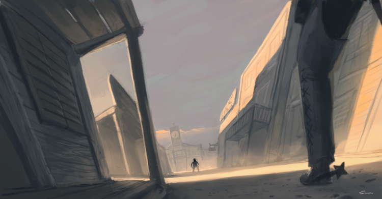
10-02-2012, 01:21 AM
cool stuff bro! i like how you are evolving! keep doing what you do !! thanks for the visit in my sketchbook also!:D really appreciate it!
10-12-2012, 10:26 AM
Thank you! :D I'm so glad to hear that I'm evolving. I can feel it, but to get the confirmation from others means a lot to me.
A minor preview of something I started a few 20-30 minutes ago, I'm quite excited about it. 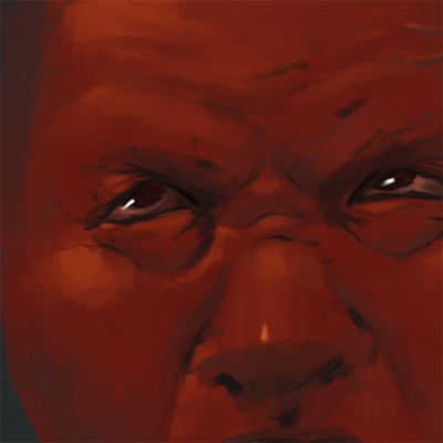
10-15-2012, 11:03 PM
Been spending too much time on this one, tried several ideas that didn't work out in the end. I'm stuck. I don't know how, nor if it's worth it, to push this piece, so I'll just leave it be.

10-16-2012, 02:14 PM
Nice rendering
If you dont feel a kick in the pants, allow me to get a bigger boot..
http://www.livestream.com/mrahart http://www.youtube.com/user/mrahsart http://mrahart.deviantart.com/ http://www.mrah.org
10-18-2012, 01:06 AM
That last one is a good start! If you're feeling stuck, I think it might be because you have not clearly defined a lightsource. It kinda-sorta looks like there is one coming from the top right, because of the light on his forehead.
So just choose that as your lightsource, and have everything on the top right be in light, and everything on the bottom left be in shadow. Thing of the head has a sphere with one light on it. And then cast some shadows from the nose, and the head onto the neck area. I did a quick little paintover to show you basically what I mean. ![[Image: CD_paintover.png]](http://whitneymisch.com/2012/CD_paintover.png) Hope that helps!
10-19-2012, 07:27 AM
Hi, I was considering having a stronger light source, but after trying a bunch of things I realized it ruined the mood of the image, especially the bottom where the blues and the reds blend together.
I really appreciate critique though, thank you. I have consulted with myself (lol yeah I do that), and I came up with that a front shot of the face isn't interesting enough anyway. I probably should have done something more dynamic, because now, its just a random red dude with an open mouth. Entering study mode :p  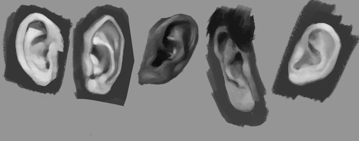
10-19-2012, 08:25 AM
Dude i'm so impressed! Love your work man! You're at the stage im aiming for next TYour light and color is just so rich and natural, I'll be following from now on! Love the Cattapilar Heaps! haha
10-19-2012, 01:29 PM
Thank you! No really, thank you for the kind words. I'm so glad to hear that I'm able to inspire even though I consider myself to be a novice. It really inspires me to keep pushing harder when I hear those kinds of things, so, thank you!
two quick studies before bed, its late :/ 
10-20-2012, 12:55 AM
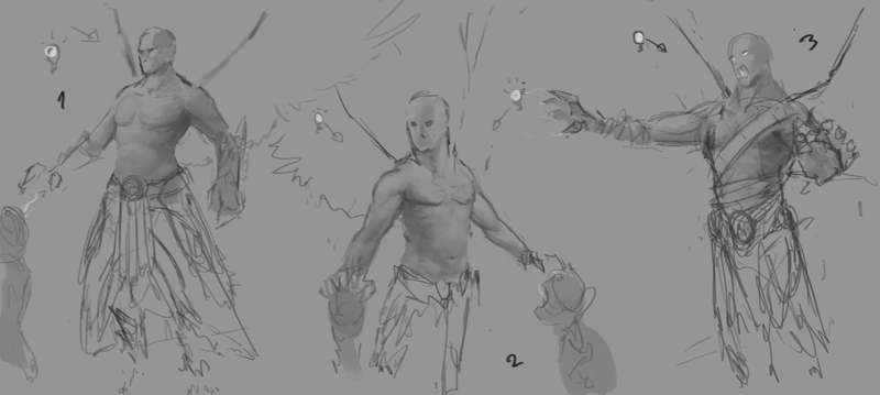
Here's a peak in to how I sketch. The idea emerged when I saw a picture online of a vampire with armor, and I was curious how he could have wings if the armor would cover the back, so my basic idea was, i wanna draw a vampire. But why generalize it, it's just a dude with muscles, wings and magical powers.
10-23-2012, 08:21 AM
color sketch, it was quite fun, I didn't expect it to turn out like this.

10-25-2012, 07:30 AM
A study and a preview pic uuuuh! More hand studies is coming!
 
10-25-2012, 10:26 AM
Hey I really like that color sketch environment! keep at it Man.
10-28-2012, 11:30 AM
Thank you, I guess it could use more contrast. It serves its purpose, to make me learn about those things.
Here we go, going to let it sit here for tomorrow, i think i'm done (which probably mean there's about 10% more that can be done) 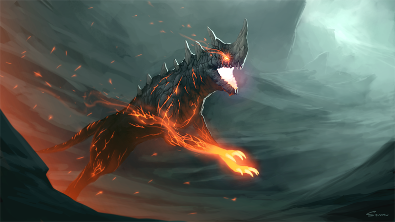
11-05-2012, 08:56 PM
One of few sketches from last night, I'm not comfortable of showing anything this loose though. Just look at the hand closest to screen, it's not even attached to the arm lol
Hope you can understand my vision though :)  |
|
« Next Oldest | Next Newest »
|