Monsieur-Beefy
Unregistered
@ Orsvend : ok cool, I was just making sure. Thanks as well.
@ brenthollowell : Thanks ;D
I'm probably not going to finish this challenge... got back to back to back tests on wednesday, thursday and friday with lots of homework to boot.
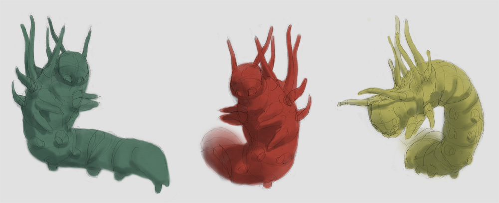
anyways, here are some sketches for my final. I think number 3 is the most predatory so that's the one I'm going to use. Different colors though. Probably green, red, and black.
Posts: 43
Threads: 0
Joined: Feb 2012
Reputation:
0
Halloa.
I'd caution you about having shape language that is too consistent. You have a lot of very bulbous shapes, and generally a pretty plain silhouette (though you've done a great job breaking it up with the antler-like growths in the front)
Try out different shape language ideas! Perhaps the front area of the caterpillar is MASSIVE compared the the rear, in the style of Lavos or the main villain of Demon's souls. Or maybe it's that his legs taper off in such a way, that they are placed in odd positions along the body. Or maybe it's just that the growths are very spiky, like the mandibles, while the body stays round.
I don't know how long you spent on these thumbs, but I'd honestly try to spend a littlbe bit longer thinking about design, and maybe not considering the lighting until you have the characteristics more planned out.
Cheers!
Lake
Monsieur-Beefy
Unregistered
@ lake : I've never played either of those games but I think I know what you mean. I don't feel like I have time to start over, but I have some ideas that might help with 'breaking it up' a little. Primarily, the antlers will be covered with little offshoots like I did with my study. I've also noticed a lot of caterpillars have these really weird flower/coral like warts running down their sides which I think would make a good addition. And folds. Lots of flesh folds. You are also correct in thinking I didn't spend too much time on the thumbs, but I flipped it a couple of times and the construction is solid (i think :huh:) so I'm gonna stick with it, while adding in lots of details of course. Do you think that these additions would be enough to solve the issue, or no?
So I like where I'm headed, but I can't shake the feeling it becomes more horribly phallic by the minute. At least he'll be creepy enough. I'm not gonna finish this on time so I might make a couple more different designs as well and make it a sweet piece for my portfolio~
Posts: 43
Threads: 0
Joined: Feb 2012
Reputation:
0
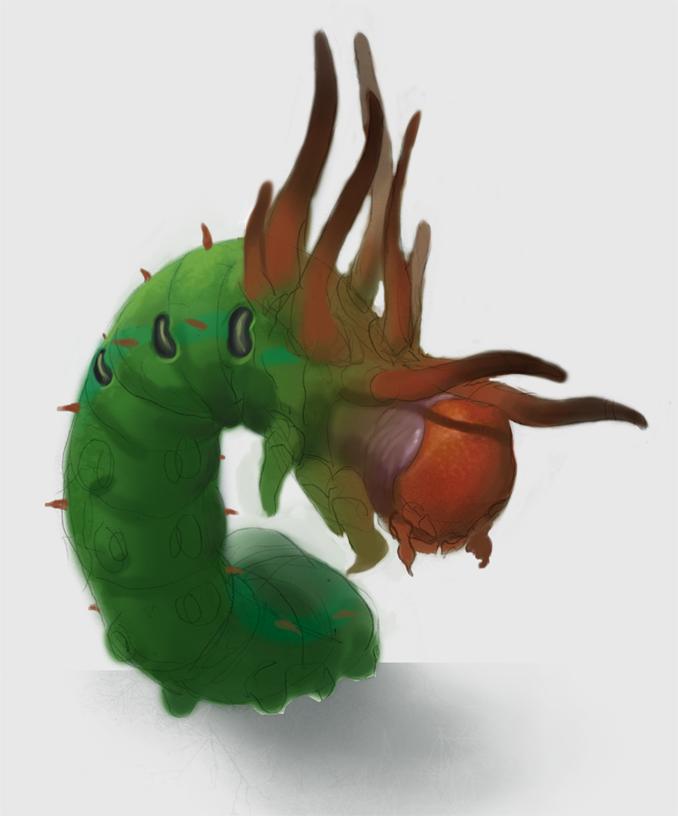
Ok. let me try to be a bit clearer. Check out the two images below. One is a very simplified breakdown of shape language. This makes up the most fundamental principles of what "design" means. I've also applied several of these principles in a quick paintover.
I hope this makes my meaning more clear X_x
Monsieur-Beefy
Unregistered
@ lake : Much clearer. This was a huge help to me. I've never seen any of this stuff before but I can see it's effectiveness pretty clearly just looking at what you showed. When I look at my image versus your paintover, if you were to take a crosssection of my caterpillar it would be a perfect circle, but yours is more of a trapezoid like a snake's body. I borrowed a bunch of ideas from your paintover, including that one. Hope you don't mind. Thank you once again for all the sweet advice you've been giving me ;D
--
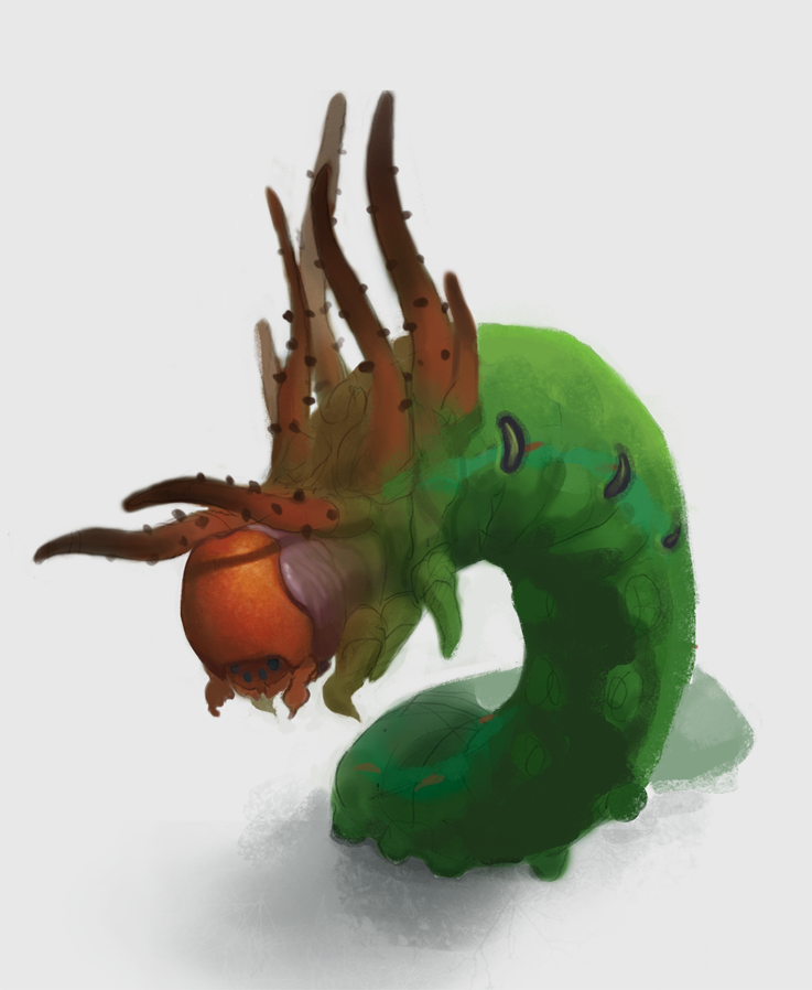
Trying out lots of new brushes. Having trouble getting the textures how I want them... small progress?
Posts: 160
Threads: 3
Joined: Jan 2012
Reputation:
10
Looking juicy! I really love the surface quality and texture of the head, that little sliver of red violet shadow that separates the head from the overgrowth of the neck/body puts a smile on my face. Great articulation based on lake's advice! Keep it coming.
Monsieur-Beefy
Unregistered
@ CoreyKLamb : Thanks! I promise to finish!
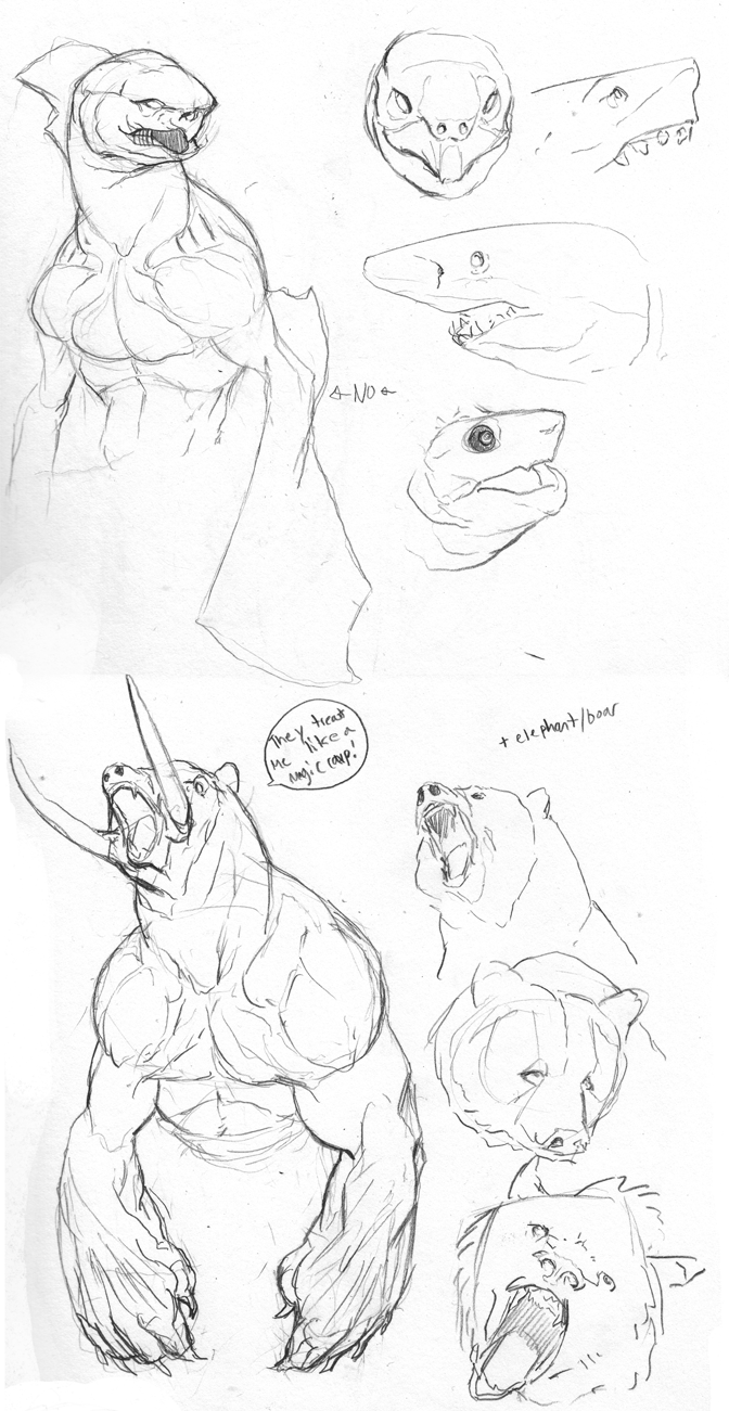
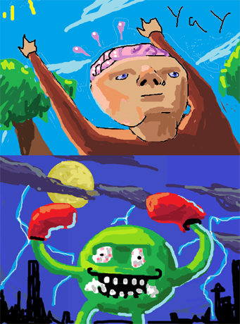
Today I drew out what I want to do for COW 250. Also worked on my dad's birthday present (not pictured). Also MS Paint + mouse in math class:
Monsieur-Beefy
Unregistered
I never do everything I want to each day. I wish I had like 200 hours a day to spend. I don't even really like these two :-/
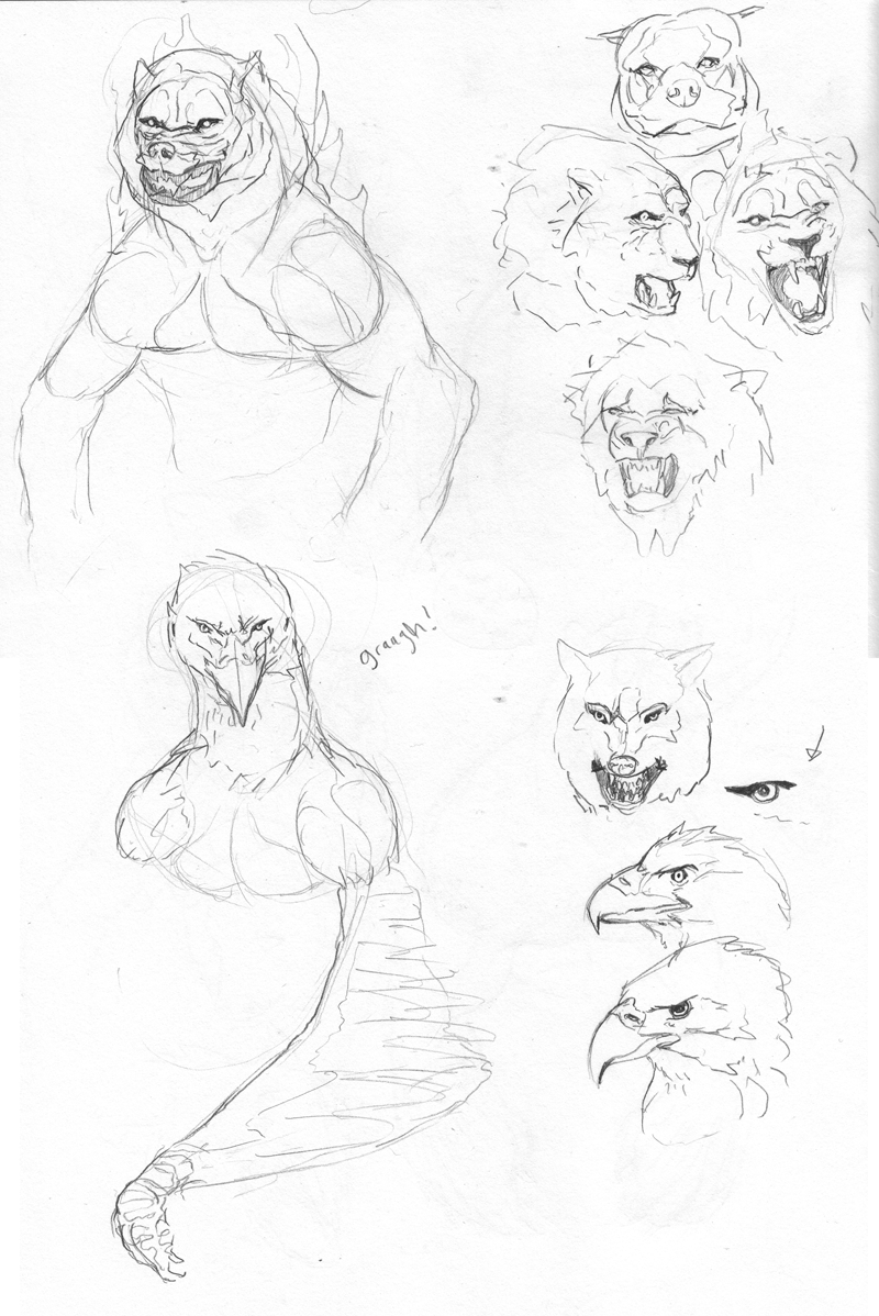
Monsieur-Beefy
Unregistered
Bakuman was sweet this week haha
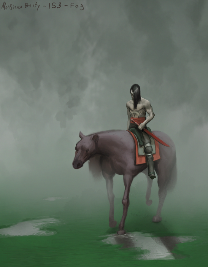
This was for teen Challenge 153.... Most comfortable I've been yet. Only took 4 hours, no major glitches in the process. I'm going to keep working this way, just better ;D
Monsieur-Beefy
Unregistered
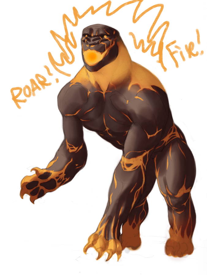
Blocking in colors + multiply layers
values are all over the place. no texture yet, but now I can start painting!
Firedogcat will have a mane of fire.
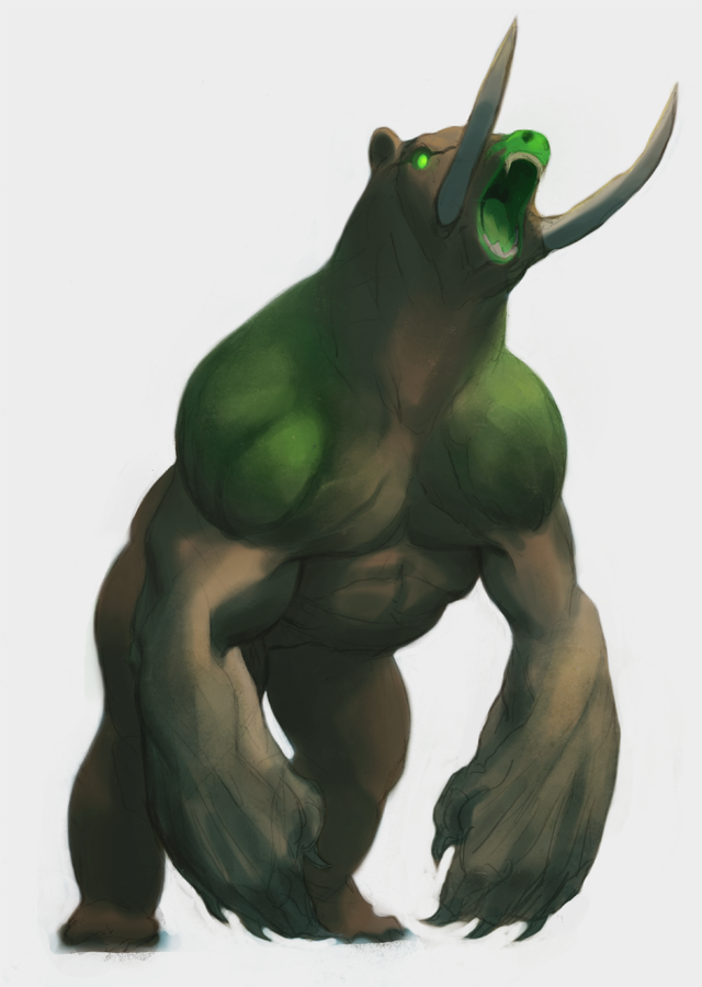
Posts: 77
Threads: 2
Joined: Jan 2012
Reputation:
7
great sketches! as far as paintings go, I really like how the insect turned out. you should do more painting studies to get more comfortable with colors. keep it up!
Monsieur-Beefy
Unregistered
@ yog joshi : I'm not actually done yet with the caterpillar, I'm gonna work a lot more on my bloodsport entry and really polish it up for my portfolio. studies are totally on my to-do list as well :D
Teen Challenge 154 WIP:
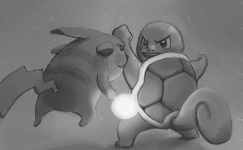
Posts: 269
Threads: 14
Joined: Jan 2012
Reputation:
35
love it all so far man, i see you're drawn towards creature design a bit so i'd recommend picking up an animal atlas and going through it with sketches and studies altogether. it's a nice way to build your mental image library of animal elements that you can later on use in your designs.
keep it up!
Monsieur-Beefy
Unregistered
@ Sickbrush : Thanks man! I love designing stuff, creatures included. I will certainly do so!
-Small progress :-/
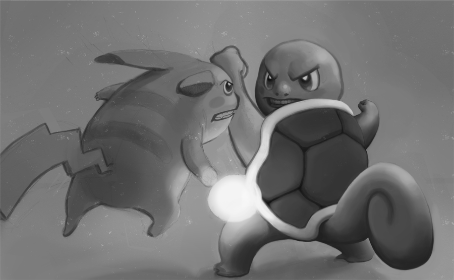
Monsieur-Beefy
Unregistered
A wild COLOR LAYER appeared!
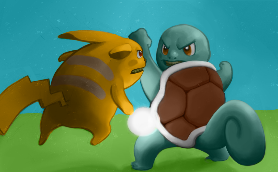
Monsieur-Beefy
Unregistered
Shit. There is so much I want to do with my life and I'm like already 15% dead :exclamation:
makes me really excited to enjoy so many different things, but also kinda depressed.
In other news, started up on 40 mins strength training each day because I think it is good habit to be in haha. 1/25550 days complete!
yeah, I didn't draw too much today and most of this design is stolen from other art anyways:

Posts: 127
Threads: 4
Joined: Jan 2012
Reputation:
1
cool beasties man. Your colours tend to look a bit muddy tho, look into colour temperatur. I'v attached an image (not mine, found it in imagine fx, from a animation dude - I forgot his name ><) to illustrate-
![[Image: 287j51g.jpg]](http://i56.tinypic.com/287j51g.jpg)
Monsieur-Beefy
Unregistered
@ rich4rt : Thank you, wonderful crit. I'll try and push it tomorrow when I finish up the pokepiece.
---
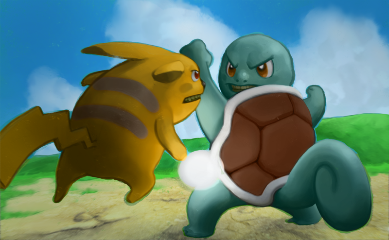
Painted in the background.. tomorrow I'll paint in the sunlight, the speculars, the textures, the lightning ball and the battle fx. whew
Monsieur-Beefy
Unregistered
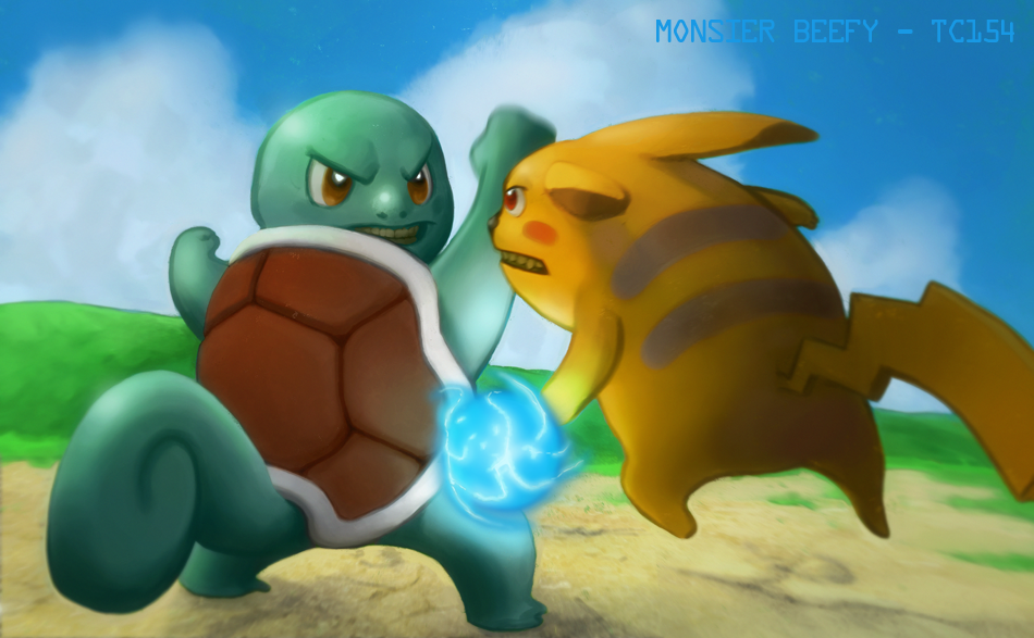
Finished! I'm really really happy with this. The two parts I like the most are the composition and the rendering on squirtle's head. Everything else I need to do better next time I think. yaaay for success :D
Posts: 127
Threads: 4
Joined: Jan 2012
Reputation:
1
Hey man, I hope you don't mind but I did a quick paintover to illustrate a few things to keep in mind for next time.
Firstly you have a solid base to work from, the poses and expressions are great, the composition works well, I especially like the slanted horizon.
![[Image: 6809100162_303a25d006.jpg]](http://farm8.staticflickr.com/7037/6809100162_303a25d006.jpg)
I added mountains for depth and to strengthen the composition. I desaturated the green hills as they roll into the distance (atmospherics). I darkened the entire image and pulled out the lights in the centre where his lighting is. I added more light/colour coming from the lighting that helps form the shapes like his shell. I adjusted some colours by shifting the hues so they don't appear so muddy. And lastly some general things like edges in the turtles face to push his expression, and ground shadows caused by the lighting. Hope this helps! Don't be afraid to just add a new layer and go mad with brush strokes, experiment - in digital art nothing can go wrong ;D
|


![[Image: 287j51g.jpg]](http://i56.tinypic.com/287j51g.jpg)


![[Image: 6809100162_303a25d006.jpg]](http://farm8.staticflickr.com/7037/6809100162_303a25d006.jpg)