01-18-2019, 12:03 AM
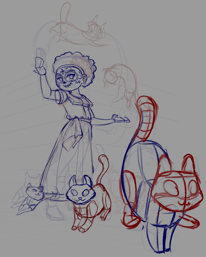
Drawing I'm doing for an illustration challenge

|
Tfantoni's Sketchbook
|
|
01-18-2019, 12:03 AM
Drawing I'm doing for an illustration challenge

01-19-2019, 04:16 PM
Good job.Small note finish cleaning the linework don't rush.
01-25-2019, 10:21 AM
Thanks dartktiste!
A friend of mine commissioned me to draw some characters from his RPG campaign, here's the result so far 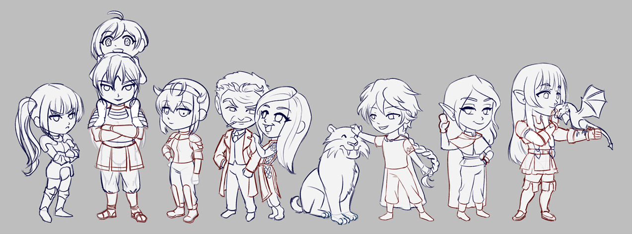
01-25-2019, 10:31 AM
One small advice if you permit don't do to much free work or you can end up giving your time away that you could use in a more productive fashion.It still good to do a few free comission just for the ''client'' experience of being given a restrictive goal.But if you want challenge just do art challenge there already restrictive and give you something to achieve.You don't want everybody to go around and tell other you work for free that just not a good business model.It sure is publicity but a bad one.
02-02-2019, 06:34 PM
@darktiste it's a paid commission actually =P I have bills to pay after all hahahah
I'm trying to finish this illustration but since I started to rendering it I'm feeling stuck and unhappy with I made since then (like the old woman's face for instance). I also tried to put some textures but for now it seems more like a collage due to lack of better integration. I know it but at the same time I don't know how to bring a painterly feel 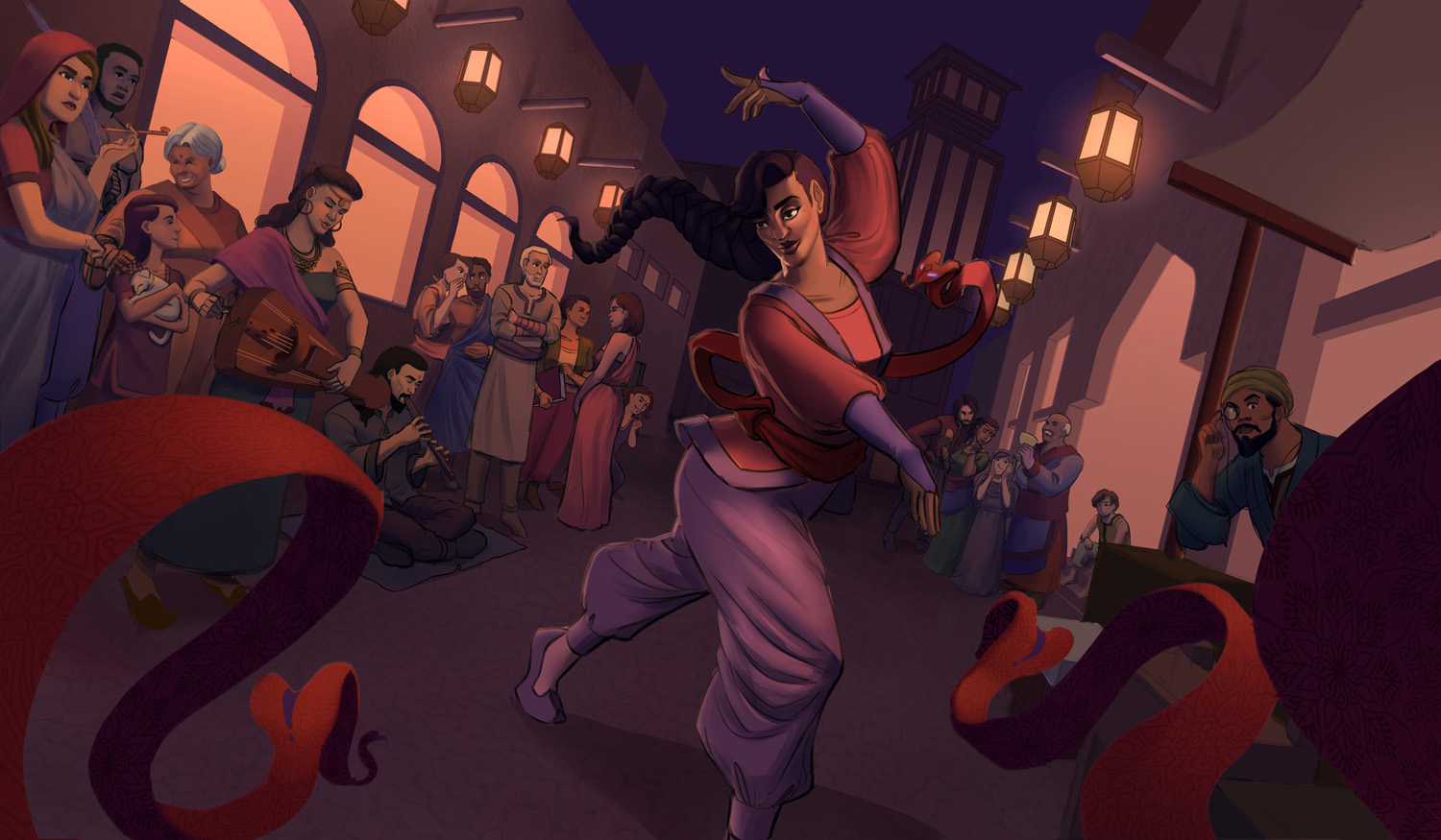
02-02-2019, 07:30 PM
I feel like you treat everything with the same amount of detail and that actually not helping your storytelling as it should be focusing on the point of interest.I did a few adjustement to talk about stuff like the rule of third idk if you heard of that principle of design and i also did some blur to bring the focus to the dancer.I also did crop a part of the image so that the dancer fall into 2 point of the center of focus.I know it doesn't seem alot but it just to show how changing a few thing can alter the focus of the story telling and it doesn't cancel that you can have supporting stortelling element that support the main point of interest.Just look at how much space she occupy now compare to before she not in competition for attention now
02-02-2019, 10:26 PM
there are many ultra sharp edges. on buildings and the snakes
also most of the characters are outlined in black then, there is an overall issue with value patterns and composition. all too unclear, chaotic? what is light what is dark? my main concern are the openings on the walls, too bright, too wide? some painterly filters + contrast 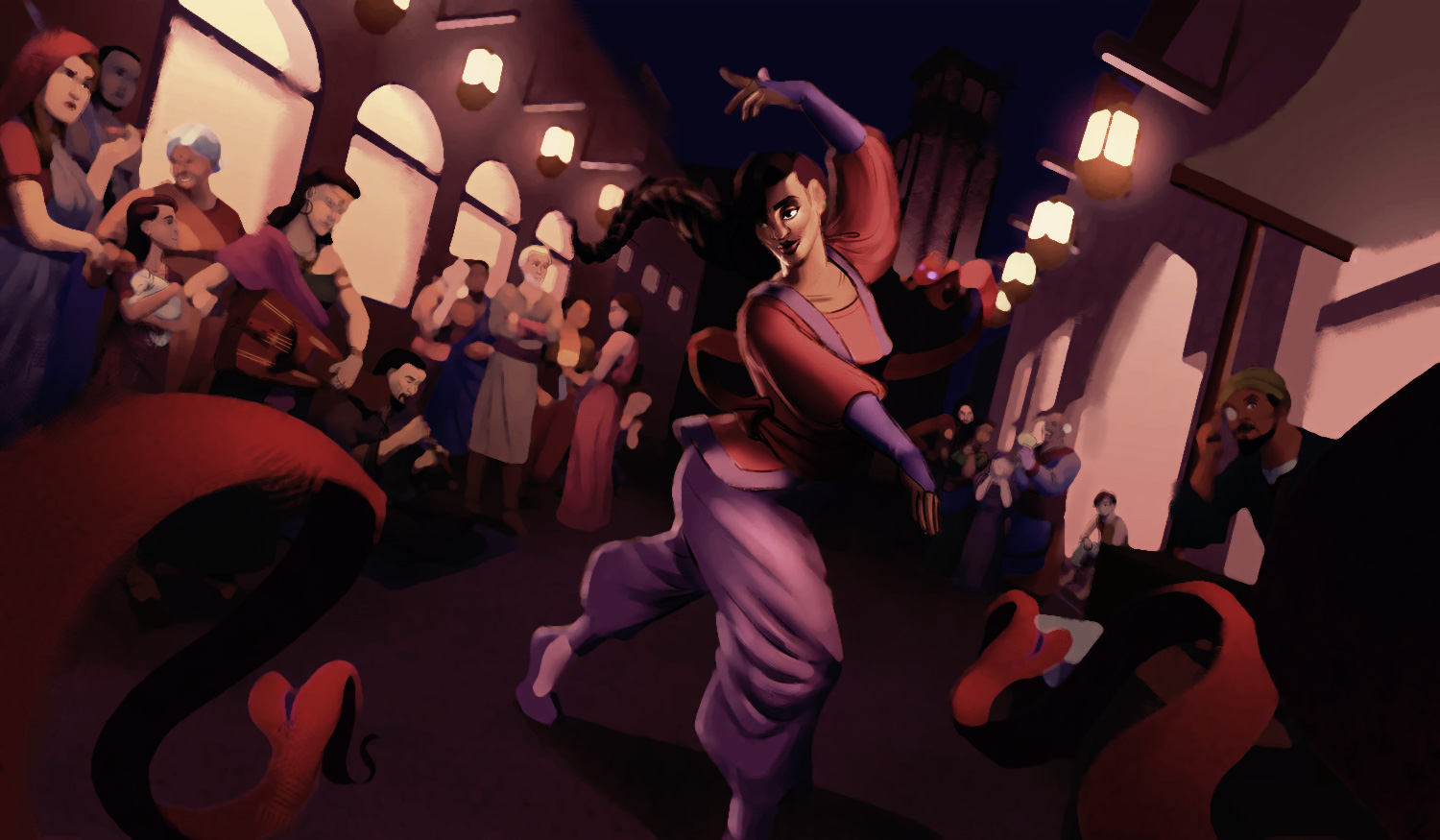
02-04-2019, 02:59 AM
I think the shading on the main characters face might be a little too dramatic? She's the main character after all.
Right now the painting is very very heavy feeling. So what I'd try would be to increase the contrast on the people observing, give them a bit more shadows and lighten your main characters shading up a bit? Many photographers use lights to make a main characters face evenly or less dramatically shadowed so to bring attention to it. Another thing you might wanna try to take a look at is that the people observing the girl have no shadows whatsoever, making them look like cutouts, make them take part in the environment more and maybe it'll feel more cohesive.
02-07-2019, 03:56 PM
Thanks a lot for all your feedback guys! <3 I'll try to improve the value grouping and edges
Here's a little of what I did for figuary to get some momentum 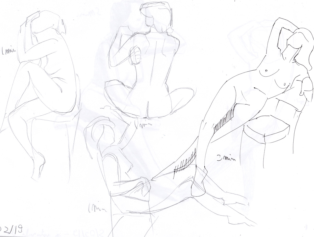 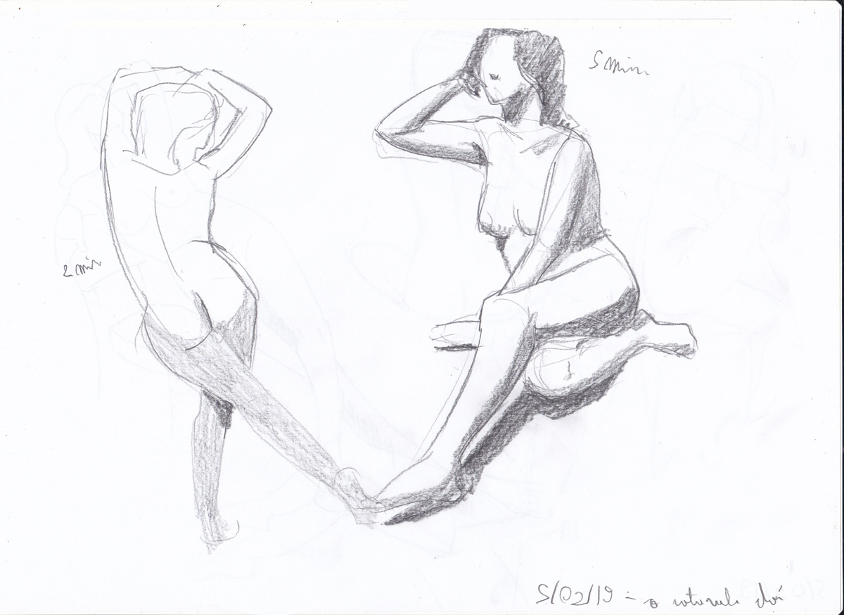 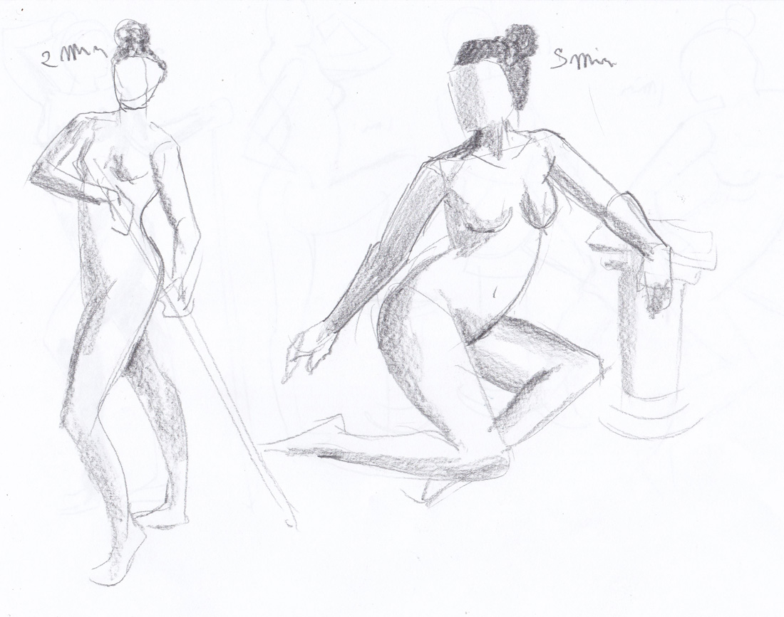 
02-13-2019, 01:20 PM
Since idk what you were exactly trying to achieve i have noted a few flaw in the copying here what my eye could pick up.
image 1.you miss shape of the shadow of the leg on aladdin.The value of princess pant are to dark. image 2.the angle of the light from the spot light are wrong.The women back isn't going foward but back ward.The dress doesn't have this shape you oversimplified it.Her left arm value shape is wrong it should be more rectangular with a rounded top rather then triangular. image 3.the value of the sky and the crowd are to dark.The castle proportion are off. image 3. the value are to dark.The angle of the ledge are wrong.Mulan left arm is way to low. image 4.the shape of the branch are sloppy image 5.the value of the right wall is a bit to light overall comment value are to dark and some issue of proportion and angle. I hope your strong enough to appreciate this harsh critism and that can grow from it.
02-20-2019, 09:35 AM
@darktiste it's a color study I did for sulamoon's mentorship in a hurry :P so I've spent little time on each thumbnail, that's why it looks so sloppy hahaha. she said the studies were fine for its purpose, now I have to pick some movie screencaps to practice a bit of rendering
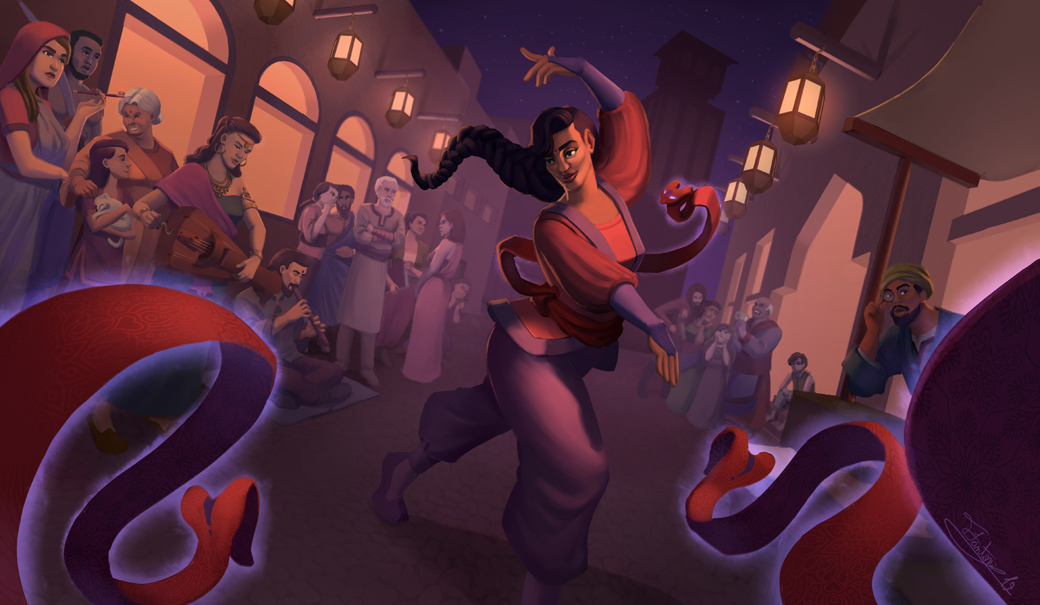 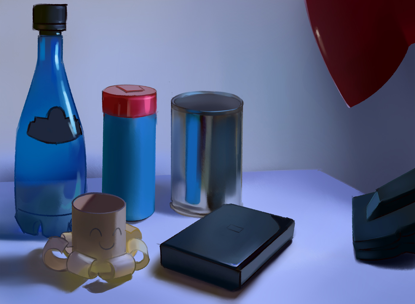 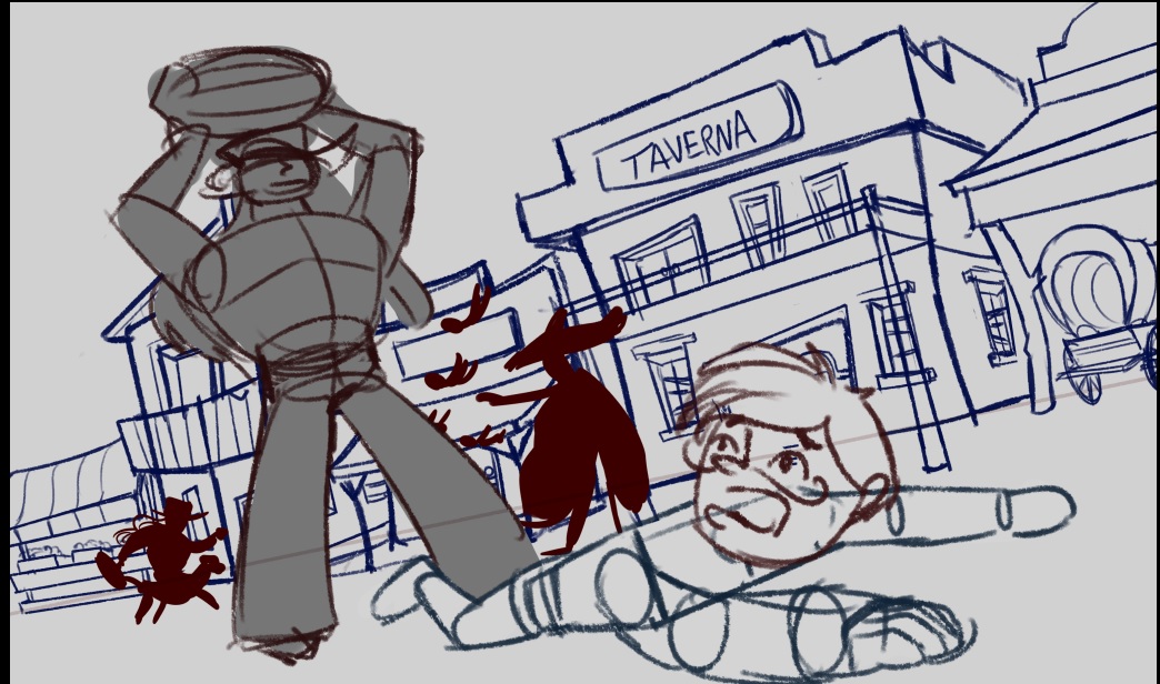 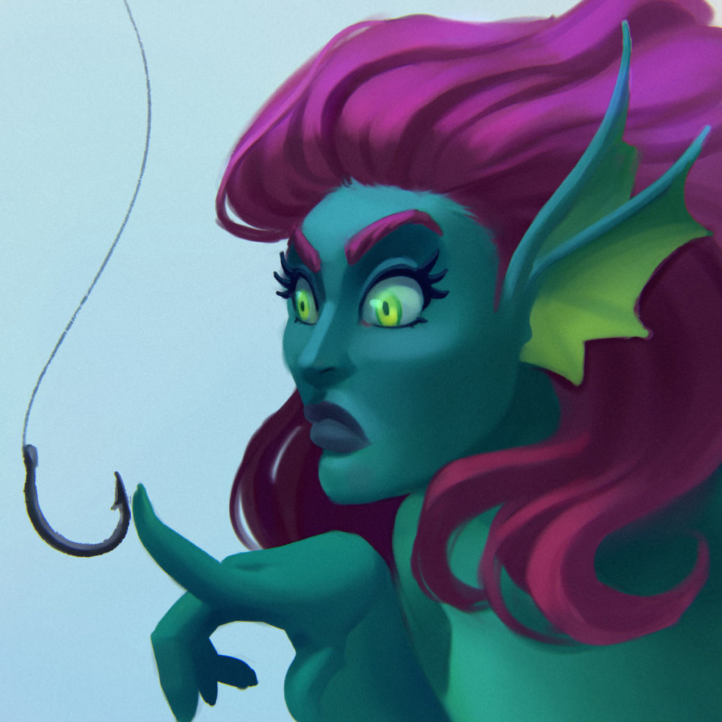 Art by Caroline Gariba <3 she's so fucking amazing aaaaaaa 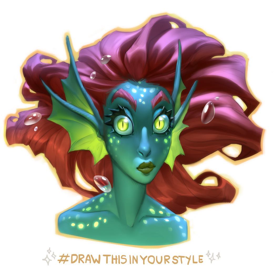
02-20-2019, 09:42 AM
The studies are nice, colors are always something i forget to study haha same with design.
Also killer illustration and stilllife :D
03-06-2019, 06:14 AM
Study the neck.You want a stronger shadow for sure and you want the neck to feel more round than right now in my opinion.You can even add the adam apple for extra realism but i guess your going for a simplication.
03-23-2019, 04:34 AM
Thank you darktiste!
Things got tougher in the last weeks. I'm barely drawing, my wrist hurts, got a breakup... Latest commission I did: 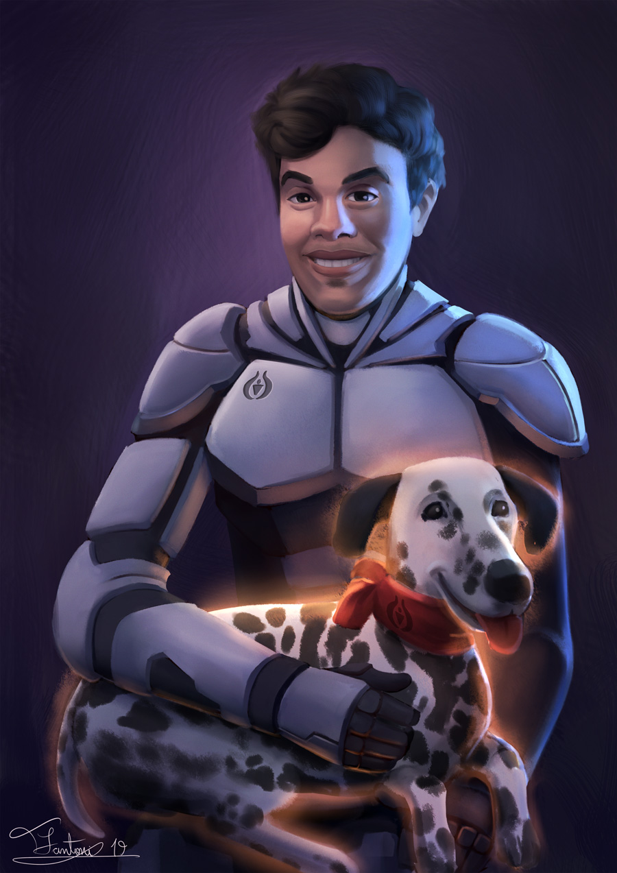
07-21-2019, 01:55 PM
Hey everyone. Here I am, coming from the dead once more :P
I've been doing some commissions meanwhile, so here it is 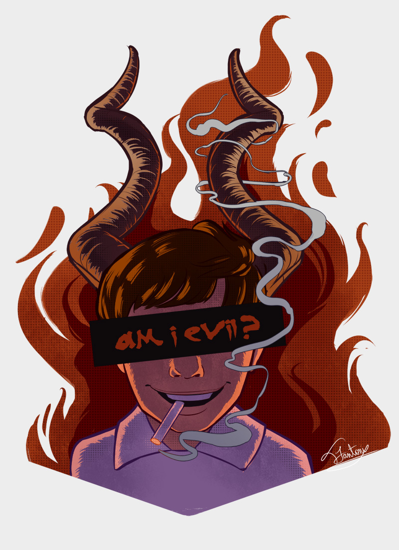 My dollified version 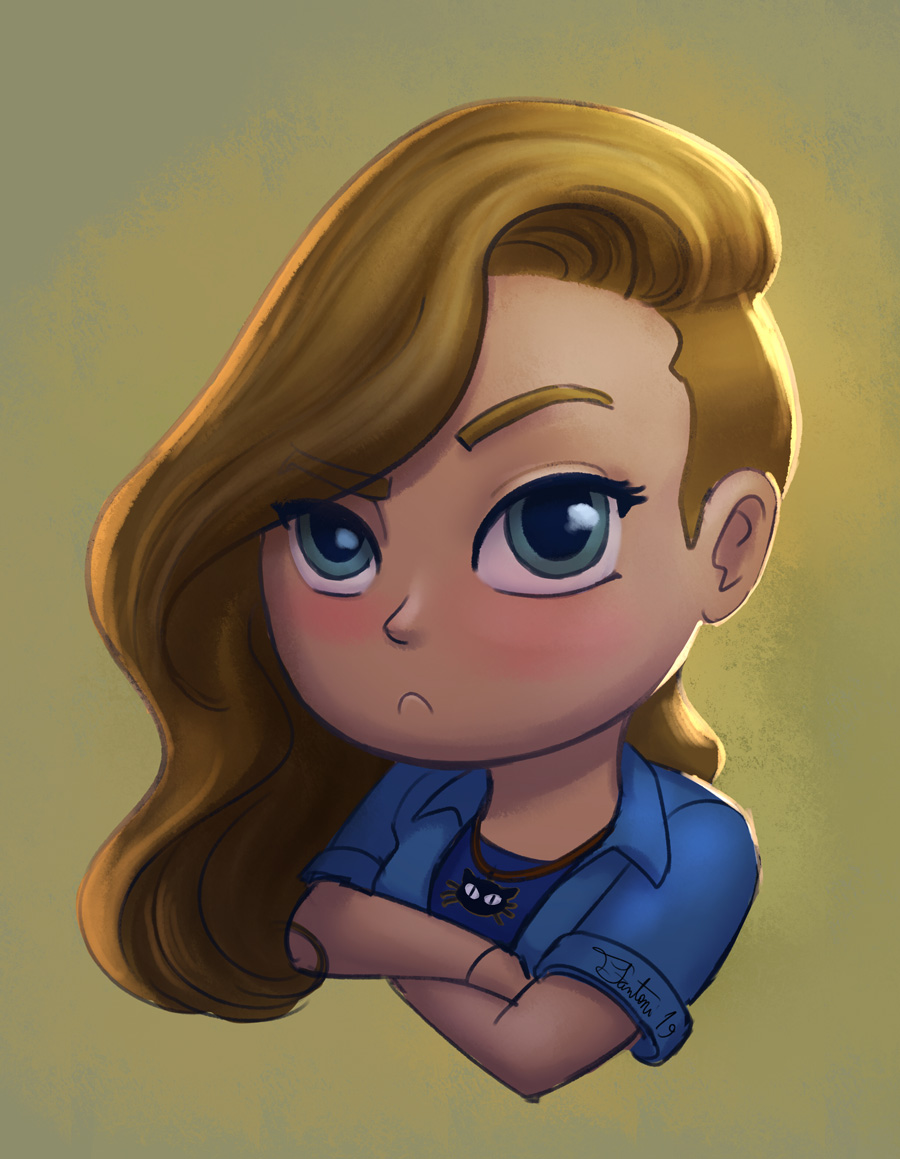 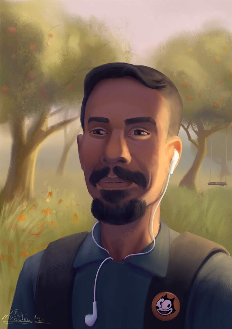 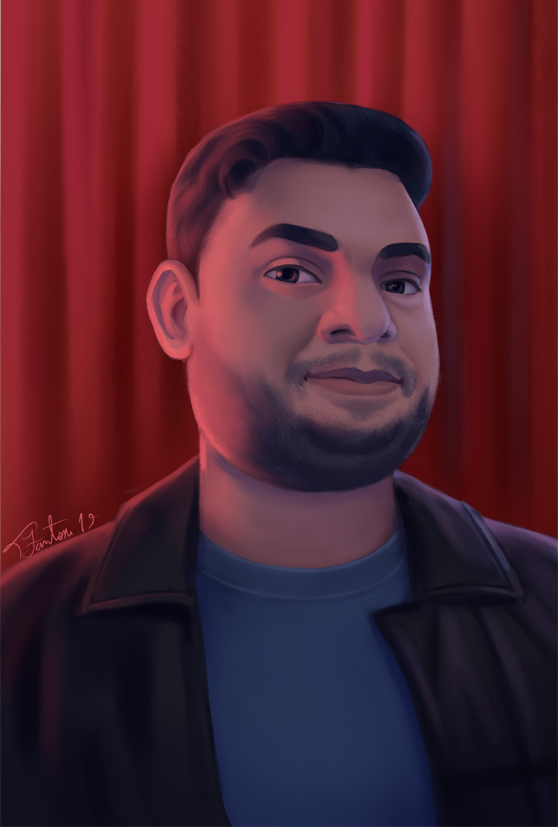 This one is heavily based on a twin peaks artwork by Christopher Lovell 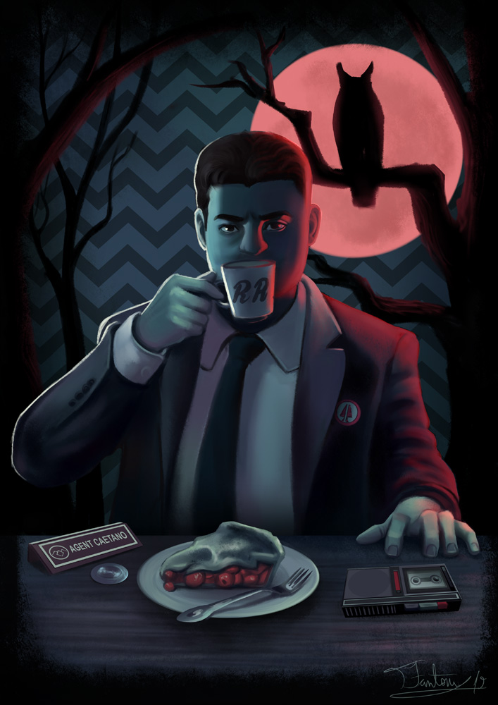 Current WIP, myself as a cyberpunk 2077/shadowrun character 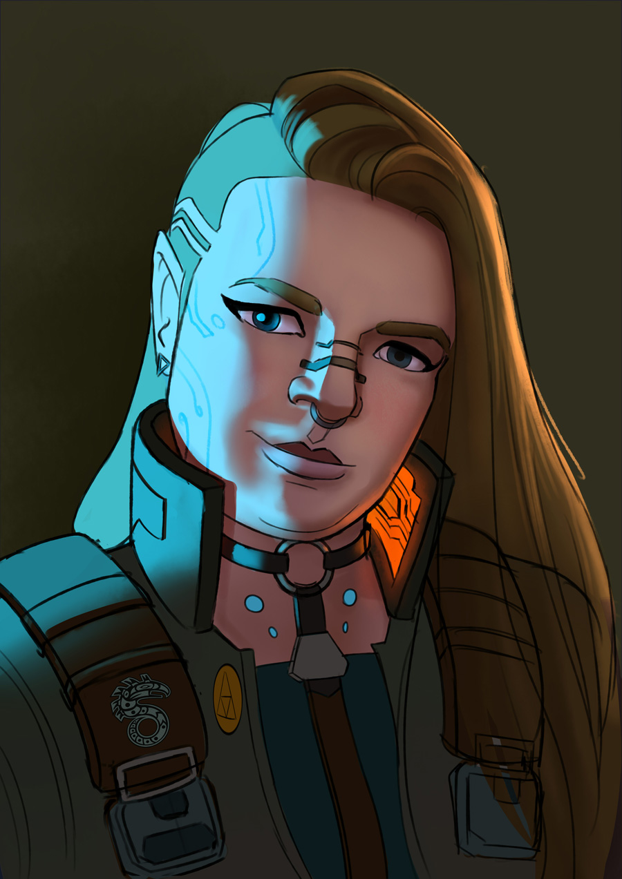 Slowly going back to the studies 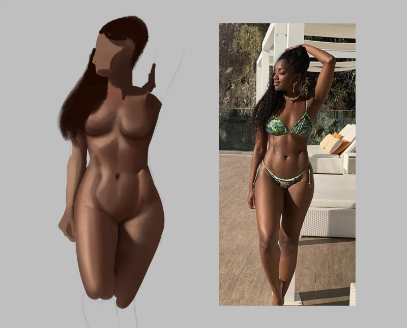
07-24-2019, 04:09 AM
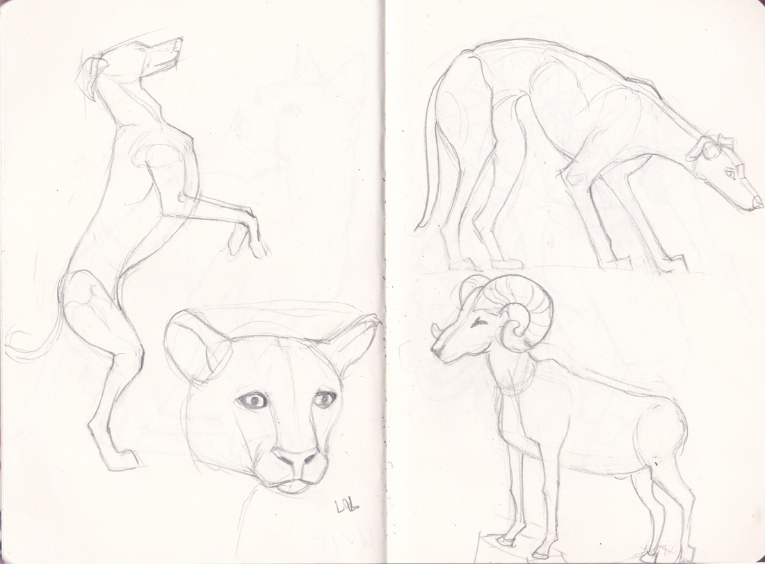
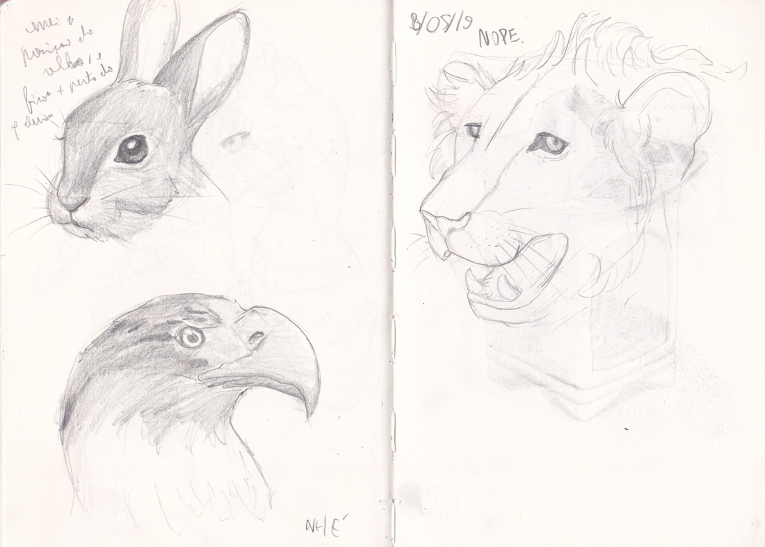
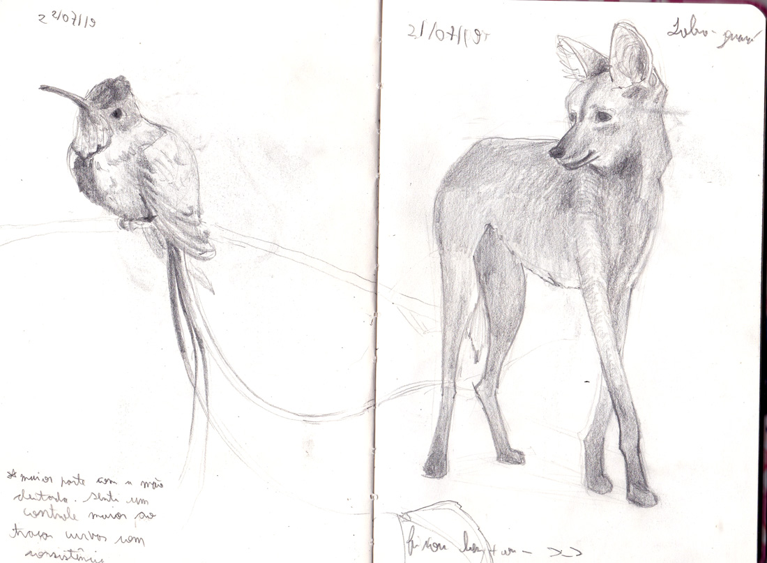
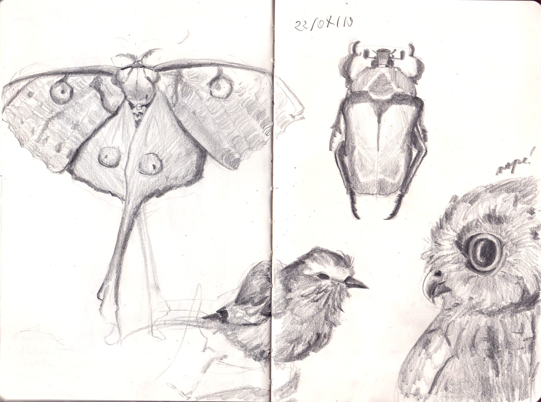
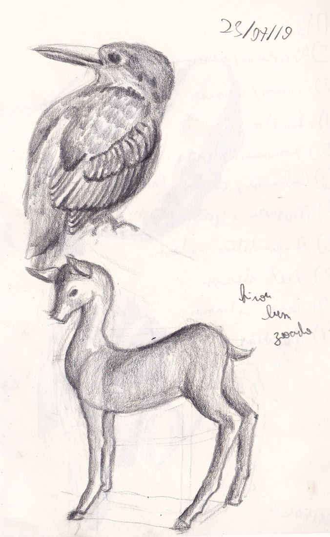
It seems I got some little progress on my sketchbook :'D I finally started to hold the pencil like proko does
     |
|
« Next Oldest | Next Newest »
|