08-31-2013, 06:09 PM
The art for metal gear is kickass mixing it with a manga style is an interesting idea, i'm liking it, looking forward to seeing what your planning with the story as well.
|
Eddy´s Sketchbook
|
|
08-31-2013, 06:09 PM
The art for metal gear is kickass mixing it with a manga style is an interesting idea, i'm liking it, looking forward to seeing what your planning with the story as well.
09-02-2013, 06:02 AM
sweet updates man, it feels like ages since I last dropped a comment here but i'm still lurking and watching in the shadows :p
I'm pretty exited to see where your going this this personal project you've got going, it feels to me to have lots of potential. I look forward to your fan art piece also!
09-03-2013, 02:21 AM
Hey, loving your progression and works :)
© missimoinsane: Daggers Sketchbook | deviantART | Facebook Page | Personal Webpage ❤
09-04-2013, 10:03 PM
Not much to add, but I think the style's pretty nifty. I known what you mean about feeling "burned" when putting in a lot of time into something and not liking the end result. It could easily keep you from wanting to do anything to completion in the future, so try to keep your head up and not let that happen.
09-05-2013, 01:14 AM
Awesome stuff dude, cool to see you exploring so many different things. Think the style's working, and love the two images. I already want to know what happens between them. :). Keep it coming :).
Website - www.ohbullocks.com
Blog - http://blog.ohbullocks.com Sketchbook - http://crimsondaggers.com/forum/thread-678.html Working towards 10000 hours at http://10000hourrule.com
09-06-2013, 07:05 AM
Hey daggers! :)
Mr. Toodles: damn! i´m an apocalyptic spammer xD also, thanks for the advice! i will try to be loose next time, i´m usually too obsessed with lines and forms, so it will be a good excercise. Triggerpigking: i agree! and thanks mate, i´m currently writing the script, the characters, etc. Writing is hard as hell too! Sublimus: thanks a lot! :D Warburton: thanks man! yeah, i´m lurking a lot these days too, but i will start spamming feedback all over the forums as soon as possible haha. As always, thanks mate i will be doing more stuff related to my personal project once i´m done with this fan art piece. missimoinsane: thanks! ;) MrFrenik: thanks mate! yeah, the thing is, i dont think i can learn much more from this illustration, i already learned tons! but its over now. I keep working on it to see it finished but it isnt fun anymore. :P Maybe thats what "burned" me. But yeah, its not going to defeat me, i will be moving forward no matter what. JakeB: thanks a lot Jake! glad you like those pictures, i had my doubts with that style but now i think i just need to keep exploring it, changing this, and eventually i will find something cool. Update! probably the last update on this fanart before completion. I rendered all those guys and gals in the background, then realized that they were drawing too much attention so now i had two options. Make them less visible, or erase them? Edit: just updated the picture, made some little changes, really tempted to call this one finished and start working on something else. xD 
"Stand tall, and shake the Heavens!"
Tumblr for my comic!: http://rainfallcomic.tumblr.com/ Sketchbook: http://crimsondaggers.com/forum/thread-1227.html Facebook: http://www.facebook.com/eduardogarayart Deviantart: http://eduardogaray.deviantart.com/
09-06-2013, 08:56 AM
I think you should keep them as they are; she's still very much the focus. You could try dropping them down a fraction so that the two ladies eyelines are lower than the main character. At the moment all three women are pretty much on the same line; dropping the other two down may make the main girl appear more dominant. Maybe.
09-06-2013, 09:55 AM
looks gorgeous ed! love how you put alot of character just in their faces
09-07-2013, 05:28 AM
WOW!! This is so awesome, I love the character expression and the emotion here it feels very strong. Well done you. Thank you for sharing your wonderful work. Very impressive!! ~mii
© missimoinsane: Daggers Sketchbook | deviantART | Facebook Page | Personal Webpage ❤
09-07-2013, 11:06 AM
This turned out so radical man! I don't know how I feel about some of the cropping but you did such a great job making the focal point stand out and painting that metal that I don't really care XD
tbh, with how much attention you put into the metal of her outfit the cloth feels sort of lacking. I'm not sure why, but it seems like it's made of the same material as her skin. maybe some textures would help :\
09-08-2013, 04:47 PM
Yet another incredible armor design, and I'm really liking the silver hair! It lends an air of authority or wisdom. The swish of the fabric and hair adds great movement to her gesture.
p.s. Are the features of the guy on the right based on Locke from the show "Lost?"
_________________________________________________________________________
The best time to plant a tree was 20 years ago. The second best time is now. -Chinese proverb Sketchbook
09-09-2013, 10:56 PM
Brush strokes in your newst painting reminds me of marko djurdjevic. They're awesome, especially in armor part. Oh boy oh boy oh boy. great job!
09-15-2013, 01:20 AM
Yeah, spending too much time on something that you're not getting anything from anymore will drain you of motivation pretty quickly. You'll pick up from here and take what you learned into your next one.
09-19-2013, 11:03 AM
Hey there! i´m not dead! :)
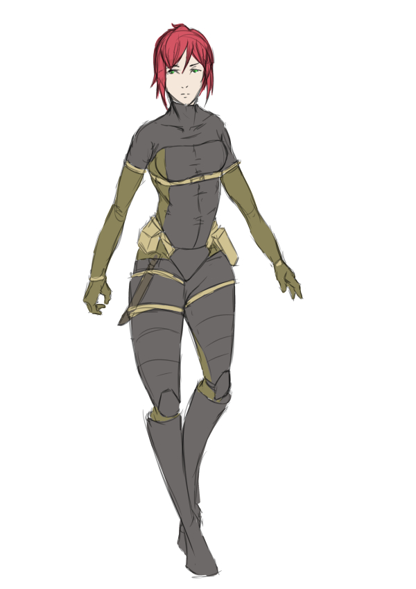
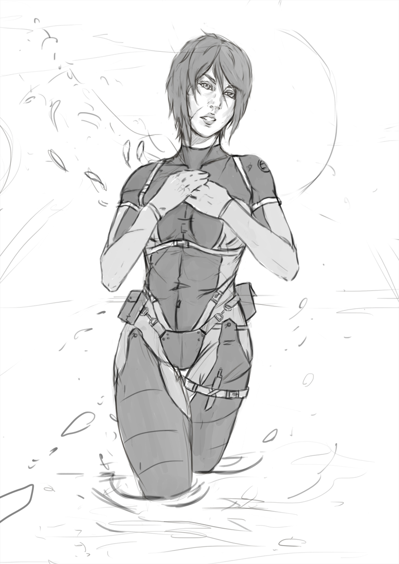
So sorry for not updating this thing earlier, sometimes life doesnt give you a break. Ignatz: Thanks! yeah, i could still change some things, but i´m not going to touch that illustration anymore. Time to move forward onto the next challenge. :) BenFlores: Thanks a lot Ben! yeah, i love doing facial expressions, i really want to get better at that haha. missimoinsane: You are just too kind! :) i´m really glad you like it. Samszym: thank you! :D your comments are always so useful man, i will definitely think twice before doing a cropping like that, and yeah, textures! textures are something i´m only beggining to understand, and truth is i wasnt feeling confident enough to try texturing the cloth. But damn, next time i will try to give proper texture to every material. Tygerson: Whoa, thanks a lot! yeah i truly enjoyed adapting the original anime armor to reality, and the cloth was very entertaining to paint too. But pretty exhausting too. As for the old guy, he isnt Locke (but i can totally see some resemblance now!) but the original James Bond, Sean Connery haha. ramalooke: aw yeah man! i really glad you like it. Also, Marko djurdjevic is crazy, crazy good. Before him, i´m just dust in the air. xD MrFrenik: thanks mate! it is exactly what you said, i´m already sketching ideas and planning my next move. :) And now, the update itself! damn, i wanted to update this earlier but i´m still dealing with those changes in my life i mentioned before and some freelance stuff too. Did you guys know a card game named Romance of the nine empires? i´m working again on that game, i believe the base game will be out in the United States very soon. Here is a quick gesture sketch i did last week, trying to make things simple. Yoji Shinkawa inspired.  Because i´m so tired of doing fanart, these days i´m working only on my personal project. So here is some concept stuff for the two protagonists. First a couple of sketches:   And some concepts i did with this software i have, Clip Paint Studio. (A review is coming)   Aaand finally, since its almost october i was planning to redo this artwork: http://eduardogaray.deviantart.com/art/C...-331714779 As i really want to see how much i ve improved this year. I will probably do the two versions, with full stealth suit and the topless one. And i´m going to do a topless version because... ?? Because i think i have an awesome idea involving exposed skin, but i´m not sure yet haha. If you want to know the inspiration behind this new illustration, have you daggers played Metal gear solid 3? if thats the case, do you remember the battle with The Sorrow? the river...? :)  
"Stand tall, and shake the Heavens!"
Tumblr for my comic!: http://rainfallcomic.tumblr.com/ Sketchbook: http://crimsondaggers.com/forum/thread-1227.html Facebook: http://www.facebook.com/eduardogarayart Deviantart: http://eduardogaray.deviantart.com/
09-19-2013, 12:53 PM
Awesome update man. Love the very first one :)
09-19-2013, 01:10 PM
Welcome back Eduardo!
Man, that loose gestural chic @ the top is freaking beautiful :')
sketchbook | pg 52
"Not a single thing in this world isn't in the process of becoming something else." I'll be back - it's an odyssey, after all
09-19-2013, 05:10 PM
Your characters' poses are just wicked man! Must have put a lot of effort in pose studies! That sketchy pose study is just awesome.. Keep it up!
09-19-2013, 07:07 PM
man the gesture one is crazy, how do you that on digital? my lines on digital are horrible D:
|
|
« Next Oldest | Next Newest »
|