Posts: 654
Threads: 4
Joined: May 2013
Reputation:
22
(02-20-2014, 01:48 PM)Tygerson Wrote: That's a good enough answer for me. I liked Loomis, but wanted to know more how things are constructed. Hampton sounds good. While I have'nt studied bridgman in a while, I think his work will be better to study after hampton or alongside the later stages of hamptons book.
Hampton builds up a gestural 3d form and then builds the muscles as 3d forms on top and I think bridgmans book will work better if you build it onto hamptons alot better then just studying the book by itself.
I'm gonna try it myself as soon as I can get a new bridgman book(my cat destroyed it about half a year or so back XD).
Posts: 1,098
Threads: 11
Joined: Aug 2012
Reputation:
34
Triggerpigking: thanks man! and yeah, what a typo. xD I will edit the post with the corrected version. Ooh and yeah, Hellsing. Though, my biggest inspiration right now is probably Tsutomu Nihei? i'm bad with names, let alone foreigner names. He did Blame! among other gems.
That means that i want to experiment a lot with chiaroscuro and everyone is going to look sickly, pale and sad most of the time, some people think that kind of design is boring or deppresing, and they have a point, but i still love it.
Ursula Dorada: Thanks a lot Sula! :) yep, just what you said is my mantra right now, i'm trying to improve in each new page, and just do it.
Tygerson: yeah if you are looking for a more in depth book about how to construct the figure, go for Hampton.
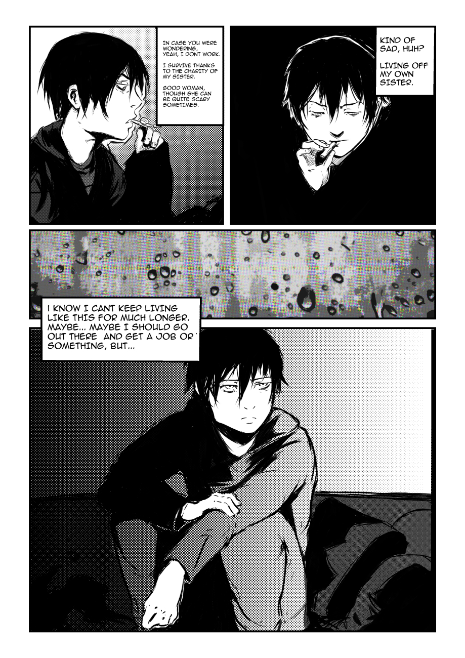
Here is page two, after i spent a couple of days, doing lots of drafts and writing stuff, writing is by far the hardest part, and planning how to fit the story in X pages, and so on, everything is difficult. I'm not really complaining (well, just a bit) , this is the only way to learn.
Aalso, now i added the tumblr of this project to mi signature (thanks to Ursula for the suggestion)

Posts: 556
Threads: 5
Joined: Dec 2012
Reputation:
8
Hey, really great to hear you started working on the comic and are just going for it.
I like the pages that you've got so far. The only thing that feels off is the use of photos for some of the panels, they look too apparent, especially when seen right next to your drawings. One other thing, on the first page we've got a picture of a city, and above that there's a picture of what looks to be a suburban house's window. The two don't really match so there's a loss of continuity between the two panels.
It would take you more time, however I feel it result in a better end product if you were to draw the buildings and other things that are photos at the moment. I am really looking forward to seeing where this will go. Keep up the good hard work, man. :]
Posts: 465
Threads: 2
Joined: Mar 2013
Reputation:
18
Dude yes!!!!!!!!!
Tell the story, draw the comic, watch yourself get batter and faster as you go :0 it'll be amazing
I have to start doing what you're doing! inspirational stuff dude, really.
I think your clothes aren't very convincing,you gotta do some more cloth studies and figure out how folds and different materials act. Maybe shoot some reference photos of a model or yourself in similar clothes instead of winging it?
Posts: 389
Threads: 2
Joined: Jan 2013
Reputation:
13
Good god, man; staying creative 24/7 I see? Working on freelance jobs and when you aren't doing freelance, you are steady killing it with your personal work!!! Inspirational, hopefully, I can arrive at a similar place in the near future.
You've read and watched Attack on Titan right? I don't think I am in a position to give advice, but let the artist of that series be your motivation: his art was...umm...pretty bad in the beginning haha and you are many times better than him when he created his one shot and the first few chapters. Now, he is really good simply because that was all he did! So to that to say this, have fun and let your ideas run free!! Don't be hesitant to work outside your comfort zone. Be fearless man, congrats on reaching this point in your journey!
Posts: 1,098
Threads: 11
Joined: Aug 2012
Reputation:
34
Archreux: thanks a lot! indeed, i've tried using photos, since thats a standard practice in a lot of works, but i dont know how to tone those photos properly and i dont think it suits me anyway.
So i will redo the first page sooner or later. :)
Samszym: Whoa, i am very thankful, i'm the one feeling super inspired each time i see to your works, so, i can only wonder how awesome your project will be when you start with it.
With the technique and knowledge that you already have, dont hesitate dude, just do it.
Mannyhaatz: Thanks a ton mate! it really means a lot! though, things arent really like that, because we dont want to bother/worry others we usually only post about the good stuff, and that creates a distorted image of ourselves online (which isnt necessarily a bad thing)
but i too often tend to get trapped in periods of melancholy, in those periods i really cant bring myself to do anything, i just feel depressed, start to question everything, you know, the blues.
In fact, i started doing this comic as a sort of "self therapy" haha.
Thats why i appreciate your words so much mate, like you said we just have to look at the author of attack on titan as a recent example of someone with an inspiring development.
(Check out the early works of Norihiro Yagi, the author of Claymore, now thats some crazy development!)
Lets keep working as much possible, whenever possible. :)
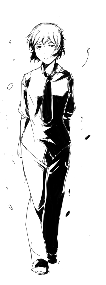
BONUS, a little sketch before going to bed.

Posts: 1,098
Threads: 11
Joined: Aug 2012
Reputation:
34
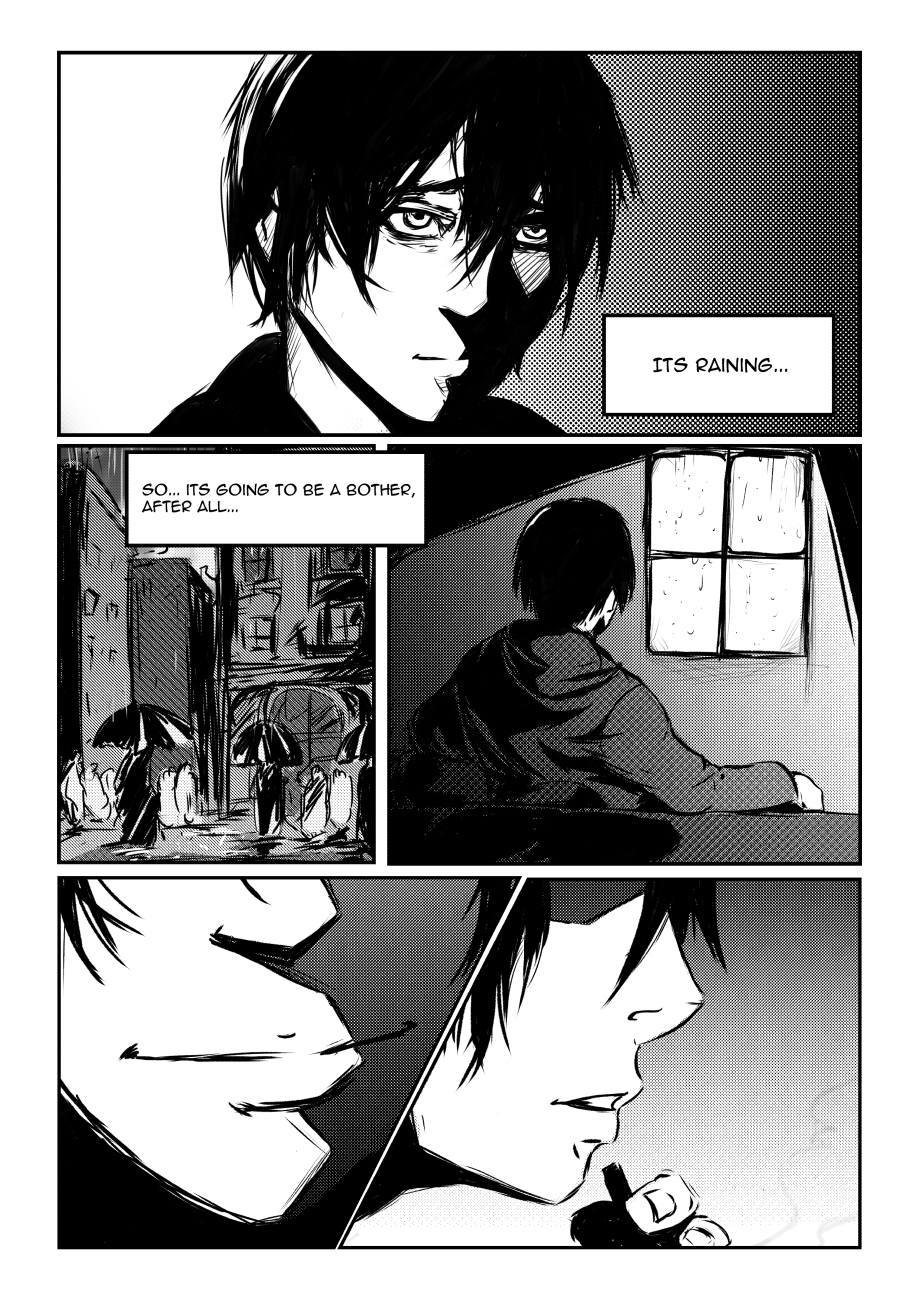
Behold! page 3 is here lol, i never though doing a comic was this frustrating! enough ranting, here is the page:
My goal now is to make a page per day, but maybe, just maybe i should simply do the pencils of all pages, then the inks, then tones then the lettering.
I will have to think about it.
Though, i will probably be doing some cloth studies and re-read some books before going further.

Posts: 850
Threads: 4
Joined: Mar 2013
Reputation:
21
Comic! Awesome!! :D Tumblr is a good idea, already added to my rss reader :)
As for update schedule and process etc... you have already mastered the most important step with actually starting, you'll figure the rest out on the go :)
Sorry if you already mentioned that somewhere, but do you already have a plan for how long (pages/chapters etc) it is going to be?
As for feedback - I am not sure if this is supposed to be character-slang, but if it is not, then maybe use apostrophes where required? "It's" instead of "its", can't instead of "can't" etc.
Looking forward to the next page(s) :)
Posts: 1,342
Threads: 17
Joined: Jul 2013
Reputation:
45
Ooh that comic is lookin' good. Cant wait to see more of it!
Liking the main character so far. Probably too soon to say, but the eyes (you fucking nailed that aspect), messy hair, even the facial shape just fits together with the character, you've done great in that regard.
Posts: 694
Threads: 14
Joined: May 2012
Reputation:
16
Awesome stuff Eduardo, comic pages are getting better with each one you do. Keep em coming!
Posts: 1,098
Threads: 11
Joined: Aug 2012
Reputation:
34
Lyraina: Thanks! i already have planned a first chapter, 20-25 pages or so. But if people like it and i'm still interested i will continue developing the story.
And thanks a lot for calling me on that, my english isnt really good enough to translate a comic. xD I will be careful with that from now, but whenever you spot something weird, let me know! :)
crackedskull: woo thanks a lot! He has darkened eyes of unhappiness (and not enough sleep) :D one thing i discovered after starting with the comic is that, even if you have a clear idea of how the character should look, you will still have a hard time make him/her look consistent in every panel. Thats good though, because every panel is a challenge.
JonHop: thanks mate! :) thats pretty much what i want to do, make it better, or at least try different things in each page.
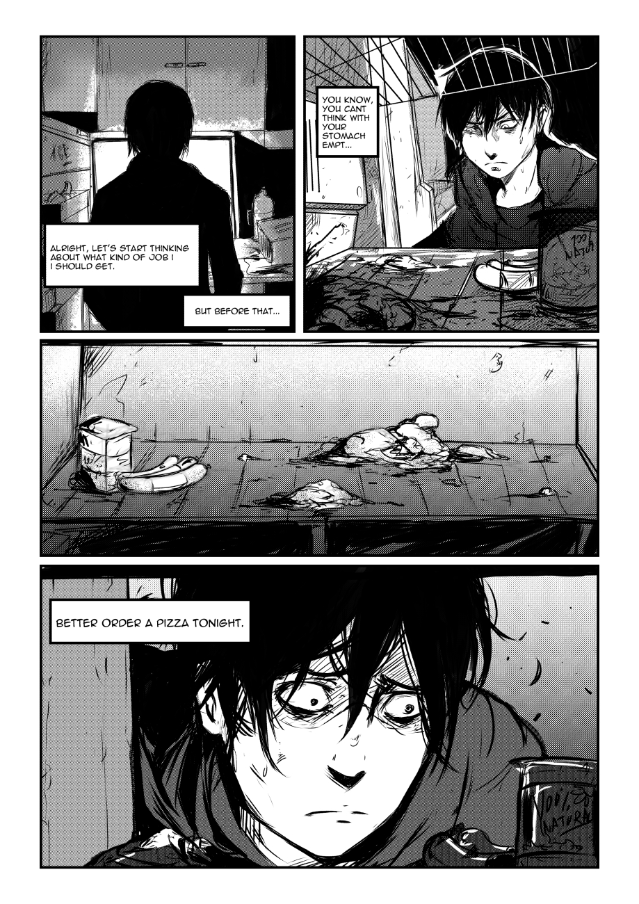
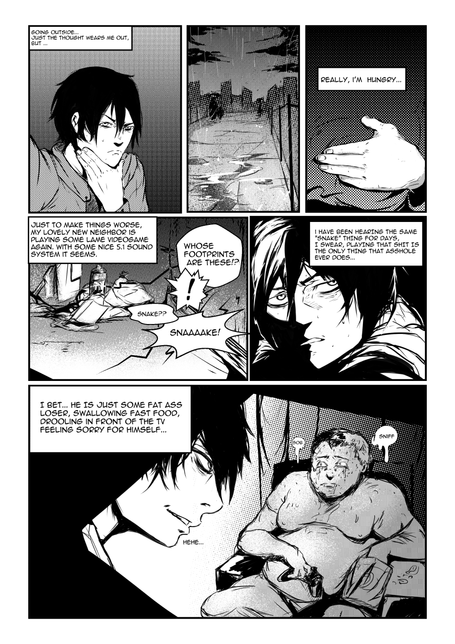
Page 4! thats a pretty depressing fridge isnt it? xD
Slowly getting more accustomed to tones and inking.

Posts: 1,098
Threads: 11
Joined: Aug 2012
Reputation:
34
Page 5 took longer, life got in my way.
The guy has a dark side too!

and a non related sketch i did the other day

Posts: 556
Threads: 5
Joined: Dec 2012
Reputation:
8
Haha, this last page really is amazing. I'm really enjoying this style of yours that you're developing.
Keep up the good work. :]]]
Posts: 467
Threads: 2
Joined: Jan 2012
Reputation:
16
Hey man, I know it's been a while since I dropped a comment in here, sorry about that ;p Though ive been keeping up to date with your stuff on facebook and ive gotta say it's really cool man.
Your compositions and the way you transition the story is awesome. I tried doing this for one page so I know how hard and time consuming it is haha. Especially love that fridge scene. The way you use that grey tone with the blacks and whites is cool as fuuuuuck.
Can't wait to see more dude, keep em coming!
Posts: 1,098
Threads: 11
Joined: Aug 2012
Reputation:
34
Archreux: haha thanks! i'm glad you like this, because i dont really know what i'm doing myself. xD
Warburton: hey man! :) no worries! i too have an eye on your stuff on facebook haha, but its always nice to comment in the good ol sketchbook. I should pay a visit to yours soon!
Indeed! took me a whole day to plan the pages for the comic, and still i'm doing lots of modifications on the run, still its a fucking awesome way to practice composition, over and over and over. xD Every little panel is kinda an illustration by itself.
For the toning, thanks mate! i still have to learn how to use tones correctly, but i'm on it haha.
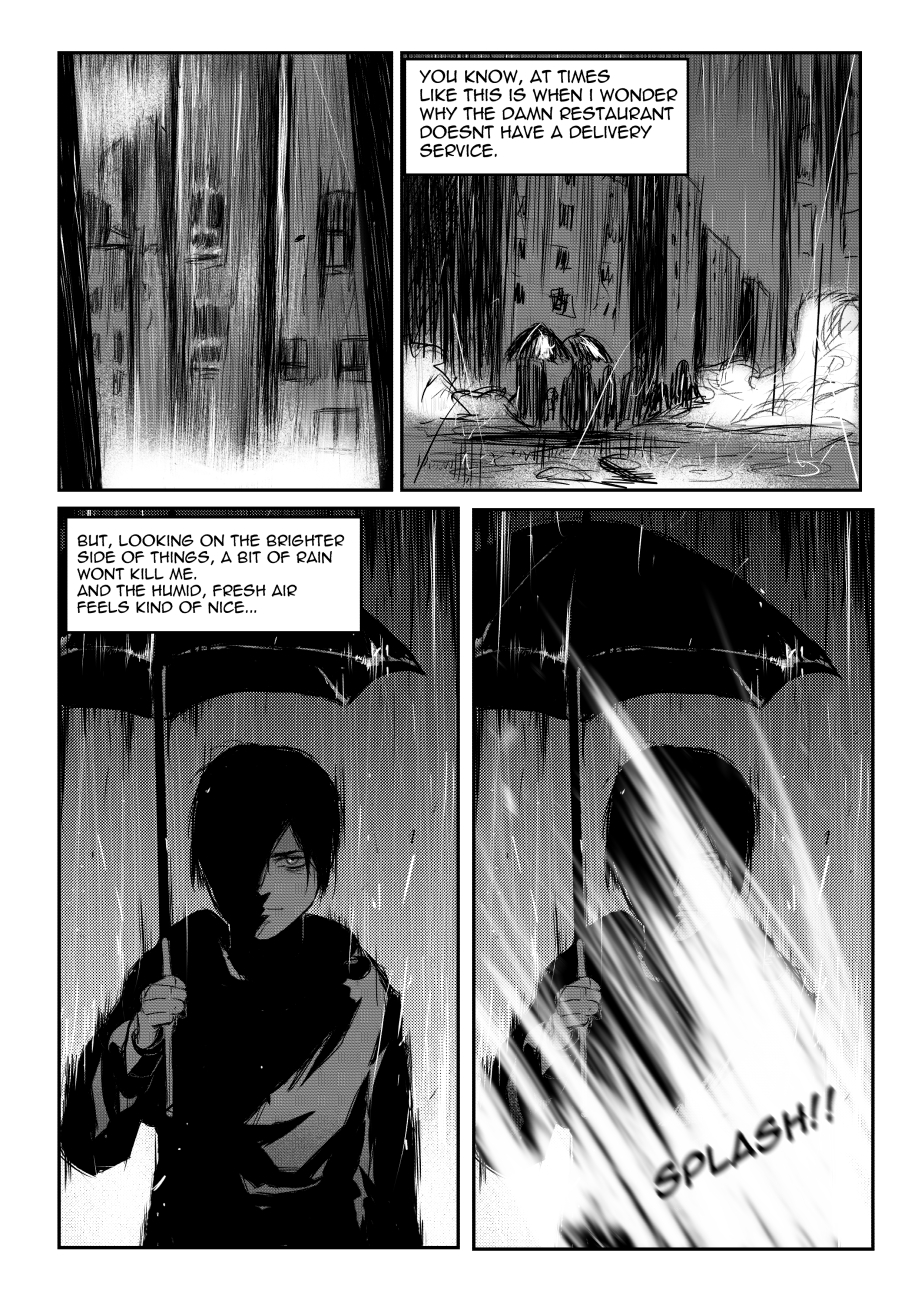
Well, Page 6:

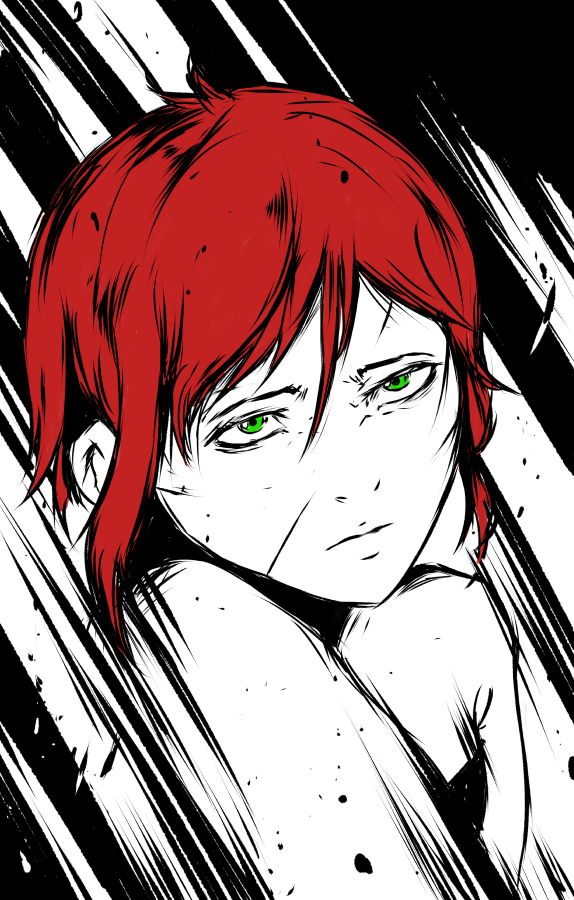
And some sketches, mostly from imagination.
Ayanaaaaamiiii!!!!!

Rin from Katawa Shoujo:

And Sana-Kan from Blame!:

Posts: 1,342
Threads: 17
Joined: Jul 2013
Reputation:
45
Lookin' good with the comic. Gotta love those inkings. Keep it up!
Posts: 235
Threads: 9
Joined: Oct 2012
Reputation:
6
Cool to see the shape experimentation and overall style evolving.
I'm still missing some facial proportions (namely the way the features rest within the head shape.)
The hands you're drawing in the fat-ass comic look GREAT though.
Over all continued face and anatomy/pose studies should continue to propel you forward nicely, even within a week or two of doing them daily.
Posts: 1,098
Threads: 11
Joined: Aug 2012
Reputation:
34
crackedskull : thanks man! now that the challenge is over, i'm going back to it. xD
Einver: sorry for the super late reply mate! thanks a lot, yeah i agree, there is so much grinding to be done. I want to start studying bodies in movement, will probably pick some sports videos to get started.
Its been a long time guys, between some life stuff and the crimson arena challenge i totally forgot to update this haha.
I will post here the stuff i did for the challenge, in case you didnt check the challenge thread.
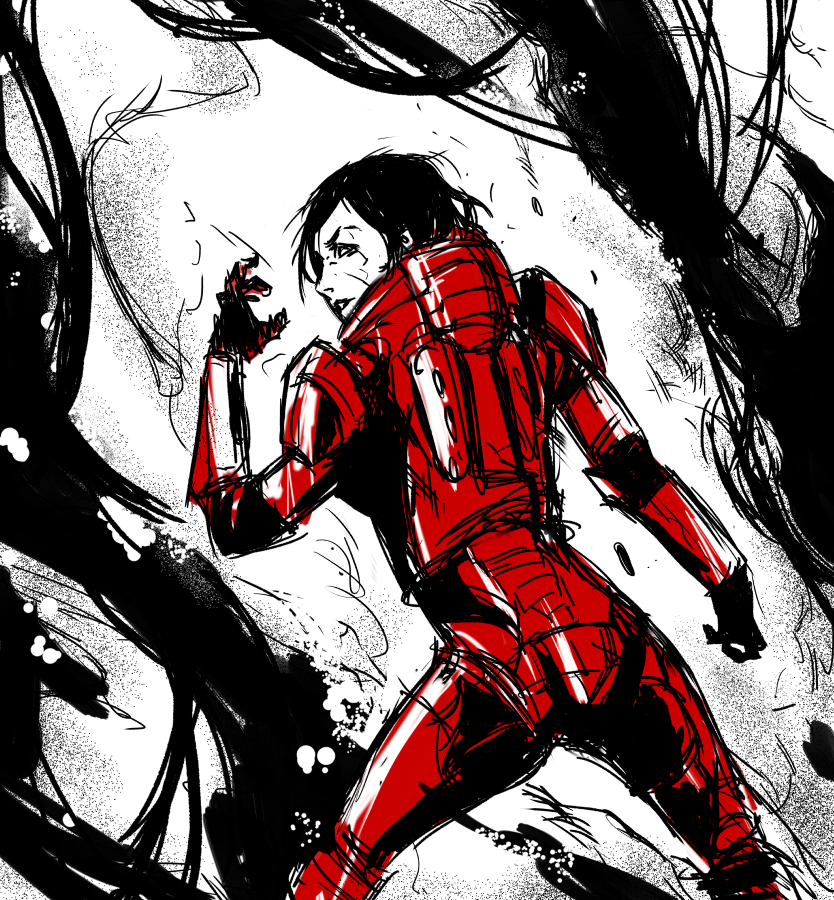
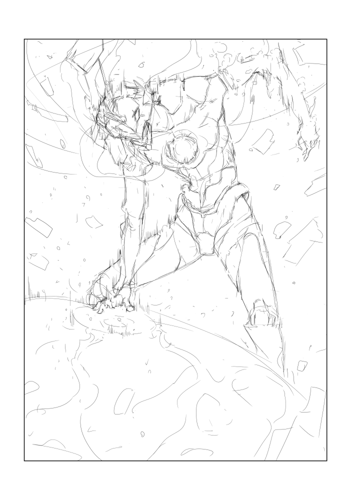
My entry was sci-fi Enyo, goddess of war, more info about it on the crimson arena threads. :)
![[Image: attachment.php?aid=46344]](http://crimsondaggers.com/forum/attachment.php?aid=46344)
the final:
![[Image: attachment.php?aid=46342]](http://crimsondaggers.com/forum/attachment.php?aid=46342)
And finally back to my dear comic stuff.
I'm considering a change in style for the comic, something like the stuff Yoshitoshi Abe does (He worked on Serial experiments Lain, Texhnolyze, Haibane Renmei...)
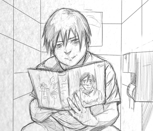
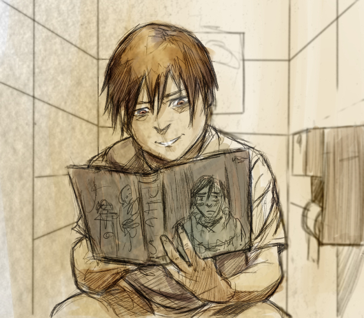
So i'm experimenting a bit with Manga studio.
Textured pencils, then lighter colors on Linear Burn, darker colors on Multiply and some heavy shadows on color burn. What do you guys think? Would you prefer it in color? or Black and white like until now? Both have its own advantages, but setting the mood for each scene would be easier with color.


Posts: 288
Threads: 8
Joined: Nov 2012
Reputation:
9
Loving the comic stuff. Already want to find out where the story is heading.
As for the style, I say go for whichever you prefer! They both seem like they'd be cool.
Posts: 1,342
Threads: 17
Joined: Jul 2013
Reputation:
45
Not sure if you should go to color or stay in B&W. What is your stance on coloring strong light/shadow scenarios? The 2 value black and white scene can be really powerful.
Great arena entry btw.
|


