Eddy´s Sketchbook
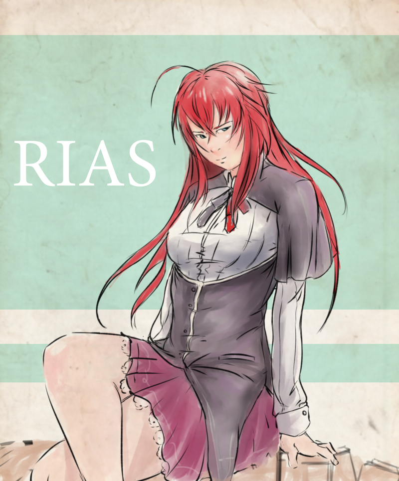
Haha, I was hoping I'd see some attack on Titan stuff from you!
Watch out for the facial construction in that last WIP, the features don't feel aligned in perspective and it seems like the face is above a horizon line you've indicated, but it doesn't really feel like an up shot.
Good luck man, it's AWESOME to see you working on your personal project.

Reply
I honestly can't even say how much I love that sketchy, almost watercolour-y looking sketch up top. Keep staring at it, looks so cool. And you've got that same sort of energy in your sketches and more rendered work as well, so good. Keep crushing it dude, awesome work.

Reply
I must say, awesome stuff you have in your sketchbook sir! Thumbs_up
Reply
Took me a while for me to relize that was from attack on titan, you've nailed that gestural style man, it looks beautiful.

Reply
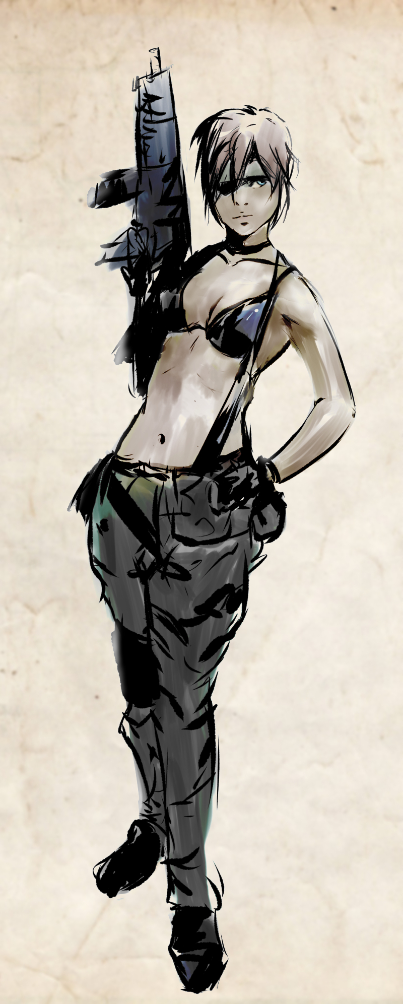
YES MGS 3 FTW!!!!!YES!YES!
Man mgs3 has the best boss battles...
The Shinkawa inspired gesture is awesooome! You definetely captured his stlyle (if you haven´t already, check the MGS1 artbook...i believe thats where shinkawa´s style is most stylized)
Very cool characters too!

Reply
radical stuff, wish I had your skills and determination!

18 yr old artist comin atcha Party

Tumblr!!!

SketchBook
Reply
Oh, that Yoji Shinkawa sketch is so cool! It looks like those super old asian ink and watercolor landscapes...except it's not a landscape. Perfect detail level--not a single brushstroke too few or too many!

Also, thanks for the comment! I haven't updated it a while because I was in the throes of drawing 100 heads for the "in yo face" class. It just took a bit of time.

_________________________________________________________________________
The best time to plant a tree was 20 years ago.  The second best time is now.  
-Chinese proverb

Sketchbook

Reply
Hey daggers!! :) i was missing you these days too.
But good news, i´m back on track and ready to fight!

Ursula Dorada: thanks Sula! :) yeah, it surprised me how much attention that little sketch got. And thanks!

smrrfette: thanks! damn, now i know what the rigth path is when doing gestures. xD

Prabu: Thank you :)

Kaffer: Not enough effort! xD thanks mate! i appreciate it.

Blewzen: thanks man! i used a custom brush i did when i was trying to emulate Ashley wood linework in the Metal gear novel graphics and Portable ops/Peace walker. Its basically a caligraphy brush but shaped like a rhombus and with a bit of scattering. Let me know if you are interested in trying it.

Samszym: thanks Sam! yeah, not really a fan of Attack on titan, but Mikasa is cool. xD
And thanks a lot for the crit, you were totally right, i already worked on that, will upload a new wip soon.

JakeB: damn, thank you Jake, i honestly cant believe all the love that little sketch has gotten.
Glad you like this stuff, it means a lot!

Brobossa: thank you kindly! :)

Triggerpigking: thanks a lot mate!

TonariNoPunpun: yesss! :D best boss battles indeed, and the best ending in videogames history (along with Xenogears) and thanks! i followed your advice and checked that artbook, loving it so far, it even has a couple of comic pages by Shinkawa, so cool.

Kronos: thanks! :) my determination weaken sometimes, but fortunately i have this awesome to community to keep me on the good path.

Tygerson: thanks! oh yes! that was the point of the sketch, i was trying to simplify things as much as possible, the watercolor look came after a bit of experimentation. A happy accident i suppose haha.

And this is the stuff i've been doing since a couple of days, i went trough some bad stuff in the past month but now i´m better than ever. So, lets kick some asses daggers! :)

first some stuff i did to try out Paint Clip studio, i still cant do shit with that program...


Aand, after replaying Baldurs gate for the 1000 time since when it first came out (the damn game was in 5 cds! i still have that edition) i had like a revelation, i saw the light, and it was warm and inspiring haha.

No more doodles, time to get serious and work towards a specific goal.
Maybe you already can guess what my goal is. xD

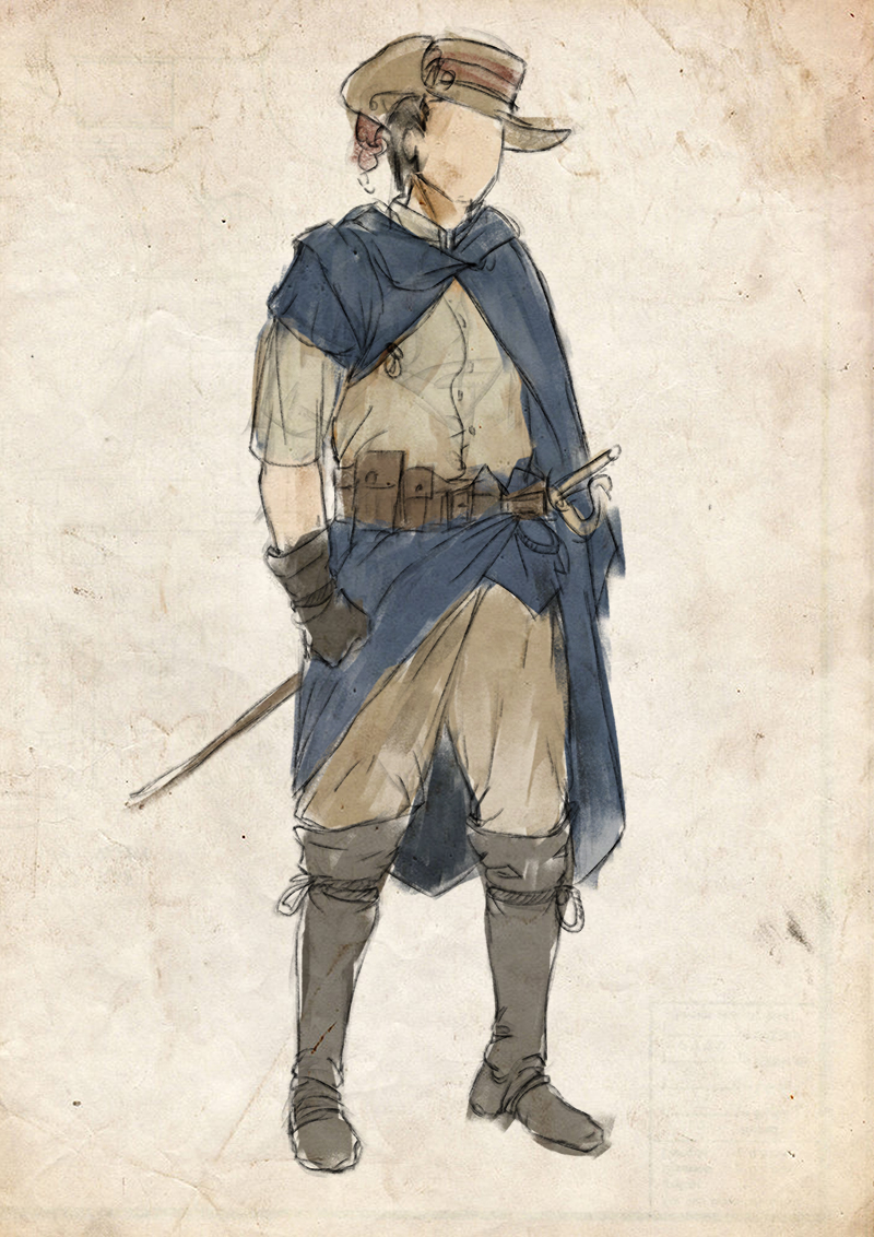
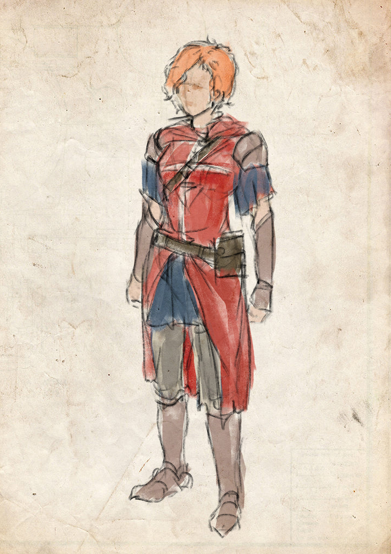
Fantasy worldmap and quick concepts of a wizard/duelist and a lady knight.


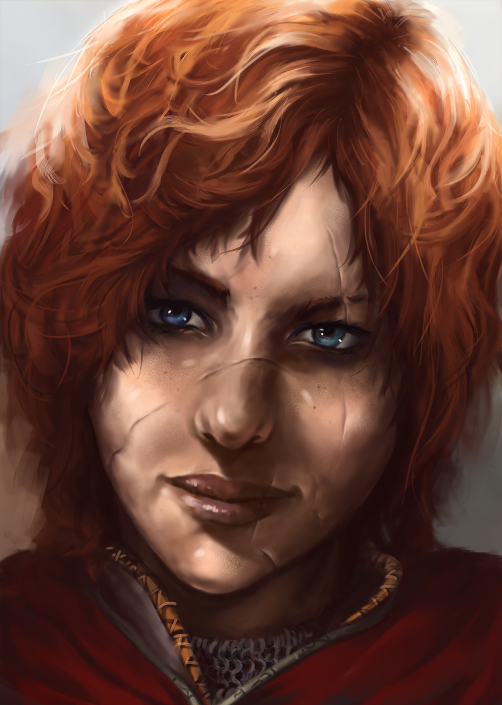
Baldurs gate like portrait of Kelda Edelweiss, dragonslayer of the imperial army.


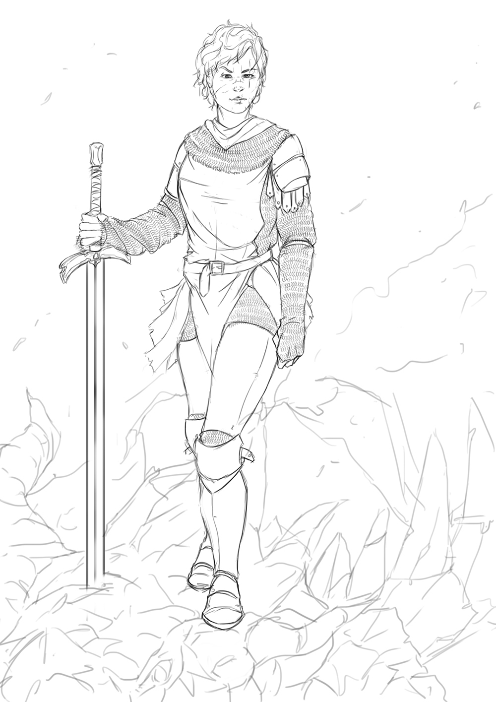
And the lineart for an illustration based on her, any feedback and criticism is welcome!!


4:00 AM, going to bed, see you tomorrow!

Reply
man i love baldurs gate that was a great game :) nice portrait i think the lighting is a little inconsistent. Figures looking nice.

Reply
Heeeey eduardo. Love this new portrait and sketches and studies. yaaaaaw! But this portrait of redhaired chick, yummy! ;3

Reply
sweet updates man, I know it's been a while but I still stalk around here lol. The sketches are lookin sweet man, great movement and gesture in them. I love that latest portrait too, great details and textures! Only thing I would possibly crit, and I may be out here, but is to watch out for some your eyes in your pieces. I see a strong style developing in your work man, and heavy influences which is awesome, but perhaps be careful not to let 'style' overpower 'fundamentals'. Then again I guess this all depends on what you want and your goals, it's not for me to say what you should and shouldn't do ;) Hannes is a good one to look when it comes to this, as his foundation came from anime and you see it a lot in his work and sketchbook.

Also, mgs3 is awesome. That game ate way too many of my hours lol. You should defiantly see that sorrow piece through!

Reply
Your maps always look great, i know a map is not like a solid piece itself but is cool! And the two characters after the map have so cool linework and nice colors yeah im digging your lineworks alot lately. Btw it would be cool to try that brush you metioned!

Reply
YOLOLEX: thanks! yeah, i did a lot of things wrong in this portrait, not only the light, but thats cool too, now i can do better next time. xD

ramalooke: i´m glad you like it mate! :) I´m still a little unsatisfied with it, i will definitely try again soon!

Warburton: I always appreciate your support and feedback mate! :) and no, you are totally right. Its true that i've been neglecting my fundamentals for too long. I was so focused on improving certain things that i completely neglected others, thanks for your advice, i will start working on those fundamentals asap and yeah, MGS3 is just too awesome, and that ending mate, that ending.

Blewzen: thanks man! i love maps! and i used to do some very detailed ones a few years ago, maybe i should do another one, just for the old times.
For the brush, of course! i will email you my brush pack. (If some else read this and want to try my sketchy brush too, let me know, and i will upload it dropbox)

Here is an update of the Lady Dragonslayer illustration, well technically, thats not a dragon.
Its a Wyvern. In case you are not into mythical creatures, a wyvern is smaller than a dragon and more like a winged snake. They also cant breathe fire.


Reply
Really like that dynamic loose linework on those two characters in the last post! Last character is coming along nicely too ;o

Reply
New illustration looks prommising. But perhaps try to figure out different background to make the character pop more. I think it may blend with the environment to much. Oh and try sharpen those edges, especially around the focal point <3

Reply
Love your studies and the gesture of more loose character drawings.

It's a somewhat solitary existence, a bit like a lighthouse keeper throwing a beam out into the darkness, in faith that this action might help someone unseen.

BombMy Sketchbook (critique welcome)Bomb
Reply
CoreyH: thanks! i´m trying to focus on drawing a lot recently, need to get better at drawing!

ramalooke: thanks mate! i changed the sky to light blue, hopefully that will make the character pop more. And edges, damn edges, i´m working on that. :P

kerm: thanks! :)

Here is an update of the lady dragon killer, some gestures and a comic practice.
I already started to focus on drawing and something that terrifies me, drawing from imagination.
And whats that supposed to mean? it basically means that you are going to see loads of crap in the coming months. xD


Reply
Love the map, love the "pen and watercolor" sketch, really love the lady with the torn up face. The scars contrast well with her heart shaped face. Really liking her highly practical armor and ginormous sword. Way to draw from imagination--it can feel like rock climbing without a rope!

_________________________________________________________________________
The best time to plant a tree was 20 years ago.  The second best time is now.  
-Chinese proverb

Sketchbook

Reply
Awesome stuff dude. Looking forward to seeing that dragon hunter finished. Such a badass piece.e Her design's great. It'd be cool to see some damage to the clothing though. Scorched metal armour, torn tunic, links missing from the chainmail, blood on the sword (think you've started this with the soft colours) you know, that kinda stuff.

Keep it up dude, awesome work :)

Reply
Great stuff Eduardo. I'm really curious what will happen on the next page of the comic ;) Love the last shot, there's so much energy in there.

Reply


Forum Jump:


Users browsing this thread: 434 Guest(s)