04-08-2014, 08:23 AM
man those shadows on the sketches that is a really cool idea! also i've seen people doing the cartoon thing might be totally fun stuff!
|
Bjulvar's Sketchbook
|
|
04-08-2014, 08:23 AM
man those shadows on the sketches that is a really cool idea! also i've seen people doing the cartoon thing might be totally fun stuff!
04-13-2014, 08:24 PM
Thanks dude, haha it just happened on accident. But I think I've seen it before somewhere! Next step will be shading to fit the shadow :D
It was more fun than expected so I would recomend it! Popped out some acrylics and went to town. Must've been three years ago since I last touched them. Things I painted then looked horrible, now it's bearable. So I guess that I showed myself that mediums do transfer over and compliment each other. 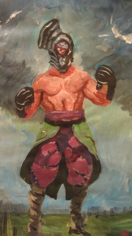 An instruction on how to prepare and cook Janssons frestelse. Super Swedish meal for christmas and easter. It's made as part of a school portfolio, couldn't include any text except for labels and measures. The sketching phase took forever.  Really want to participate in the crimson arena challenge this time. So I've started studying and stuff, hopefully there will be time. Starting it off with a dynamic pose and it's application. Not very imaginative but just wanted to capture it.   A portrait to get the face down too. Looking for some attitude and someone convincing!  Also finished up this orc from a while ago. Didn't want him to lay on my harddrive all alone and cold 
04-13-2014, 08:32 PM
Looking goood bro.
That head be tiny in the study, of the chick. Unless she is some huuuuge muscle bound girl but even then, looks a little too small, or the shoulders too wide. Though it may just be the angle. I like the face though, I think that is a pretty tough lookin girl. Matches the description well, are you planning on doing the fantasy or sci fi one? The orc looks awesome. Makes a really cool display pic too. Means everyone knows you leveled up lol.
04-15-2014, 04:43 AM
Jaik
Thanks bro! You're looking good! Haha damnit didn't see that until you pointed it out. Yeah her head is way too big. Wanted to focus on her movement more than on her head, so I think that I just forgot to look at it :D I'm planning on doing the fantasy one. I kinda see them as very similar characters, but with different personalities. Thanks, that sounds like a cool idea, changing avatar for every level up. Everytime someone mentions level up in your sketchbook, you have to change it. Starting now! Working on something new and dear to me. Found a fun lightning situation by accident and it's working out for me. I've finally got some free time after the internship and the school portfolios, which feels FANTASTIC. So I'm going to push myself again until I hit the next life-roadblock :P Really need to get more active with commenting on other peoples sketchbooks, sorry if I've slacked off there. Been pressured with everything else :< Here's a dude searching for the end with his companion. They'll find it eventually. 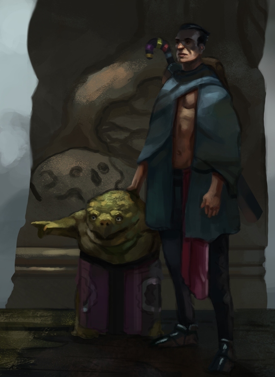 And jumping into the crimson arena challenge. Going for the queen of stormhaven and i'm picturing here as some kind of Joan D'arc character. With floaty and cosmically weird hair. Something of an avatar of war. The aim with the armor is to be more grounded than what I usually do and I haven't settled for a theme yet. Might be something to with storms (duh?) Portrait-application 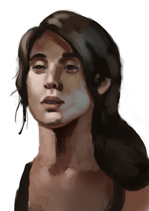 Ideas of her design, not the finals of course! 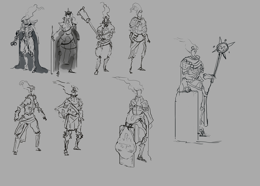 Studies of armor to get the grounded look. 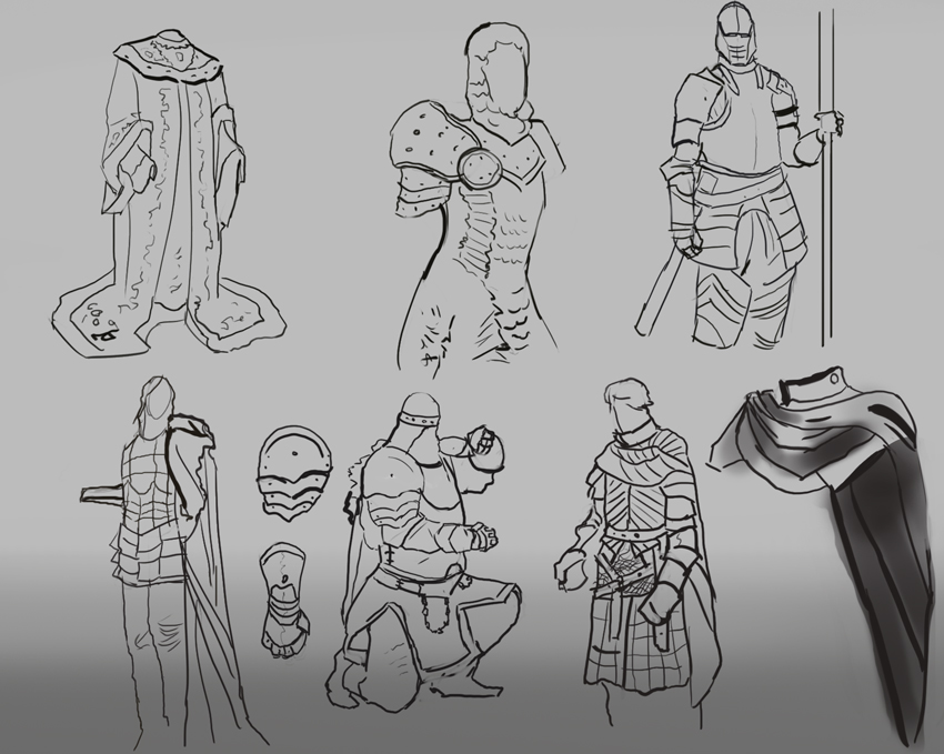 xoxo
04-15-2014, 09:47 AM
i'm digging those early designs for the challenge dude, i wanted to participate too but i just couldnt lacked ideas/motivation in the end. :P
To give you some feedback, i would love to see a pose that shows authority but also is static enough to show the whole of the character, since its still supposed to be concept art. I would recommend you to take a look at the stuff Wes burt and Yoji Shinkawa do, those two couldnt be more different haha but, they both imprint a lot of personality in their concepts trough body language. I think thats the key. And loving that synister look on the designs, keep going man!
"Stand tall, and shake the Heavens!"
Tumblr for my comic!: http://rainfallcomic.tumblr.com/ Sketchbook: http://crimsondaggers.com/forum/thread-1227.html Facebook: http://www.facebook.com/eduardogarayart Deviantart: http://eduardogaray.deviantart.com/
04-19-2014, 10:10 AM
Yo Eduardo, just saw your comic tumblr. Instant-follow! :D
Thank you man, knoow that feeling all too well! Don't let it miss you out on fun though. Felt like I started too late with it, so figured just going with one theme and not exploring as much helped there. I hope that shows now with the final and all. Didn't really go as dynamic as I could've. But it's hard showing design at the same time :P Thanks for the crit! Yeah damn, I love me some Wes Burt and Yoji. Yoji makes it look so easy too! Just recently ordered a book by Ashley Wood, containing a bunch of metal gear solid sketches. Feels like it's really similar to Yoji! Hopefully it will inspire :D Thank you man! :D A quicker armor study for the queen of stormhaven. Did it inbetween polishing the concept to get the momentum going. 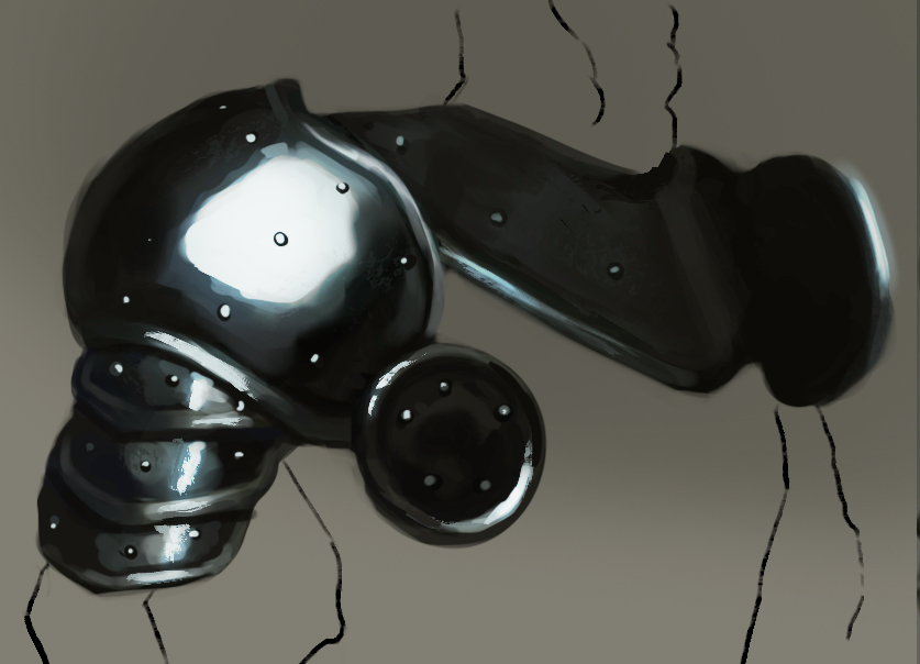 Another armor, this stood as the biggest inspiration for the concept, atleast when it came to details after the initial ideas. 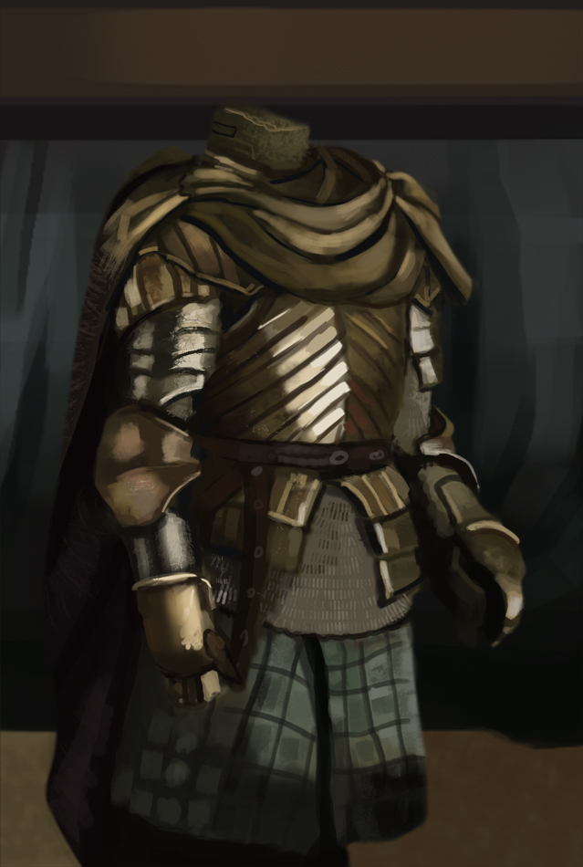 Portrait!  Now when I see it smaller, I feel that the face isn't as readable anymore. That kinda sucks! Happy with this one though, worked pretty quicker all the way from ideas, studies to final. Needed to get back into the groove with painting and this boosted that process. Went with the fantasy theme for the crimson arena. Liked the Storm in stormhaven so wanted to base the design around that. Also some floaty weirdly cool hair for a godlike effect.  The elixir merchant, sketchy thingie! 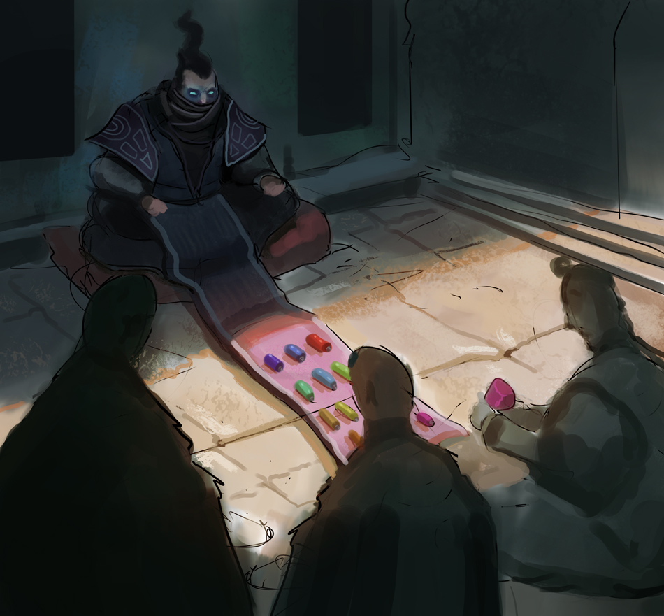
04-19-2014, 02:34 PM
Looking good man, that armor came out killer. The Stormhaven queen looks good too. Couple of things with that though, the first I'm only mentioning because I hope it will kick me to do the same, is that colour variation, especially in armor, is the thing that will really sell it and two, the shield(?) looks a little thin, my first read of it was I thought you chose the sci fi one and it was a hover board. The armor looks really nice though, I love how well you applied the study for this piece, while not copying your study at all.
04-22-2014, 08:01 AM
Thank you Jaik! I'm curious about the color variation. I guess we share that problem then. Do you think that the local color is too overwhelming? Tried putting in subtle secondary colors that would act like another light source. Could be an issue of it not being expressed enough. Really want to get better at it :P
Yeah what was I thinking with a flat shield! Total oversight haha. Gotta apply moooaar! Thanks dude :D Easter dinner, much like Christmas dinner. So delicious and tantalizing, turning the stomach into a silo and inducing comas. Green battlemages sketch 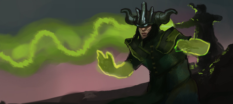 I dunno. I don't think a lot. Started off as a beast lieutenant for the sketchgroup, but it turned into a vampyre thingie. 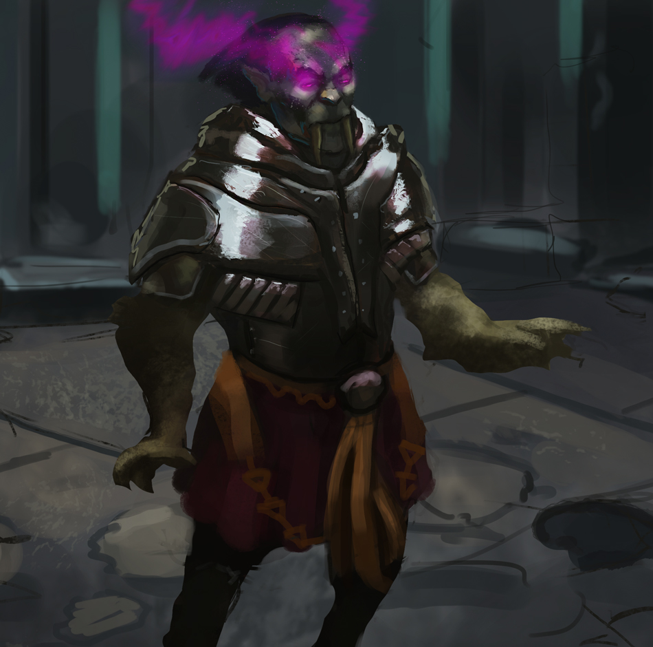 Started a barbarian sketch that I'll post soon. After a while I felt like I needed to brush up on my knowledge of old people's faces. Took quite some time to get it right or atleast "right" 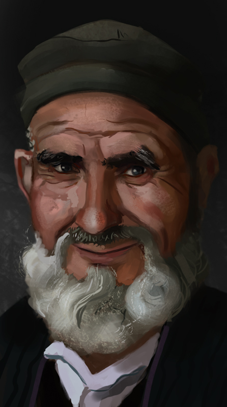
04-23-2014, 04:55 AM
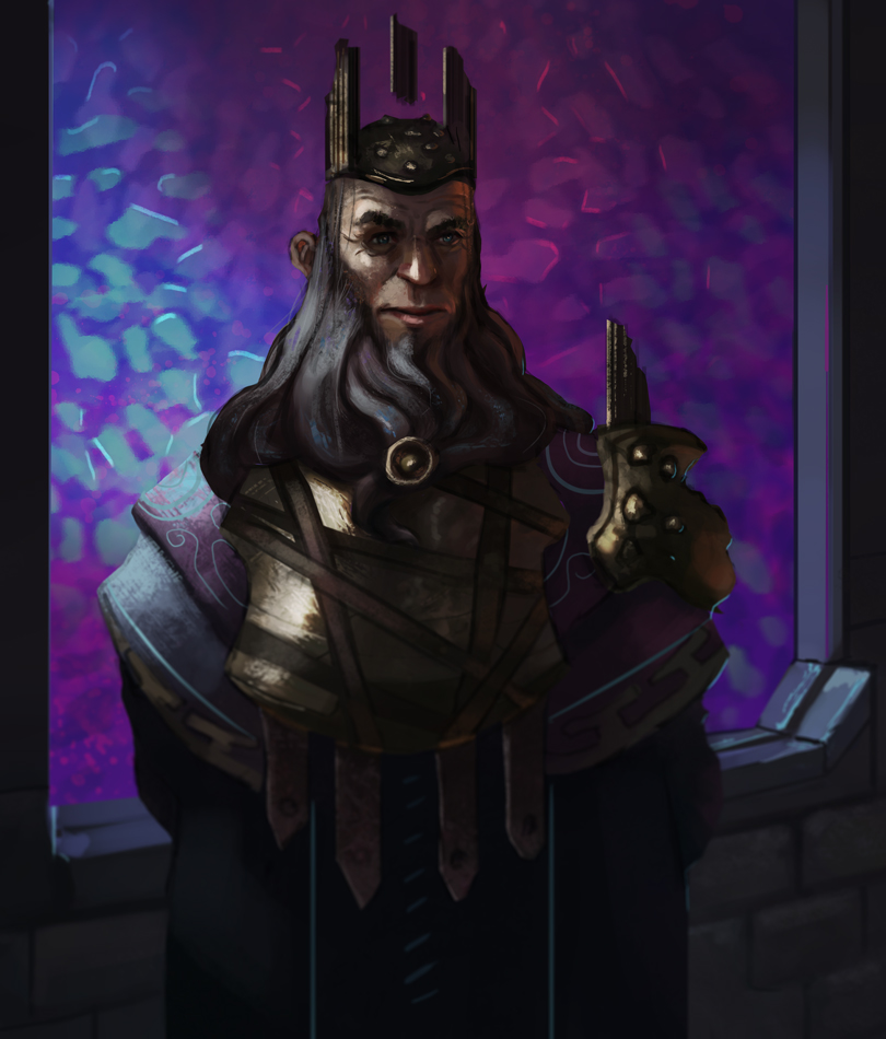
I'll never get tired of barbarians. A little longer sketch than usual! I suppose that you can't technically call it a sketch anymore :P
04-23-2014, 07:31 AM
Nice fantasy sketches dude. What pushed you to be so interested in fantasy genre?
04-23-2014, 11:26 PM
Thank you Cracked! Good question really! I think that I was introduced to fantasy very early in my life with stories, mythologies and movies. But I really love the freedom you get while thinking about themes and designs. It's not so restricted and always bound to reality as with for example sci-fi.
Being a kid and seeing Lord of the Rings probably helped too :P Misread the Mountain Eater challenge on facebook as Ether. Made some object of mystical magical stuff instead. That's what I like about words like these, getting your own twist on it. Need to do that even more! Change the theemee  Started doing Michael Hampton studies. Really sick of doing mediocre things. Gotta focus a lot more on the gestural side of anatomy, then work my way towards a more broad understanding. I got kind of caught up in making it looking pretty with contours before. So going to leave that train of thought. Here's 21 gestures with focus on movement and story. Next stepp will probably be to exaggerate them more.  
04-24-2014, 09:55 AM
Continued the Hampton studies today. Tried getting his gestural checklist into my head with focusing on story, weight, movement and proportion. Didn't exaggerate as much as I thought that I would. Haven't got used to the serpentine lines though, so they look a bit stiff.
Though I learned about the usefulness of triangles and s-lines, both in compositions and in gestures. How they help the eye and the imagination.    A quick compositional study. Don't remember the artist. I like how simple the value seperation can look, but they're still hard to paint. It's the most important part too. Love how prevalent the main characters gaze is, shooting through the crowd.  palette challenge, tried the first one. Basically the same colors that I always use, so better luck next time :P Tried getting in some hampton gesture! Really weird anatomy at the neck and chest.  A longer armor study. This one surprised me a bit with how the bright the values were in relation to how I saw them in the original photo. Especially in the face. Much more saturated too. 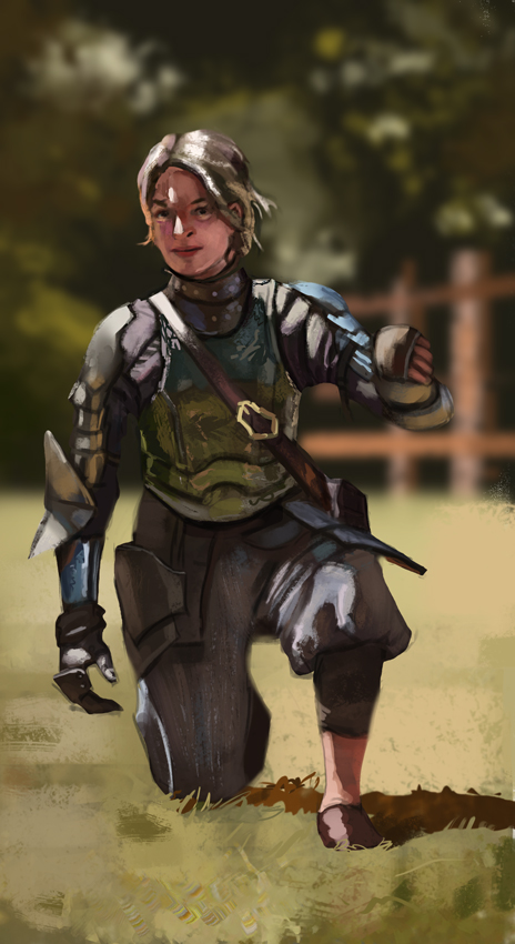
04-25-2014, 12:52 AM
Woah, damn that's a lot of studies and a TON of imagination, especially those sketches of yours. That Ether painting you did looks pretty darn cool. Not EXACTLY sure what it is (rock? crystal? bloodstone?) but it looks really nice, particularly the edges and mood you have there. I can easily see it as a character or something as well.
My only crit here is that it would be nice to see some of your works more "fleshed out"? I feel a lot of them could be pushed much more in terms of clarity and quality and it would be a good challenge to see how far you can push yourself on an image. Keep up the good stuff!
04-25-2014, 10:22 AM
Hey LongJh!
Thanks a bunch dude. Trying to amp it up now! I figured that the ether sketch would be pretty abstract. But it's a sort of stone on a rock or pedestal! Had a lot of fun with it anyway :D Yeah I suppose that I should sit longer with certain sketches. I've made it a habit of just doing them very quick, or atleast until I'm a bit satisfied. But the illustrations I do gets time put into them! Will keep it in mind. Could be a challenge :) Full day on a sketch! More Hampton, too tired to write :(  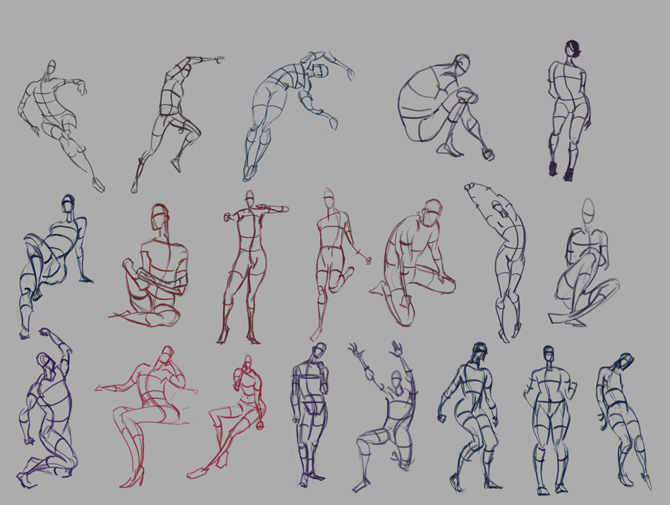 Palette challenge 2, not sure if I'm doing this right. But whatevs, mah rules 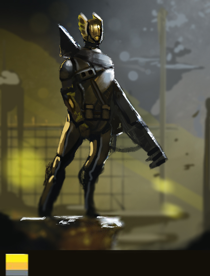 Progress on a thingie, love painting this thing. 
04-25-2014, 11:52 AM
You've done a lot since I last looked in here! I like that acrylic piece at the top of the page. I just started painting with acrylics after a long time of not using them recently myself. Im hoping it will get me better with digital. Great job, keep it up!
04-25-2014, 10:03 PM
Hail ye Bjulvar you old dual wielding spinning barbarian, you!
So much updates here, and so much things I'd like to comment on haha, but I don't want to build to huge of a wall of text in your sketchbook. Really like where you're going with the adventurer and the green little guy. It's got a nice composition and interesting shadows and focal points. Also like how the man's face has got some constellation thing going on, like this: http://th08.deviantart.net/fs71/PRE/f/20...729g47.jpg Gotten your hands on The first law books yet? ;) Feels like it could inspire the hell out of you. Make those barbarians of yours even more barbarian-like heh!
04-27-2014, 06:42 AM
Hypnagogic_Haze
Wooho glad that you're checking by :D Thank you mate. It's really fun switching it up, I'm sure that you'll increase your digital skill, definitely. Just try and be as conscious of your strokes when you go to the digital side. I've noticed that it's easier to become more focused when working traditionally, especially when mixing colors and such, since you have to think about what they'll look like. Thanks man! Adzerak Hoho what a badass title, thanks! Lava-bashing ultra barbarian! Haha that's flattering man! Thanks! You're allowed to build a wall of text if you want to :D Thank you! The fun thing about the shadows is that they emerged out of chance when the colors came into play! Felt goood. The constellations were a later addition since it was really dark in the face. But yeah, totally inspired by Magic art :P Not yet dude! I'm currently reading prince of thorns! When I'm done with that I'm going after First law. I want some barbarian action in my hands :D Had a shitty artday yesterday, procrastinated like hell. But I managed to finish the 100 gestures for Hamptons class. Tried to apply it on a quicker 20 minute gesture class, felt like I could find the movement and weight quicker eventhough they don't look very good.  Another masterstudy, total fail on the face. But the cloth and how the shadows are lit is something I found really interesting, so I took it further in another sketch. Really want to explore having colors in shadow, but it's a hard thing to pull off, atleast for me. So cool when color clicks like that. 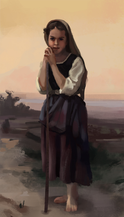 
04-28-2014, 02:20 AM
Just noticed the Crimson Arena 2 video! Loved listening to all the crits everybody got. Reminded me of why I love entering challenges. That damn embarassing feeling of "why didn't think of that" so now I have a bunch of notes of improvement for next week and next time.
The funny thing is that during the painting of the queen, I couldn't come up with a good theme for all the patterns and shapes. Probably should've taken a few steps back and looked over what I had. Going to travel to Paris for the next five days. Superpumped for museums and monuments. Always wanted to visit France! Nothing beats seeing some masterpieces live. Whipped some sketches up before leaving, thinking more about theming and such for the designs. Quickie with shapes.  Quick with themes n shet  Have a nice one guys, you're great!
05-05-2014, 08:14 AM
Yo!
Back from Paris! Got to see a lot of cool stuff. Mainly my hero Gustave Doré! That dude painted some huge paintings, much more fun to see them in their actual scale than small-ass google thumbnails. Now I gotta get back into it. So here's some stuff from today, not feeling the quality of it though. Castle of the sun spitpainting. Just to challenge myself with an environment. I'm still quite shite at them.  May the Fourth sketch! Quick because it's mandatory  A metal/helmet study 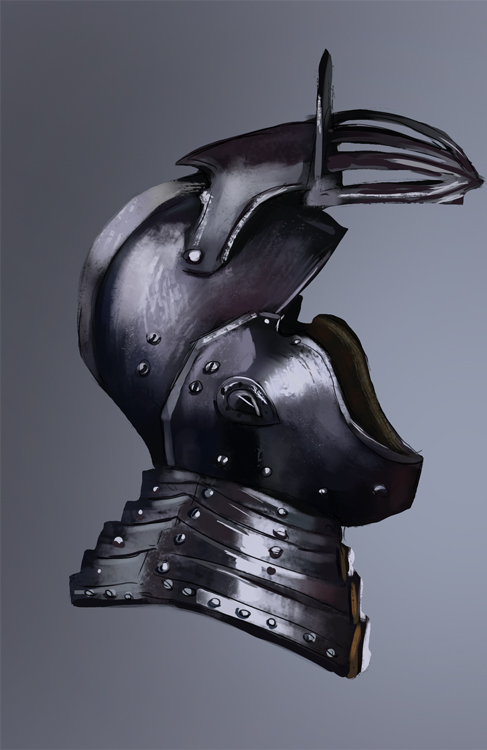 Aand some compositions for Crimson Arena 3. Going with the Godfather Death story. I'm liking the kings head thumb the most right now. 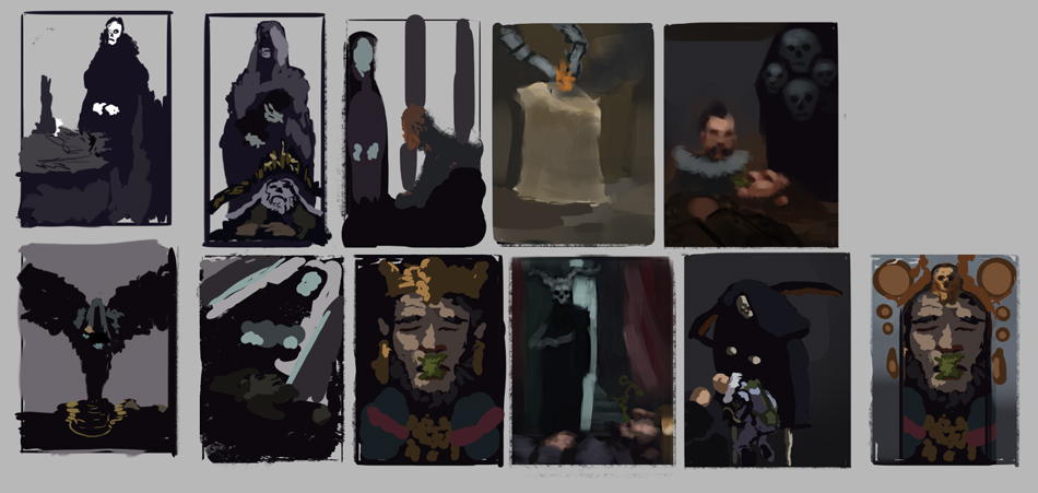
05-05-2014, 10:59 PM
Great work as usual. Always impressed by guys who practice and update consistently haha.
Bottom row, comp 4 from the left! Do that! That one has a cool mysterious vibe to me, especially with the doorway silhouetting half of his (it's?) figure. |
|
« Next Oldest | Next Newest »
|