02-20-2014, 07:16 AM
NICE work on the last piece, you're getting better by the week, Lyraina! Keep up the hard work.
|
Lyraina's sketchbook
|
|
02-20-2014, 07:16 AM
NICE work on the last piece, you're getting better by the week, Lyraina! Keep up the hard work.
02-20-2014, 08:28 PM
Lovin all the hard work and progress going on Lyraina!
I hope you don't mind, I did a paintover of your bloodsport: ![[Image: kxQ4K8M.jpg]](http://i.imgur.com/kxQ4K8M.jpg) ![[Image: RxrBhlA.jpg]](http://i.imgur.com/RxrBhlA.jpg) Just a few things I thought would have made the image more interesting: - The image is very wide, so I cropped it to get rid of some empty space -The purple plant in the foreground, as indicated by the current horizon line (white line), means that it would be very big compared to the swamp elder as its base is in line with his knees -The smaller circled purple plant is lit in a way that makes it pop in front of everything else, also making the large purple plant look very huge -Adding a little bit of two-point may make it more interesting (blue lines), so I indicated this with the path going to the hut -His size compared to the scene makes him feel insignificant so I made him a little bigger. (Even if he's a small character) -Also suggest adding more an indication of his shadow to ground him more onto the scene So I hope this wasn't too out of line and is helpful! Feel free to call me on my questionable judgment haha. Really do like the final result though, keep up the awesomeness
Sketchbook ~ Blog ~ Deviantart ~ Livestream
02-20-2014, 11:15 PM
Woo I like some of pnate's suggestion, but I'd personally go into a different route. I'd have drawn a second shack on the empty space there. It would give it more context, more depth.
Great work, keep it up! :D
02-23-2014, 09:05 AM
Coindidentally I was thinking about that vanishing point thing that you were mentioning. I dont have an answer but I was pondering it a few days ago lol.
Looking good. Keep focusing on those weak points. And some really nice suggestions from Pnate too, or a hut would also solve the problem if you dont want to crop :) Keep on pushing forward :)
02-24-2014, 12:09 AM
Samszym: Thank you! Ah well, I hope some day perspective will just click for me :p
Tygerson: Thanks, glad you like him! JJ Aaron: Thank you :) I only use Photoshop CS5 at the moment. For straight lines I use a standard brush with opacity settings turned off, sometimes I use pen pressure for line thickness though. Horizontal and vertical lines I do by holding down shift, the rest with clicking on the start point, then pressing shift, then clicking where I want the line to end. Sometimes I also use the form/shape tool set to line (press u). For curves I can't do freehand I use the pen tool, although I don't really like that method. Thanks for the feedback! I agree about the things you said, will have to do better next time... although I am really not sure how to loose edges in a graphic approach like that :< Tom Seas: You're right about failing! :) Thank you for the paintover, I really have to be more patient and precise with things like that. Thanks so much for the perspective tool!!! This is so much better than what I was doing so far (perspective brush, form etc..). Thank you! Kaffer: Thanks :) Nika: Thank you, I will! pnate: Damn, now that you pointed that out... how could I not see it earlier D: The thing is, I even had a less wide composition at some point, before I decided to go with the wide one :P Thanks for all those suggestions, I agree that those things would have led to a better result. I will keep them in mind. Ursula: That's a good idea, too. Thanks! Jaik: Ah well, let me know if you figure it out ;) So far I just decided to ignore the matter, continue with other things and maybe I'll get it later. Update! Pencils as a daily warmup. 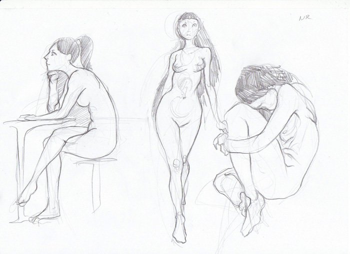 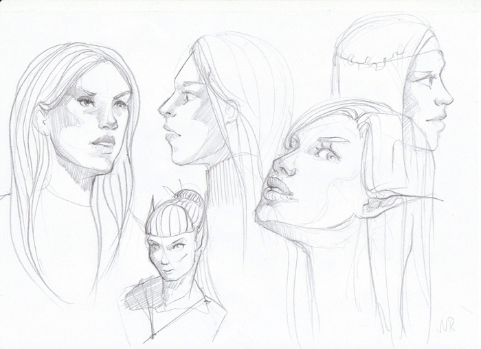 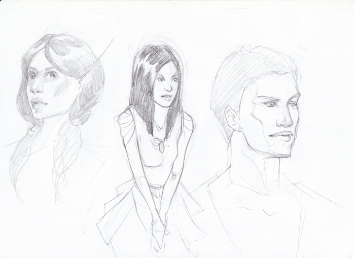 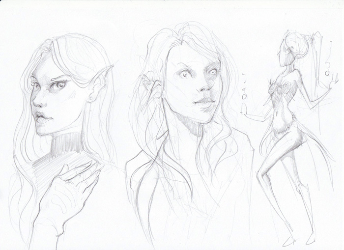 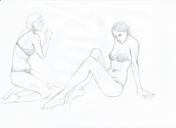 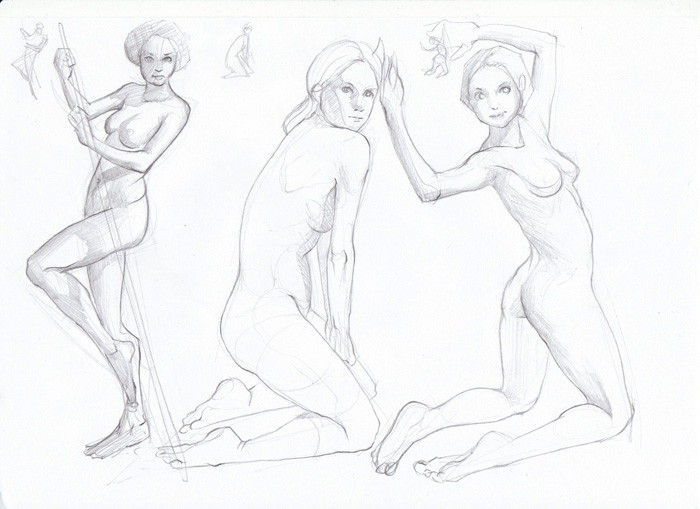 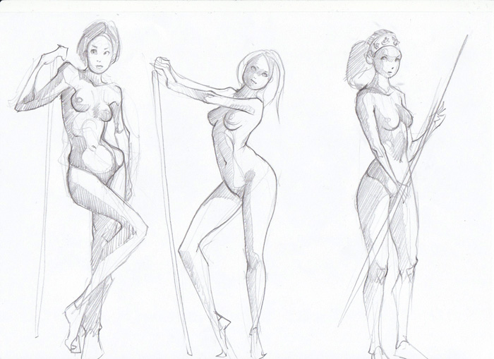 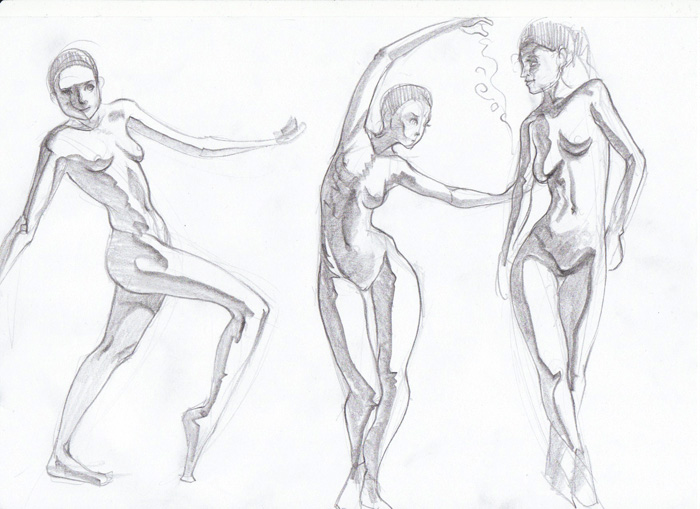 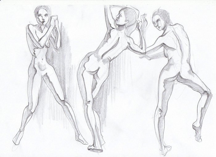 skin test 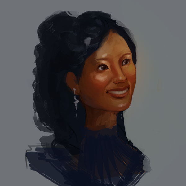 from life. had to hurry because I was afraid that the sun might go away... if was glowing brighter than I was able to replicate in PS o_o 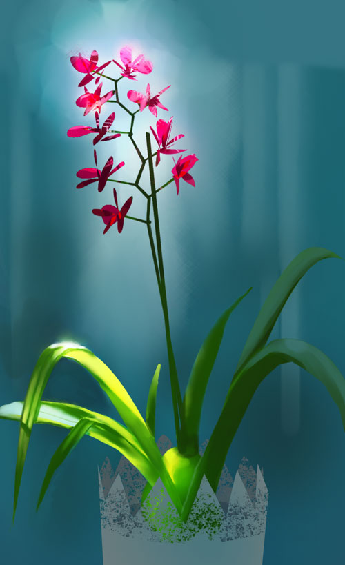 new attempt at applied perspective - thumb, lines, and then realizing how hard it is to place those shadows right! 
02-26-2014, 07:43 AM
Personal project WIPs... feedback appreciated!
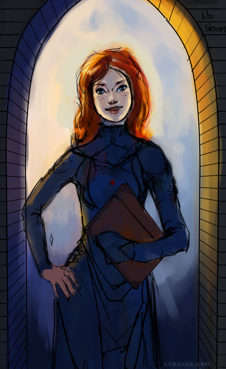 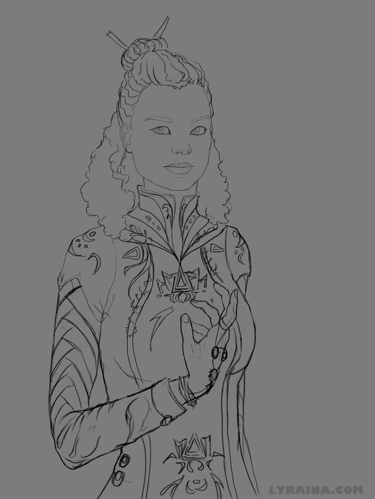 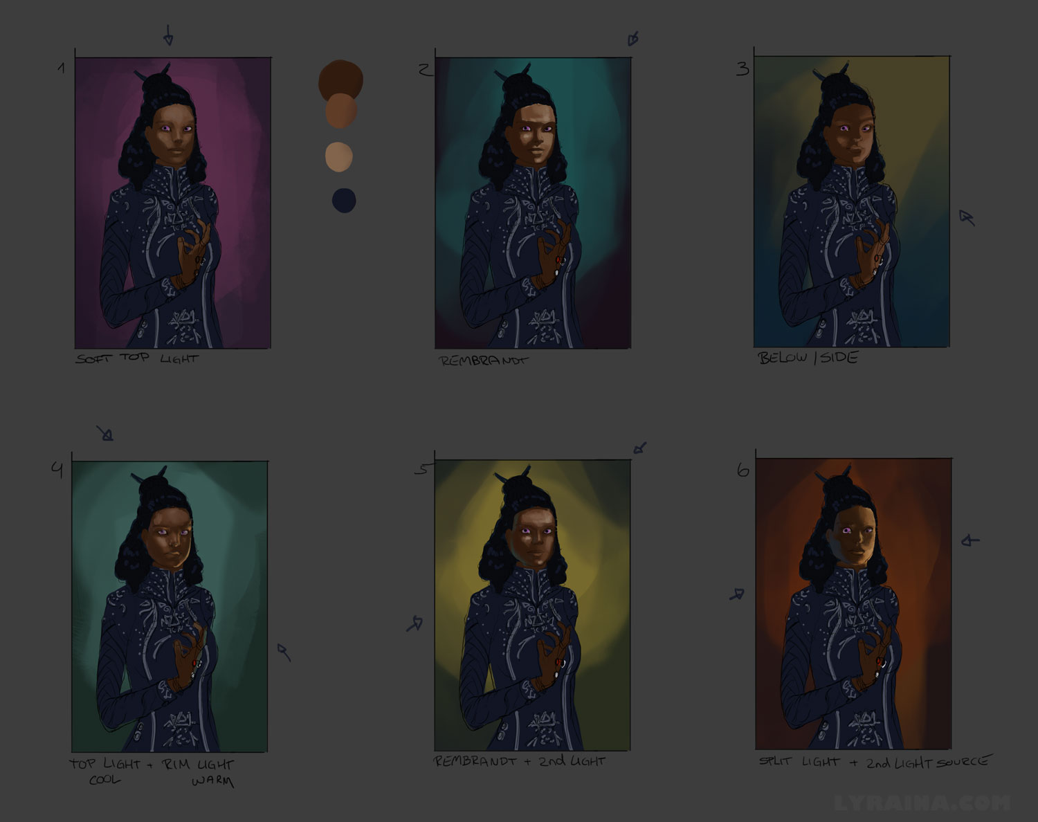
02-26-2014, 04:37 PM
The lady in the doorway has a really friendly and appealing face and natural posture. She looks smart, but approachable.
I like how the colors are shaping up, although I can't figure out where the light on the sides of the face is coming from. It sort of looks like her hair would partially block it, but maybe you just haven't finished putting all the light in, and it will make sense when it's complete. Anyway, it looks lovely, so keep working on it!
_________________________________________________________________________
The best time to plant a tree was 20 years ago. The second best time is now. -Chinese proverb Sketchbook
02-27-2014, 07:50 AM
Tygerson: Woo! Yay! That is exactly what I wanted her to appear like :) Unfortunately I lost some of that in the progress, will have to try to get the character back in. I hope that the reflected light from her surroundings will light her face a bit (I actually shot some reference from myself and it looked like that, but I stood besides glass, which is obviously more reflective than stone.) But I just realized that reflective light in that situation should be a lot stronger from the right side where sun hits... will have too keep that in mind. Thanks for the hint.
So here's a update on Shallan (orange haired girl), cleaner lines, but somehow lost her vibrancy and some of the fire, maybe because of the straighter hair.. also gave her a pig nose and aged her by 10 years... not sure why D: Will have to rework that. 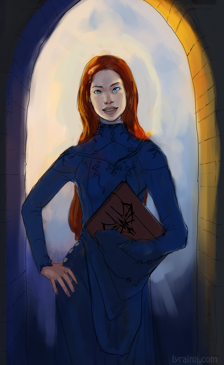 And here's the finished 1p perspective thing from a few days ago, I am actually quite pleased with how it turned out (will probably delete this line tomorrow :P), with me being such a perspective/hard surface noob! Especially since I didn't really do anything except the initial drawing, then it kind of ... painted itself. 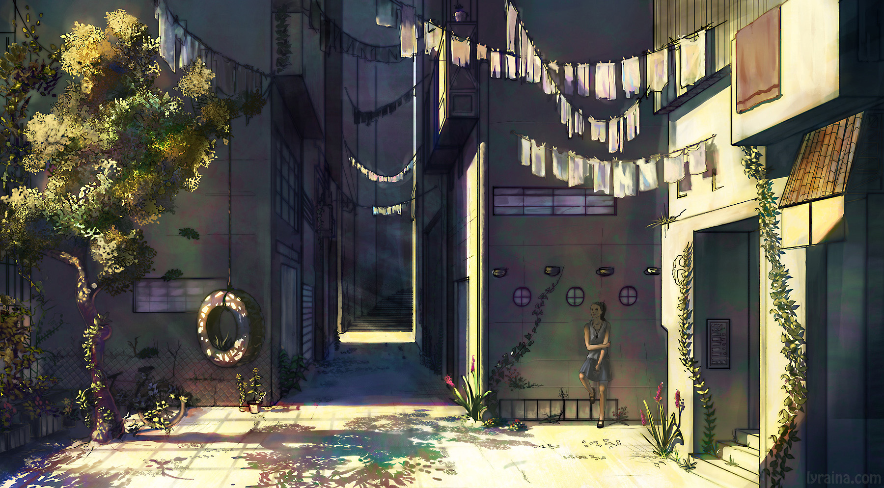 Also, occasional anatomy warmup 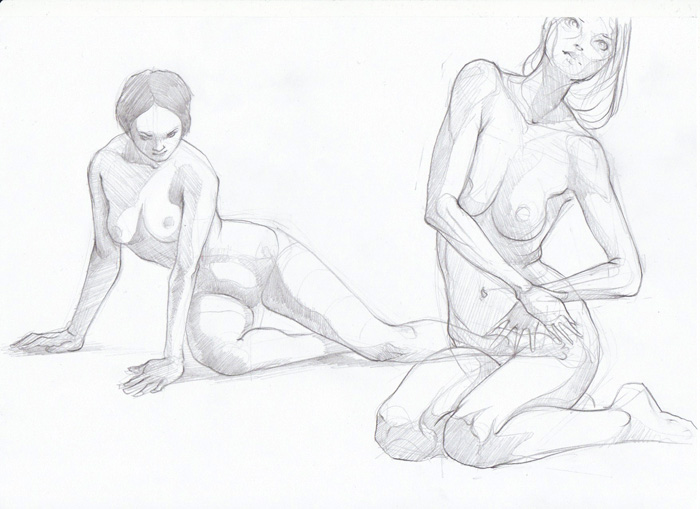 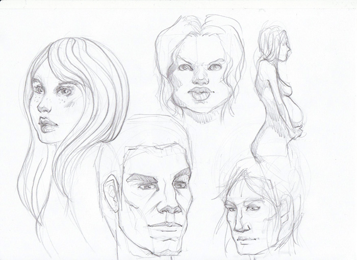 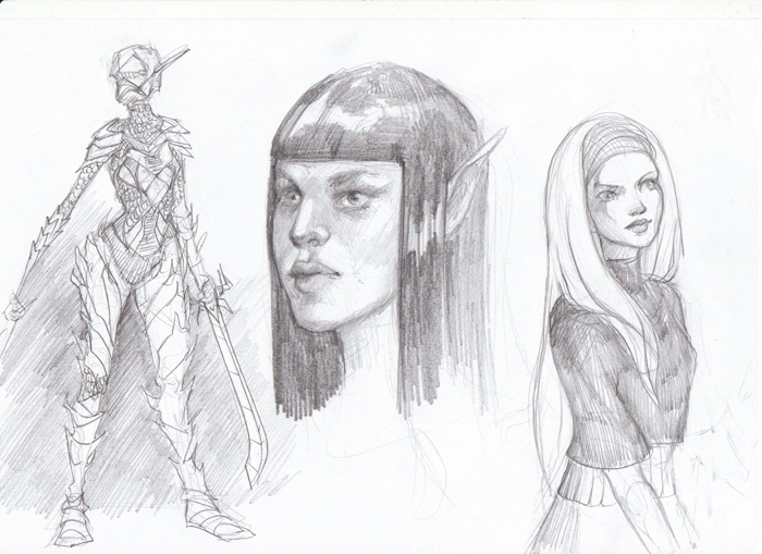 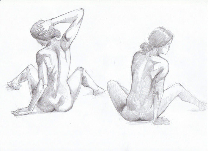 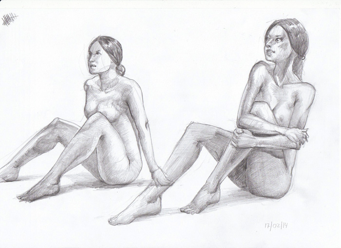 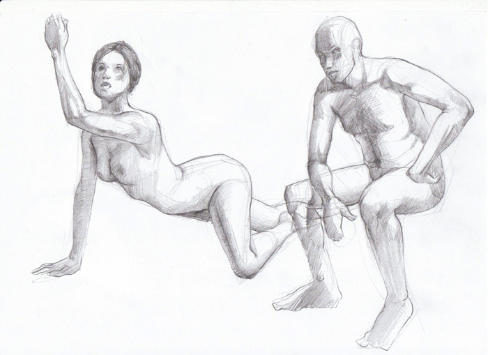
02-27-2014, 08:19 AM
Wow! I really like your work! :) The perspective study is awesome, as well as the lighting. Your figures are looking great, reminds me of how much I need to work on them myself. And the girl, Shallan, I would check her eyes, looks like they're looking for different directions. Keep up the great work! :)
02-27-2014, 11:56 PM
+1 to what Clarisse said! Also do you always work from line drawing? I find its helpful to some times switch it up and start with just blobs of value or color and build up from there. Its like switching gears and thinking only about form instead of contours. Its nice to have different approaches to yield different results and make your work more dynamic.
02-28-2014, 02:16 AM
So much cool stuff :o The perspective is really cool, I especially like that latest piece you did with the values, it turned out great! I don't know how you did it but i like what you did witht he colours too, kinda gives it a surreal quality. I think I'm going to take that class too lol :p
Pretty exited to see where you take this project of yours. I see what you mean about that Shallan piece too. You see it surprisingly often that tidying up the lines makes the initial piece loose it's vibrancy. That's partly why I stopped using lines a lot for personal stuff lol, I just jump straight in with blocky values. I think it's easy to put too much faith in lines and get restricted by them, even if their broken and you end up just building up on broken scaffolding. A lot of people will say that a piece will always look shitty early on, and then you make it look better as you progress, but i disagree. If your piece looks crappy early on, say your comp doesn't work or your basic values and lighting are off, then it'll look crappy no matter how much effort you put into it lol. Just a personal thought anyways, take it with a pinch of salt haha :p Looking forward to more updates from you, your stuff is getting better and better. And sorry for the ramblings in your thread xD
02-28-2014, 02:17 AM
I love the way that perspective piece turned out; great lighting.
03-01-2014, 07:47 AM
Clarisse Silva: Thanks a lot! You're right... she really is cross eyed.
Hypnagogic_Haze: I actually prefer painting straight away, without any lines. But I think my images turn out better when I start with line drawing (more or less clean) because this forces myself to make sure structure, anatomy etc are correct befor I jump into painting and rendering (my favourite part). Maybe I should hone both approaches though. Warburton: Thank you! I don't know how I did it either, haha! :D Lots and lots of layers with fancy modes and fancy brushes, I think. About the lines, as I said to Hypnagogic_Haze, it is my way to force myself to slow down and do better work ... but losing the life of the initial idea really is an issue. Maybe I can find a hybrid way that works for me. Feel free to ramble all you wish ;D The class is quite basic but a very nice summary of the perspective fundamentals, and Matt does a great job answering questions and giving feedback (so far) etc... if you decide to take it and if it's your first class make sure to use a link of me oder pnate or so for a discount :p Ignatz: Thank you! Ok - this is really getting frustrating! I've repainted the face several times now and it just gets worse and more stiff. Also, I am encountering a problem I don't really know how to solve or why that is: When I work zoomed in it looks ok, but as soon as I zoom out again, I immediately hate it... but I can't really tell what's off. It reads when I reduce values to 3, so that can't be the problem. I think I'll just give up and close her mouth next time..and only give her a tiny smile. She's too colorful so far, but I want to go for a really light skin, with lots of subtle color shifts, so I hope this should work as a base. Will see how it goes! Beware of creepy doll stare :p 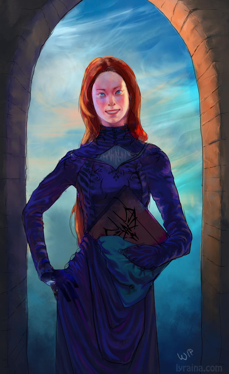 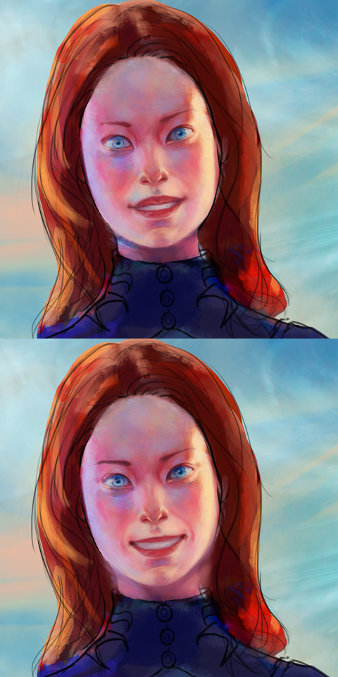
03-01-2014, 09:02 PM
In fairness it's coming along nicely, I know it's frustrating but stick with it because that's were all the learning takes place and it's really cool that your pushing yourself. It's mainly the eyes which look off. Perhaps chill on all the folds of the dress too. While they look awesome there's so much detail the eye has trouble finding places to rest.
As for the zooming in and out thing, perhaps try and force yourself to stay zoomed out while painting it, and tread the zooming in phase as like icing on the cake (if that makes sense). I can be tough as it's always so tempting to zoom in there all get all those details but chances are, all those details probably wont even get looked at in the end, it'll be the big shapes and values which truly sell the piece and certain focal areas. Pnates portraits are a really good example of this when you see how few strokes go into making his forms read so well. Plus when your zoomed in, you cant see how your work is effecting the piece as a whole, so you have no idea whether what your doing is truly helping the piece as a whole. Just a thought anyway, hope it helps in some way lol. Really looking forward to seeing more updates, love watching your progress. And yeah, i'll drop you a link when i sign up for the perspective thing, thanks ;)
03-01-2014, 11:22 PM
It looks like the mouth area flattened out because its missing that little bit of blue reflected light above the upper lip on her right side. I think the first lips you had looked a better with the shape of the top lip being fuller and more curvy. Take a look at some mouths and study how a smile looks. Its surprising how subtle of a curve a smile can be. I think her eyes look good. They make her look like shes Asian. Her ethnicity is ambiguous due to the rest of her features which I think adds interest.
03-02-2014, 12:22 AM
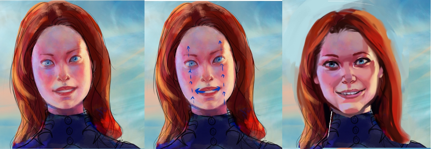 Hey Lyraina I hope you don't mind but I could not help you better than just repainting your face. I absolutely love the colors you picked, so beautiful I would hang this picture on my wall immediately! Her face "before and after" has almost not changed. Be more courage with repainting your work. I know how hard it is to take that far step back and allow yourself to repaint almost everything. Also If I can suggest, grab a small standing mirror and place it beside your monitor. I always paint with mirror even when painting other sex :D It's irreplaceable help especially painting expressions. Just look how skin tightens on whole face when you smile. How chin gets pointy, how cheeks rounded, how nostrils go up, how eyes squint. When you will feel it, and observe in reality, it will be easier to paint. I don't know the background of the character (don't want to be cruel here) but she evidently don't have eyelashes. If she did not lost them in fire explosion minutes ago give her stronger makeup. She haves attractive body but her face in my opinion looks a little creepy ^^ I also think she haves too high forehead, and to big skull. Hope you can grab something useful from my reasoning :D
03-02-2014, 11:34 AM
Glad to see that I am not the only one who seems to get further away from the mark every time I repaint a face -_-
I think Madzia has the right idea, a nice focus on form and brashness with the face will work, just make sure to keep true to the description of the character (the hard bit) I wish I could give you more advice, but since we are both struggling with almost the exact same problem (except opposite, because it looks okay zoomed in for me, but then I zoom out and hate it).. hopefully if you solve the problem, I can get benefits from the way you went about solving it :D
03-15-2014, 03:54 AM
Sorry for the lack up responses and updates. Sometimes I tend to get overwhelmed by my to-do list and struggle to keep afloat, but I'm good now :)
Warburton: Thank you ... yeah, the thing that is most frustrating is that often times things get worse the harder I try to make it look good, while 'just painted something to relax for an hour' things turn out better than expected... but I will definitely stick to it, want to improve after all! You're right about the folds... I think there was some rule about 30% detail and 70% area to relax for the eye... Hypnagogic_Haze: Thank you. I'm glad you think she looks Asian, because that is exactly what she needs to look like! (And what made me struggle a LOT, haha) Madzia: Thanks so much for the feedback and overpaint! It is funny how I totally missed that I forgot the eyelashes, probably because I normally paint them in pretty late in the progress. I agree that she looks creepy, it bugs me - but hopefully I can adjust that when applying your advice & overpainting :) Thank you! Jaik: Actually the same for me, looks better zoomed in than zoomed out (not sure if I got it wrong above). I imagine the "paint most of it zoomed out" might help with that, as hard as it is. Update..let's see where I was. Here I tried to do anatomy studies in PS to improve my digital line skills, but somehow got carried away. Which is not a good thing because if I spend more time on something like this, it would be better to fix certain things early in the process... but at least I had fun. 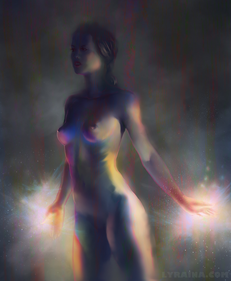 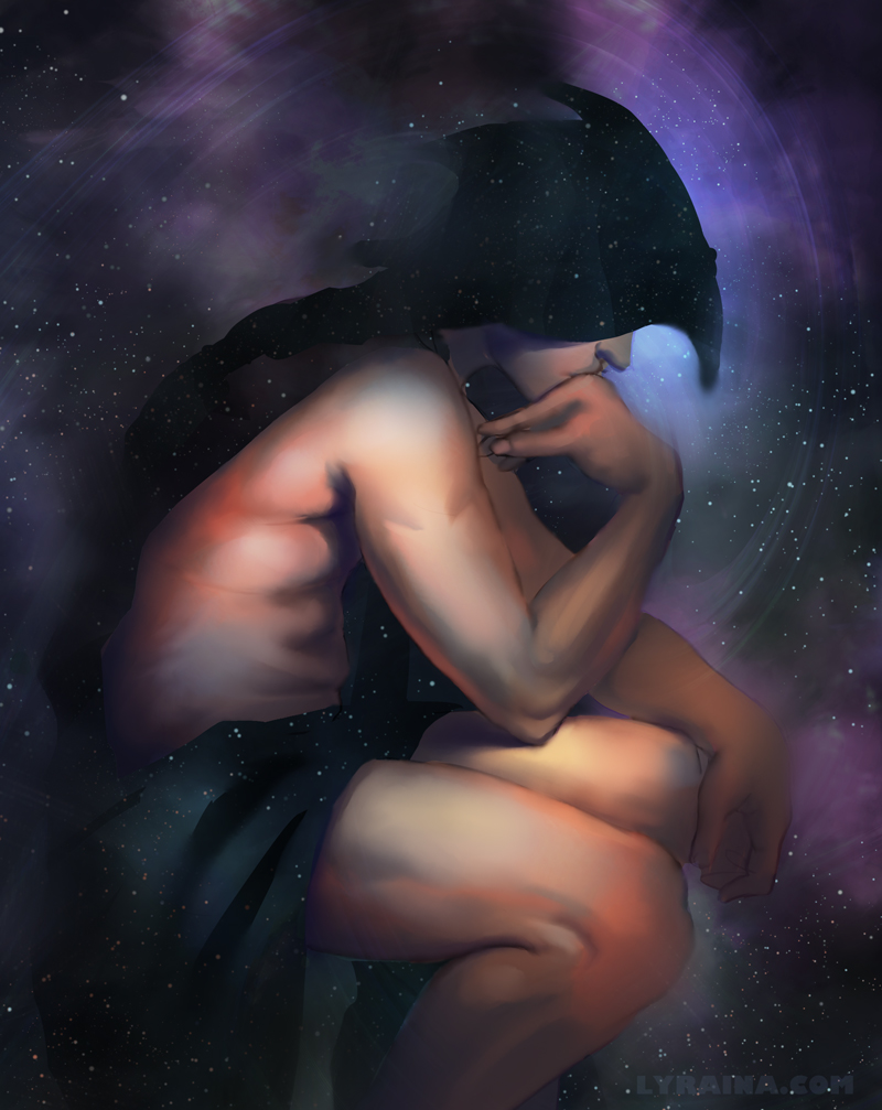 Some character designs for bloodsport 3, might be overkill, but I want to develop my design skills and this was a good excuse to do so. 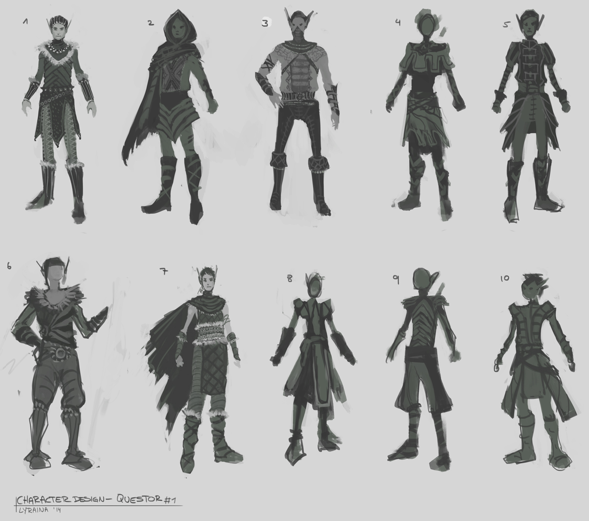 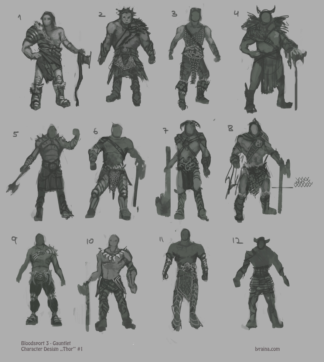 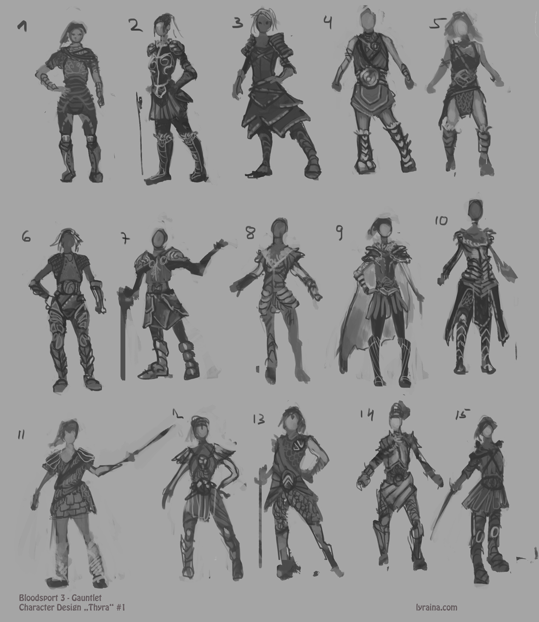 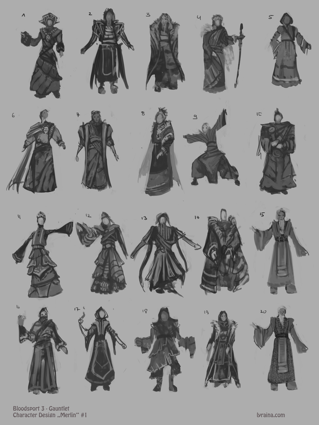 WIP 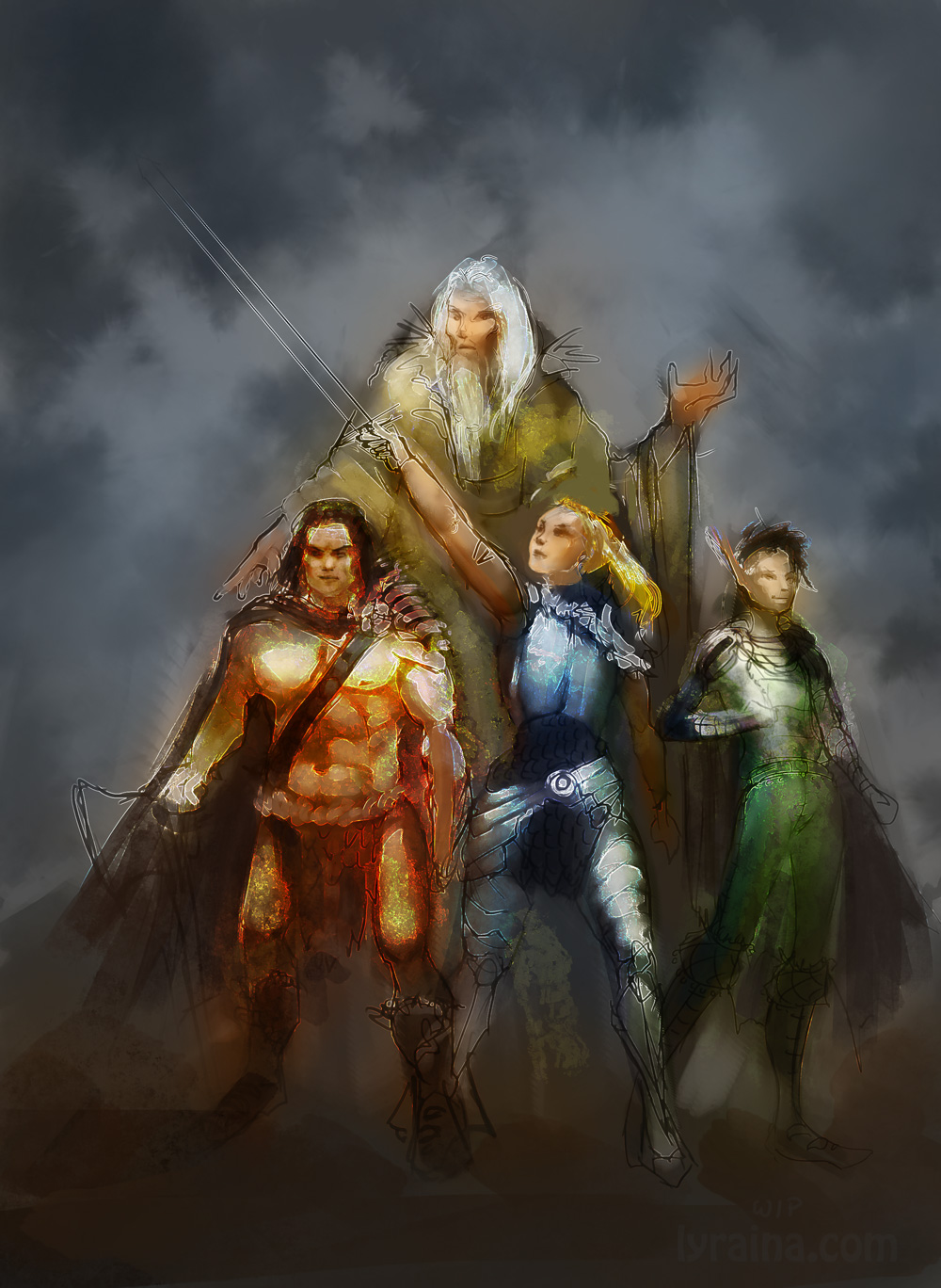 and.... LIFE DRAWING!!! Finally got the chance to take a course! It was really funny... so surprised when I realized that the model actually is a former class mate of mine (which I never met again after finishing school). Last one was drawn with left hand. 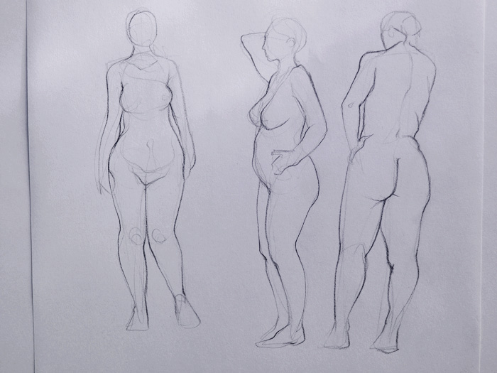 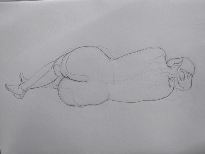 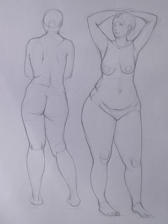 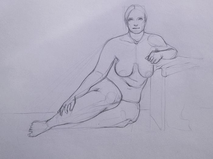 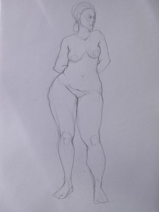 What confused me a lot was the teacher asking me if I need those drawings for fashion school. First I thought that she confused me with someone else but it turned out that she was talking of the way I draw my lines. I think I am supposed to draw them more... wonky... natural...less clean? Which is basically what I was trying to avoid all those months O_O Line quality and such. But I'll now start out with a softer pencil and not do a light underdrawing first and see where that takes me.
03-18-2014, 10:31 PM
I think your teacher has a point, the appearance is that your first concern in these was the clean lines. sort of looks like you weren't paying enough attention to finding structure or anatomy because you were getting that clean finish. I think doing that under-drawing with cylinders and box-like forms while focusing of the figure's balance and weight distribution would help you place the figure in space better and loosen up some more. It's not that making clean lines is a problem and you have to go messier, it's just that you're putting the cart before the horse in a way, a clean finish is probably the last thing you should be worrying about.
Anyway, awesome stuff! Really impressed by those bloodsport thumbnails, that's so much work and variety :0 Keep it up!
03-19-2014, 12:15 AM
I know that feeling all to well about 'trying' to make something work and it coming out rubbish while doodles like better than expected lol. I do that all the time :p I try really hard to focus and the drawing comes out shit, but then a switch onto automatic pilot and stuff seems to look better all of a sudden, yet ive just done it without any direct concentration, if that makes sense lol? It's so confusing :p
These life drawings look cool too. It's easy to forget how hard it actually is to draw figures from life. I don't really understand the whole line quality thing and what it's 'supposed' to look like either. At the end of the day your using life drawing to study right? It's just a means to an ends to get certain information into your brain. The end result and it looking pretty really don't matter. I think focus on form, structure and anatomy and just let the other stuff like style and line quality come on their own, which they will through contrast repetition and practice. I always end up going on rants and writing essays in your sketchbook, im sorry xD The updates are awesome as always, and all those character thumbnails are sweeeet. Love how much you exploring design. Cant wait to see more again :D |
|
« Next Oldest | Next Newest »
|