Posts: 850
Threads: 4
Joined: Mar 2013
Reputation:
21
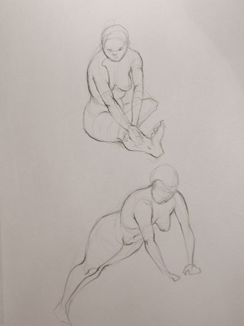
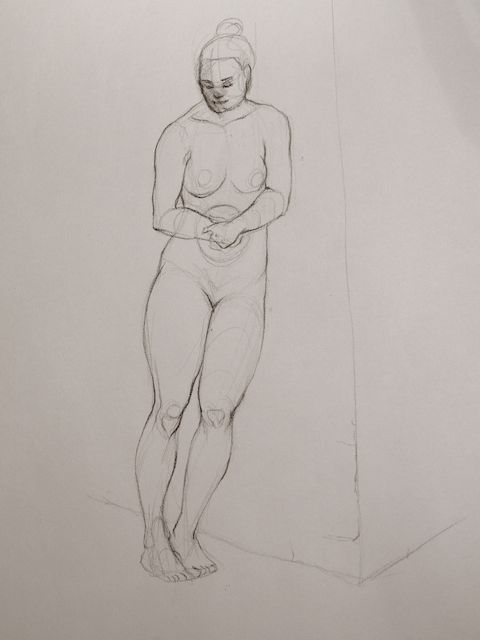
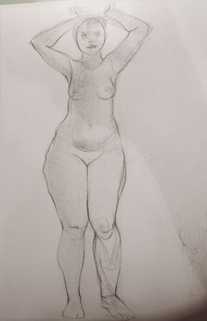
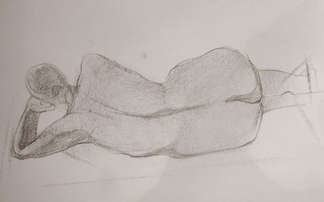
Samszym: Yeah, I'll try to construct more next time. I can't deny that I am obsessed with pretty lines... but balance and loosening up to get a more natural feeling is really something I need to work on.
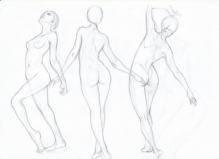
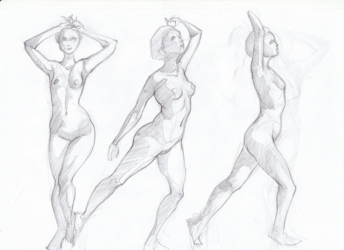
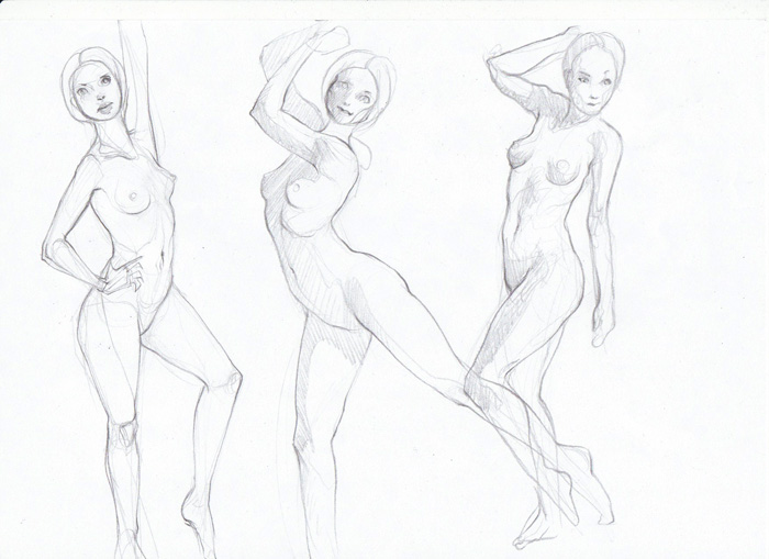
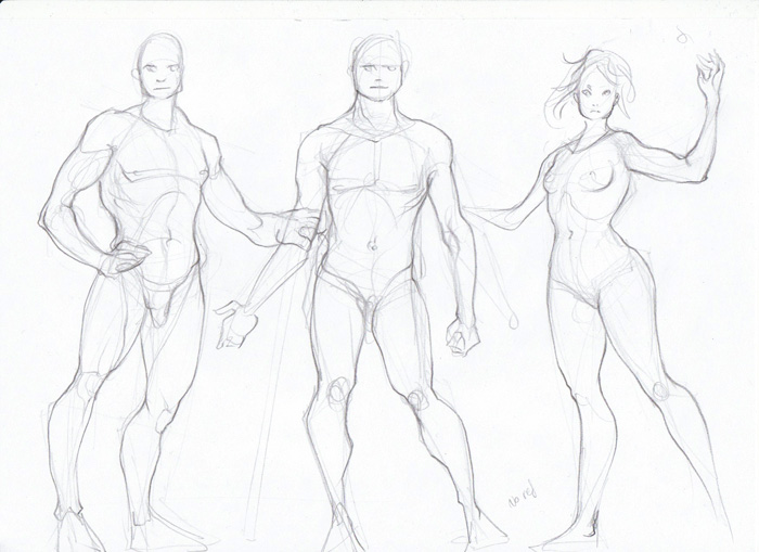
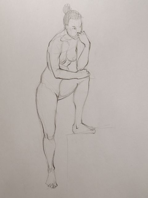
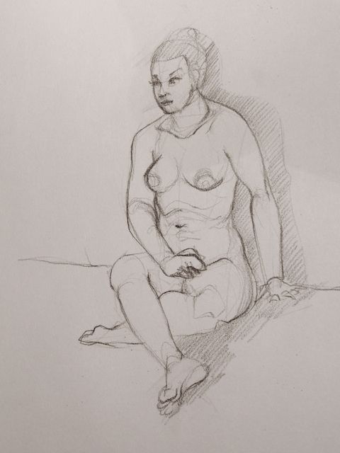
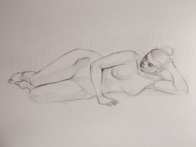
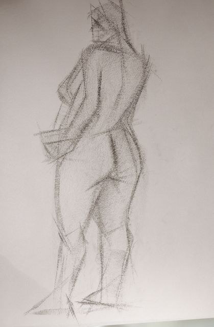
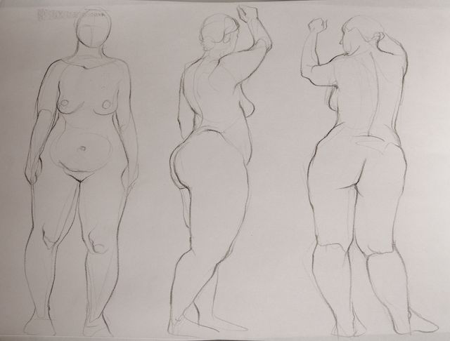
Warburton: So now we just need a way to combine the "work hard on something specific" with the skill of the autopilot-mode :p Glad you like the life drawings. I was actually quite relived that they didn't turn out completely horrible, I was sooo nercous :p Especially since we have to bring them with us next time and everybody gets to see each other's work. My main problem is that I seem to have different ways to approach figure drawing, sometimes I focus on pretty lines, sometimes on building everything out of boxes, sometimes I measure exactly to get proportions and foreshortening right. Sometimes I freehand everything and just go with the flow (those don't get scanned :p) Don't know which of those are best for drawing from life, with limited time etc. But I guess I'll just have to experiment :D Don't apologize for commenting in my sketchbook, I love to hear other people's thoughts! :)
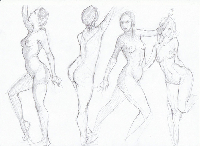
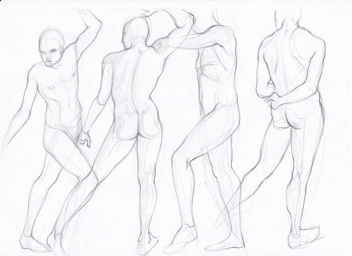
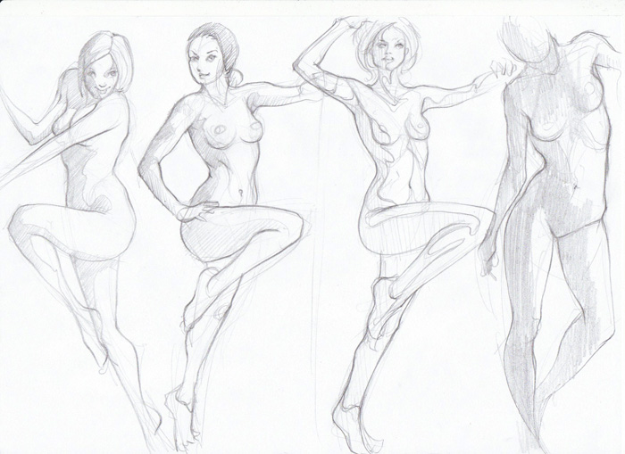
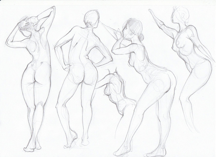
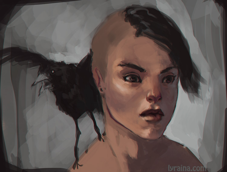
Some more photo figures for warmup:


Here is the bloodsport final. Although I keep tweaking details...

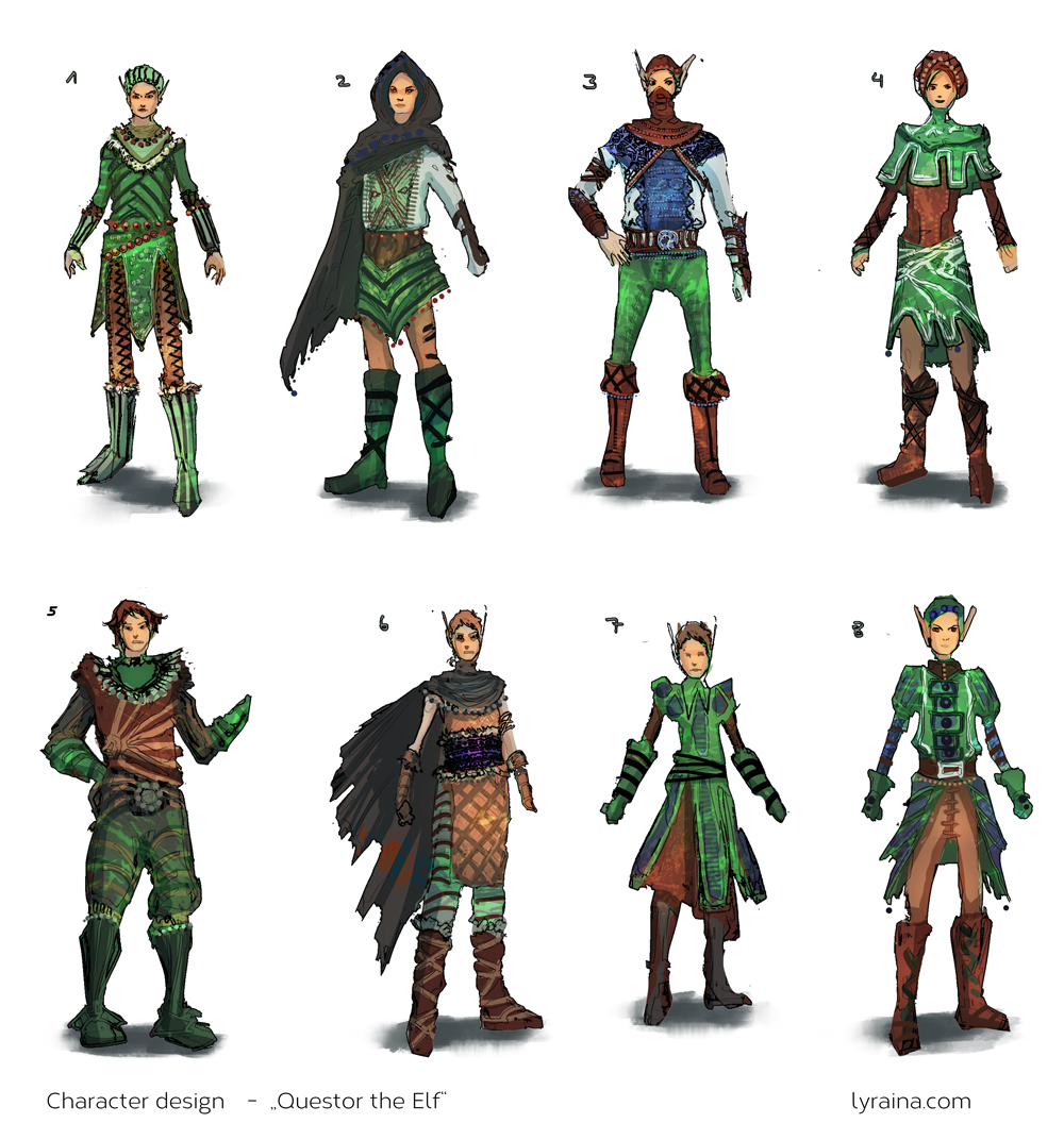
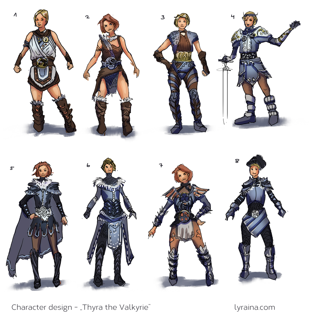
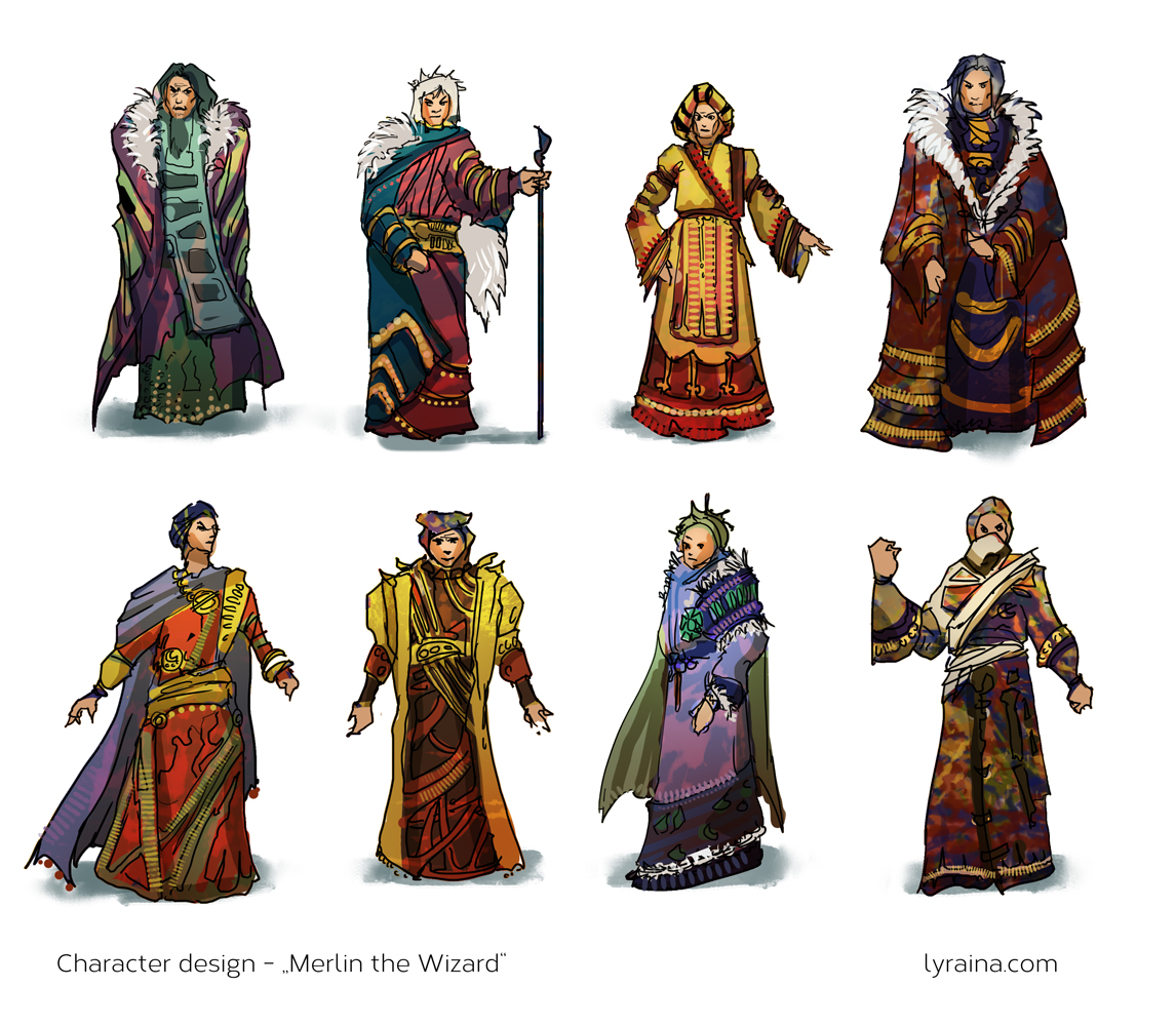
Also decided to throw some colors on the character sheet, to try out workflow etc. I wish I knew at which stage something like this would be give to a client, and how polished it would have to be. Anyway, I call this the "lazy and sloppy approach of extracting lines from thumbnails"-technique

Posts: 1,118
Threads: 12
Joined: Nov 2013
Reputation:
63
Really cool seeing you experiment with new things. Feeling uncertain means your learning from it. Keep pushing yourself out of your comfort zones and you'll keep growing. Try not to worry about failing at something new because failures are great learning experiences.
Posts: 850
Threads: 4
Joined: Mar 2013
Reputation:
21
Hypnagogic_Haze: Thank you. Yes.. always need to remind myself not to stick to my comfort zones!
More refinement of the char thumbs. This time without line-shortcut and therefore a bit cleaner, but also less detailed. Colors were a challenge because they can really change the entire feel of a character.


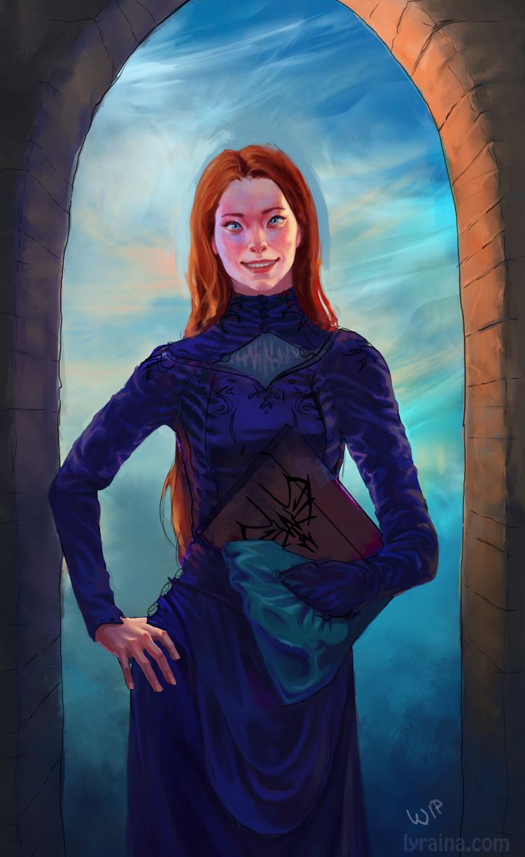
Udate on Shallan - tried to apply all of your feedback, thanks again for the help! Especially Madzias paintover was very helpful :) Still not there, but better and less creepy I think. Also reduced the amount of folds a bit.

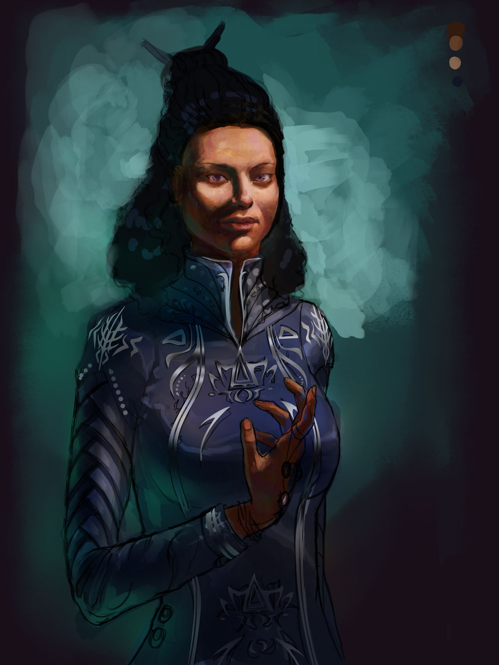
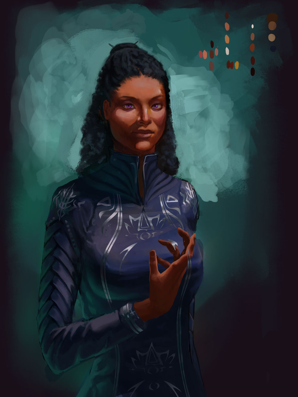
Also started with Jasnah, although I am still not sure about the colors. Right now it is supposed to be a warm main light, and cooler fill light. I'm struggling with the colors, too - SO much saturation going on! If I try to go less saturated, it looks dirty. She's supposed to be tan, maybe similar to a medium dark indian woman.

Posts: 114
Threads: 5
Joined: Feb 2012
Reputation:
2
Wow, great sketchbook here! keep up the good work Lyraina! :O
Posts: 45
Threads: 2
Joined: Mar 2014
Reputation:
0
Wow, I love, love, love your elves and figure drawings.
Posts: 1,074
Threads: 9
Joined: Jan 2012
Reputation:
53
Girl! Just wanted to give you a hug. Keep being awesome! Loving the updates.
Nice way to make char design - thinking of them as thumbs too. Hmm.
Posts: 60
Threads: 2
Joined: Oct 2013
Reputation:
2
Woah, that is some WILD improvement. That last two anatomy studies (in space) pretty much blew my mind.
For your Shallan painting, have you considered smiling in a mirror and using that as reference? It might be helpful.
Anyway! Really fantastic work Lyraina, lookin forward to more good stuff!
Posts: 556
Threads: 5
Joined: Dec 2012
Reputation:
8
Damn, so much improvement over a few pages. You've been absolutely killing it, there's no doubt there.
Your sketchbook pages are so inspiring, and in so much volume at that.
If I could give a small crit on Shallan: There's something about the eyes, I don't know if it's the placement, but they look as if they're crossed and looking at us at the same time. Maybe the spacing between them is just a bit awkward. There's something there so it'd be worth experimenting with for a bit to see what happens.
Great stuff. Can't wait to see all these chars finished! :]]]
Posts: 848
Threads: 20
Joined: Jan 2012
Reputation:
29
Oh man, you have been working hard. Cant believe the improvement over the last week.
I agree with Archreux, Shallan looks slightly cross eyed but some how still looking at the camera.
Those thumbs are really good too. So much work went into the bloodsports entry, so impressed :D
The forms on Jasnah are reading so well too. Really feel like she is sitting perfectly in 3D space.
So motivated by the amount of work you are putting out :D
Posts: 850
Threads: 4
Joined: Mar 2013
Reputation:
21
RenatoCaria: Thank you!
Kaycee: Glad you like them :)
Ursula: Yay hug! :D I don't know if those are actually called thumbs, but.. they are small and quick rough drafts, so...
LongJH: Thanks a lot :) I'm using reference as well as a mirrow, but every time I change something it looks wrong in another way.. :P
Archreux: Thank you, I see what you mean. Not sure why I always paint cross eyed persons. Tried to fix it..
Jaik: Yeah so much work and still I completely forgot that studies are a requirement :P Glad you like Jasnah so far. :)
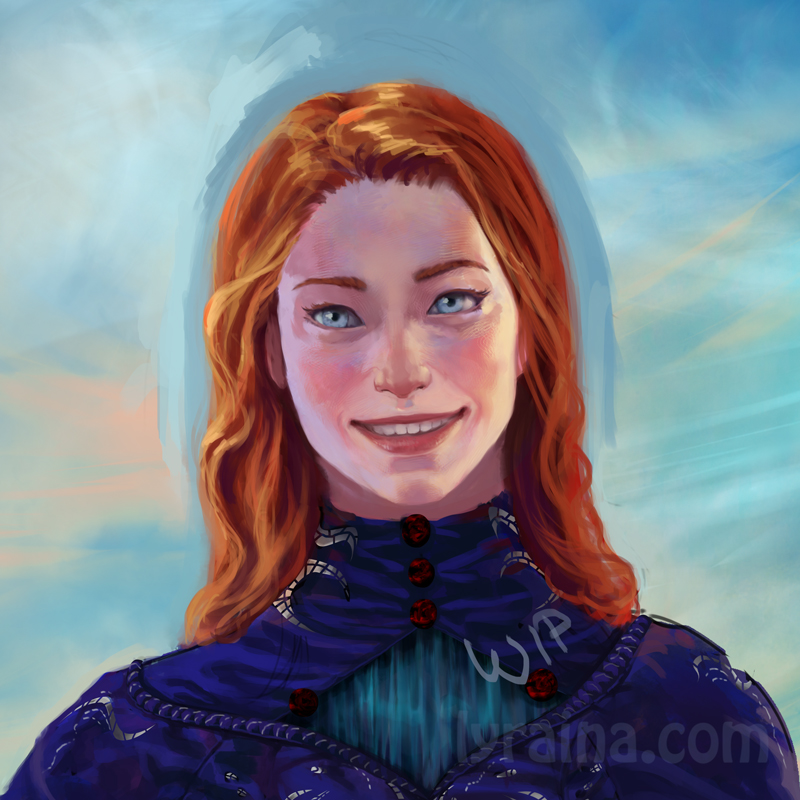
Just a quick update on shallan before I go to bed.. did the eyes again, still not happy. I don't understand why they look off even if I paint them over a grid aligned with the edges of the mouth, symmetrical to the nose etc. Also not sure why it's so hard to make them look asian, even with ref oO I feel like I really don't even see what is off and what not anymore after looking at it for so long... maybe it's time to just finish it and move on.

Posts: 362
Threads: 10
Joined: Mar 2012
Reputation:
21
Dont give up on that character. I really would like to see where you can push that.
the space between the eyes is a bit bigger than normal. Maybe that gives the impression of something misplaced.
also the mouth - when grinnig this much upper lip is more stretched and would be more like a line than have this much of an arc in it.
I really like what you are posting here and this is one of the sketchbooks i check most often. Keep going you do very well!!!
Posts: 903
Threads: 54
Joined: Feb 2012
Reputation:
18
Love the improvement Lyraina. Those character design explorations are really cool, especially Merlin. Do you plan on taking those further? As Wolkenfels said, the space between the eyes is probably part of the culprit. The pupils and irises seem to be in the right place, but the thing I notice is that the eye shapes are different from each other at the inside eye corner, so the left eye (her right) looks shorter. Might be a good idea to put it away for a few days, then look at it with fresh eyes later. Eyes are always tricky like that, so I feel your pain :)
Posts: 345
Threads: 4
Joined: Jun 2013
Reputation:
2
Hey your last character is coming along nicely, only a couple of things I noticed and wasn't written: I'm not sure her right hand would get that much light, I think she would cast a shadow over it. Also, you might want to tune the saturation a tiny bit down - altough the colors are good, the saturation might make it a bit too vibrant. I like the way her dress is thought out! Keep at it :)
Posts: 850
Threads: 4
Joined: Mar 2013
Reputation:
21
Wolkenfels: You're too kind, thank you! :) I think I am going in circles - adjust eye size and spacing - then paint the inner arc to make it look asian - then they end up too far apart again... I tried to place them one eye width apart this time.
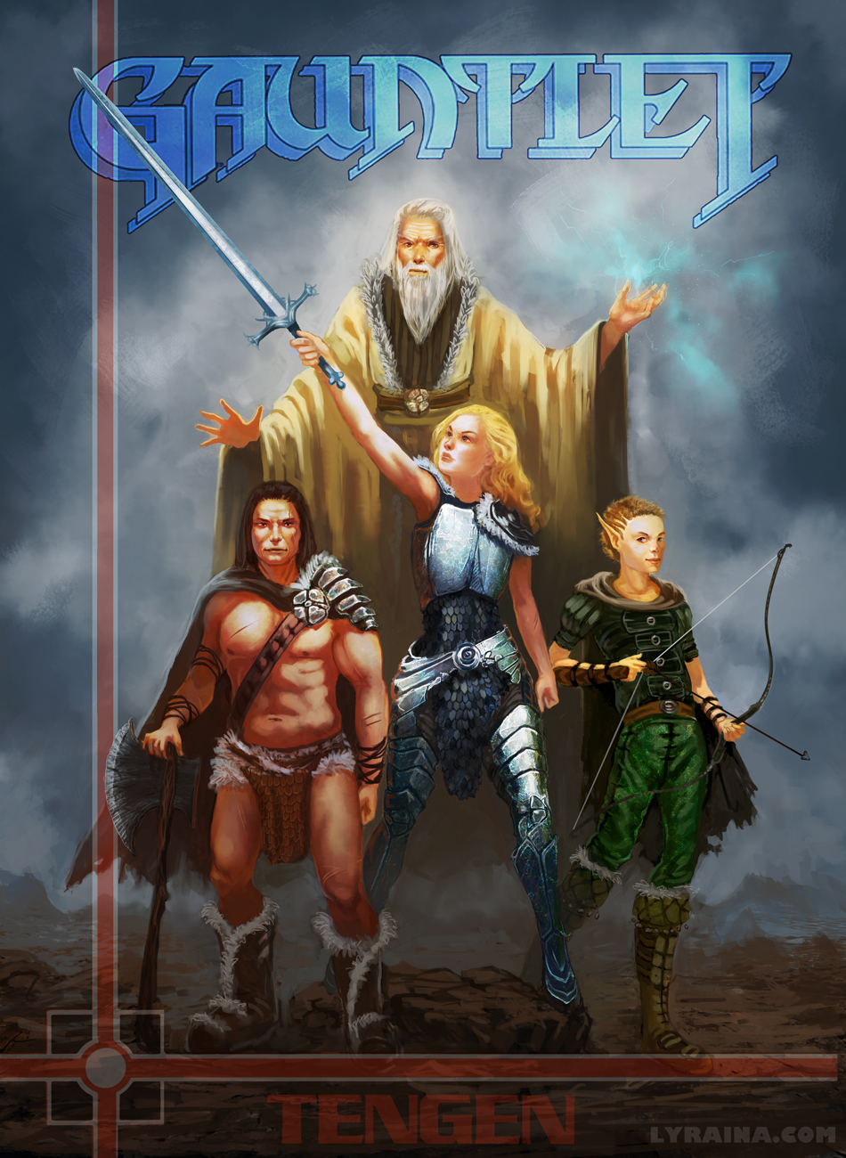
pnate: Thank you! No, didn't intend to take those any further, just wanted to explore the process of creating similar yet different character designs a bit. Unless someone were to tell me how to progress with this kind of stuff to make it suitable for a concept art portfolio, then I might do that.
Kaffer: Thanks! I hoped I could get away with the light on the hand because it looks pretty :p You're right about the saturation, getting a bit out of hand... I took it back a bit.
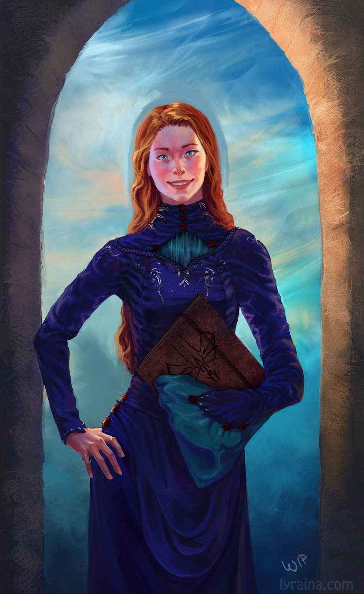
Shallan update: New yes, new nose, new skintone...

Jasnah update:

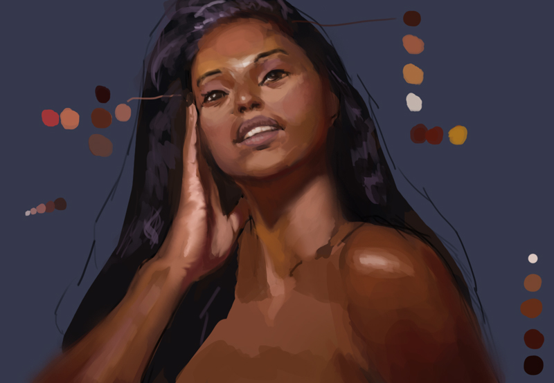
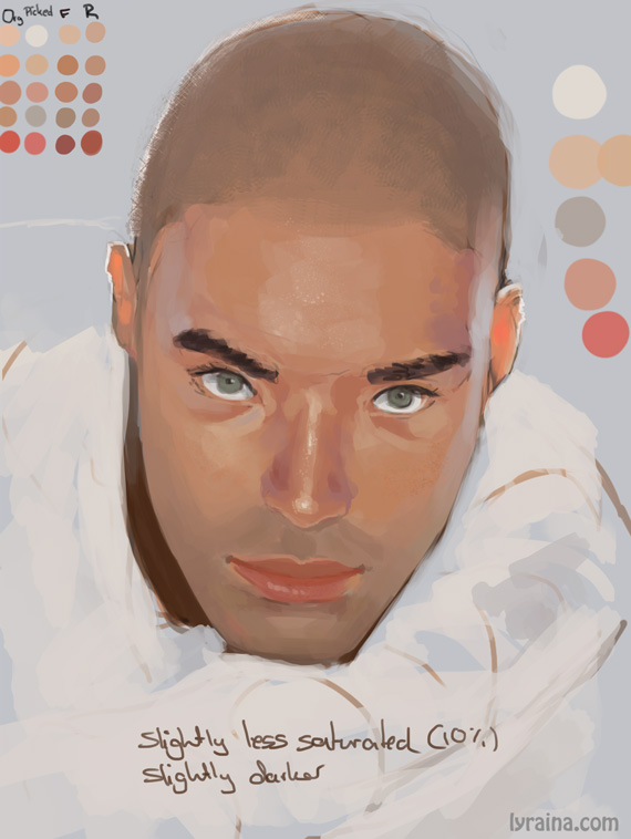
Skin study:

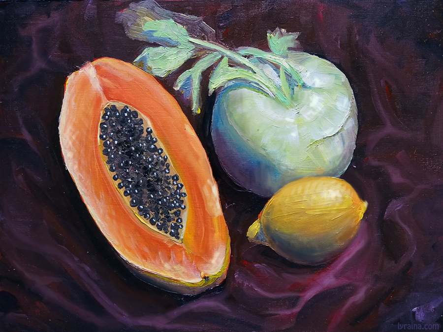
Oils from life! Woo!

Posts: 53
Threads: 3
Joined: Jun 2013
Reputation:
0
Nice improvement, keep it up! :)
Posts: 905
Threads: 39
Joined: Sep 2013
Reputation:
51
Cool, oil paint! :D Interesting subjects (what is that green round thing?). I'm no master at painting, but you'll have better time describing the volumes of objects if you treat your brush like a chisel and have your brush strokes follow the form of the object. And not just only in one direction too, crosshatch sometimes. For example, the lemon your strokes are following the form on the length of the lemon, try following the form on the width. Sort of like if you're painting belts for the lemon. ... man that's not very clear is it.
The green vege seems to have too much bright white, which is probably the wet paint reflecting too much light for the camera. The actual painting is probably darker. The black shadows end too suddenly. Shadows usually fade more gently, unless the light source is really harsh and close by.
I did a little bit of mild paint-over without changing too much of the original, see if it helps.

Posts: 118
Threads: 2
Joined: Apr 2013
Reputation:
1
Post #274 looks awesome! The more I look at the Jasnah piece, the better it seems to fit in a mysterious dimension. Well, sorry for not having any critique.
I hope to see more of your beautiful Wip's in the near future!
Posts: 850
Threads: 4
Joined: Mar 2013
Reputation:
21
Posts: 905
Threads: 39
Joined: Sep 2013
Reputation:
51
O_O dayum...! Usually when I feel like I want to slip down on the floor and pass out, I slip on the floor and pass out. If one ever claims to want to learn to do/improve art, one ought to go at it with the determination you demonstrated just now. Imma be on the same level you on before I say anything again. Keep up the good work! least I catch up to ye... Appreciate you dropping by my SB, by the way. I'll have better stuff for you to look at next time, swear.
Posts: 848
Threads: 20
Joined: Jan 2012
Reputation:
29
what is this...? You're painting males?!? You must be tired...
Looking real good. I admire your determination to carry on even when you feel like collapsing. I just procrastinate when I feel like that.. not good lol. Spend all my time doing nothing productive.
Those figures look good. You should play with edges a little when you get a chance. Thats what I am aiming at next. Anatomy on the shorter poses then long posts play with edges.. So much harder drawing from life lol, but we will get there! I don't know whether you ever get it, but if it is an attractive model in a great pose I wish I could fast forward my artistic ability by a few years just for the pose because I feel like it is wasted on me lol.
With the skin studies, what is the O F R? Original flat and render obviously, but do you lay down O, put in F, then blend with R? Didn't quite grasp the concept there lol.
Keep on pushing, every day :D
|
