03-05-2015, 01:05 AM
Goood Lord! Those last sketches and the color block ins... Hollly... I'm just in awe. e.e
Really gorgeous work. Very inspiring, keep 'em coming! :)
Really gorgeous work. Very inspiring, keep 'em coming! :)
|
Rosolino Sketchbook
|
|
03-05-2015, 01:05 AM
Goood Lord! Those last sketches and the color block ins... Hollly... I'm just in awe. e.e
Really gorgeous work. Very inspiring, keep 'em coming! :)
03-05-2015, 01:54 PM
dude, doesnt even look like the same person that did the first page, you have improved so much! Really like how you are slowly using photos in your work and not photobombing like crazy like some people do *ahem* me *cough*
Really wish I could give an actual helpful crit, but I got nothing!
03-06-2015, 04:31 PM
@RickRichards: Hey rick in first thank you! I'm glad that you said that!
I checked the art of Adrian Wilkins! I already saw his work a few times and is incredible :D! And yes, sometimes i use multiply on my brush setup, but just to discover some colors and then i start to paint in normal mode (you need to be on the same layer of the color for magic happen :) aaa and other times I prefer to use Ctrl L, but just when the object already is painted! @LaleAnn: haha i will o/ @Jaik: wooow, thats is really nice to hear hehe! Thank you Jaik! Cool what you said, my friend said the same thing! like using photobashing skills in your design, in your lines, instead of photobashing to create a design without thinking or planning. I agree! Those hands, i got to do something better!! Despite this I have a feel with that I improved something on my work haha, don't know what or why! But is better then the first character for sure :) At least I'm pretty happy right now, lets see tomorrow :p 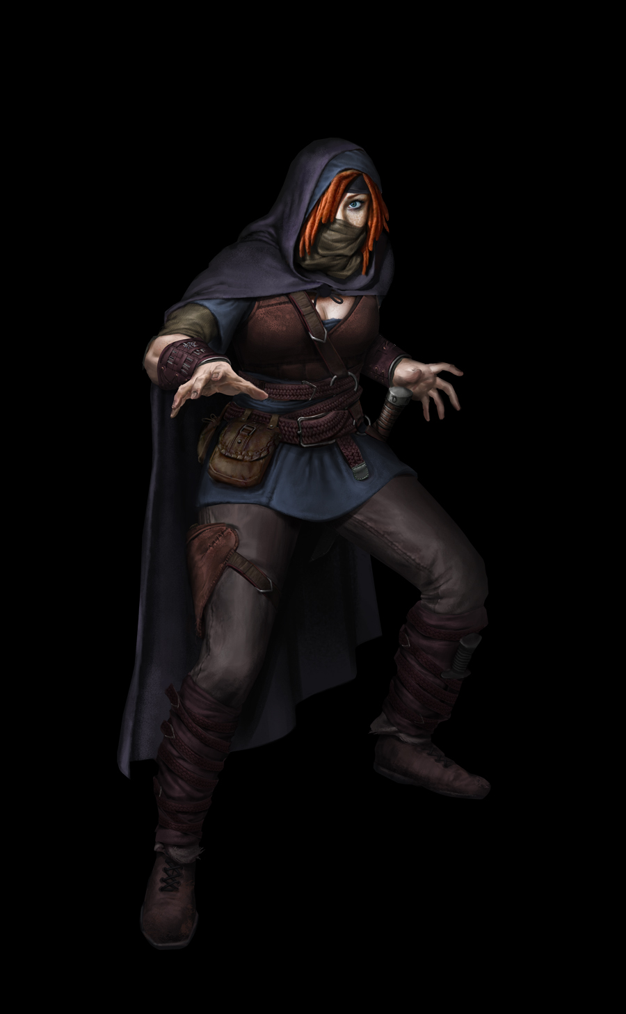
03-06-2015, 05:30 PM
Really awesome stuff! Designs, rendering, everything woooooooo
Sketchbook ~ Blog ~ Deviantart ~ Livestream
03-13-2015, 12:23 AM
Trying to get back with some cartoons. Super inspired by my love <3. Also the second one was a gift for her birthday!
And the first one was for a group of themed challenges on facebook, called 4FORFAN! The theme this time was EGYPTIAN PRIEST. I super recommend to check it out! https://www.facebook.com/groups/4forFAN/ 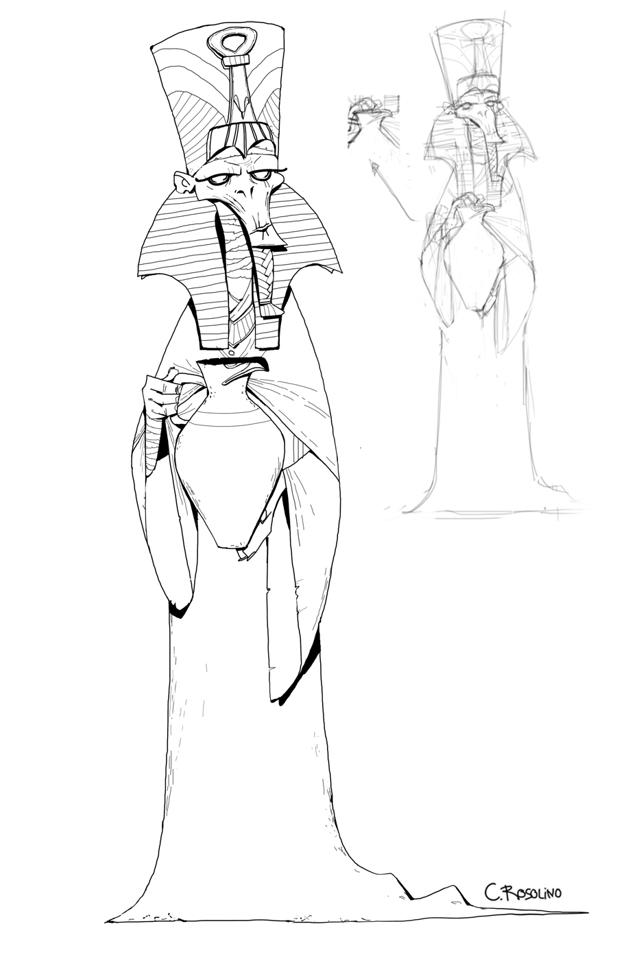 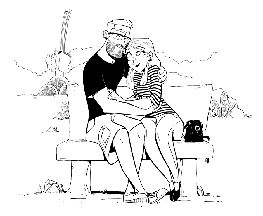
03-13-2015, 03:06 AM
I really love the warmth in your lighting, and how dimensional all your forms feel. Mmmm.
03-13-2015, 04:29 AM
Holy crap, these characters are next level, what on earth! My brain is exploding. Haha, can't wait to see more of those, thank you for the kick in the ass, I gotta get working!
03-18-2015, 05:30 AM
wowww, thanks guysss :))
Trying to finish all the characters in this week, no time for sleep o/ IT'S POSSIBLE!!  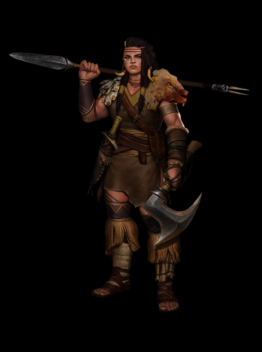
03-18-2015, 03:27 PM
Thinking about this short or long neck, i like both!
1.Short: good because is kinda creepy, like a characteristic about them? 2.Long: More realistic and true proportion? more natural?  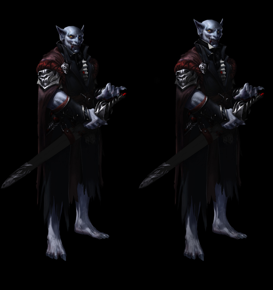
03-19-2015, 09:38 AM
This looks awesome!
I would go with the longer neck, because the "creepy" vibe of a weirdly proportioned neck is not reflected in the rest of the design, it seems more like a small mistake than a deliberate choice. Great rendering and compelling character!
03-20-2015, 03:26 AM
@Vicianus: Thankkk you! Yes, I thought so too! And someone taller, slender, also would be better I guess :p Glad that you liked o/
woww! After a talk with Mike Azevedo (damn how he is good :O) we talked about process of a painting, edges, saturation, colors, etc.. and others things! But the main topic was: when you painting. try to separate the process, try to focus only in one thing per time, like separate ( including layers) the shadow, the light, the reflect light, then apply some texture, and so on! This thought will basically help you to not get lost! So i tried it and it is working, it's amazing haha! Sometimes we do this but we dont think too much on how important this technique are! I'm telling here because you can think about and try this too! we always want see things finished but better think before and do without rush, than getting stressed and get lost. I know is something you probably heard before, but it is always good to remember, right? :) 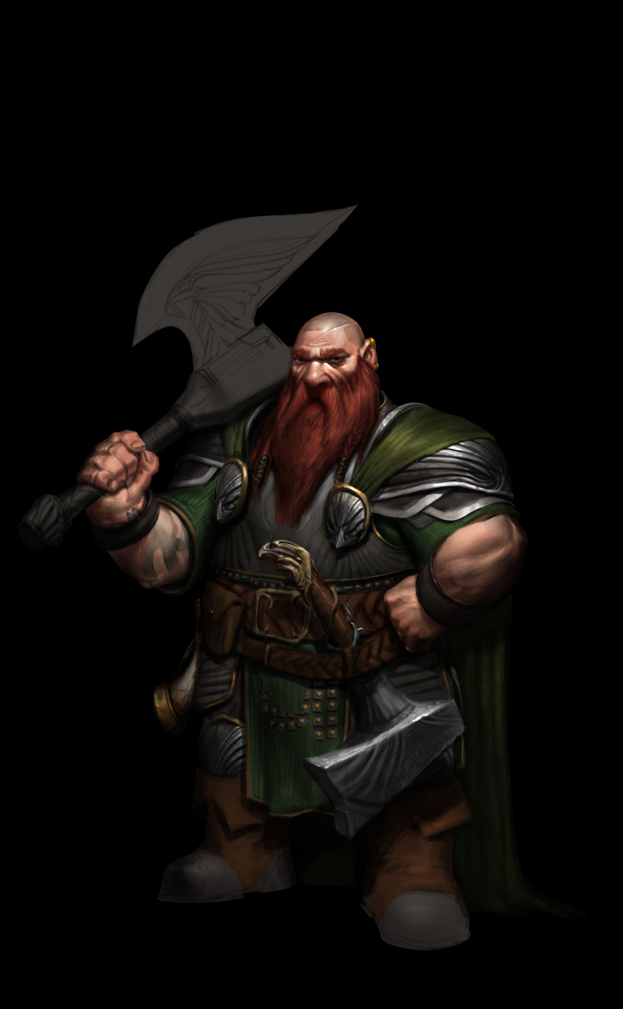
03-23-2015, 02:30 PM
Wow!
I had a great conversation with my buddy Hugo Richard yesterday!! (if you have some time, please check his awesome works) And we found that some of my characters (most of them haha) were "stuck" inside the "right" proportions and this thing was killing them! Because of this 'limit' on my mind, all my shapes and cool ideas of design was getting weak and consequently my characters were a bit weak too!! (of course has a problem in this example below on gesture, but mostly this "real" proportion was hurting me somehow). So now i got to get back in some characters but this isnt a problem! I'm so happy that he brought that question to me that now i'm more confident and alert to move on o/ I brought the lineart of the elf and you can notice the difference comparing with the last one. What you guys think? I would love to hear your opinions :))) Take care 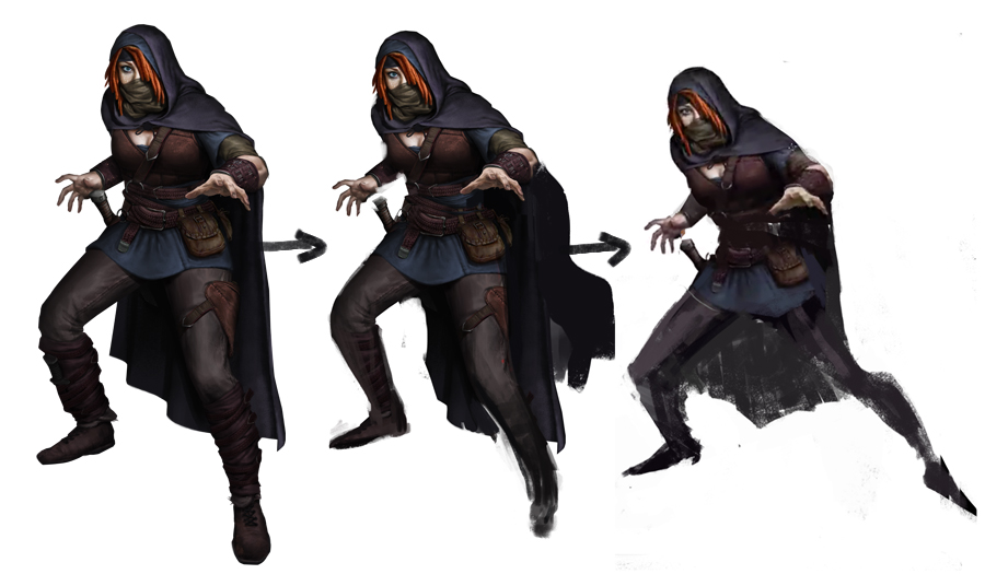 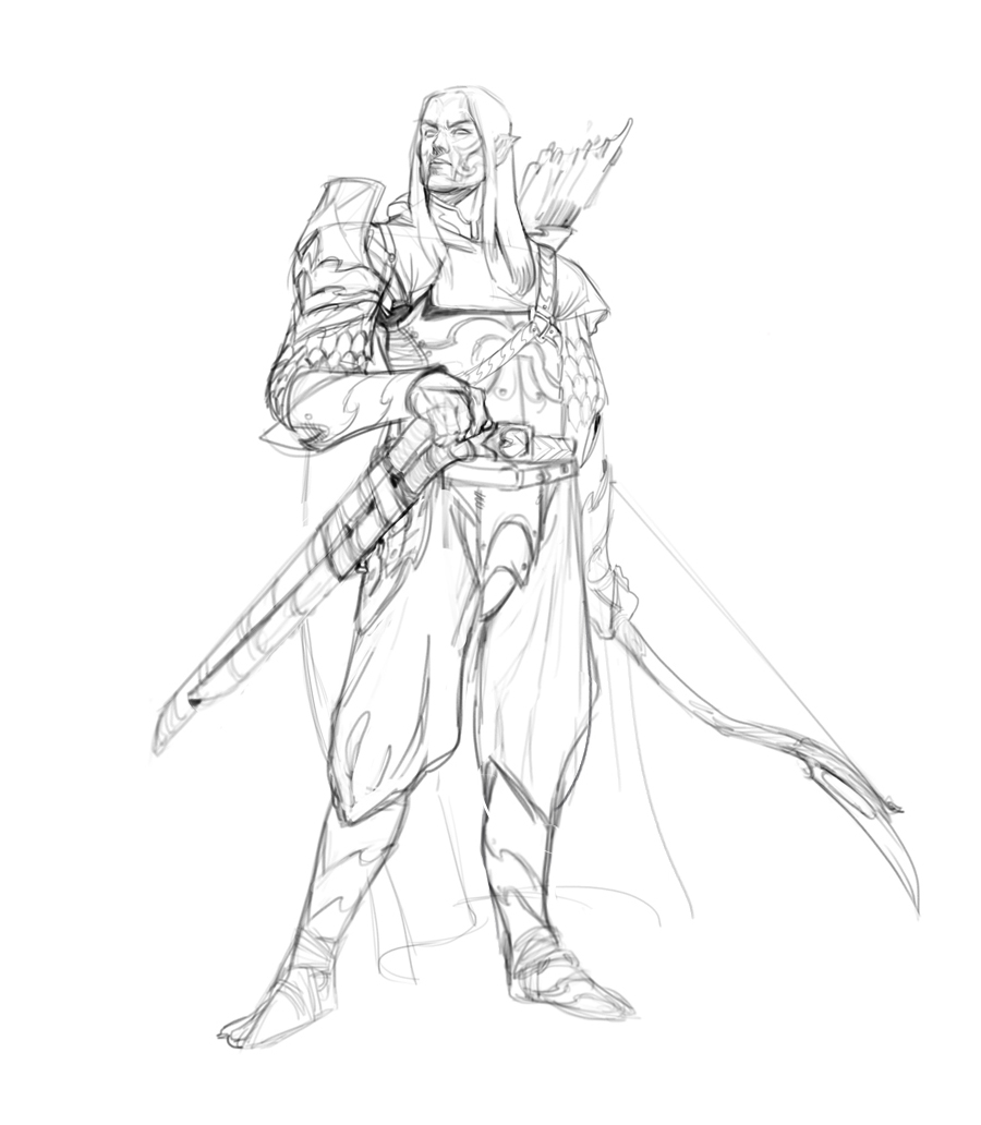
03-24-2015, 06:38 AM
@rainbowsorknives: Thanks man :)
Some updatesss based on the last post, what you guys think about this helmet design from orc? Also thank you Rafael Zanchetin for the advices <3 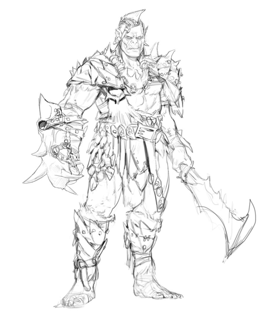 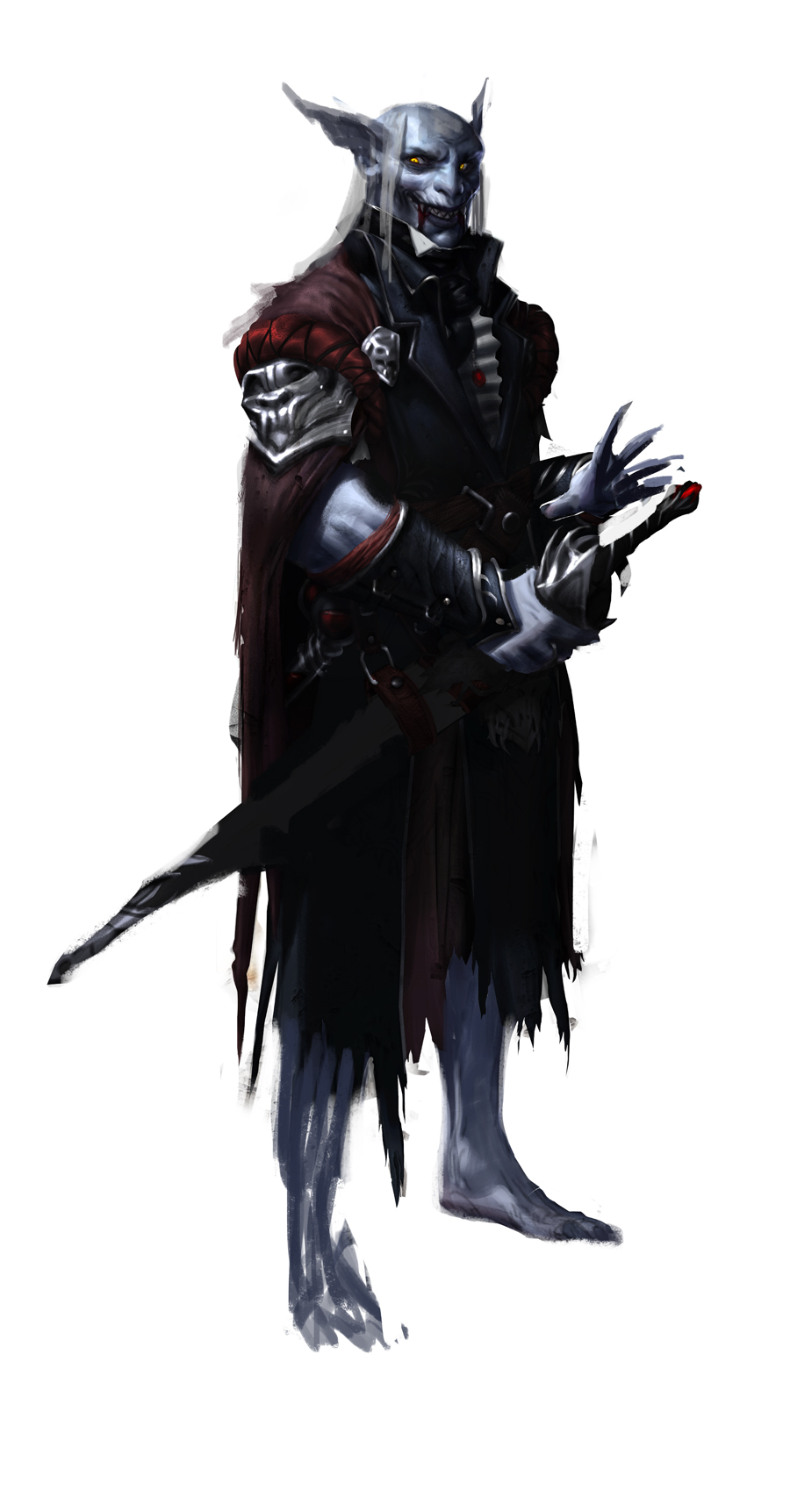
03-27-2015, 01:27 AM
Hey!
Dividing my time between writing the report for this project (college purpose) and I got my first job in card game industry I'm so excited!  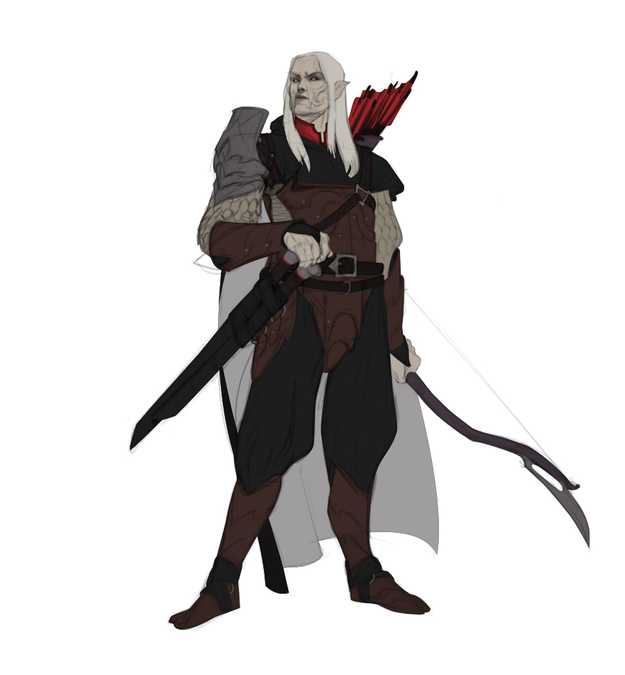
03-27-2015, 01:47 AM
Congrats on the job man! You deserve it. These characters you're doing look awesome.
|
|
« Next Oldest | Next Newest »
|