Rye's sketchbook
#1
Hi guys! I'm studying animation and I also love drawing/painting so I'm kinda trying to get better at everything at once. Comments and crits are greatly appreciated!! 

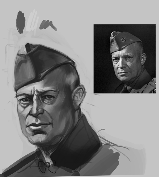
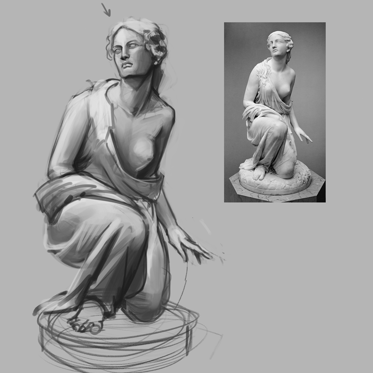
Study of the day, tried to concentrate on values/ brush economy, because I really need to work on both;


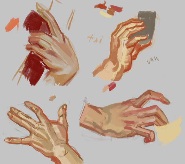
Some Leyendecker hand studies I did a while; (hands are still something I need to work on)


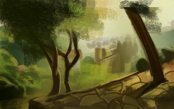
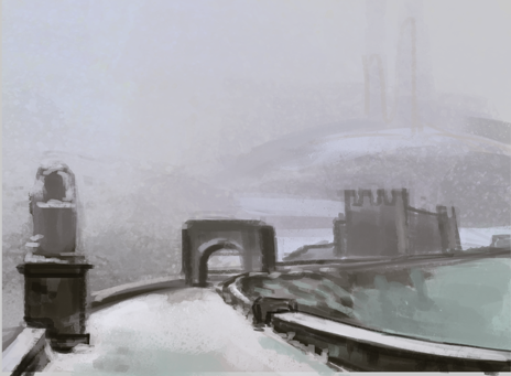
Some environment studies I did, I really want to get better at perspective/ environment drawing


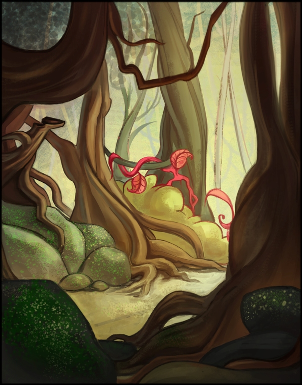
And a background for a school assignment >w<

Reply
#2
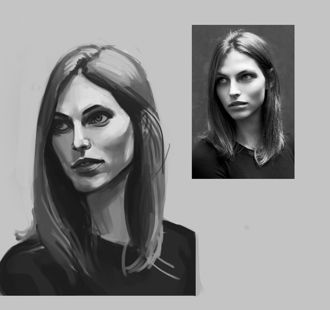
Last one have really good vibe in it. I like the style. About first face. Values are off, lets say...Her bottom lip is dark, yes but if u check it with picker. For example u used values of 20% brightness on lips and 40% on her left cheek. When in reallity it is almost the same values around 40%. And 20% is reeaaaaalllyyy alot :)

Try to think more about how one thing looks in comparision to other. Beside that, try to use soft and hard brush. Sometimes shadows are hard, and sometimes they are soft. If its hard for u to know where you should use darker or lighter shadow, try to do grid on her face ( like in 3d model) and think how it bounce light

https://olihoff.files.wordpress.com/2010...lines.jpeg
Reply
#3
(12-18-2015, 08:14 PM)seppoday Wrote: Last one have really good vibe in it. I like the style. About first face. Values are off, lets say...Her bottom lip is dark, yes but if u check it with picker. For example u used values of 20% brightness on lips and 40% on her left cheek. When in reallity it is almost the same values around 40%. And 20% is reeaaaaalllyyy alot :)

Try to think more about how one thing looks in comparision to other. Beside that, try to use soft and hard brush. Sometimes shadows are hard, and sometimes they are soft. If its hard for u to know where you should use darker or lighter shadow, try to do grid on her face ( like in 3d model) and think how it bounce light

https://olihoff.files.wordpress.com/2010...lines.jpeg

Thank you so much for the feedback!! I will try paying more attention to how things look compared to one another and switch more between soft/ hard brush. I am still not confident enough with the soft brush but making progress *u*

Reply
#4
The first one is a study I finished from the previous day, I literally didn't touch my tablet for a week and it shows. The second one is a bit better, feels so good to be painting again! I'm planning on doing more b+w studies so I can better my values understanding and also I'm finding that personally for me, people studies are great for building up a visual library for character designing later on. 


(rip proportions) 


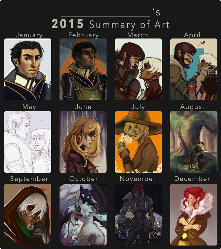
(credit for the meme goes to DustBunnyThumper on deviantart)
Also decided to do one of these art summaries to kinda see what I've done so far and tbh 2015 wasn't a really strong art year for me which motivates me to arty a lot harder this year!

Reply
#5
Welcome to daggers!
You have some nice vibrant stuff man. I really like the flowing trees in the background you did for a school assignment.

Reply
#6
(01-05-2016, 01:38 AM)crackedskull Wrote: Welcome to daggers!
You have some nice vibrant stuff man. I really like the flowing trees in the background you did for a school assignment.

Thank you!! I was actually planning to use it for a future assignment as well (with some polishing of course).

Reply
#7
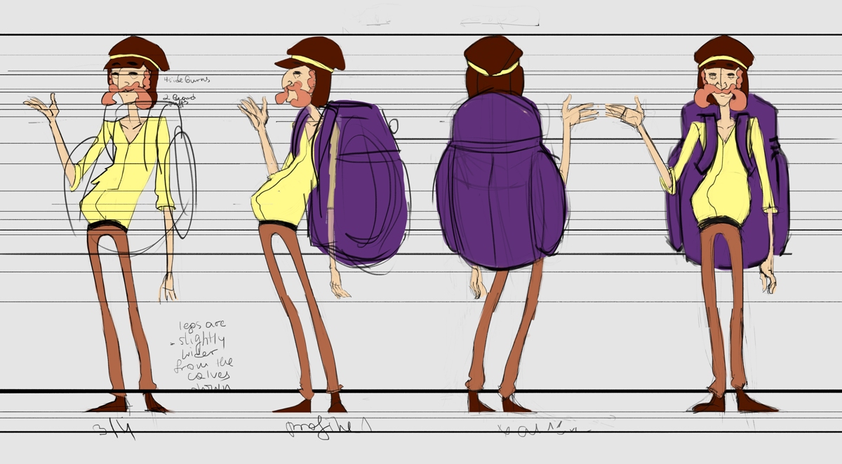
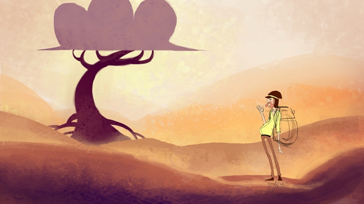
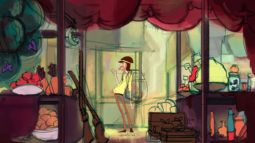
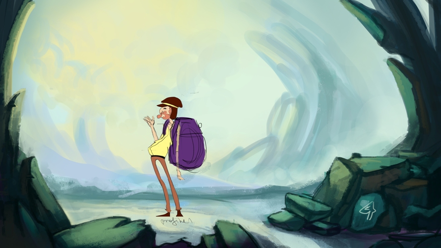
This is what I've been up to in the last couple of days. We have to make a 10s animated short and mine was supposed to have an old man just walking through random backgrounds until he finds something in the end. 


(not completely finished turnaround)

First is the desert, then the market and finally the rocky something. 


I've worked the least on the market one, because I think I messed up something somewhere along the way, so I'm putting it off for a bit so I can work on other stuff and come back later. The idea was to have the bgs really textured so when he passes through we will stand out because I am gonna animate him in flash and flash isn't the best with textures lol. Any feedback/ critiques will be greatly appreciated!!

Reply
#8
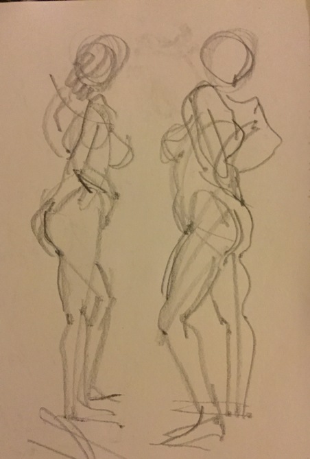
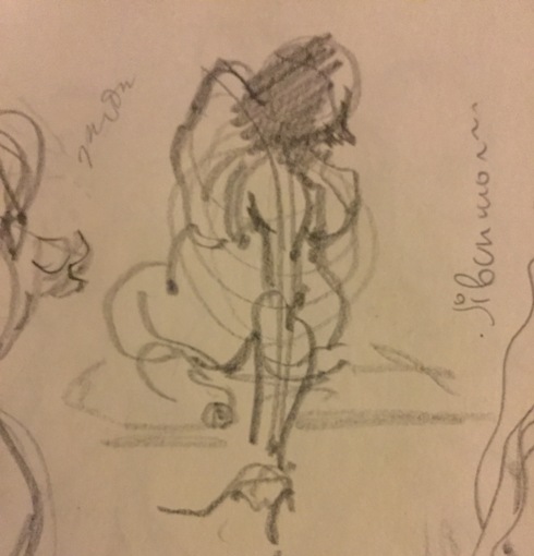
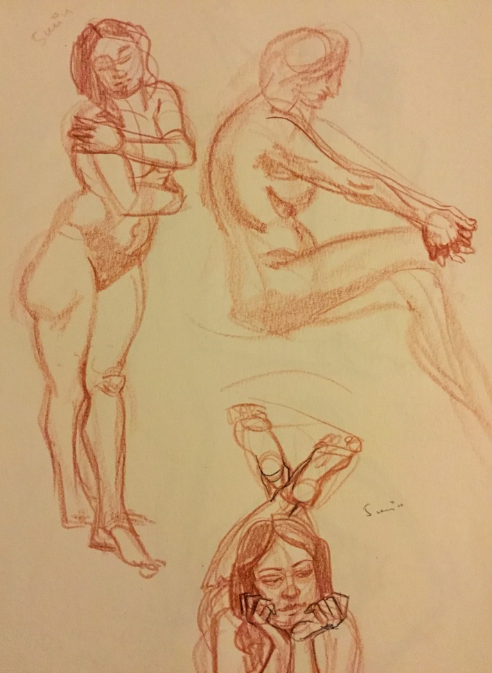
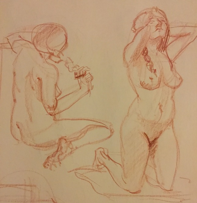
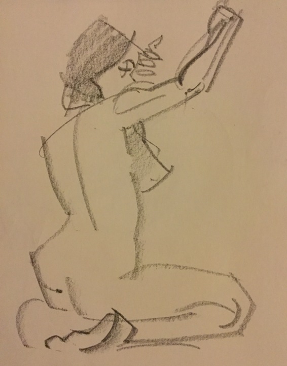
Haven't posted in a while, here's some life drawing from yesterday:


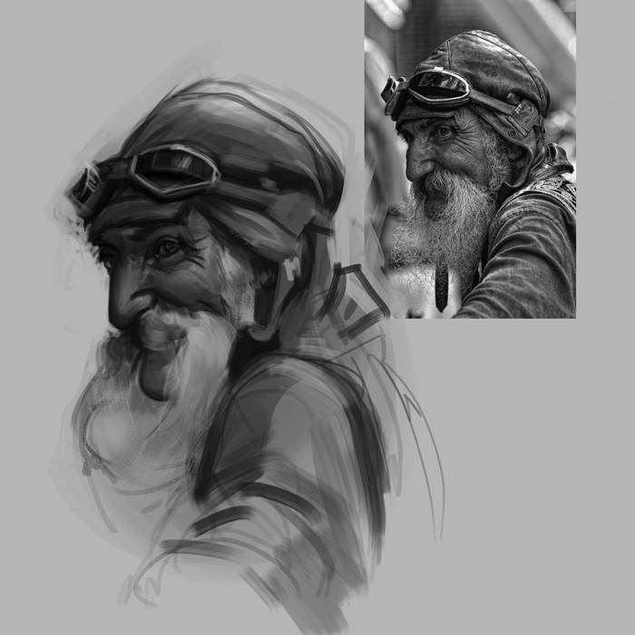
And a b+w study which I messed up pretty hard, but was still good practice, gonna do more of these, hopefully every 2-3 days!


Reply
#9
Not much crits to give just keep working on what youre working on, try practicing lighting basic geometric shapes (cube,sphere,pyramid etc.). Keep up the good work

Reply
#10
great work man, on the value studies it looks like you are exaggerating the darks a bit too much on them though.
As Hobbit said, practicing lighting on basic shapes is a really good(and imo fun) exercise, I practiced Istebraks method here for a little while and it helped a lot.
I'd also reccomend doing Sycra's value game as a warmup, that helped me a lot as well.
http://pre04.deviantart.net/1c58/th/pre/...8pjiln.jpg
https://www.youtube.com/watch?v=J5zVFlMQZEs

Reply


Forum Jump:


Users browsing this thread: 2 Guest(s)