Posts: 1,424
Threads: 12
Joined: Dec 2015
Reputation:
139
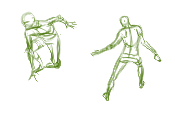
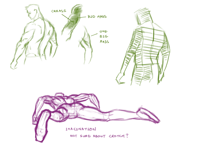
Gestures are great for building up that visual library so I'm trying to do a least a few a day, I also read that using a thicker brush helps you to avoid getting too bogged down in detail which is great for gestures:

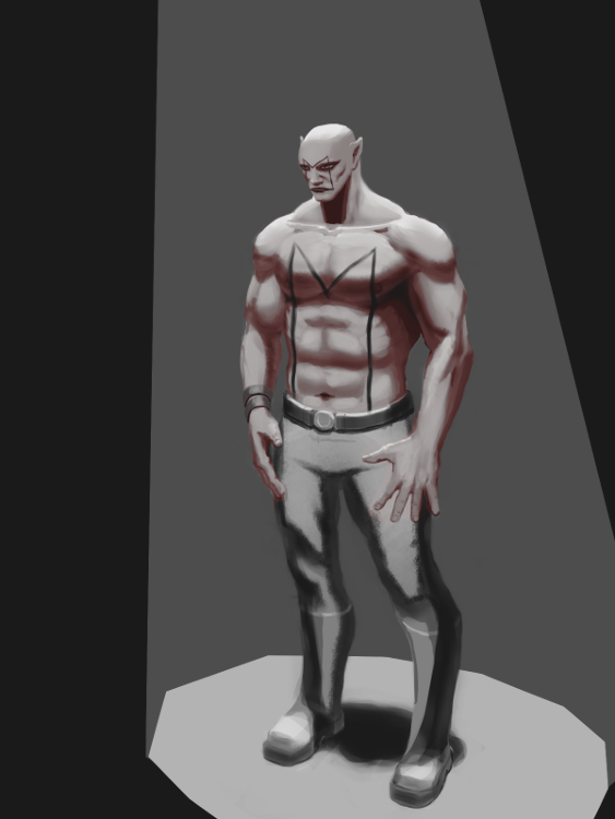
And here's that personal piece so far:

“Today, give a stranger one of your smiles. It might be the only sunshine he sees all day.” -- H. Jackson Brown Jr.
CD Sketchbook
Posts: 1,424
Threads: 12
Joined: Dec 2015
Reputation:
139
A couple more gestures today:

And I'm putting this personal piece down and moving on now:

Still a few weaknesses I've noticed and will try to improve on:
- Proportions: The Chest should be lower. The navel a bit higher.
- Rendering: A bit messy.
“Today, give a stranger one of your smiles. It might be the only sunshine he sees all day.” -- H. Jackson Brown Jr.
CD Sketchbook
Posts: 112
Threads: 1
Joined: Aug 2016
Reputation:
6
I don't see any problems with the chest except of the navel. It should be a bit higher as you said. But what I've noticed is that the head on this character is way too small. By standard proportions a wrist must be the same size as a face (from chin to hair line) and from chin of a head to nipples lies 2 heads. Also I see some problems with lighting.
Posts: 1,424
Threads: 12
Joined: Dec 2015
Reputation:
139
@Anton_Fort: Thanks for dropping by Anton - I should have said before but I was going for a 9 head proportion with this guy as he is supposed to be a bit of a brute. I'd love to hear a bit more about what is off with the lighting though - I'm just starting out with this and would appreciate as many pointers as I can get. Is it the values that are off or the shapes of the shadows or just bad rendering?
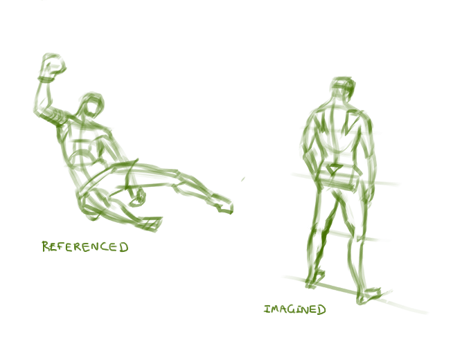
Some gestures from reference:

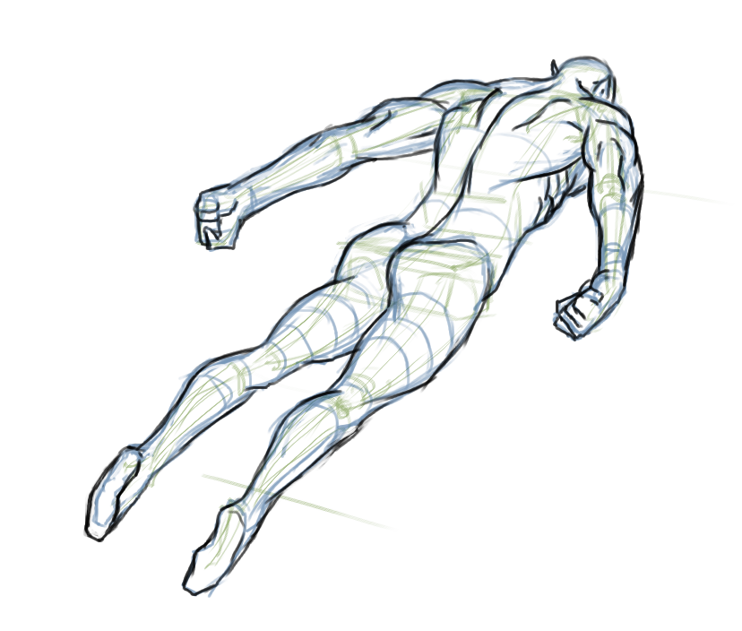
A line drawing from imagination:

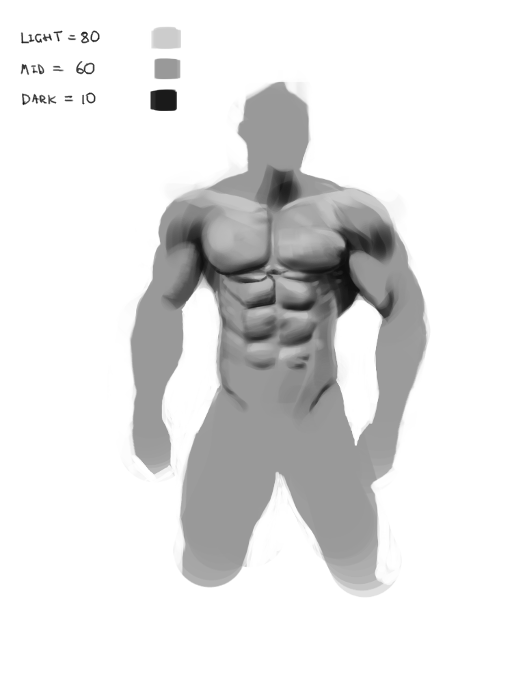
And a value study:

“Today, give a stranger one of your smiles. It might be the only sunshine he sees all day.” -- H. Jackson Brown Jr.
CD Sketchbook
Posts: 75
Threads: 3
Joined: Apr 2014
Reputation:
2
Your figure drawing is looking really good man, especially your foreshortened figure from imagination.May I ask which method you're studying for figure drawing (Loomis maybe)? It has a nice structure to it.
Posts: 150
Threads: 2
Joined: May 2016
Reputation:
11
Hey!!!,Here a couple of notes.
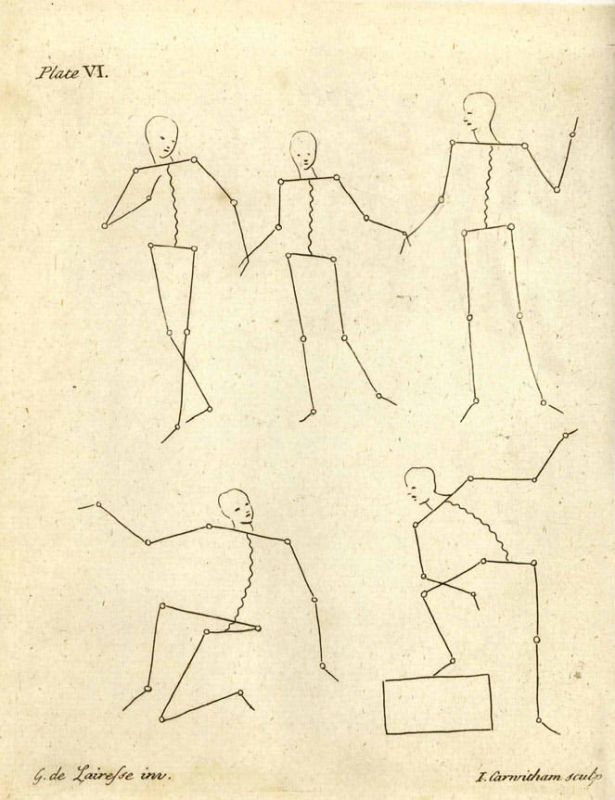
“The points are at the joints ... and that’s where the action is.”
Gerard de Lairesse a contemporary of Rembrandt, demonstrated how effective and efficienta stick figure could be in translating a figure’s action

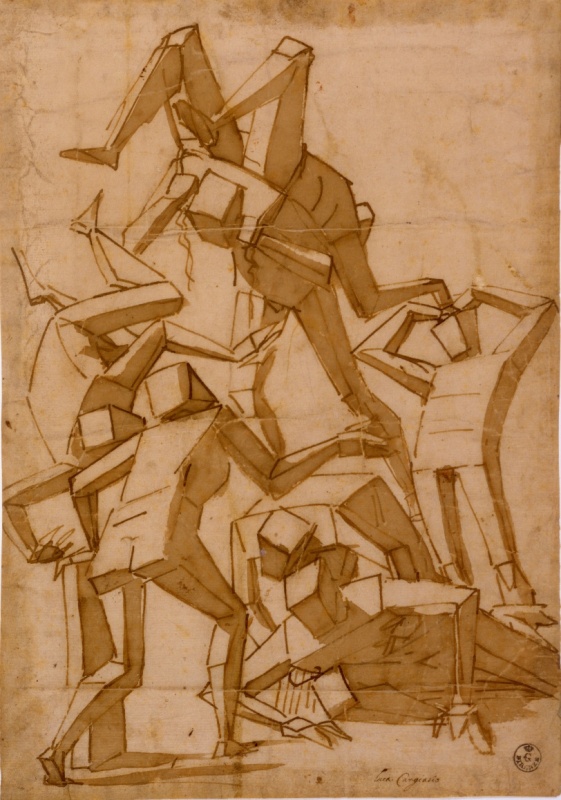
Luca Cambiaso Reducing the masses of the body into simple geometric solids and viewing them in different orientations.

Never doubt in study the masters. Keep going. ^^
'The best way to have a good ideas is to have a lot of ideas ' Linus Paulingth
Posts: 472
Threads: 7
Joined: Jun 2012
Reputation:
15
The newest drawing from imagination came out really strong! Great job on the fortshortening. The feet should have probably been bigger since their so much closer to us and the hold the weight of the body but considering how hard this pose is I'm very impressed.
Nice to see youre also developing your values!
Keep it up! It only goes up from here :D
Posts: 1,424
Threads: 12
Joined: Dec 2015
Reputation:
139
@The Lama: Thanks for the encouragement - I have studied Loomis in the past but I am now studying from Hampton. I also found Proko's YouTube videos on mannequin constructions very useful.
@Abnormal: Wow those are some great notes - strangely I have recently found myself being drawn to using stick figures to get my gesture and proportions right! Thanks!
@Zipfelzeus: Thanks for dropping by Zip :). You are on point with the feet - thanks for the tip-off!
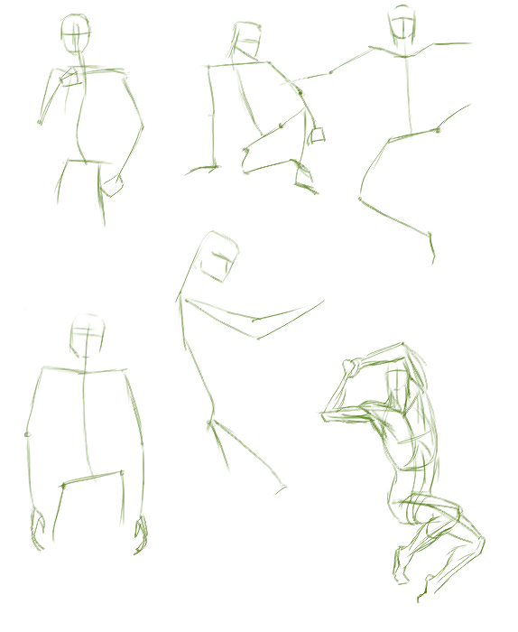
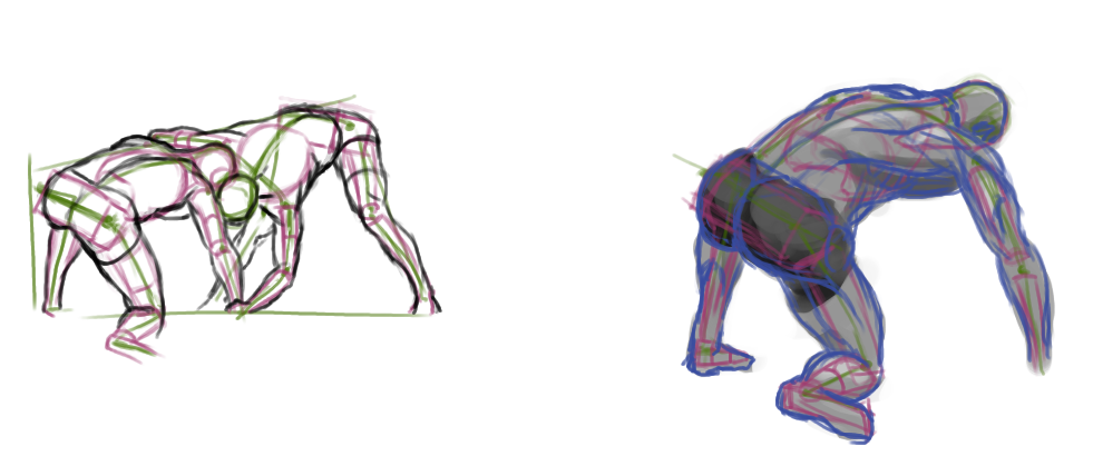
Spent a load of time gathering references tonight so just managed a few more figure sketches before bed (the green sketches are referenced):

“Today, give a stranger one of your smiles. It might be the only sunshine he sees all day.” -- H. Jackson Brown Jr.
CD Sketchbook
Posts: 1,424
Threads: 12
Joined: Dec 2015
Reputation:
139
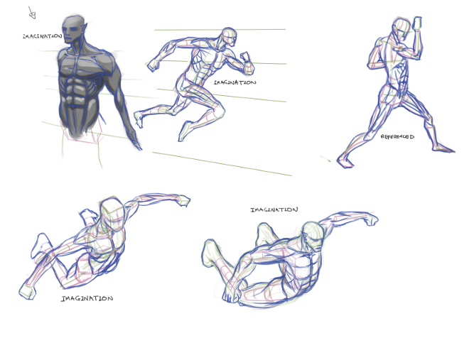
Trying to hyper focus on drawing figures (from reference):

A couple from imagination:

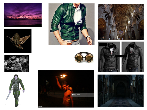
And making a start on this month's illustration - gonna join in the September Crucible with this one. Here's the moodboard for "Captain Mothstorm Leaping From A Ledge":

“Today, give a stranger one of your smiles. It might be the only sunshine he sees all day.” -- H. Jackson Brown Jr.
CD Sketchbook
Posts: 1,424
Threads: 12
Joined: Dec 2015
Reputation:
139
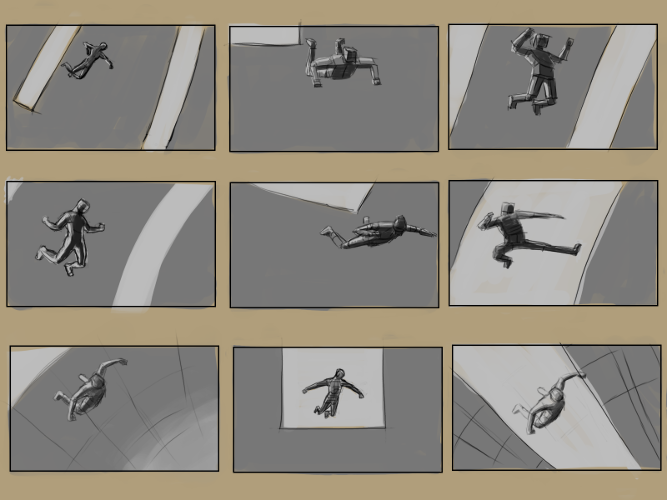
Tried some thumbnails for my illustration - I've never properly sat down to do thumbnailing before so I watched this FZD tutorial first:
https://www.youtube.com/watch?v=gsHD5GQ01og
It's all about idea generation! Quite good fun actually!

“Today, give a stranger one of your smiles. It might be the only sunshine he sees all day.” -- H. Jackson Brown Jr.
CD Sketchbook
Posts: 205
Threads: 4
Joined: Oct 2015
Reputation:
7
Artloader, your figures and anatonmy are improving a lot. Are you referencing wrestlers for the 4th pose from last?
Posts: 1,424
Threads: 12
Joined: Dec 2015
Reputation:
139
@DQ_Nick: Thank you my friend. You mean in post #190? Yeah Senegal wrestlers - brutal!
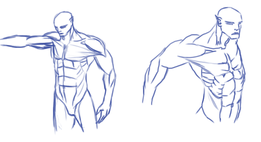
Some more figure sketches - I'm trying to decide on a workflow for figure sketching - I think I'm being too constructive at the moment so my imagination sketches are bit too stiff. I might try just winging it a bit more and being more gestural - my sketches come out a bit more natural looking when I do that.

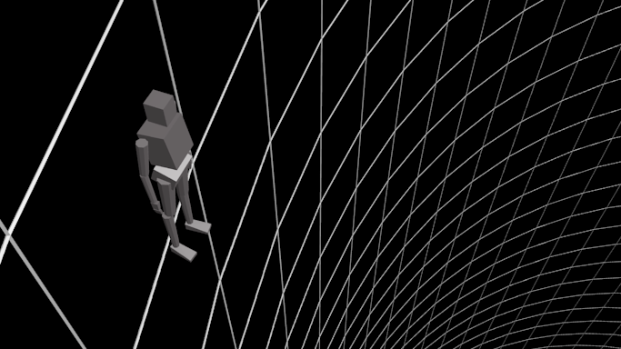
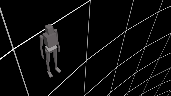
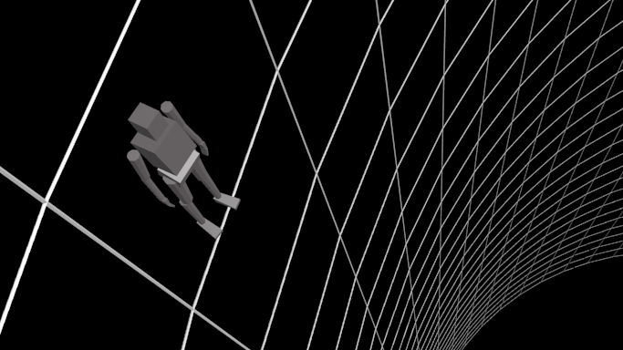
And some more work on my illustration - I've resorted to a rough 3D model in order to work out the perspective. Not quite sure which one is the best composition yet - any ideas anyone?


“Today, give a stranger one of your smiles. It might be the only sunshine he sees all day.” -- H. Jackson Brown Jr.
CD Sketchbook
Posts: 1,424
Threads: 12
Joined: Dec 2015
Reputation:
139
I think I'll go with this setup for my illustration now:
![[Image: attachment.php?aid=91101]](http://crimsondaggers.com/forum/attachment.php?aid=91101)
“Today, give a stranger one of your smiles. It might be the only sunshine he sees all day.” -- H. Jackson Brown Jr.
CD Sketchbook
Posts: 1,424
Threads: 12
Joined: Dec 2015
Reputation:
139
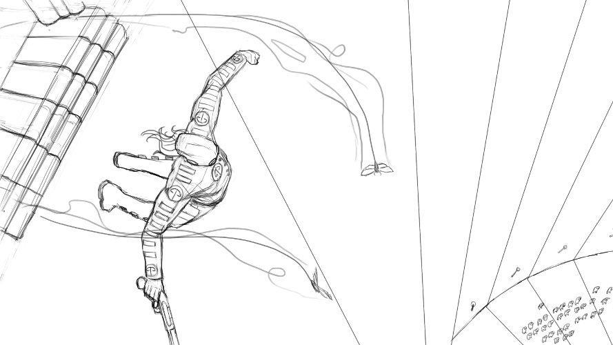
Put in a line drawing for my Captain Mothstorm illustration based on the last 3D scene. I'm trying to do this for CC September but not sure if I'll make the deadline :/.

“Today, give a stranger one of your smiles. It might be the only sunshine he sees all day.” -- H. Jackson Brown Jr.
CD Sketchbook
Posts: 530
Threads: 14
Joined: Dec 2015
Reputation:
51
Great work perspective grinding! As for the CC, al least you've got lineart and some basic comp.
I also feel bad about my CC, worked on another challenge.
Posts: 2,817
Threads: 15
Joined: Jun 2013
Reputation:
109
Hey bro bro, thanks for leaving a comment in my SB :)
I can see you're goin hard at it in here; that's good, really challenging things i see, it will only help even if it looks nowhere near where you want it.
I wanted to save you some time in life and point out a mistake you make
http://crimsondaggers.com/forum/attachme...?aid=90741
http://crimsondaggers.com/forum/attachme...?aid=90244
You draw heads kinda too small, so just make em bigger for a while, even if it looks funny at first
http://crimsondaggers.com/forum/attachme...?aid=91060
Like in the figure on the top left that is sprinting, look at how the neck is connecting to all those muscles, remember the whole neck and collarbone region is very round, first of all.
But look at some bald people's neck and the fatty lumps that appear when the neck is bent back
Just make note of the connection points is all I'm saying, like how the skull fits into the back
https://s-media-cache-ak0.pinimg.com/564...cd673e.jpg
https://s-media-cache-ak0.pinimg.com/564...60fb78.jpg
Took me a while to realize tbh
Srsly tho get Hogarthe's Dynamic anatomy; it's right up your alley, hell you might already have it and be workin from it; if so awesome, he's my fave <3
Posts: 1,424
Threads: 12
Joined: Dec 2015
Reputation:
139
@Neopatogen: Thanks - yeah I'm trying hard with perspective at the moment - I find doing a basic 3D model of the scene really helps and thanks for the kinds words on the CC September - I hope you have success with yours :).
@Fedodika: No worries my friend :) Thanks for dropping by here too and leaving some great pointers - appreciated. Yep I have been picked up on my small heads before so I need to do something about that. Also - the neck to head connection is a good call - referencing from real life should help here I guess - I need to do more of that. I don't have the Hogarth book yet - I'm currently studying from Hampton but will keep that one in mind - thanks.
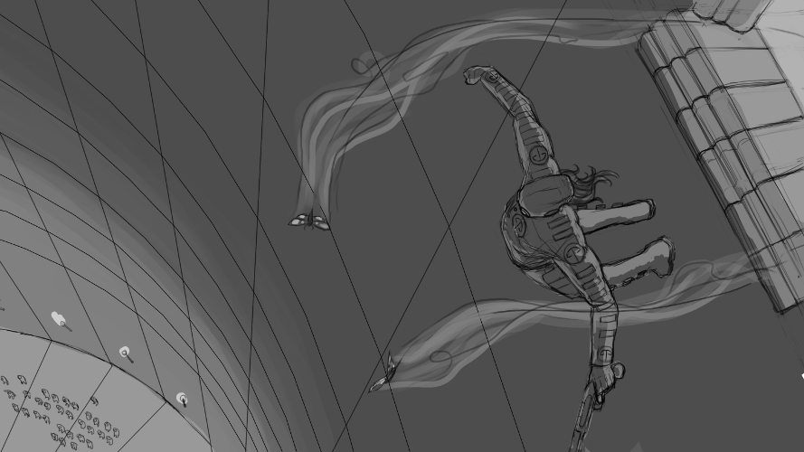
Put down some values for my illustration:

His suit is supposed to be quite dark so I was wondering about darkening the values on it a bit - not sure if that would work though?
“Today, give a stranger one of your smiles. It might be the only sunshine he sees all day.” -- H. Jackson Brown Jr.
CD Sketchbook
Posts: 75
Threads: 3
Joined: Apr 2014
Reputation:
2
Hey Artloader!
Your arts coming along great. I think darkening the suit values would work well since you have to light sources on either side of him. It would give you the opportunity to do some strong lighting and have some cool shadow shapes on this body. :)
Posts: 205
Threads: 4
Joined: Oct 2015
Reputation:
7
Artloader,
I think darkening the local values on Captain Mothstorm is a good idea. This would set a clear focal point on your figure, especially with contrast created by strong directional lighting from behind.
Another suggestion I have is to place more of the moths descending downwards towards the crowd, thus reinforcing the depth of the picture plane and adding some storytelling.
Smart use of 3D to get your shot established!
Posts: 1,424
Threads: 12
Joined: Dec 2015
Reputation:
139
@The Lama: Thanks mate :). I tried to go darker but I think I could push the suit darker still. Didn't get time to do some shadow shape experiments before the CC deadline but I will carry on with this piece afterwards.
@DQ_Nick: Awesome idea about the extra moths and story telling - thanks dude! I put a couple more in my submission to the CC but might end up putting even more in afterwards. Yeah I'd forgotten how to rig up a figure in Blender so had to swot up on that again!
Anyway here is my submission to the September CC - I will probably come back to it after the crits and take it further.
![[Image: attachment.php?aid=91293]](http://crimsondaggers.com/forum/attachment.php?aid=91293)
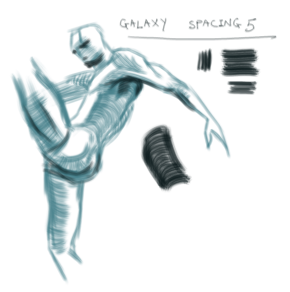
And here's a happy discovery I made in Gimp - found a great brush setting, inspired by watching one of Walent's Gumroads and also a Gumroad from Jama Jurabaev:

“Today, give a stranger one of your smiles. It might be the only sunshine he sees all day.” -- H. Jackson Brown Jr.
CD Sketchbook
|
