Posts: 1,424
Threads: 12
Joined: Dec 2015
Reputation:
139
@Fedodika: Yep, hopefully these tiny steps will add up to a great journey :).
@chubby_cat: You guessed right, I often end up surpassing my small task many times over and now I am starting to feel the momentum adding up :).
@HorseSaysQuack: Thanks for the tip and the kind words dude :). I've actually moved on from Gimp now, I tried Krita a few years ago but it was really slow on my old laptop so I bought Clip Studio Paint on sale and have been using that for a couple of years now.
Progress on my comicbook project, I wrote almost a whole page and have been doing a master study of a comicbook panel by the phenomenal Lewis Larosa:
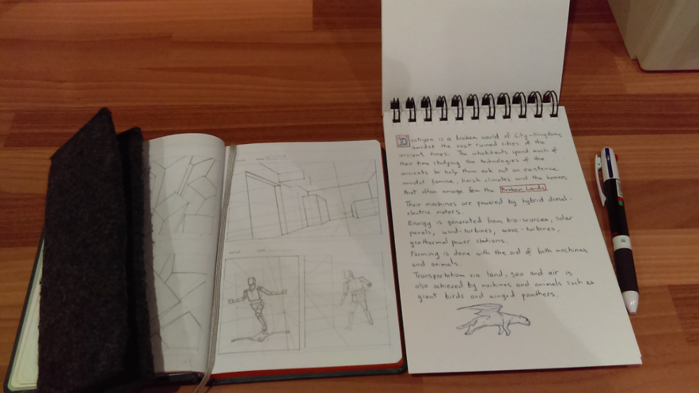
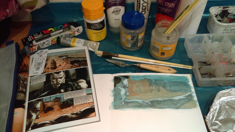
I'm aiming to make my comic in traditional media but not sure if it will work out so I will experiment.
“Today, give a stranger one of your smiles. It might be the only sunshine he sees all day.” -- H. Jackson Brown Jr.
CD Sketchbook
Posts: 42
Threads: 2
Joined: Jan 2020
Reputation:
8
wow impressive traditional works Artloader. I've drawn a lot with pencil/pen but have never touched traditional paints. Considering the time effort it takes me to paint stuff digitally I'm in awe of people who have the patience to get good at traditional painting which is probably 10x as hard.
Also a Clip studio user here. I honestly love this program compared to any others I've tried. It has all the tools that I need (and more), is not overly complicated, super customizable, fast, super cheap (compared to others), and has not crashed on me a single time.
I am also trying to slog my way through the Scott Robertson book (How to Render at the moment). I find the videos the most useful part. Trying to go through the book without video instruction is super dry and discouraging. If you are interested in rendering and have the funds I highly recommend Scott's old Gnomon dvds on rendering matte surfaces. He does it all with pencil and chalk but the principles are very clear and can be applied to any media. He definitely has more of a technical "industrial design" kind of focus and less illustration oriented but is still probably quite useful to any artist.
Keep up the great consistent work!
Posts: 1,424
Threads: 12
Joined: Dec 2015
Reputation:
139
@tchangchang: Thanks man, I love the painterly style of traditional media and I'm aiming for that with my digital art as well.
Also I love Clip Studio as well, I originally chose it for the extra comicbook features like word balloons and comicbook frames.
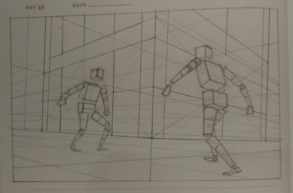
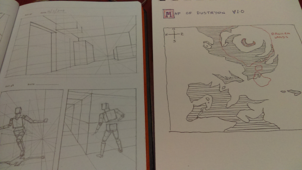
Anyway, I've been making slow but steady progress on my comicbook project, nothing much to show but some perspective drills and a world map:
“Today, give a stranger one of your smiles. It might be the only sunshine he sees all day.” -- H. Jackson Brown Jr.
CD Sketchbook
Posts: 1,424
Threads: 12
Joined: Dec 2015
Reputation:
139
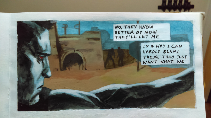
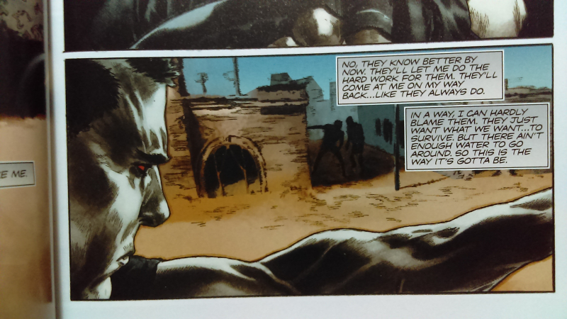
I'm still plodding along with my comicbook project but in the meantime I thought I'd do an experiment with making a comicbook panel in acrylics.
The results are a bit hit and miss. I'm pleased with how the acrylic paints worked out but when I tried to hand write the lettering using an acrylic ink marker, I found that my handwriting isn't up to it. I didn't even manage to fit all of the words into the boxes.
So now I'm thinking I will paint the panels in acrylics and then do the lettering digitally later on.
Any thoughts on making a comicbook using traditional paints would be much appreciated.
I've included a reference photo of the Lewis Larosa panel I used to study from as well (I'm aware my accuracy is really off here but feel free to chastise me about it anyway :) ).
“Today, give a stranger one of your smiles. It might be the only sunshine he sees all day.” -- H. Jackson Brown Jr.
CD Sketchbook
Posts: 2,817
Threads: 15
Joined: Jun 2013
Reputation:
109
I think, personally just IMO; that making something imaginative and as expansive as a comic book in traditional medium is a waste of time; itd be much faster and more efficient to do it digitally. Even from a learning perspective, Most of comic rendering is just fill shapes and paint buckets that take far longer to execute by hand; Plus digital has premade fonts, you can resize and reshape things on the fly. etc
You can learn the fundamentals of design and storyboarding all digitally doing these things, and save time since you dont have to fill in blocks of flat tone by hand and use the paint bucket tool
Traditional is extremely effective for learning fundamentals, but as far as a comic, just the volume of work and the type of work it is (which is highly repetitive, imaginative, and a need to be very limber) would be best done digitally
Posts: 671
Threads: 8
Joined: Feb 2016
Reputation:
113
(02-16-2020, 10:39 AM)Fedodika Wrote: I think, personally just IMO; that making something imaginative and as expansive as a comic book in traditional medium is a waste of time; itd be much faster and more efficient to do it digitally. Even from a learning perspective, Most of comic rendering is just fill shapes and paint buckets that take far longer to execute by hand; Plus digital has premade fonts, you can resize and reshape things on the fly. etc
You can learn the fundamentals of design and storyboarding all digitally doing these things, and save time since you dont have to fill in blocks of flat tone by hand and use the paint bucket tool
Traditional is extremely effective for learning fundamentals, but as far as a comic, just the volume of work and the type of work it is (which is highly repetitive, imaginative, and a need to be very limber) would be best done digitally
To be fair, I think making art in general is a waste of time! So I partially agree with Fedo!
It's true that a lot of mainstream comic book rendering got that paint bucket fill look to them (is it called "spot black"?). While Fedo's concerns are true for the majority of the sequential art that we see, it doesn't mean other methods/approaches are less effective.
![[Image: e206dec7-8975-4887-9b9b-917b19838449.jpg]](https://assets.catawiki.nl/assets/2018/2/20/e/2/0/e206dec7-8975-4887-9b9b-917b19838449.jpg)
*Gabrielle dell Otto (acrylics)
This series would read differently given the usual treatment of india ink and digital colouring. If this has the same script and dialogue, but executed in the usual fashion... imagine a Tim Burton movie but made by these production houses that white washes anime series.
I do agree with Fedo that it will be more productive/time efficient doing them digitally.. but the question would be, is it more effective in the way *you* tell the story?
If you are reading this, I most likely just gave you a crappy crit! What I'm basically trying to say is, don't give up!
----
IG: @thatpuddinhead
Posts: 2,817
Threads: 15
Joined: Jun 2013
Reputation:
109
I actually just remembered this video from an artist who spent 13 years doing a comic traditionally, could give some cool insights
https://www.youtube.com/watch?v=6BzCDVR-tr8
Posts: 1,424
Threads: 12
Joined: Dec 2015
Reputation:
139
@Fedodika: Good point dude, I agree with you about the efficiency of going digital, but at the same time I am torn because am am loving the process of traditional more and more. There's just something about using a real brush and real paint that makes me happy :). Also, thanks for posting that video, it gave me real food for thought. I will ponder ...
@John: I'm going for a painterly style, not sure if it will fit the subject matter so I will experiment. Thanks for pointing me at Gabriele dell Otto, I had not seen him before but I'm loving his work!
I dunno, maybe I will do the majority in digital and the cover pages traditionally.
“Today, give a stranger one of your smiles. It might be the only sunshine he sees all day.” -- H. Jackson Brown Jr.
CD Sketchbook
Posts: 2,817
Threads: 15
Joined: Jun 2013
Reputation:
109
You could always do things traditional that are more fun and engaging, then do the more mundane like filling in and corrections digitally :)
Posts: 369
Threads: 6
Joined: Sep 2019
Reputation:
23
Hi Artloader, is the question really traditional versus digital, or bucket fill versus painterly? - because you can do both digitally. Painterly is more dynamic (read: comics-like) when staying away from excessive realism - but realism has its pros too. Trying to understand what you are after.
Posts: 432
Threads: 70
Joined: Mar 2020
Reputation:
69
To add to Leo Ki's point, which art programs have you tried? In the last few pages I've only seen you mention GIMP and CSP. It seems that people who enjoy working traditionally often lean more toward ArtRage or Corel Painter than, say, Photoshop. CSP is sort of in-between, but I've seen people get surprisingly painterly results with it.
Still, there's a massive gulf between programs like those and working with physical materials in the real world, and they can never truly replicate the "look". You will probably just have to do a dozen or more fully rendered pages of your comic traditionally and seriously think about whether you can keep it up for 2000+ more.
Posts: 1,424
Threads: 12
Joined: Dec 2015
Reputation:
139
@Fedodika: Yeah doing corrections digitally sounds like a good idea.
@Leo Ki: For me the question is traditional vs digital as I enjoy using real brushes and real paint more than a stylus and tablet.
@Pubic Enemy: I've only really used Gimp, CSP and traditional acrylics. I will do a few trial runs and see how I go :).
Thanks for the input guys, appreciate it :).
“Today, give a stranger one of your smiles. It might be the only sunshine he sees all day.” -- H. Jackson Brown Jr.
CD Sketchbook
Posts: 1,424
Threads: 12
Joined: Dec 2015
Reputation:
139
A perspective drill:

“Today, give a stranger one of your smiles. It might be the only sunshine he sees all day.” -- H. Jackson Brown Jr.
CD Sketchbook
Posts: 1,109
Threads: 18
Joined: Apr 2014
Reputation:
68
Hey man! Great to see you're getting that comic book project going! I totally get you on the traditional vibe, it is a great sense of accomplishment when you can look at your work on a physical page! Just beware about juggling too many new/new-ish skills cause you can end up dropping all the balls! Divide and conquer seems to be the approach to learning art stuff. (you knew that anyway)
I have a new comic in process, I started out doing the whole thing traditionally in ink and watercolour, then I switched to just inking by hand and colouring digitally with hand painted texture overlays, now as the pages have mounted up I said screw it and do the whole thing in CSP and even now I get overwhelmed by the pile of pages left to do >.< That's just me though, I have trouble 'staying in the moment' and just focusing on the current page maybe...
I guess in the end it comes down to whether your goal is a traditional look, or enjoying the process of creating it traditionally. For my traditional pages, I ended up tightening things up in photoshop anyway so the original page now looks lacklustre compared to the final, I kind of don't like looking at it anymore ;-;
Anyway, just my thoughts, take with a pinch of salt! Here's a video from Jason Brubaker who has this awesome hybrid digital/traditional look to his comics:
https://www.youtube.com/watch?v=dHKg-zr-oxs
I think he inked it traditionally too, then added traditionally painted textures, so kind of all done 'traditionally' in a sense, just compiled in photoshop.
Posts: 1,424
Threads: 12
Joined: Dec 2015
Reputation:
139
Jyonny! Thanks for dropping by man :).
Yeah I'm going through a strange phase right now.
I recently had this idea that I should be savouring the Journey instead of focussing on the Destination.
Prioritising Process instead of Outcome.
Making art in order to enjoy the Process of making art.
What I'm going to say now is probably going to be completely the reverse of what most people would want to do ...
I'm thinking maybe I don't need to achieve any particular goals with my art. Instead, actually being in the Process of making art IS my goal.
To this end it doesn't matter to me if the creation of my comic is really slow, instead what matters is that I am able to pick up my brushes each day and enjoy making marks on a canvas. To answer your question my goal is not a traditional look but rather my goal is to make art traditionally.
Maybe I've lost the plot? I dunno but I am really enjoying painting at the moment and I believe it is down to focussing on Process instead of Outcome.
How do I focus on Process instead of Outcome?
By continually refining my process. Working out what kind of brushes I like to use. Trying out different techniques for making soft edges. Experimenting with different quality paints.
And when I find myself thinking about the outcome, I force myself to switch back to thinking about the next mark I am going to make and how can I make it better than the one I made before.
Does this sound nuts? Probably, but I am going to pursue this idea and see where it takes me.
By the way thanks for the Jason Brubaker link - fascinating stuff, that guy really knows how to use CSP!
Anyway thanks again for dropping by and it's great to see you back on here man :).
“Today, give a stranger one of your smiles. It might be the only sunshine he sees all day.” -- H. Jackson Brown Jr.
CD Sketchbook
Posts: 1,424
Threads: 12
Joined: Dec 2015
Reputation:
139
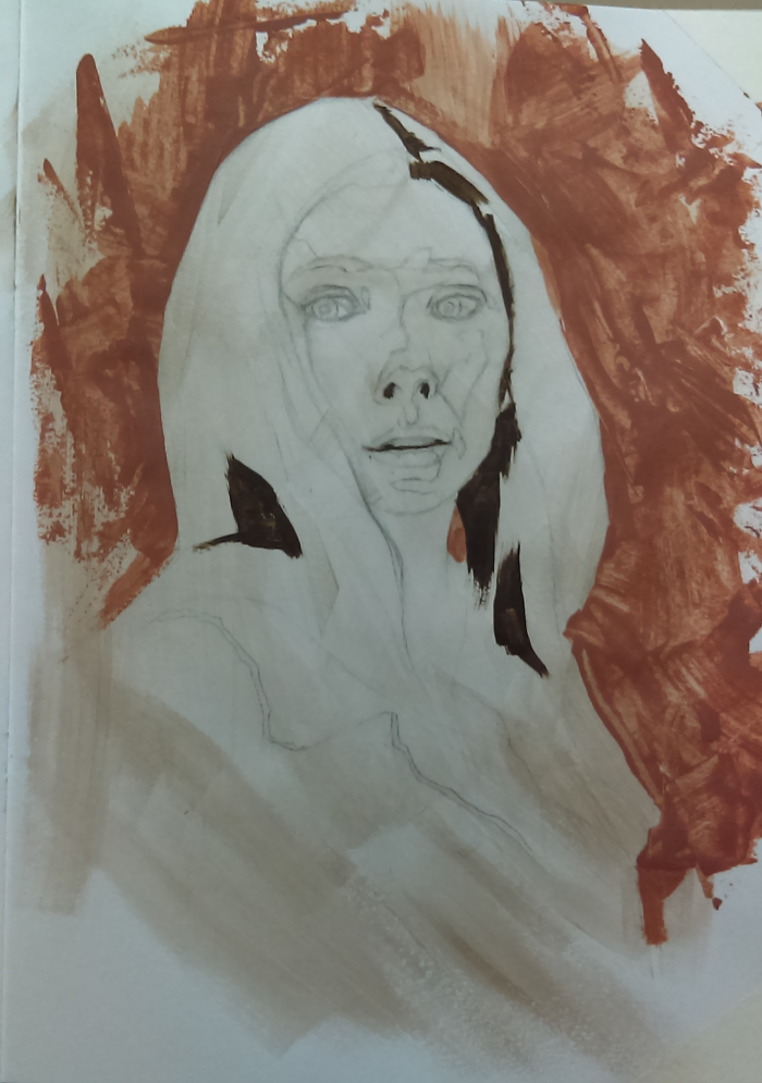
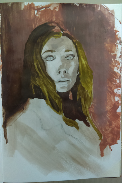
I watched a Greg Manchess video and tried to emulate how thoughtful and deliberate he is with each brush stroke:
https://www.youtube.com/watch?v=MPjZy9bx...dex=6&t=0s
Anyway here is an in progress shot - experimenting with mark making. I went to town with a palette knife - not sure I like the result :/. A lesson learned I guess.
On the other hand the I like the Manchess-style marks I made for the shadows.
Any feedback would be most welcome - thanks :).

“Today, give a stranger one of your smiles. It might be the only sunshine he sees all day.” -- H. Jackson Brown Jr.
CD Sketchbook
Posts: 2,817
Threads: 15
Joined: Jun 2013
Reputation:
109
Ive found when making abstract shapes on a painting, its best to like design them beforehand, even if they are really wild and spontaneous. For yours, like going down the right side of the canvas I wouldnt have done, maybe just a simple but stylish splotch behind the head to frame it in the composition. And like maybe drip from her shirt down and methodically try to make nice... drips? lol
The more you do it, the better you get, theres not much theory behind it, just gotta feel it and plan it right
As for the drawing, her forehead feels kinda small and nose too big, but idk i cant see the reference
Posts: 1,424
Threads: 12
Joined: Dec 2015
Reputation:
139
@Fedodika: Hey man - thanks for the feedback. Yep, you speak wisely about designing background shapes - I will try that on my next piece.
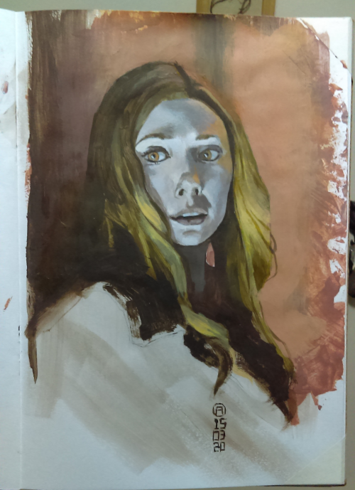
Here's the finished piece along with the reference.
I was a bit shocked at how far off the colour is on the photo I took of my painting when I looked at it side by side on the computer screen but I just checked and it is because I took the photo of my painting under a blue-ish light.
When I hold the physical painting up next to the computer screen, the skin-tone on the physical painting is nowhere near as blue as in the photo I took. Something to note for future reference - don't photograph my paintings under that dodgy blue light bulb.
Learned some stuff during this:
1. Use stiffer brushes and don't water down the paint as much.
2. Design each brush stroke - like Greg Manchess (and probably all other master painters).
3. Dry-brushing is a great technique for blending soft edges in acrylics. The paint dries faster as well which helps when trying to manage the colour-shift you get when acrylics dry.
4. Buying a good quality paint really helps you make a better painting. Some of the cheap paints I was using were really transparent and left the under layers showing through - frustrating!
5. Even if you want to make random brush strokes - you should design them to look random and not actually do them randomly.
Critiques welcome as always.


“Today, give a stranger one of your smiles. It might be the only sunshine he sees all day.” -- H. Jackson Brown Jr.
CD Sketchbook
Posts: 56
Threads: 0
Joined: Nov 2019
Reputation:
16
You probably already realise this and any moron can point out proportional issues but your, Proportions of the face are off. Her face features align to the thirds rule fairly well; hairline to brow, brow to bottom of nose, bottom of nose to bottom of chin are almost equal thirds. Measure yours, and see where you went off.
Structure and alignment of the eyes and nose are also not set using the anatomical landmarks of the skull in perspective. One example her right eye (our left) is higher than the other and seems to sit above where the socket should be. Most likely these issues could be helped at first by thinking a little more constructively when placing your base measuring landmarks. i.e. draw a shape for the entire brow and socket area simplified first, when that orientation and placement feels right then place the eyes. Similar problems happened with the end of the nose and her mouth where perspective and placement became skewed and sends her off to uncanny valley.
Attempting to see the larger structures underneath for a bit in your approach may help you with placement as well as just getting more rigorous with your measurement. Always check and re-check your first assumptive measurements if something seems off. Step away from the drawing regularly, or use a photo on your phone to see it small. It's amazing what errors one sees just from a few steps away every so often.
Posts: 1,424
Threads: 12
Joined: Dec 2015
Reputation:
139
Hey thanks man, I was aware of the proportional issues but completely blind to the mis-alignment of the eyes and nose (and mouth) until you just mentioned it!
Great tips on construction and measurement and re-checking.
I was pondering the virtues of checking and correcting a few weeks ago and although it is tedious, the rewards are worth it. I seldom get stuff right first time so taking the time to go back and correct will pay back in the end.
Sometimes when I draw it kinda feels like a geometry exercise instead of an artistic endeavour but I guess that's what it takes to create something with the correct proportions and alignment and that is reward enough for me. Bring on the geometry!
Thanks again dude :).
“Today, give a stranger one of your smiles. It might be the only sunshine he sees all day.” -- H. Jackson Brown Jr.
CD Sketchbook
|


![[Image: e206dec7-8975-4887-9b9b-917b19838449.jpg]](https://assets.catawiki.nl/assets/2018/2/20/e/2/0/e206dec7-8975-4887-9b9b-917b19838449.jpg)
