Posts: 1,109
Threads: 18
Joined: Apr 2014
Reputation:
68
I think things like not using undo or copy paste/transforming things are great training. Erasing and redrawing instead of undoing can see you end up with something better than before. So I commend you on your efforts, it's something I only started doing recently. For sure you still want to embrace those digital possibilities like you're doing.
It's an interesting exercise you're doing, recreating the whole page from memory, I'm sure there's tons of value in that. I do think that you might be able to increase the gains by having those peeks at the real page in between drawing sessions. Like how our short term/long term memory works, stuff goes into the short term and gets thrown out if it isn't re-used, if it's re-used at lengthening intervals it gets put in the long term. So what you're doing now, there will be a ton of stuff that you remember that will turn into more long term memories, but probably lots of little things you already forgot. If you check the page in between sessions, you can get some of those details back into your short term memory, then when you draw again you reinforce them once more and add to the long term stuff.
That's overly simplified of course, but hopefully you get my meaning? For quicker studies I'd say don't look, but since you're spending longer on it, I believe you could get more by looking. Just my opinion anyway, I'm interested to find out how it goes for you!
Posts: 181
Threads: 0
Joined: Oct 2017
Reputation:
41
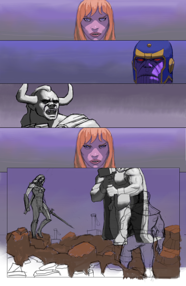
The memory study is looking good. It's a lot more saturated than the original, but I wouldn't call that a bad thing (unless you're striving for complete 100% accuracy... sometimes it's good to put your own flair on things too!).
To kinda echo what Jyonny said - trying to not use digital crutches is really good for training.
However, if you want to go down the comic path, these are going to be massive time saving features for you to embrace. Imo when colouring (especially for comics/comic style) layers are your friends. A lot of artists use layers and layer styles because they are so adjustable. It means you aren't locked into anything and you can really experiment and rein back in without having a massive headache on your hands. Experiment with your workflow and see what works for you :)
Posts: 1,424
Threads: 12
Joined: Dec 2015
Reputation:
139
@JyonnyNovice: Thanks for the tips on having another look at the original ref. to load up my short term memory - I tried that and it turns out I have a the memory span of a goldfish! My memory study looks nothing like the original! Oh well - I will persevere anyway as I feel it is good training for putting together a comic page. One thing I did gain from not looking at the original though is that it forced me to put my imagination muscles to use to fill in the gaps in my memory - I even had to do some research elsewhere - pretty much like any artist needs to do when they have gaps in their visual library I guess.
@chubby_cat: Thanks for the kind words and the thoughts - I think you are right - layers definitely give a massive advantage when working digitally - being able to adjust values, hues and saturation in such a controlled way should be a major advantage.
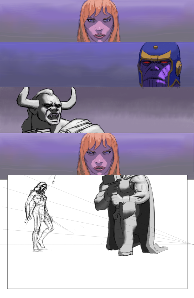
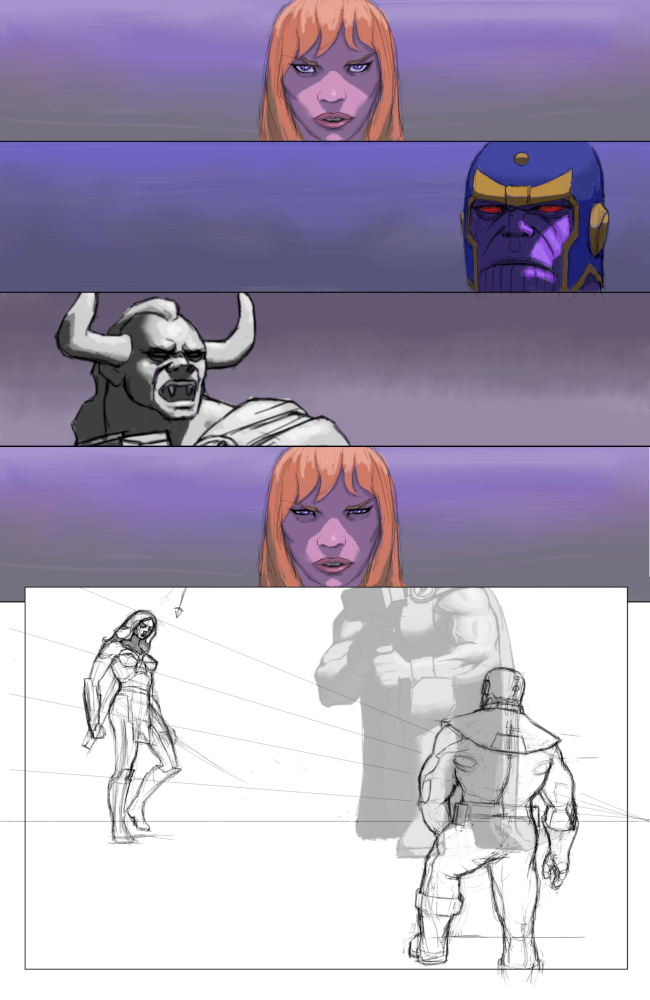
Slow progress on this study - cutting and pasting elements around like this gave me good practice at paying attention to perspective - for example making sure that the horizon-lines matched up etc ...
On the figure drawing of the warrior woman - I also played around with my construction process - usually I do a really detailed construction but this time I tried to do that in my head and only sketched in a few construction marks to begin with - to set the perspective and proportions and landmarks. I felt like this speeded up my process a bit but I'm not sure if it had a negative effect on the end result?

“Today, give a stranger one of your smiles. It might be the only sunshine he sees all day.” -- H. Jackson Brown Jr.
CD Sketchbook
Posts: 432
Threads: 70
Joined: Mar 2020
Reputation:
69
Regarding not doing the construction, I don't think it had a negative effect. You can always get things to look more correct with a full perspective construction, but it's at the cost of losing some expressive qualities (and usually time).
I think it's generally true (based on books and sketches/preliminary pieces I could find) that good imaginative artists start out with doing heavy construction for their pictures, and then gradually break away from it as they get more skilled, to the point that they only make quick scribbles before going all-in. So if you feel comfortable with breaking away from the heavy construction process now and then, it certainly wouldn't hurt. It's probably necessary to practice that if you eventually want to do less construction anyway.
Posts: 30
Threads: 0
Joined: Jan 2017
Reputation:
4
Hi I looked a little through your sketchbook and I really enjoyed your recent studies of rabbits. You really did well on blocking out the basic forms of them despite the dificult perspective! I also like the shading in your comic page! Especially on the faces of all characters and the muscles of Thor in the last panel. It's look very realistic already! :)
I think heavy construction lines are only really necessary in the beginning. Later on you can estimate a lot from all the practice and experience you got from doing them early on and then it's not necessary to draw lines for every picture anymore. So, if you feel confident about your lines, I see no problem leaving out a few to save time!
Keep up the great work! :)
Posts: 1,424
Threads: 12
Joined: Dec 2015
Reputation:
139
@Pubic Enemy: Thank you for the feedback - I think I will try your suggestion of experimenting with less construction for a while - although I will probably still try to do it in my head - just won't make the marks on paper.
@Kaiko: Thank you - I actually find the foreshortened angles easier to do since when I am faced with a flat image I struggle to make the piece look interesting (to me anyway). Also, I will try to leave out a few construction lines for a while and see how I get on.
Slow progress with this comic page study as I got distracted by forearms (more on that further below):

So I've been longing to be able to draw forearms properly for a while now and this comic page study highlighted how uncertain I felt when drawing the monster Thor's forearm.
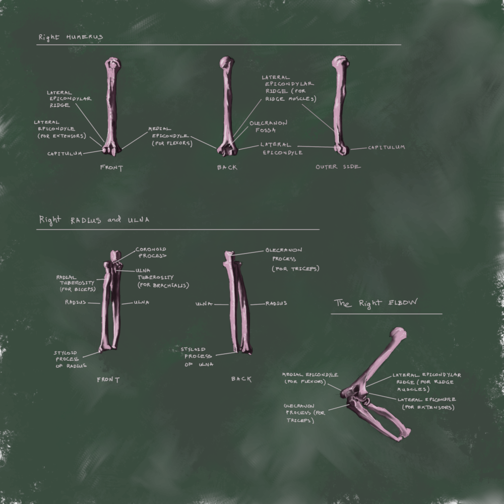
So I dug out my Stephen Rogers Peck book "Atlas of Human Anatomy for the Artist" and studied - my aim is to understand how the muscles and bone structure all connect together - origins and insertions:

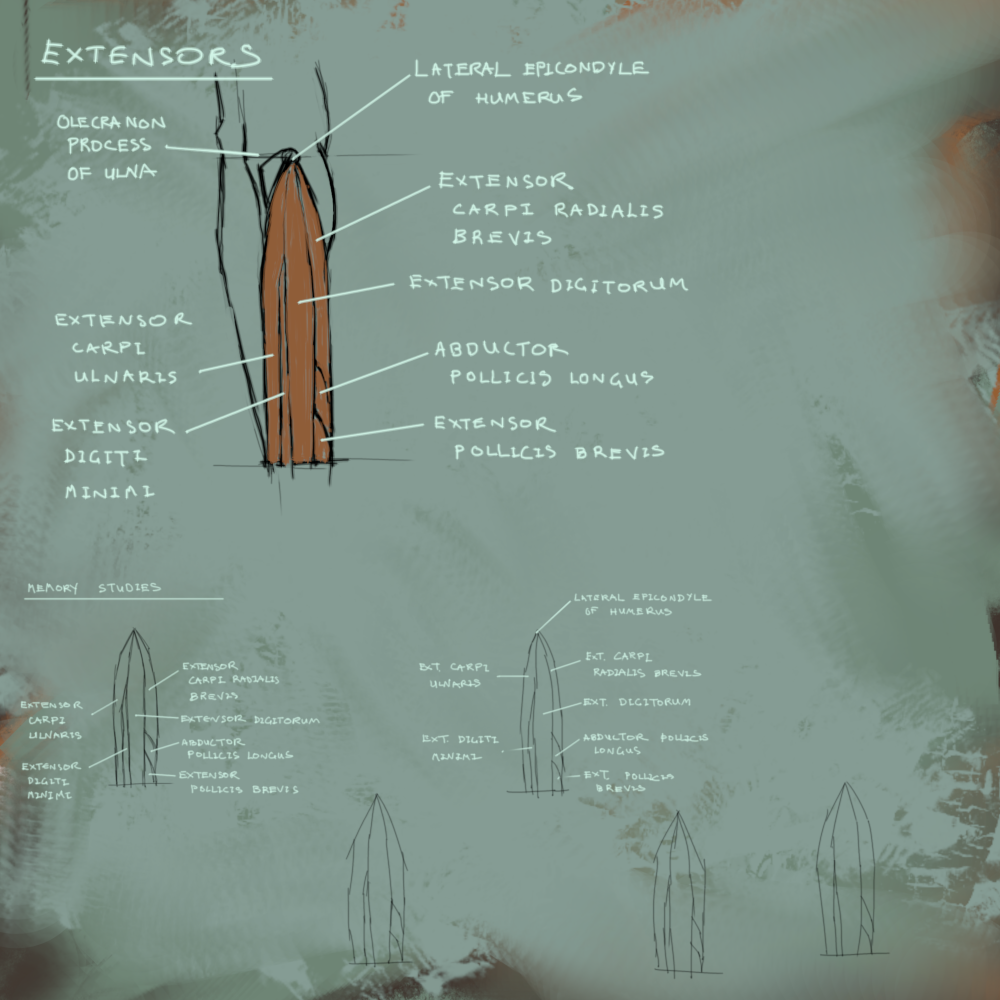
Here's me trying to memorize the extensor muscles from this Proko video (I found it useful where he simplified the extensor muscles into a bullet shape diagram - this helped me remember the relative configurations of the muscles better):

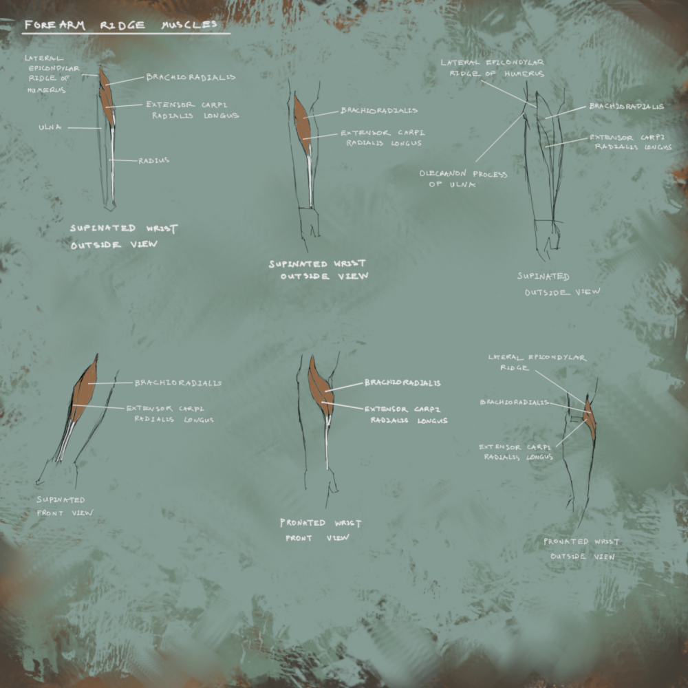
Trying to memorize the ridge muscles from Proko and from the Rogers Peck book:

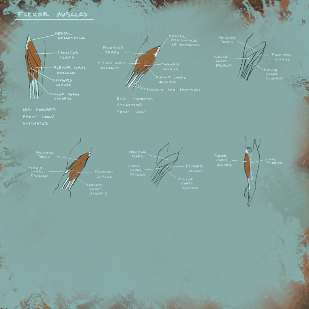
Trying to memorize the flexor muscles from Rogers Peck and some extra research on the internet (the free version of Proko does not go into detail for these as the individual muscles aren't as obvious on the surface as they are for the extensors):

Any hints and tips on forearms and/or on my study strategy would be most welcome - thanks!
“Today, give a stranger one of your smiles. It might be the only sunshine he sees all day.” -- H. Jackson Brown Jr.
CD Sketchbook
Posts: 1,424
Threads: 12
Joined: Dec 2015
Reputation:
139
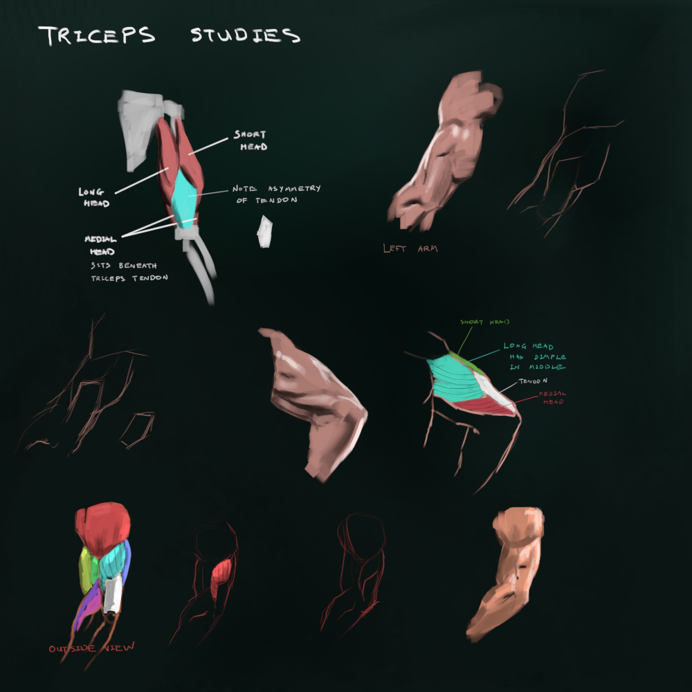
Some more anatomy studies - from Proko's free YouTube and then some photo references:

“Today, give a stranger one of your smiles. It might be the only sunshine he sees all day.” -- H. Jackson Brown Jr.
CD Sketchbook
Posts: 181
Threads: 0
Joined: Oct 2017
Reputation:
41
Nice studies! The arm (especially the upper arm) is definitely a tricky bit of anatomy to learn and get right, haha. Time to draw a million different arms now?? :) Not sure if you know about this or not, but this resource is good for photo references if you're short on refs: https://modelindexdatabase.smugmug.com/browse
They have lots of different body shapes and sizes too, which is always good to explore when doing studies.
Posts: 1,109
Threads: 18
Joined: Apr 2014
Reputation:
68
hey man! don't know if you know this tutorial from some years ago, it's a more 'high level' simplified view of the forearm but really help me with the beginning parts of a forearm drawing.
https://www.deviantart.com/funkymonkey19...-452348235
Posts: 1,424
Threads: 12
Joined: Dec 2015
Reputation:
139
@chubby_cat: Thank you for the kind words and the reference link - I spend so much time looking for references so any helpful links like this are always much appreciated :).
@JyonnyNovice: Yeah - that's a great way to simplify the forearm - so useful - I hadn't seen this before - thanks for sharing man!
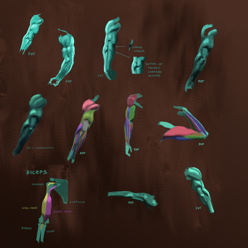
Been doing arm studies on and off over the past week - I feel myself falling into the trap of studying and not applying so have forced myself to do a few invented arms but probably not enough.

“Today, give a stranger one of your smiles. It might be the only sunshine he sees all day.” -- H. Jackson Brown Jr.
CD Sketchbook
Posts: 460
Threads: 10
Joined: Mar 2016
Reputation:
64
Your doing great! I dont really have any criticism on the last post, so I'm just gonna offer some words of encouragement! Keep up the good work and hope to see all your studies come together in a nice illustration at some point! :)
Posts: 1,424
Threads: 12
Joined: Dec 2015
Reputation:
139
@Zorrentos: Thanks dude! Encouragement is always appreciated along this journey :).
So I've been chipping away at this comic page study - I've kind of lost my way here a bit - what was my objective for studying this? We should always ensure we have clear objectives to our studying and I'm in danger of not having any at the moment!
I think from now on - I am going to form a habit of each time I do a study I will state the objective - just to make it crystal clear to myself otherwise my monkey-brain will lead me off into the jungle!
[study-objective = see what it takes to re-create an Esad Ribic comic book page]

“Today, give a stranger one of your smiles. It might be the only sunshine he sees all day.” -- H. Jackson Brown Jr.
CD Sketchbook
Posts: 460
Threads: 10
Joined: Mar 2016
Reputation:
64
When it comes to very ambitious studies like this (essentially studying a whole comic book page), we really need to break it down to the smallest possible components in order to get the most out of it.
I think that doing such a long study is a bit of a lost cause (This is just my opinion, others may disagree), I would rather read about the fundamentals and then do numerous, shorter studies in order to enhance my knowledge and understanding of the subject.
For comic book page studies, I would probably go this simple (NOT MY WORK):
https://cdna.artstation.com/p/assets/ima...1533157212
And then take A LOT of notes along the way as I go. Then I would apply it to my own work and create a comic book page of my own. I would also make sure to compliment my studies by reading the fundamentals such as this book:
https://www.amazon.com/Framed-Ink-Drawin...1933492953
This, I think, would be more beneficial if I wanted to become a better comic book artist.
Posts: 1,424
Threads: 12
Joined: Dec 2015
Reputation:
139
@Zorrentos: Hey thanks for the feedback dude - I think you're right - copying a whole painted comic book page like that is too much for one study. Breaking it down into components parts sounds like a smarter way to go. I already have Framed Ink - awesome book - I need to go back and study it again I reckon.
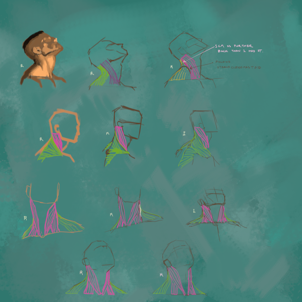
Anyway - I'm quite enjoying doing anatomy studies at the moment so I am making the most of the motivation while it lasts - here are some neck studies:
[study-objective = understand neck muscle configuration from different angles]

“Today, give a stranger one of your smiles. It might be the only sunshine he sees all day.” -- H. Jackson Brown Jr.
CD Sketchbook
Posts: 1,424
Threads: 12
Joined: Dec 2015
Reputation:
139
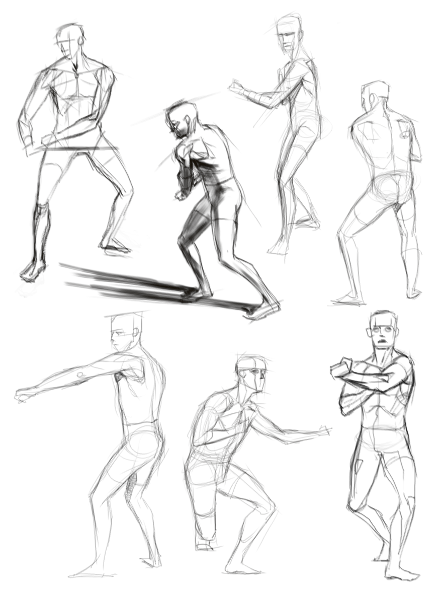
Taking a step back from detailed anatomy and doing some figure sketches.
[study-objective = to build my visual library and make my figure drawings more natural and realistic]

“Today, give a stranger one of your smiles. It might be the only sunshine he sees all day.” -- H. Jackson Brown Jr.
CD Sketchbook
Posts: 288
Threads: 8
Joined: Nov 2012
Reputation:
9
Great work. Are you doing applications of those studies?
Sometimes I feel like only doing studies from reference without then doing imaginative studies is a bit like learning creative writing by only reading. It definitely helps, but you gain a lot from immediately trying to recall what you learned.
I'm also trying to actively build some more community involvement in the challenges at the moment - seeing as you are doing figures, maybe the CHOW would be up your alley? Great way to apply those studies.
https://crimsondaggers.com/forum/thread-9138.html
Posts: 1,424
Threads: 12
Joined: Dec 2015
Reputation:
139
“Today, give a stranger one of your smiles. It might be the only sunshine he sees all day.” -- H. Jackson Brown Jr.
CD Sketchbook
Posts: 124
Threads: 2
Joined: Nov 2020
Reputation:
13
Nice to see a perspective grid in use in your last post , it's something I can be somewhat lazy about. Did you do any exploration sketches for kraken bloke - I think experimenting with the gesture and expressions can lead to a stronger end result, especially if you have an idea of what sort of emotion/presence you want your character to convey
Posts: 181
Threads: 0
Joined: Oct 2017
Reputation:
41
Those figure sketches in post #636 are *chefs kiss* The CHOW character is great too - I really like the octopus you picked for it.
Posts: 1,424
Threads: 12
Joined: Dec 2015
Reputation:
139
@Skeffin: Yeah - I'm not good enough to wing the perspective yet so I like to sketch them in - even when I'm just doing a figure drawing without an environment background. Also thanks for the crit about doing exploratory sketches - that would have definitely improved the pose on the Underwater Assassin - it looks a bit stiff now that I look at it.
@chubby_cat: Thanks! I'm glad I took the time to find the octopus reference - my tentacle drawings were so bad until I bothered to do that!
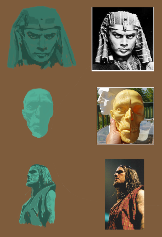
Anyway - I recently signed of for a Schoolism course: Digital Painting with Craig Mullins. I read somewhere a while back that one of the fastest ways to improve at something is to find yourself a good teacher and they don't come any better that Mr Mullins in my opinion.
The first lesson was about identifying light, shadow and half-tones. The things I learned from watching the video lessons were:
1. When rendering a flat shape - try to put in a diagonal variation in value and hue - makes it a lot more interesting.
2. When rendering light and shadow, you can have your light and shadow quite close together in value as long as there no variation in value within the shapes.
3. Near the terminator is where most of your texture and colour is. Use a texture brush and saturate your colours more here.
And the assignment was to do some studies of light, shadow and half-tones (I tried the low-contrast thing on the skull-head model):

“Today, give a stranger one of your smiles. It might be the only sunshine he sees all day.” -- H. Jackson Brown Jr.
CD Sketchbook
|


