12-21-2016, 11:44 PM
One small thing i might suggest is that upload your images at more higher resolution because right now its quite blurry, at the very least make the largest dimension 1200px. Ohh and nice studies
|
John's Thread (Used to be super active! Still the longest thread name ever in CD)
|
|
12-21-2016, 11:44 PM
One small thing i might suggest is that upload your images at more higher resolution because right now its quite blurry, at the very least make the largest dimension 1200px. Ohh and nice studies
12-25-2016, 03:12 AM
Hobitt - Make it bigger? Will do! Thanks!
--- Portrait study: 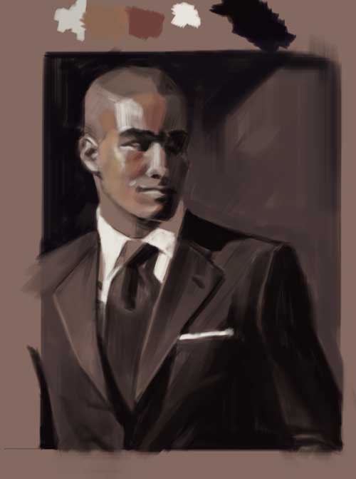 It's a value study and an incomplete color study... Maybe I'll finish this one day. Personal project stuff: Work in progress! And obligatory Christmas motif! 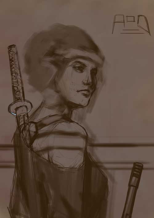 Happy holidays you guys!
If you are reading this, I most likely just gave you a crappy crit! What I'm basically trying to say is, don't give up!
---- IG: @thatpuddinhead
12-27-2016, 03:35 AM
No art exercises for the past couple of days.. Got to get back to it soon.
--- Personal: 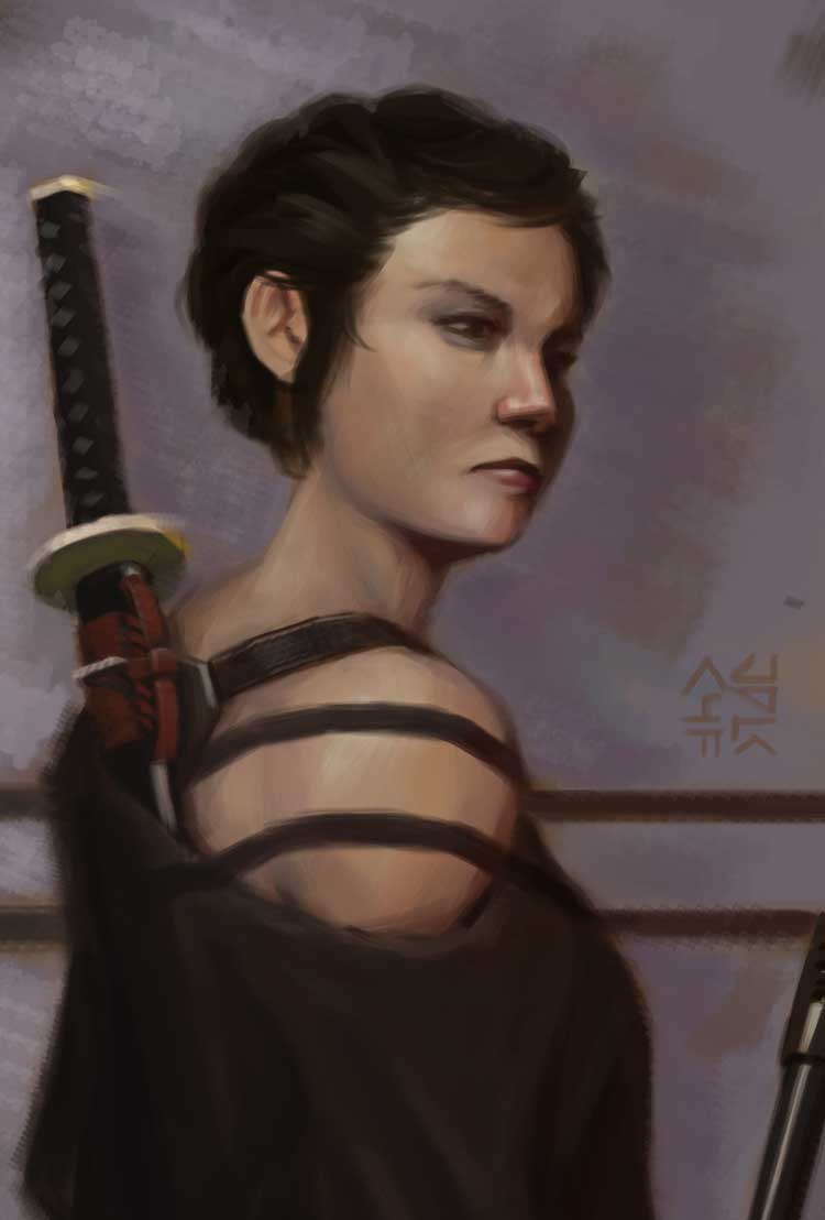
If you are reading this, I most likely just gave you a crappy crit! What I'm basically trying to say is, don't give up!
---- IG: @thatpuddinhead
12-27-2016, 09:27 AM
Aaahh nice last post! Love the colors you used. I kinda noticed that the mouth is a bit off so maybe do some seperate studies of that. But other than that very cool *.*
12-27-2016, 10:48 AM
Awesome studies John! That experiment with the cool pink neon lighting and the blue moon light in post #204 came out really nice :).
I like the way you're tweaking your process as well - always good to try new things mate. Keep it up my friend!
“Today, give a stranger one of your smiles. It might be the only sunshine he sees all day.” -- H. Jackson Brown Jr.
CD Sketchbook
01-01-2017, 06:54 AM
Hey man, You've got some really cool stuff going on here! You definitely seem to have a healthy work ethic which is the main thing imo if you want to get good.
Let's see if I can give you an useful crit! When you work on faces, I like your lines a lot, they are good to define the heads structurally, but they seem not to be translating well when you add values. I had that problem a lot, I used to draw faces and really like them, then try to paint them and they just wouldn't look like I thought they should when I considered the lines. I got to the conclusion that lines were kinda deceitful when it came to representing 3 dimensional stuff ( I know,duh ) so lately I've been just avoiding the careful lines and basically just changed the approach to making a few marks to define the overall structure and then working directly with values, that way I'm always seeing what I have, if that makes any sense, and i get to the result I want faster and easier. It also has the benefit of giving your work a more organic feel to it and avoid a bit of the "digital" look. I also noticed in some of your imagination work that you tend to go, sometimes, too dark with shadows in skintones, where they shouldnt be. Consider the sss qualities of the skin and also how reflective it is.There is usually something reflecting light on the skin. I'd recommend building the values gradually and avoid using a wide range of values from the get go. Like for example, try to paint a portrait with a very limited variation between the darkest and lightest values, then when you are done, expand the value range a bit, then again and again. I've found that's a nice way to get a feeling of the right variation of values in skin. About your last work, I'm really digging it! I have a thing for chicks with swords too haha. I agree with NoodleInBox about the mouth being a bit off, I also think that the nose is a bit weird looking right now and the neck is looking like it's completely straight but i think that's a trick of the hair on top of where the curve should be in the back of her head. I'm attaching a little thingy to kinda show what I mean. Also, this is more of an stylistic preference but i feel like the far cheeckbone is a bit too low and the brow ridge should be protruding out a bit more. I hope that helps. Keep up the great work man! ![[Image: linesover.jpg]](https://dl.dropboxusercontent.com/u/80326726/linesover.jpg)
01-04-2017, 12:25 AM
NoodleInBox - Nice catch Noodle. The perspective is terribly off. I made changes on the latest. Thanks!
Artloader - Oh Loader... always such a pleasant person. FabianSaravia - Good call on the skintones. And the hair. Well basically everything you've said. I'll remedy the hair because that's easier to translate. And ear, and a lot of things. And I agree, my rendering for skin still is a long way to go. Thanks! Thanks guys! ---- A very unproductive holiday season for me in terms of output. A lot of looking at stuff and color picking. A big booo on that part. Studied how moon light works with skin: 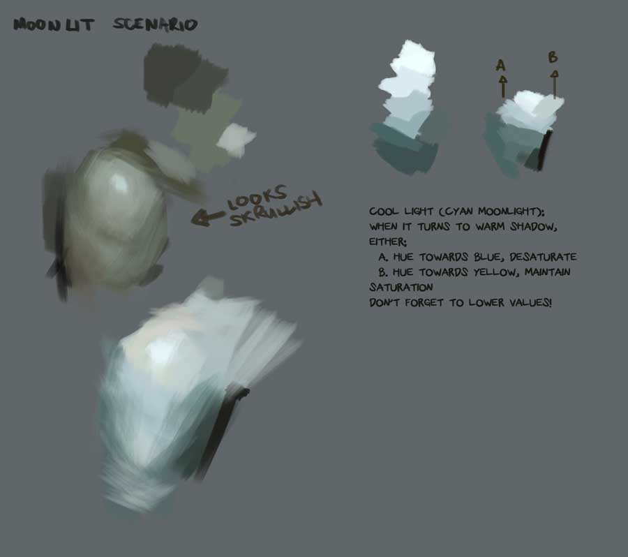 Studied Sargent: 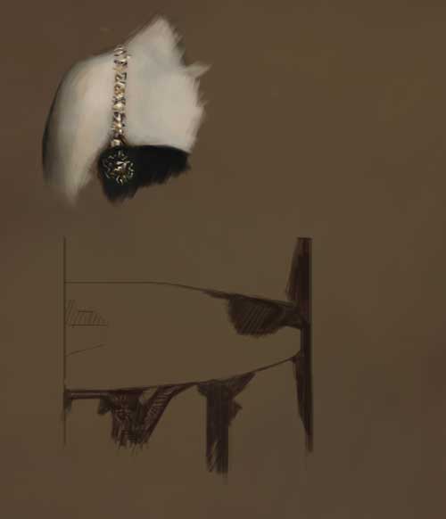 Unfinished Chowdown entry turned personal piece: 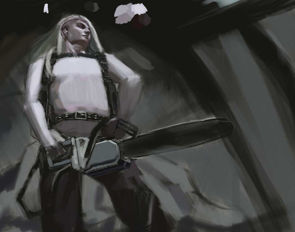 This is probably the dumbest thing I've done. A mash up of all my insecurities in one piece. 3 point perspective. Low angle view. Drawing men. With a night time scene.
If you are reading this, I most likely just gave you a crappy crit! What I'm basically trying to say is, don't give up!
---- IG: @thatpuddinhead
01-05-2017, 12:40 AM
The placement of the elbows looks incorrect ( more construction!), chainsaws angles feel off it also doesen't have any sense of weight,the face seems to be a bit skewed ( construction issue). If its a night scene then wahts the lightsource? if its the moon it needs to be weaker ( bigger fall off), if its local light needs even more fall off but also it will illuminate certain portions of the area ( im sure you used a flashlight in the dark so you know what i mean), maybe colours can use more variation and stuff like that altough i do like the mood of the piece so who knows.Overall its good that you draw things that are difficult for you, its the fastest way to improve!
01-05-2017, 06:21 AM
Did you brain fart the constuction on the arms? Face and body is mostly ok, so what happened with the very simple cylinders for the arms? Gotta ask yourself that, while hitting yourself in the face
01-06-2017, 04:54 PM
Don't give up on that last piece John. It has a few fundamental flaws, sure, but I see the potential for it to be something really cool
01-20-2017, 11:35 PM
Hobitt - I need more studies on night pieces. Thanks for this and the Discord critique.
Amit Dutta - That wasn't a brain fart you smelled. It's me shitting the bed :) DQ_Nick - Oh Nicky. Always so pleasant. Thanks! --- I've become complacent. I think I got significantly slower in terms of output.. Portrait study: 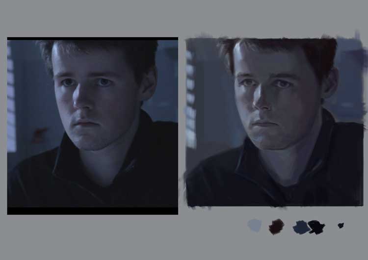.jpg) Personal piece (still work in progress): 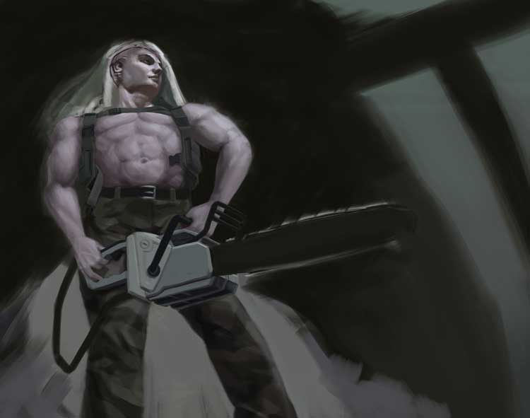 And a quick exhibit piece. It's one of our local comic book superhero IP's, I was lucky enough to get invited to do one. (Okay, I wasn't invited. I begged them to sneak me in...) Super rushed job. I got 2-3 days working on it. Ugh... again with my turtle like speed. 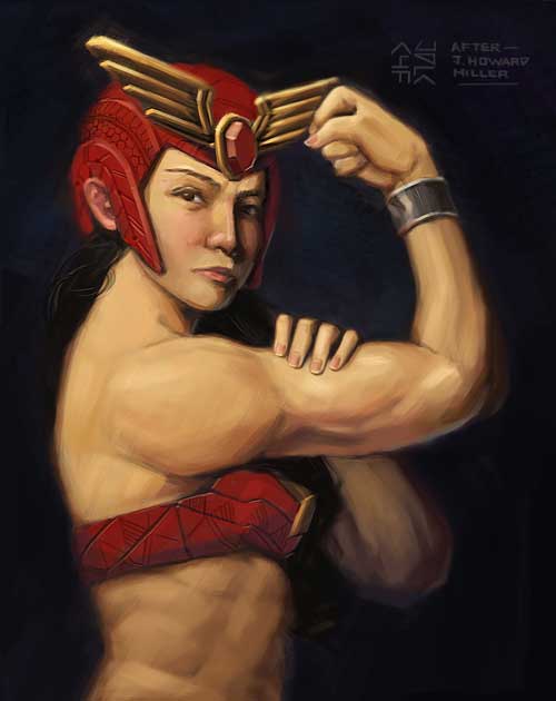
If you are reading this, I most likely just gave you a crappy crit! What I'm basically trying to say is, don't give up!
---- IG: @thatpuddinhead
01-29-2017, 08:44 PM
I'm calling this done. Too much time noodling.
Personal piece: 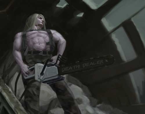 Portrait study: 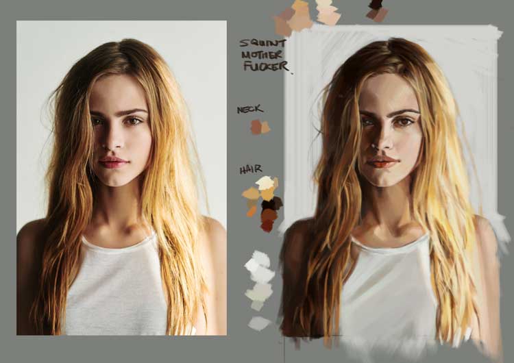
If you are reading this, I most likely just gave you a crappy crit! What I'm basically trying to say is, don't give up!
---- IG: @thatpuddinhead
02-12-2017, 05:41 PM
Long time no post!
Super busy working myself stupid hoping to get out of it so I can work myself stupid on art. After a long dry spell of knowing what projects to do, now I'm complaining about too little time to do them all! I have another piece that got shoved in the back burner because of this: Street Fighter Vs Darkstalkers! http://www.udonentertainment.com/blog/ne...rs-fan-art I love comic books. I love both franchises. I know this goes against the mentality of not wasting time promoting other people's IP if you're not going to get paid for it. But, what can I say? I am a slave to commercial work!  I'll update once I get this done. And on that note, back to my cave I go!
If you are reading this, I most likely just gave you a crappy crit! What I'm basically trying to say is, don't give up!
---- IG: @thatpuddinhead
02-14-2017, 09:02 AM
I love that you love the art you do John! There's no better reason to do it :).
Can't wait to see where this one goes - good luck my man!
“Today, give a stranger one of your smiles. It might be the only sunshine he sees all day.” -- H. Jackson Brown Jr.
CD Sketchbook
02-19-2017, 08:53 PM
There's a mentality against doing fanart? that's weird imo.
One of the main reasons I do art is because I love being able to express my love for media that I enjoy lol, plus if the painting was enjoyable who the hell cares.(plus as we've seen before in the case of people like Dave Rapoza fan art can actually help you get your name out there). Anyway short ramble aside nice work dude, you are uploading these way to small though, if you're worried about the file size being too big you can always throw them quickly through tinypng https://tinypng.com/
02-21-2017, 01:42 AM
Artloader - Well.. I could think of a million reasons ($) But, who are we kidding! On a serious note. Probably for the most of us, having time to draw is a good reason in and of itself. I do lose sight of that from time to time. Thanks Loader.
Triggerpigking - I understand it is weird having a Marxist sense of the world going into art. It's weird because I know almost nobody gets into the game with the notion of getting filthy rich out of painting the silliest of things. The desire to draw, in some sense, is rooted from being a fan of something that inspired the person to do art in the first place. But, economically, probably not the best way to gain money. It is lucrative. We see a lot of people do fan art for a living. But it's nowhere near the money of someone who owns, say, the Teenage Mutant Ninja Turtle franchise! And as much as I like drawing, I also like money. Jeez. I do sound like a materialistic boob. (I wonder how much I value one over the other.) Haha! Thanks for the link Trigger! I'll play with the compressor! ---- Maybe minor color touch ups and I'm sending this off to the submission page: 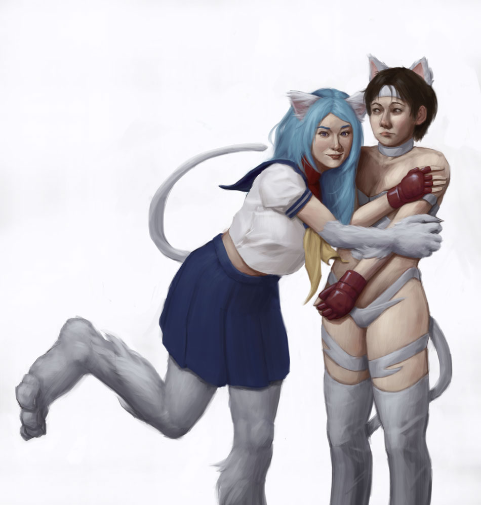
If you are reading this, I most likely just gave you a crappy crit! What I'm basically trying to say is, don't give up!
---- IG: @thatpuddinhead
02-21-2017, 08:48 AM
I love that Street Fighter x Darkstalkers piece! Well done on the expressions! Bonnie Hood vs. Chun-Li would of been my piece.
In the discussion on fanart, I'm one of those people who likes pulling characters out of my mind onto my sketchbook. Sure, its cool to see how my style affects other characters but I don't see the payoff honestly. It's kind of disheartening to know that fanart plays a major factor on getting popularity and traction on social media but... what can you do.
02-25-2017, 11:37 PM
AfricanVoodoo - Dude you still got a few more days to do it! I believe the deadline is before March 1. Awesome choices! But those two seem tedious to draw. BB Hood need guns, which I am having a hard time to draw, and Chun li's anatomy is really hard to pull off. It's hard to pull off doing those thick thighs while not making it too muscular, masculine, or just plain awkward.
I like Felicia because I can cover those features I am not so comfortable with either her fur or long locks of hair! About fan art and popularity. I agree with what you said. It is disheartening on multiple levels. I can't get myself to verbalize them all, but one things for sure. There's an over saturation of fan art going on everywhere. Or just maybe, I've been following a lot of people who do fan art! Hey man, looking forward to those ideas gaining legs! Triggerpigking - tinypng is awesome! Bookmarked and totally using it from now on. Thanks! ------ Portrait study: 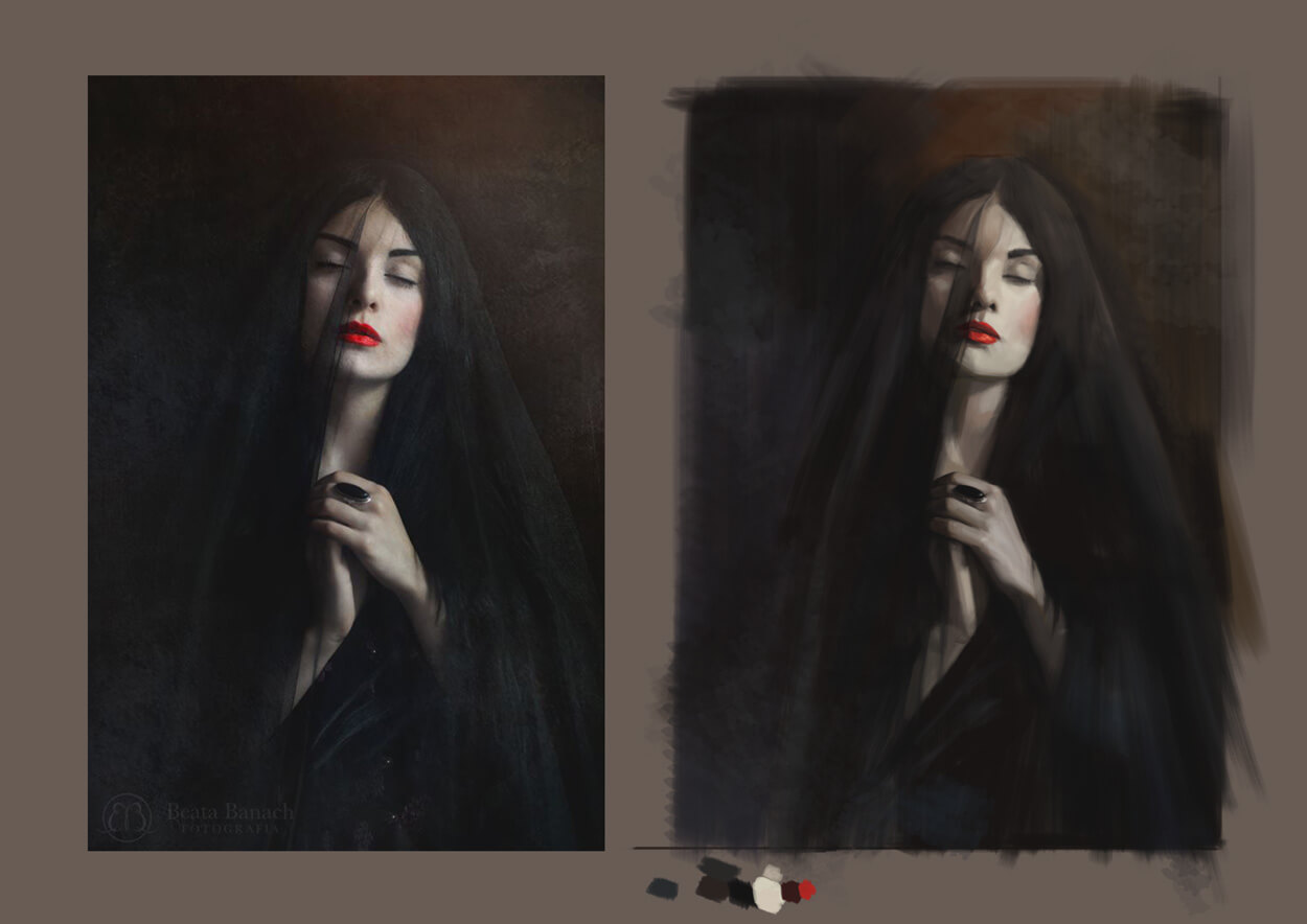 Time to touch up some old work and proceed to another piece.
If you are reading this, I most likely just gave you a crappy crit! What I'm basically trying to say is, don't give up!
---- IG: @thatpuddinhead
03-05-2017, 12:17 AM
I come to believe I always botch the hands. I always have a hard time doing them elegantly, as I find myself often noodling around. I adore how Karla Ortiz pull them off like it's nothing. I'm looking at how Sargent does his hands. I love how he sums his strokes up to a bare minimum. But regardless, I think I need to broaden my perspective on this..
---- Smoke and hand painting study: 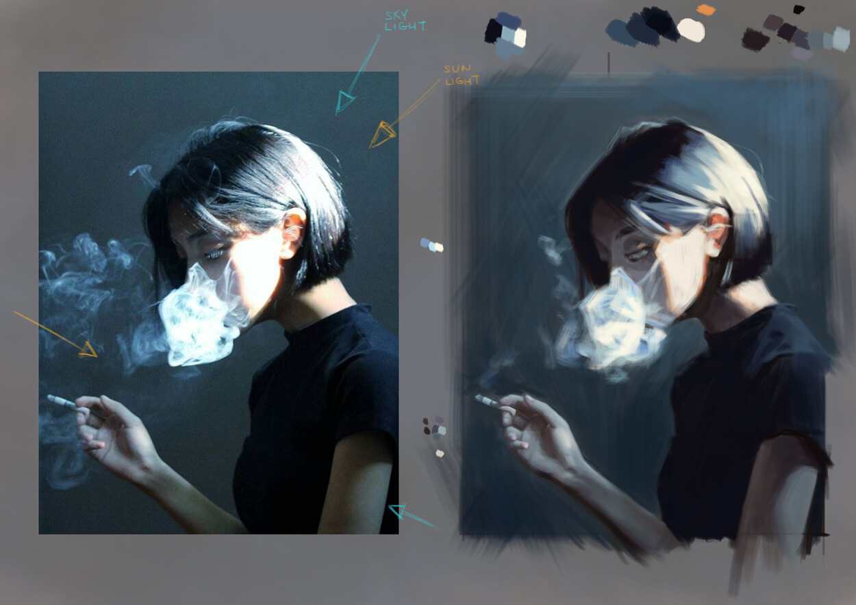 Garment/Material study: 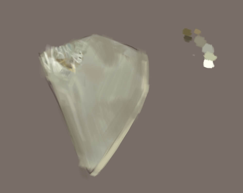
If you are reading this, I most likely just gave you a crappy crit! What I'm basically trying to say is, don't give up!
---- IG: @thatpuddinhead
03-15-2017, 01:58 AM
Personal:
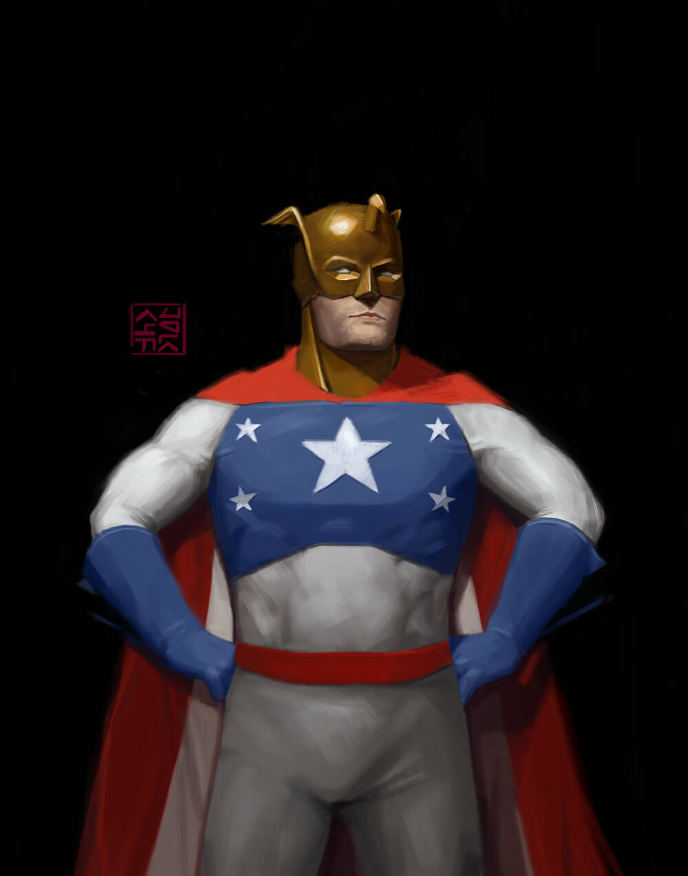 I will be doing Zorn studies. I've been putting off backgrounds for the longest time.. I'll probably be focusing a bit on that on top of the portrait stuff.
If you are reading this, I most likely just gave you a crappy crit! What I'm basically trying to say is, don't give up!
---- IG: @thatpuddinhead |
|
« Next Oldest | Next Newest »
|