Posts: 48
Threads: 2
Joined: Jul 2017
Reputation:
6
Hey everyone, sorry It's been a while since I've posted, mostly due to not having anything worthwhile to show. This past month I've focused mainly on traditional drawing, studying photos, creating my own designs, and practicing perspective forms. I feel like these are my weakest areas compared to color and lighting.
It's been almost 4 years since I started to take art seriously and looking at my work now, I'm disappointed with my lack of progress. On the other hand, I've only been applying deliberate practice for half a year, and within that time frame, I think I've improved a bit. At which rate, I'm hoping to be at a professional level within the next year or two.
I also bought into the iPad hype from other artists and got the latest iPad pro with Procreate, it's fantastic. But painting on it feels twice as slow compared to my desktop, at least it's great for reading and the occasional doodle.
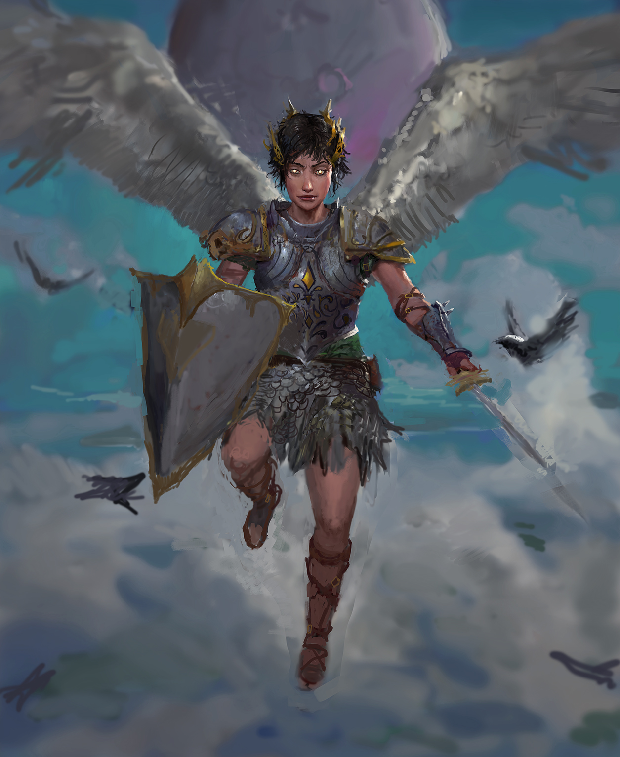
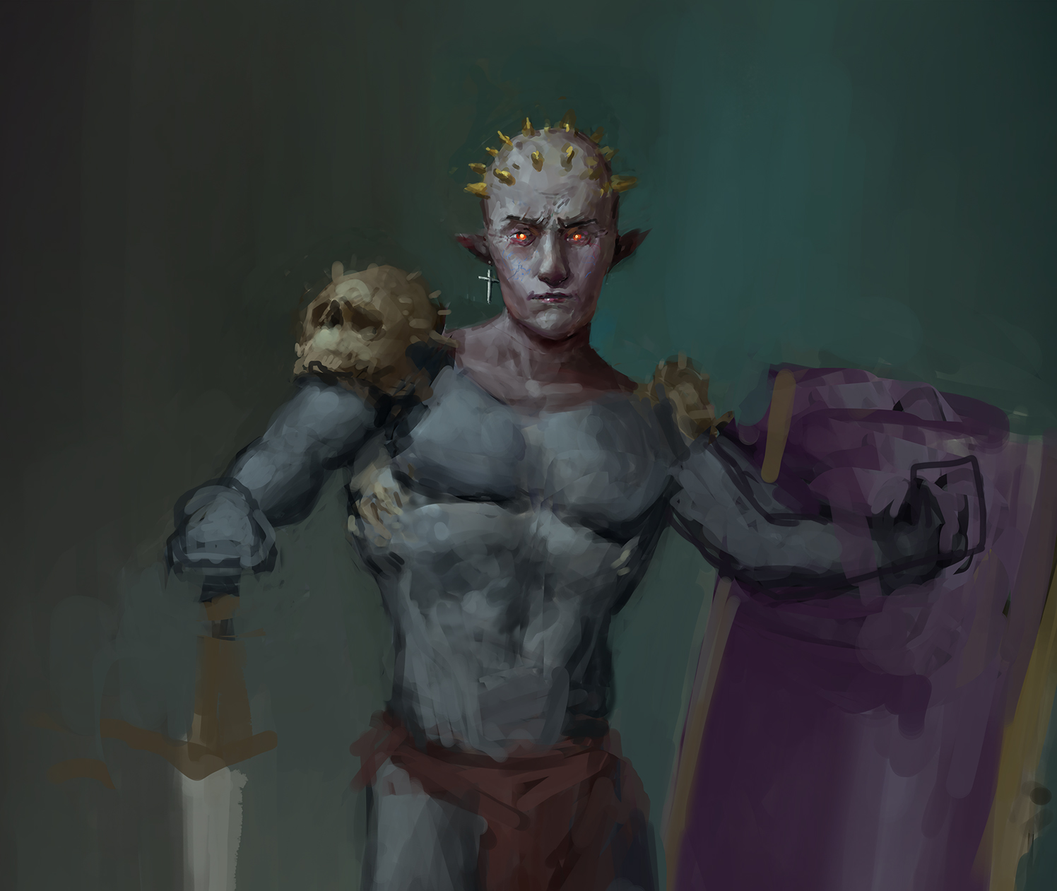
Here's a WIP I've been dabbling with on the side. It's giving me a lot of headaches and frustration, which is great. But it's not half done yet, my last painting felt too rushed toward the end, so I'm taking my time with this one.
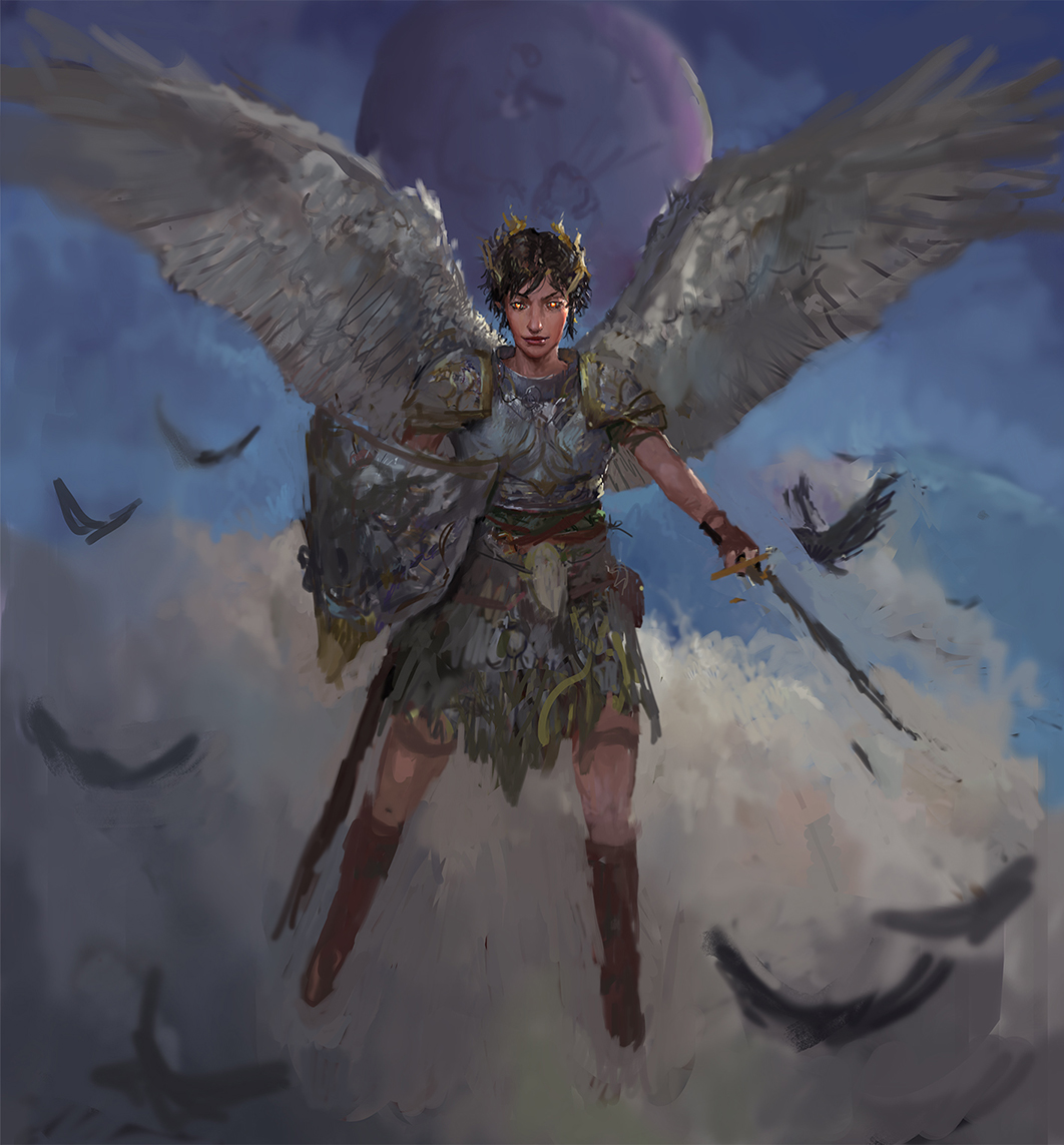 Here's the GIF process
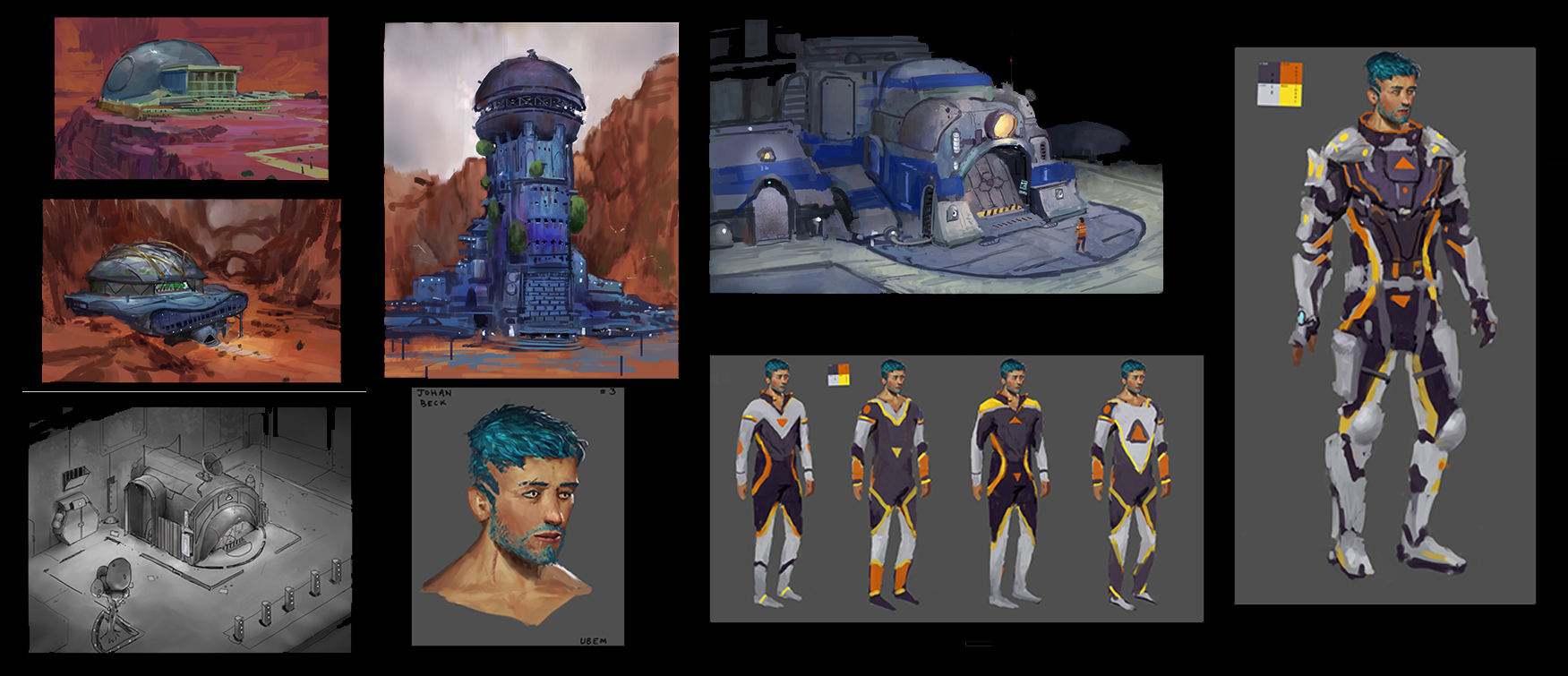
Here's ugly concept art for a sci-fi game I did with an indie team. My visual library and design sense is pretty undeveloped, and I'm struggling with figuring out how to improve in that area.
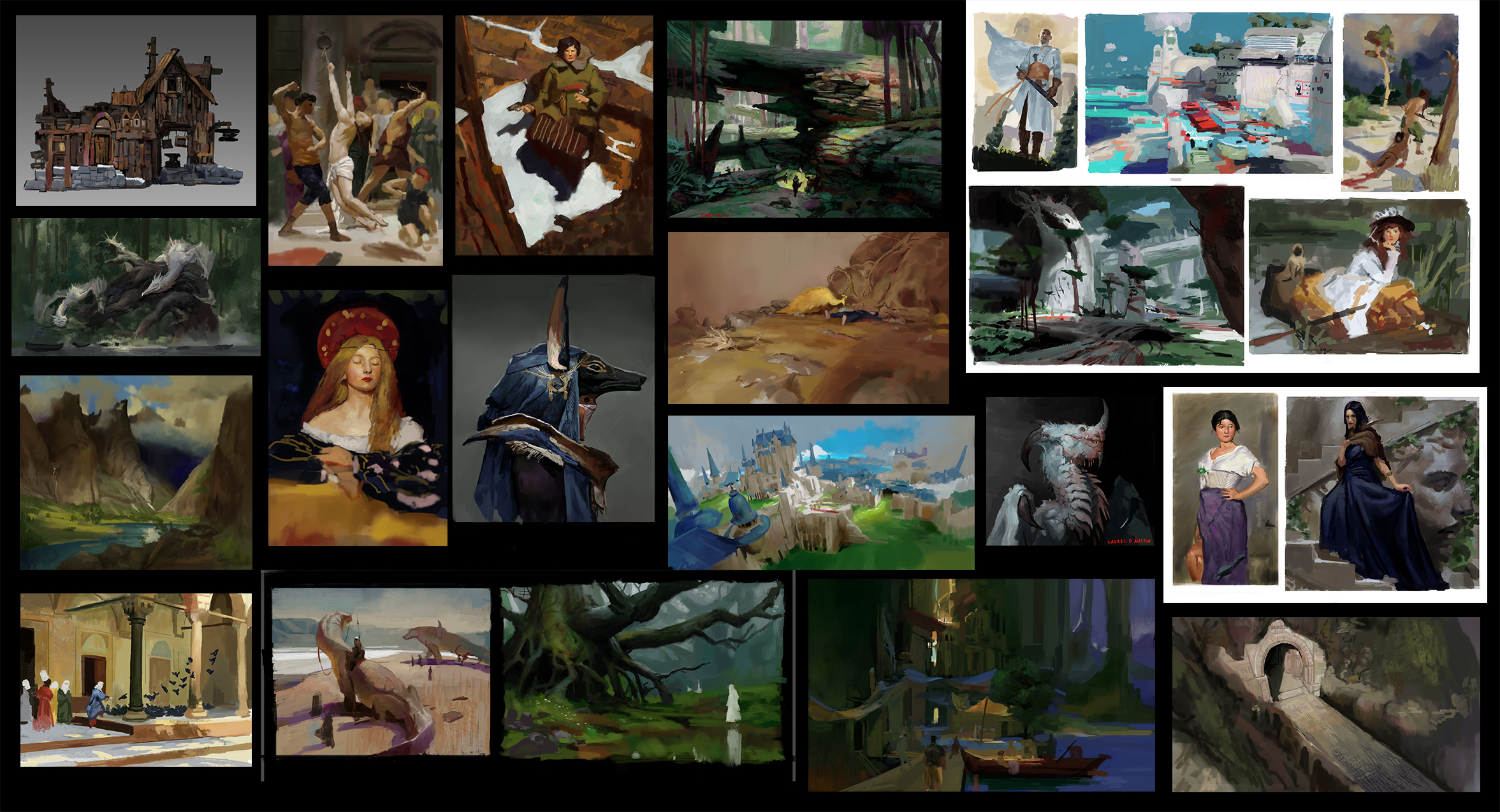
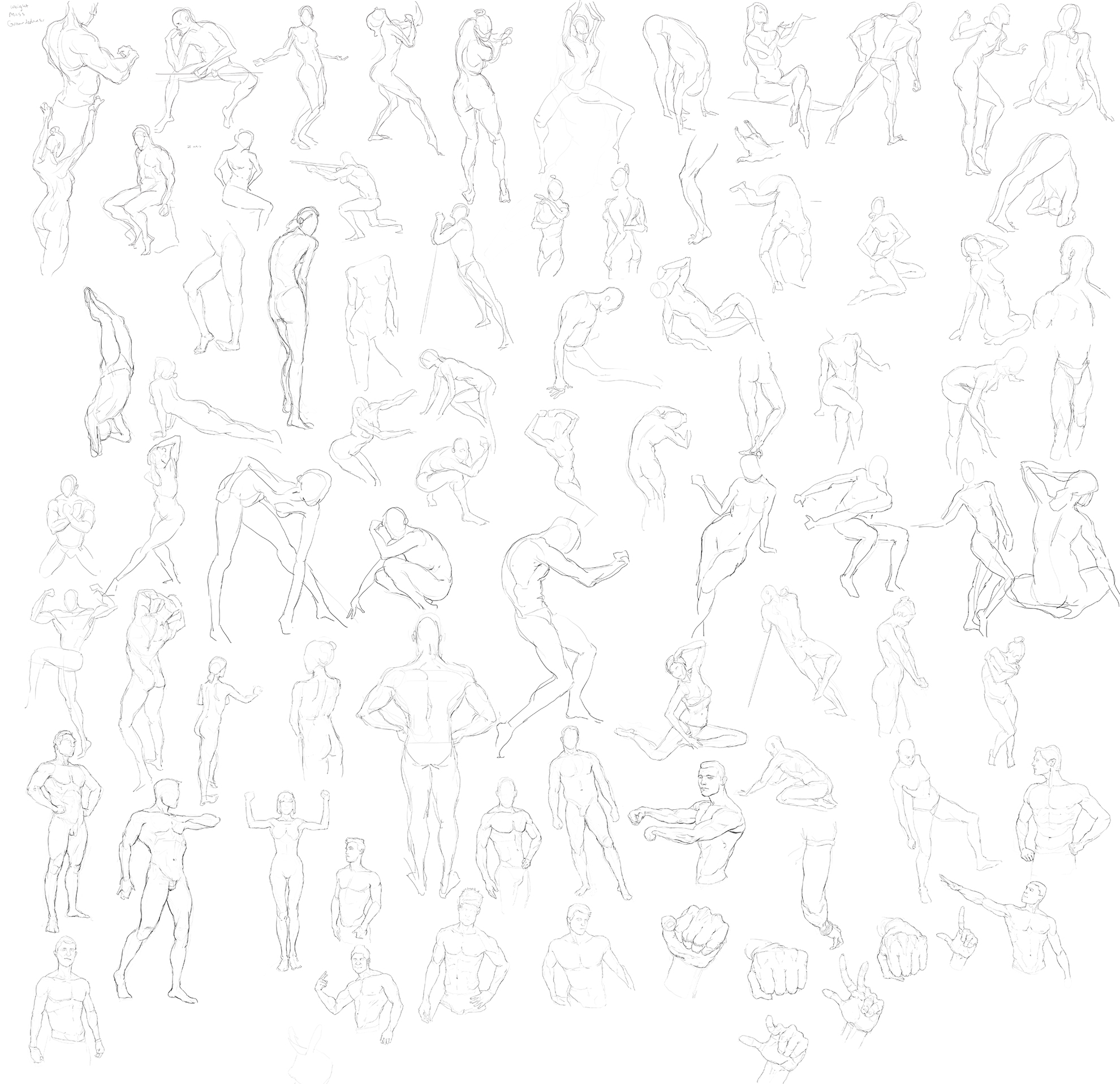
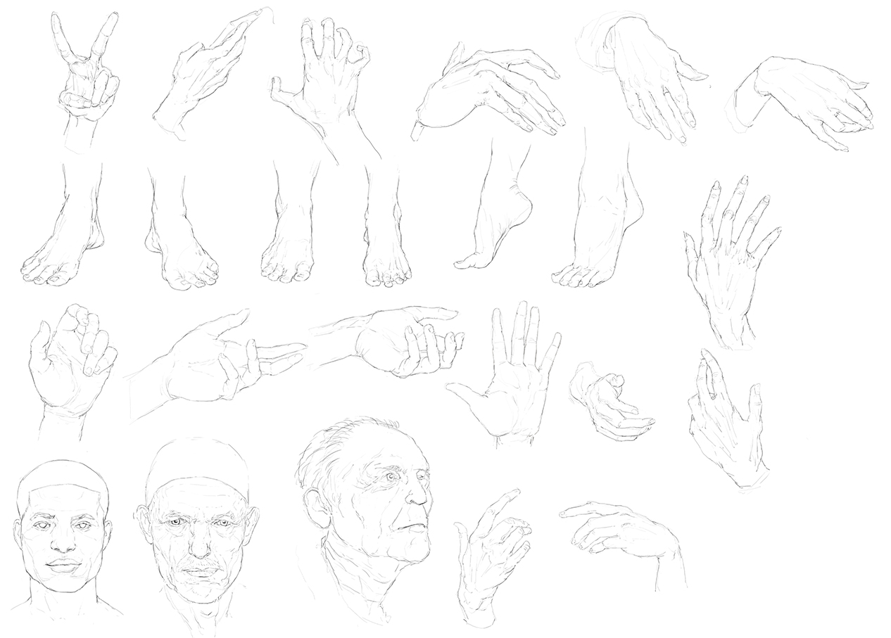
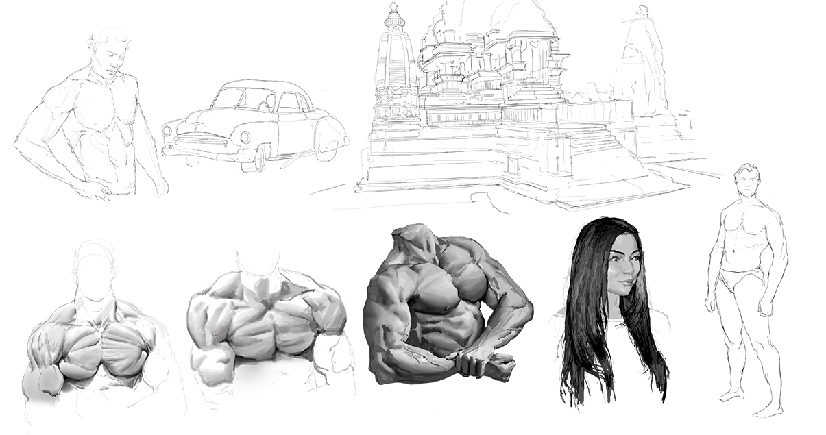
I keep forgetting to post these, here's a compilation of studies dating back from August. I miss doing these so much that I'm considering to forgo studying drawing altogether.
 I hope to post more often, looking back at everyone's support and encouragement is vitally motivating. Thanks for looking!
Posts: 291
Threads: 3
Joined: Sep 2016
Reputation:
6
Hello There! You have interesting works and i like you studies approach. Could you please tell me what is the size of small pictures from your last post?
Keep your head down at work and eventually you will grow up.
All best
Posts: 2,817
Threads: 15
Joined: Jun 2013
Reputation:
109
hey bro, child of IC right?? BOXES LOOMIS BRO
I love the design of your angel dude, nice pallete and the value composition aint bad. I think the biggest issue is you picked an ultra safe pose and a really flat angle to show the body. I personally dont think it'll work if you keep going with this pose, its too flat and scissored. The face is cool your rendering is really tasty, its just so flat bro. I mean its an evil angel flying from the heavens; like... if you were to play that roll, take that pose yourself. How cool does it feel? Like exactly how he's positioned.
Something with some drama is always more worth it... What does this pose say about the character? He can spread his legs and hold a sword with a near emotionless face? Look for angles and curves in a gesture, it can be subtle.
https://cdnb.artstation.com/p/assets/ima...1514568201
curve the spine, turn the torso in space, SHOW DEPTH!!
makes all that painting worth it ;)
Posts: 48
Threads: 2
Joined: Jul 2017
Reputation:
6
@UKRAINIANWOLF97
Thank you, the sizes of the study thumbnails are usually around 3,000-11,000 pixels wide depending on how much detail I want to study. The angel knight is about 30,000 pixels. I should note that ram is the most important spec in a computer for bigger canvas sizes; I use 24 GB right now, but hoping to upgrade to 128 GB one day. You have some great figure drawings, can't wait to see your progression!
@Fedodika
Haha, I drop by /IC/ on occasion since that's the only place Ruan Jia is discussed, not much of a fan of anything else there lol. Thanks for the fantastic critique, I agree there's a lack of drama and subtly in the pose. Even after taking my own reference photos and doing studies, the gesture is a struggle. You also mentioned depth, which is something I hadn't considered, I'm so glad you brought that up. I love the detail and atmospheric perspective the Guangjian painting you shared, I'll definitely steal from that, but the cropping and composition look strange. I'll try to tinker with the limbs to mimic Bouguereau, not sure if I have the skill to dramatically change the gesture while maintaining the composition though. Love the sheer amount of effort you're putting into your studies, hope to see how it pays off. Thanks again, after seeing you all over the forum, it was a great pleasure to see you drop by.
Posts: 48
Threads: 2
Joined: Jul 2017
Reputation:
6
It's been a while since posting, and I've had a few realizations since then. The biggest one was how to maintain energy when doing hard work. It all comes down to maintaining glucose levels in your brain through managing eating to maintain sufficient blood sugar levels. I.e. eating more food more often. This is probably painfully obvious to most, but I always assumed it was just my scumbag brain being lazy. I've since been able to kick gaming and procrastination for good. Excess calories literally turn into motivation and energy.
I got my first unsolicited job offer through Artstation, but I turned it down. I don't feel like my skills are there yet and it would distract me from deliberate practice. I don't really care if I make a living from art, my only desire in life is to improve so that I can create better and more beautiful art.
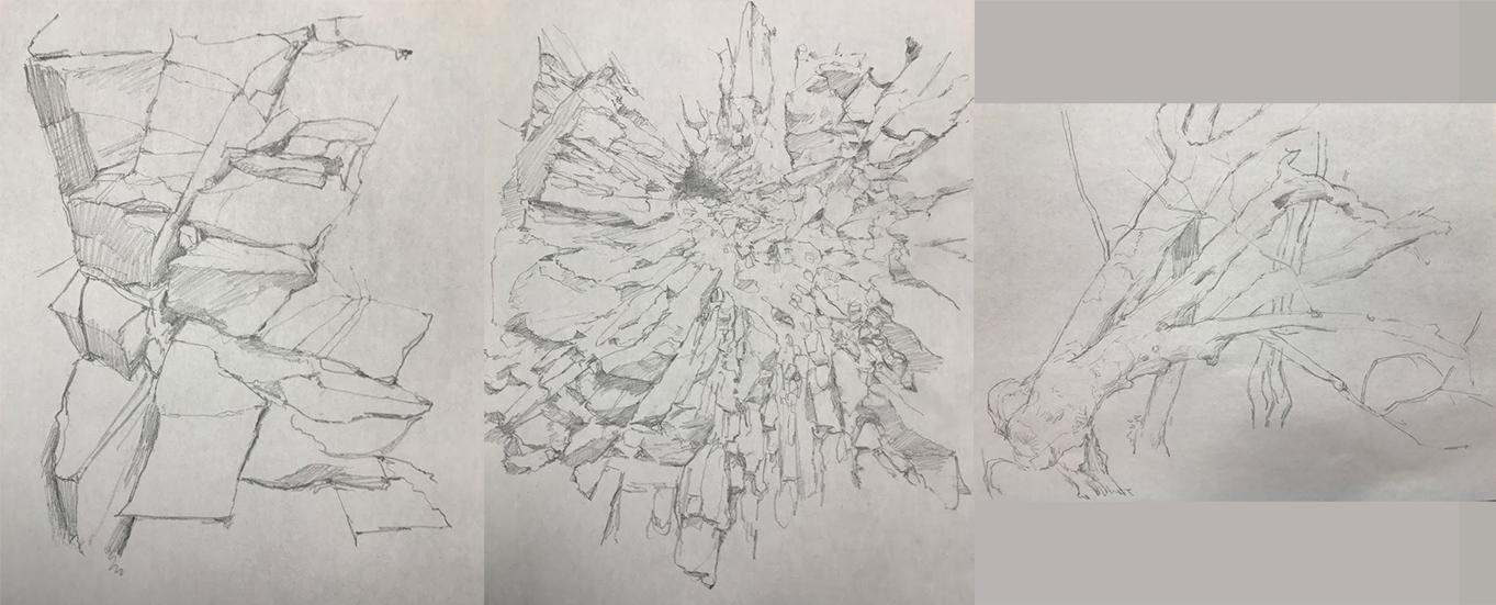
Been mostly working on drawing and building a visual library, I underestimated how vital it was to painting, especially from imagination. Knowing how to draw something before trying to figure out how to paint it saves 80% of the time spent running around in circles.
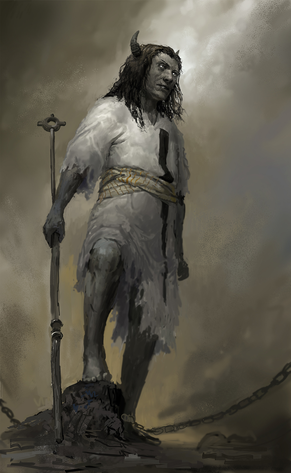
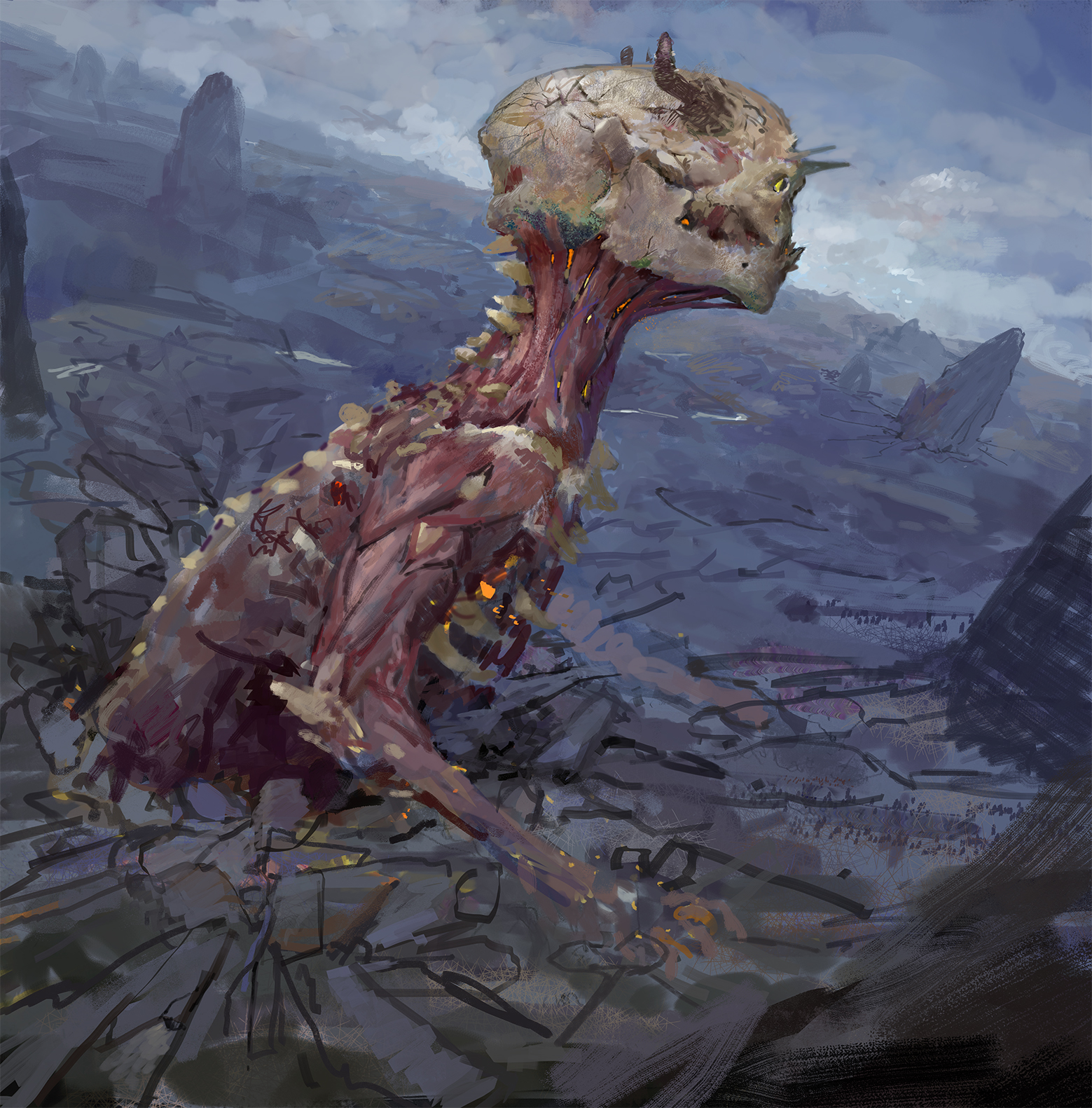
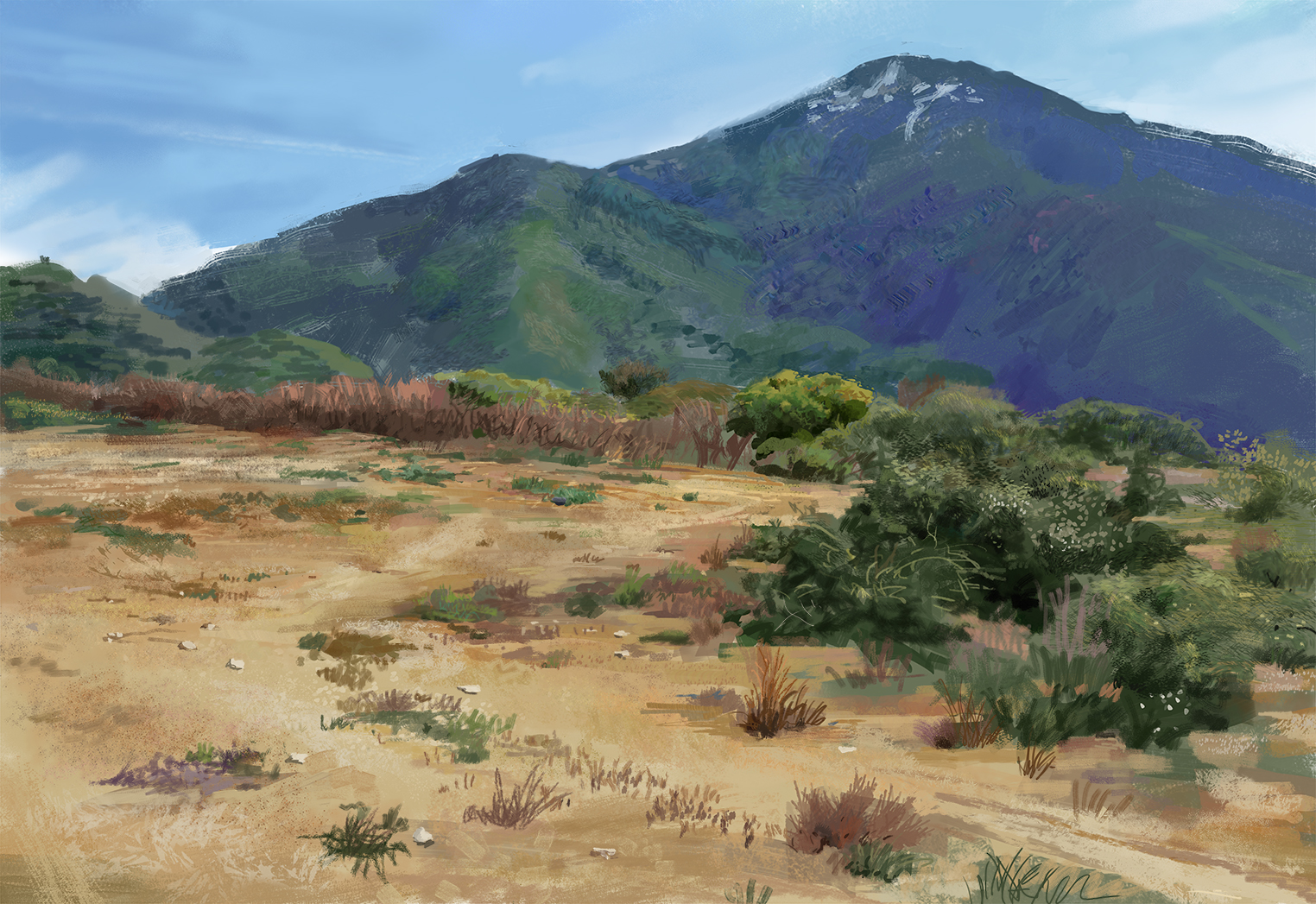
Nothing finished or portfolio worthy, just using these to identify and work on weaknesses:
Posts: 2,817
Threads: 15
Joined: Jun 2013
Reputation:
109
Awesome you got that job offer on Artstation my dude! I have yet to get one, but its not on my list of life achievements anymore lol, so i feel you on the later things you said on that. Ya nutrition is super important to feeling great and motivated, people extremely underestimate the manifestation of nutrition as their entire being, which it fundamentally is.
I think on a lot of these you're putting the cart before the horse on a lot of these. Your concepts are cool, but man the figure drawing and structure/proportions are wobbly at times. Specially the dude looking up, the perspective goes from high, to like standard 3/4 perspective. Your rendering is marvelous and you've got the idea of the ruan jia texture/color variation down, which will only benefit you in the long run.
I believe you need to get a better understanding of how gesture/structure works, and i feel weird telling this to everyone because it seems to apply universally. you know, just think like, how well do you anatomy; can you draw and shade beautifully each individual limb with each muscle visible and using tasteful edge work? Can you draw in pencil, beautiful skulls/portraits/figures even using reference with a long time span for completion? If the answer is no, it's gonna be an uphill battle with imaginative work.
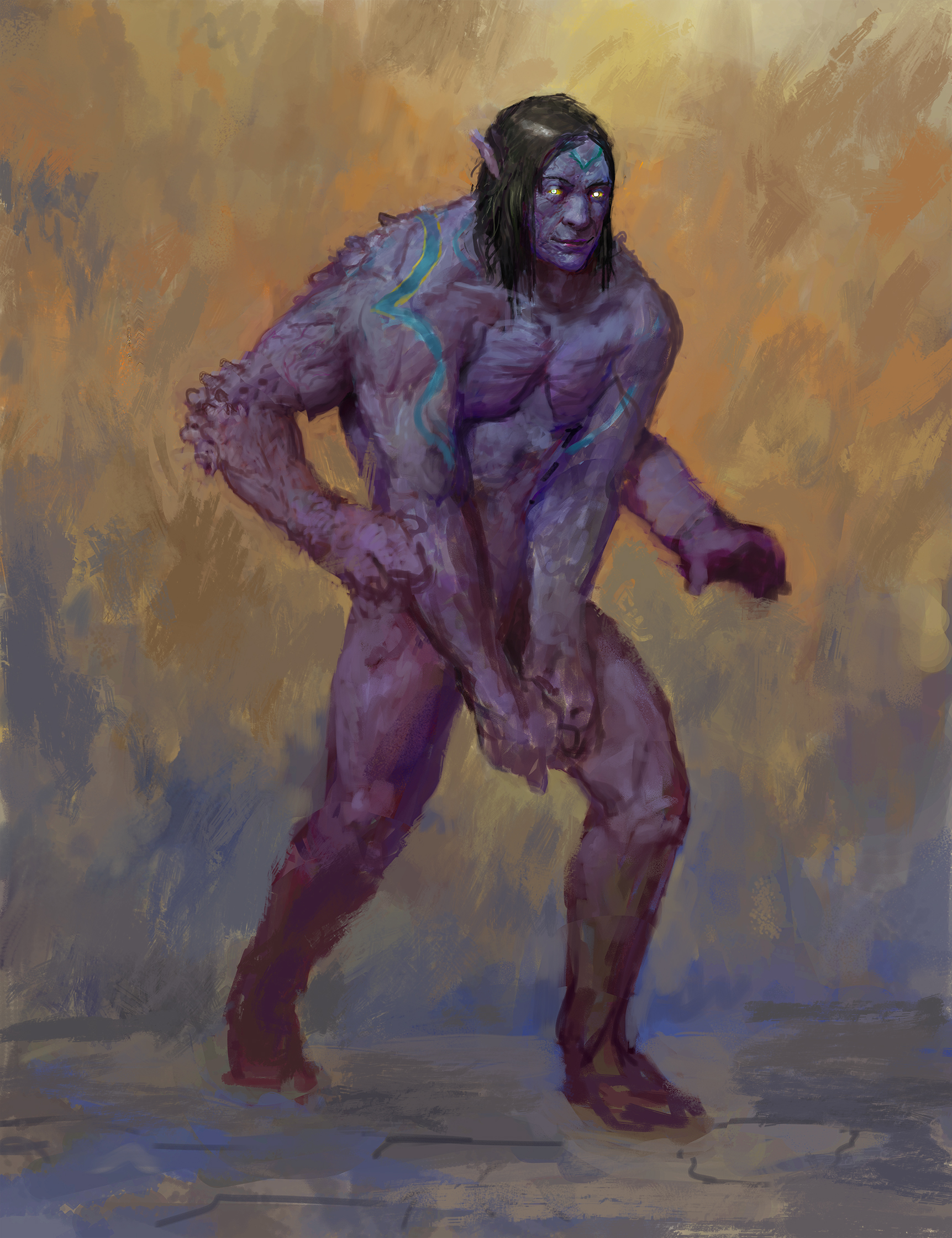
If you can figure out the drawing part, the rendering does itself; You're rendering is at a point where you could not study it directly for a few years even and still be at a very high level if you just worked on drawing fundamentals. Or like this... Demon thing coming out of the ground, such a dynamic camera angle, but he's totally in profile, you know? really nice colors/rendering/ cool character, but the drawing leaves it very short of what it could be.
And like you said visual library is vital for imaginative work, and you're on the right track thinking that way. I think you know what to do, so im looking forward to more stuff, and all the best wishes my dude ;)
Posts: 656
Threads: 6
Joined: May 2013
Reputation:
12
Your stuff looks just beautiful! Great colors. Maybe on the visual library you might consider sketching lots of dancers/acrobats/gymnasts/figure skaters/martial artists/action movie heroes. Get lots of beautiful action in your visual library. Then build a composition around a really glorious dynamic pose.
_________________________________________________________________________
The best time to plant a tree was 20 years ago. The second best time is now.
-Chinese proverb
Sketchbook
Posts: 48
Threads: 2
Joined: Jul 2017
Reputation:
6
@Fedodika Your comments and posts are always thoroughly written out and spot on, I appreciate all that you're doing on this site! You're completely right, my painting abilities have far outpaced my drawing abilities. Loving all the portraiture work you're doing, can't wait to see the grind pay off its dividends.
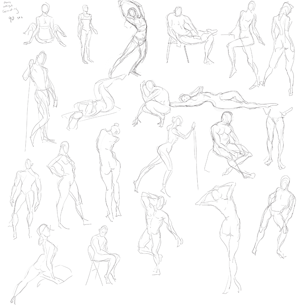
@Tygerson Thanks a ton! Fantastic suggestion, I did exactly that for the past week. I haven't seriously studied gesture drawing in over 5 years, and it shows.
--
I may have been doing too much deliberate practice at the expense of creating things I enjoy and would put in my portfolio. That's because it never feels like my skills are good enough, maybe they are, maybe they aren't. What I do know is that I'll keep striving to improve even if it means never working as a professional artist, it's that fun.
The biggest drawback to this lifestyle is the lack of friends to confide in. For it seems the mind focuses and obsesses best in utter solitude.
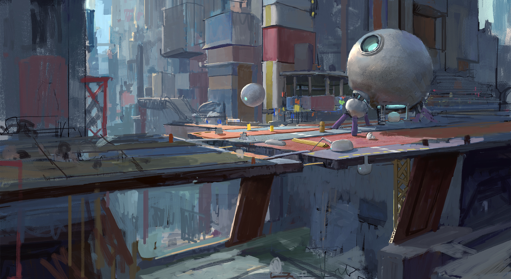
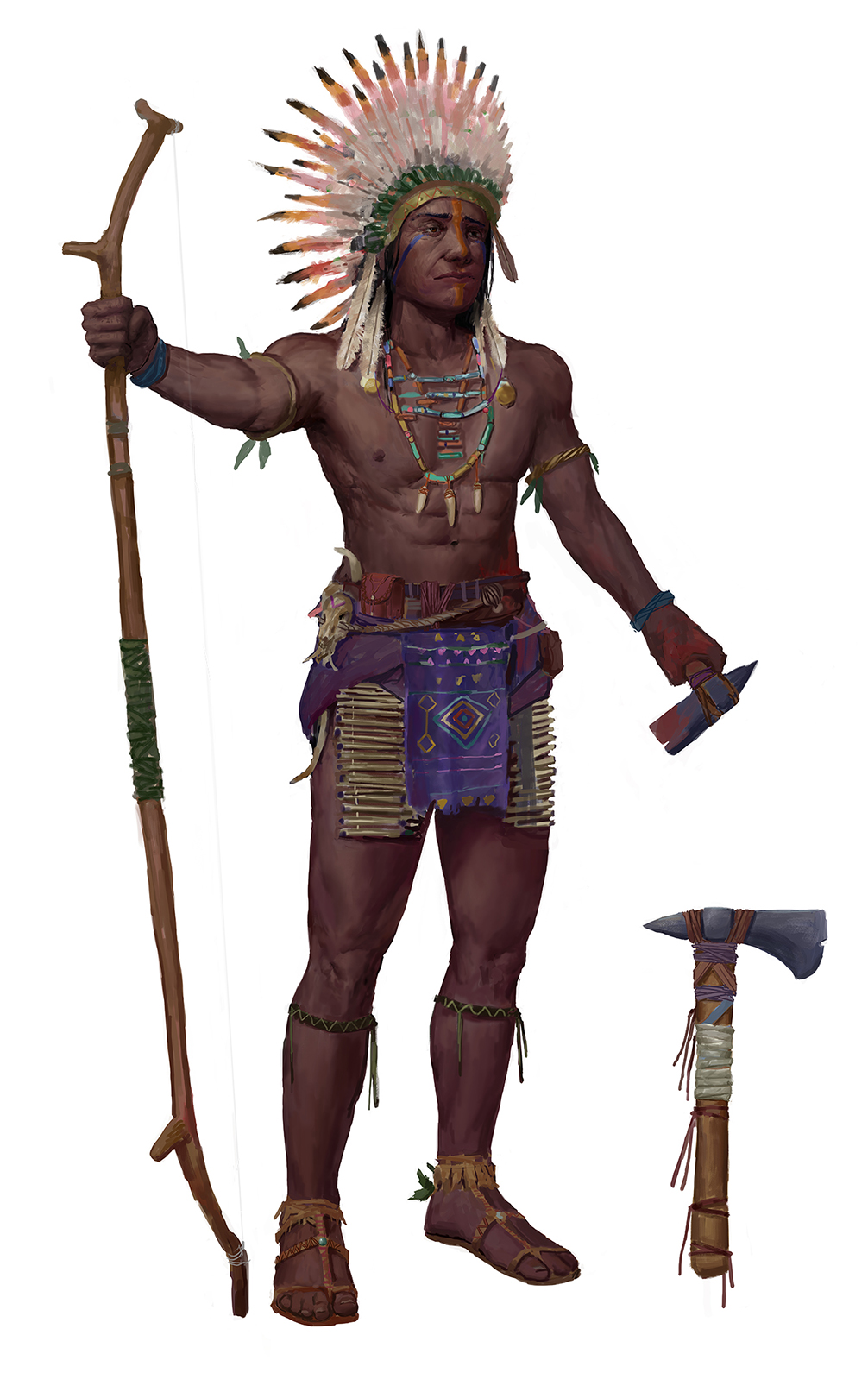
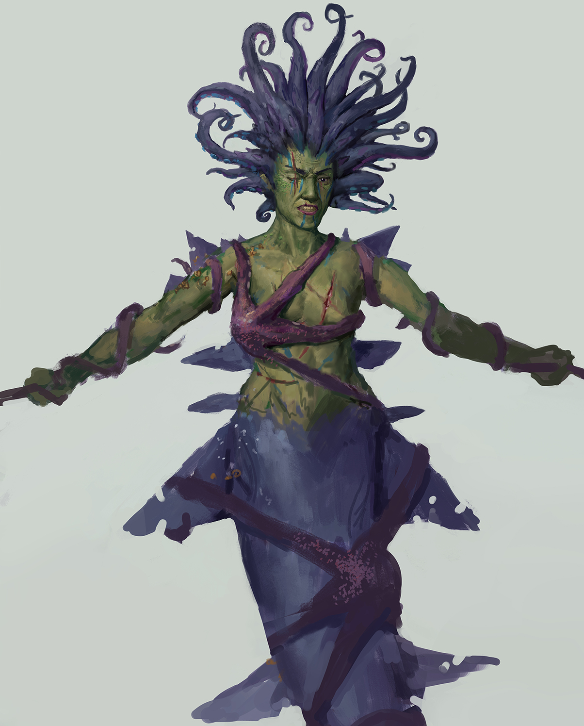
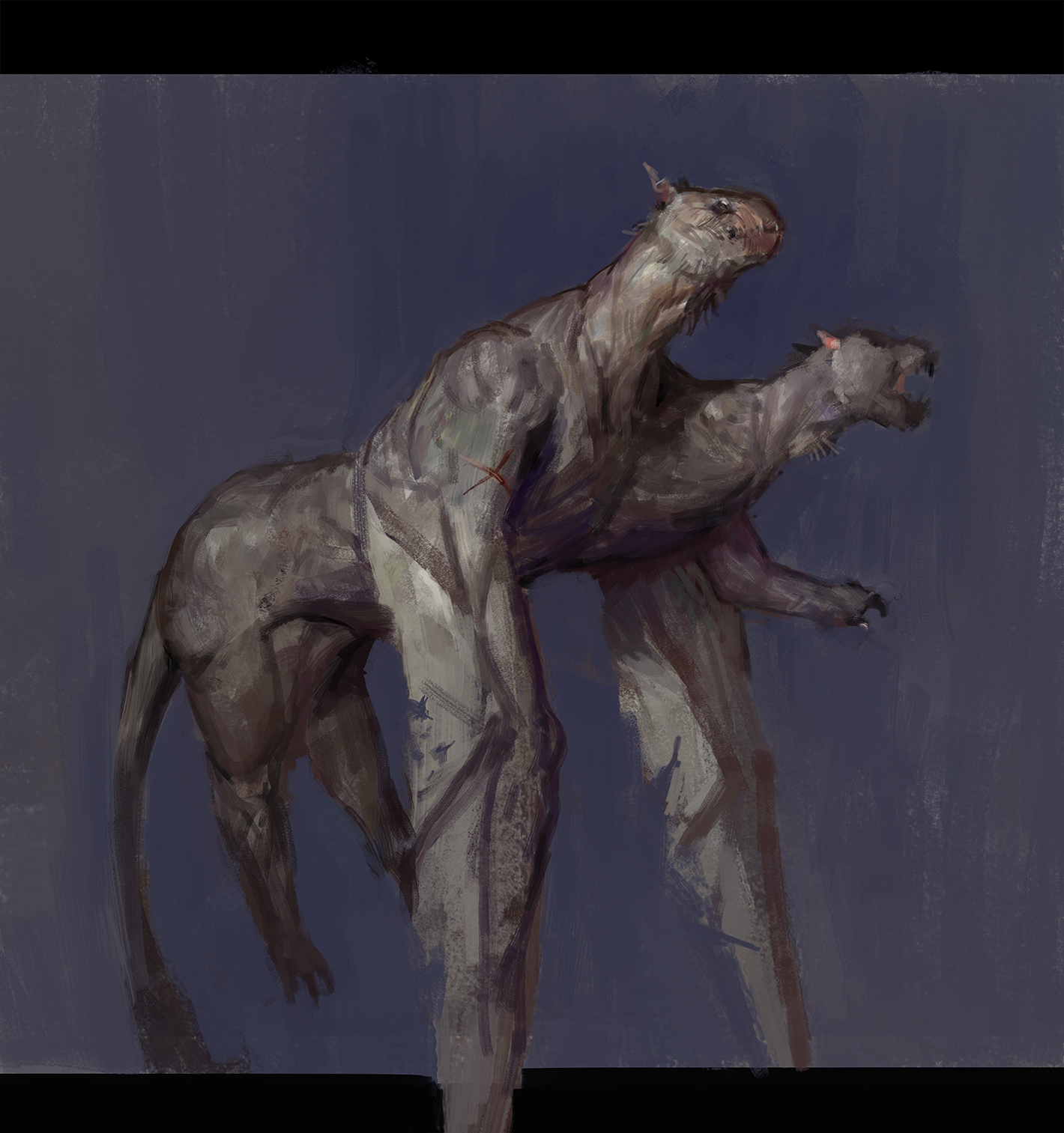
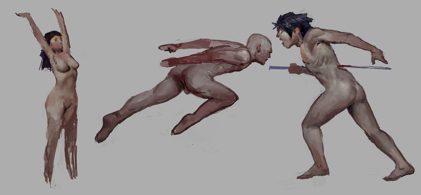
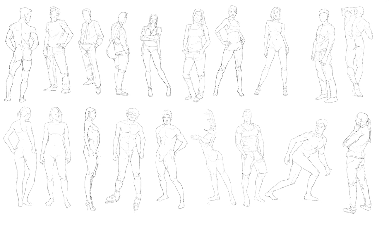
Here are a few contest doodles, and a few gestures from imagination:
Posts: 2,817
Threads: 15
Joined: Jun 2013
Reputation:
109
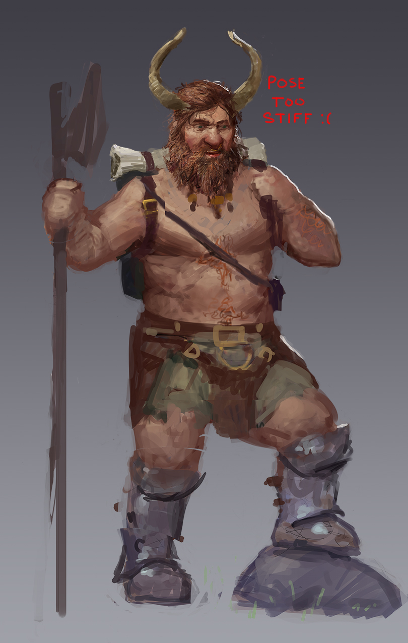
I'm trying to think of a good analogy for the things holding you back, its like i think its like Icing on a cake. You're great at the icing part; Like for this chieften guy, his belt piece for example, is as well rendered as it will ever need to be for the rest of your artistic career. The rendering you present, the icing, is professional, but the cake it is on has some ingredients that havent been measured correctly.
Like his hand, do you really think that's an attractive hand design? His eyes are strange, like one eye looks sad, and one looks like incredibly fearful. A great native american face for a chieften is very stoic and masculine, like there are intricasies of that character that yours is lacking, heres some examples
http://ep.yimg.com/ay/mcmahanphoto/nez-p...rint-5.jpg
https://cdn.history.com/sites/2/2014/01/...ull-P.jpeg
https://i.pinimg.com/originals/7c/95/be/...ceebc6.jpg
These dudes are like insanely stoic, full of character, mysterious, you can see in their eyes the've seen it all and it deeply affects them. Your guy has a face, sure, but would he look like a chieften if you took all the context away, all the outfit, skin tone? I don't think so, he'd like a scared sad generic face.Or his hand holding the axe, would a confident chieften hold an axe like that? Its tensed, like coming up a bit. A warrior would probably have it slacked at his side, if not in a dynamic pose to show strength.
The outfit you've designed is cool, no doubt about that, but the body its on is just not impressive, mainly in the face and hands, and the torso has some strange anatomy going on, liek the pectoralis is sinking into the body in a weird way. His deltoids and muscle arrangements are inconsistent, like it goes from toned to average, and his deltoid further from us is strangely small, and the way the wrist connects to the hand has this strange blocky bump, whereas the other wrist seems more correct in narrowing before the hand.
This, fishy character is in theory a cool design, but like again the body its sitting on takes all that magic away. I mean it appears to be a female, but the face looks very masculine, you have these hard jaw structure and scars and stuff, which i mean can be part of a character design sure, but its ambiguity is confusing. Usually if something is ferocious and ugly, really push that you know, dont just make like a regular face with a grimace and add a few scars. Make the entire face about being fericious and ugly, dont have any semblence of attractiveness.
I kinda get the feeling you didnt draw the arms out before you added the starfish stuff because the deltoids are non existent and her left arm is really high up as if its broken, seeing how the bicep comes out at a super hard twist. The body, and i understand shes not trying to be attractive, but its mushy and i feel like you tried to hide what you dont know about anatomy with the big starfish wrapping. And sure you can say its "quick" but that wont cover up these obvious mistakes. A lot of pros use tricks and shortcuts to save time like quick brushwork but that is not the way to approach making an image is expecting to use cover ups for holes. You gotta be confident and good enough to get it right all on its own if you expect it to be good.
http://crimsondaggers.com/forum/attachme...6801/5.jpg
This is just a goofy design lol, its like a sausage cerberus! How can he stand, im assuming his long front limbs are holding up his tiny heads and his back pelvis is just back there swingin; variation creates interest and his heads are mostly the same size. a cerberus is cool because his heads are either exactly identical or varied like the chimera or one with a birds head, lions head, etc. And again i feel like the long limbs are an excuse not to draw the proper limbs that would fit properly on a beast of that nature.To me he doesnt look threatening at all, i could probably smack him with the back of my hand and knock him over lmao
http://crimsondaggers.com/forum/attachme...6802/8.jpg
These figures, you know how attractive are they really? Would you be confident with just these as a line drawing? How much more could you improve if you drew 1000 of these and didn't paint one of them but got the anatomy and proportions on each one a little better each time?
You gotta get serious about the drawing side dude, that's why you feel lost, leading you to say, " What I do know is that I'll keep striving to improve even if it means never working as a professional artist, it's that fun."
That's your entire problem is you dont take drawing seriously and think icing will save you. You need to get on like New masters academy or jeff watts or any intensive DRAWING type course or education and start training on getting the pencil drawing to look good, with NO ICING! Im giving you the secret here it is, just draw, close photoshop for as long as you can and be confident that you don't need to learn any more rendering or painting for a good while, years even. Its all down to that pencil and paper making correct and deliberate practice.
Every flaw i picked out above has NOTHING to do with rendering/lighting/value/ or color, its all design and proportions/anatomy, and yes face drawing is anatomy. So im interested to see where you go from here and i hope you do what you feel is right ;)
Posts: 48
Threads: 2
Joined: Jul 2017
Reputation:
6
Posts: 2,817
Threads: 15
Joined: Jun 2013
Reputation:
109
ya im already seeing a big benefit! Every now and then do a big study spend a bit of time on it and then replicate it, or even just parts of it from memory. And ya i like the volume too, always shoot for quality in that volume, which you're clearly doing :). awesome youre bucklin down!
Also getting on a paid site like Proko, Watts, CGMA, Schoolism, New Masters, or most pros who have some kind of paid effort can really expedite the process! (maybe not alotta that gumroad stuff tbh, some of its good tho im sure.) Whatever you can afford, Blender Guru has a fantastic vid on it!
https://www.youtube.com/watch?v=iPwdia3gAnk
I know as an artist we see great things for ourselves and tend to reflect negatively on our process but please, you're far from a beginner. Your art already shows a decent understanding of fundamentals and that's important for any artist who seeks constant improvement. Lacking confidence and selling your skillset short will only hold you back, I guarantee. It's great to reflect on the skills you need to improve on and never forget an artist's journey is never finished but you also should tell yourself "I like what I'm doing". It's good to constantly count our wins and losses with our work and becoming more confident with the things you do excel at will help you move onto things you don't.
I see you tend to avoid rendering parts you may not be comfortable with. This is fine with quick gesture work but I wouldn't consider many of the pieces here finished. Do a figure and do not avoid rendering any parts even if there are glaring issues. Do it just to do it even if you don't think it's good enough to show off, but also show it off anyways because people will direct you on what you need to work on. Definitely continue to work on your hands and feet and facial expressions.
Posts: 3,357
Threads: 37
Joined: Aug 2013
Reputation:
234
For what i can see he probably as the potential to show render stuff but doesn't seem to bother finishing them might be getting bored in the rendering stage or get discouraged.
Here two post i think are worth reading for you to get some mental clarity and pinpoint some of your habit.
Here is two post i wrote the first one is about all the little thing we tend to do that slow us down
The second post is about how to stay positive.
http://crimsondaggers.com/forum/thread-4785.html
http://crimsondaggers.com/forum/thread-6483.html
Posts: 48
Threads: 2
Joined: Jul 2017
Reputation:
6
@Fedodika Thanks! Yea looking back, I think actual classes or a school would have saved so much time, but there's a thrill in being completely self-taught.
@Badbadcat Thanks for the encouragement and feedback, totally agree! I still consider myself a beginner, even though I'm technically a 'professional' with some understanding of the fundamentals because I hope to one day reach the levels of my favorite artists (like Ruan Jia, Jaime Jones, Theo Prins, Tadema, Jeff Simpson, etc.) and my skills are still years if not decades away from that. Making finished pieces takes me weeks, which I've realized I could be using that time and energy to be investing in working on my weaknesses instead of building on a portfolio. But hopefully by the end of this year I'll start finishing again.
@Darktiste You're right, I've been giving up on pieces very early because I see weaknesses and then decide to devote my time to studying and improving those areas. Then I make another sketch to see where I'm week at again, it's an endless cycle haha. Love those helpful posts you wrote!
-
Sorry if it sounds like I am being negative of myself and my skill. In reality I am so happy and thrilled to be critical of my own work and abilities and then to improve them. So much so that it is more fun for me to improve than to actually make art! I was even thinking of moving to Mexico or living in a van with solar panels to lower my cost of living to have more time to devote to improving. This is because I don't care much for money or having a family, I care most deeply about creating good art and sharing it with the world. I'm also deeply at peace and happy with life, things couldn't be better :)
I haven't been actively posting in a while mostly due to not having any finished art to share. Also, I'm able to see my weaknesses more clearly without much feedback, so I've been busy working on honing my skills self-directedly. But I do want to share what's going on with my life because I miss being part of a community and don't have friends due to my obsession with art lol.
Back in august I went to LA, California to attend a lecture by Vance Kovacs with my cousin. In LA, I got a lot of in person feedback from Art Center, Laguna College of Art and Design, Concept Design Academy, and from Scott Flanders who's a concept artist at Riot games. All of the feedback was so invaluable, most of which was to work on perspective, do more design iterations, and hone in my personal voice. Since then, I've been working on all of the above, mostly through traditional drawing.
I also got my first "big" freelance job thanks to a genuine friendship I made at the ICON convention in Detroit, MI. Doing actual concept sketches and renderings taught me about the value and convenience of 3D, photos, and speed for professional work. I did theme park design and environments for them, which was a great break from the characters I usually do. Those small character commissions, which were all from Reddit, paid for all that traveling and were so fun to do.
Sorry for the long stories, it's been a while!
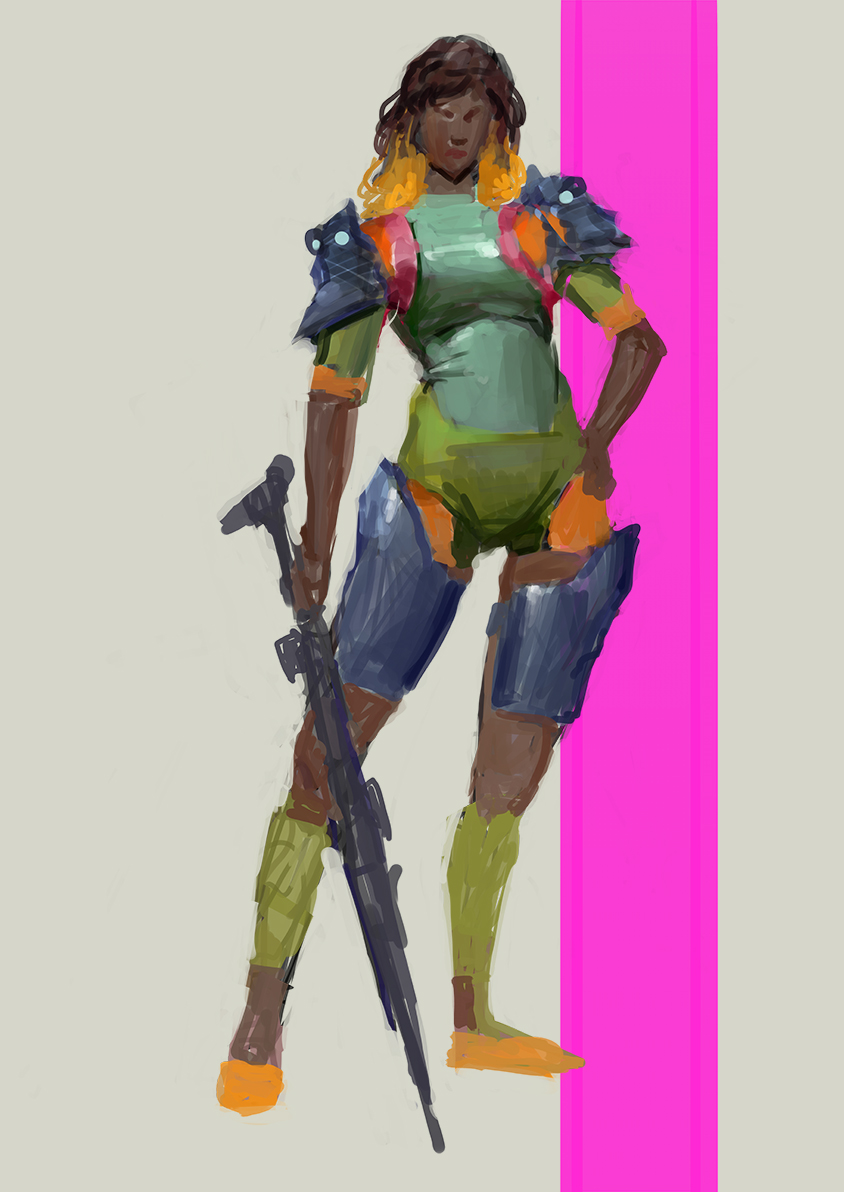
Here's paintings done in a day to practice design.
![[Image: 1.jpg]](https://cdn.discordapp.com/attachments/471434774100312105/556029548857131009/1.jpg)
![[Image: 3.5.jpg]](https://cdn.discordapp.com/attachments/471434774100312105/556628823408377856/3.5.jpg)
Character commissions
![[Image: hobgoblin_bomber_by_ubemascarenas_dci0meb-pre.png]](https://cdn.discordapp.com/attachments/471434774100312105/560481993960456213/hobgoblin_bomber_by_ubemascarenas_dci0meb-pre.png)
![[Image: attachment.png]](https://cdn.discordapp.com/attachments/471434774100312105/560482377315385349/attachment.png)
![[Image: Liadin2k.jpg]](https://cdn.discordapp.com/attachments/471434774100312105/560481560911151119/Liadin2k.jpg)
Example of client work, literally just an over painting of a photo lol
![[Image: 2Interior2.jpg]](https://cdn.discordapp.com/attachments/471434774100312105/548770644003651584/2Interior2.jpg)
Closest thing to anything finished, done last year:
![[Image: attachment.png]](https://cdn.discordapp.com/attachments/471434774100312105/560482546920587279/attachment.png)
Her arm is way high and she is missing her latissimus dorsi. Was done just for fun so I'm too lazy to fix and finish it lol.
I also did some long master studies but I got a virus on my computer and had to delete everything. Highly recommend to save anything valuable to a cloud service. After I solidify my understanding of perspective and work on more design, I'll do more detailed master studies to strengthen my personal voice. Thanks for checking out my sketchbook. Time to go back to studying!
Posts: 2,817
Threads: 15
Joined: Jun 2013
Reputation:
109
im proud you got some work my dude, ill still lay the crits on same as usual;
see this piece would be really nice if the anatomy was designed to be attractive
https://cdn.discordapp.com/attachments/4...chment.png
I grabbed this random pic off google
https://i.pinimg.com/736x/87/5c/48/875c4...3a81ce.jpg
If her face went from what you drew, which is an average, like certainly not impossible face, to that, the piece would be much more appealing
or like that
https://i.pinimg.com/736x/15/3c/21/153c2...it.jpg?b=t
Just your standard hot girl profile will get you a long way
or this
https://cdn.discordapp.com/attachments/4...chment.png
What if she had this face
https://content.latest-hairstyles.com/wp...aircut.jpg
or this girl
https://cdn.discordapp.com/attachments/4...adin2k.jpg
Pose is super stiff, the hands youre drawing are not very appealing, just kinda dumpy no fingernails, almost like you are trying to do them just because itd look weird without them. Hands are really beautiful expressive things, use photos if you have to, get some killer hands, its worth it! Her face is just, you know its like those weird elder scrolls 4 faces that dont have the animation rigged right, its not attractive, and i know beauty is in the eye of the beholder, but if youre drawing a young attractive female you gotta make her just that.
The tards on the interwebs dont want to see plain jains or your best imagination face they want attractive features, both men and women like that.
I know you dont want to hear it but you really need to stop painting and learn anatomy and draw more, you still have the exact same problems as when i gave you the same writeup even a year ago, you havent even started addressing the issues, its just more painting more not caring about stiff poses and bad anatomy.
Im happy you got the jobs man but if you want to get better faster youll need to work on the bare bones fundamentals and do beautiful drawings, with pencil on paper with construction, lets see it ;)
Posts: 3,357
Threads: 37
Joined: Aug 2013
Reputation:
234
Sh1t if your a beginner by your own standard i must be poop by your standard.
Posts: 77
Threads: 1
Joined: Sep 2018
Reputation:
9
I love your girls, I really love your girls!!! They are not fashionable beauties and that's interesting. I don't know what is your aim, but I'd suggest to play with a stylization of faces. Not that kind of semirealism stylization, but realistic. I mean, now your faces look too generous you need something in them (maybe even some ugly feature) that could make them not average. Long noses, for example, or whatever you like\want.
Posts: 97
Threads: 2
Joined: Oct 2018
Reputation:
3
Very nice rendering man, and your drawing and perspective got better since your first work . Keep on the good work !
Posts: 48
Threads: 2
Joined: Jul 2017
Reputation:
6
Fedodika: Thanks for the honest crits, I agree. I think most of those issues stem from a lack of deliberate design and not applying the anatomy or the knowledge I've gained. That's because I haven't really focused or practiced those areas enough. It may take me years at least to get it at an acceptable level.
Darktiste: Haha well I only judge my own work by high standards and only seek what I can learn from others works, no matter the 'quality'. What I like about your designs is the clarity, readability, and simplicity. That's something I struggle with often.
Roanna: Thank you! My aim was to make the clients happy given their descriptions, both said they were perfectly satisfied. You're right, underplayed their uniqueness because I didn't know how to push their character or design.
Baldgate: Thanks man, glad there's some improvement. I haven't spent more than a few days on a finished piece in years, so it felt like I'm stagnating, thanks for the encouragement.
-
It's almost been half a year since I posted anything. I thought taking a break from social media and art sites/forums would be great to find my own voice, uninfluenced. It might be too early to say it's working, but I'm happy with the direction my sketches are going.
After a lot of contemplating, I've decided to aim to design entire worlds one day, from the people to the plants, animals, environments, technology, etc. Aiming to master a vast variety of subject matter and genres, mostly so that I don't get bored over the next century of creating art.
I think I started working too soon. Even though some of my skills are considered at a professional level, my work felt too premature for my standards. I still want to get a better grip on design, values, storytelling, concepts, and most of the other fundamentals before building portfolio pieces.
Lastly, the biggest struggles I've had are still balancing between burning out and the feeling of not working hard enough. Perhaps the key to staying in the joyful center between the two where art is fun is a vigilant awareness of one's inner wellbeing.
Anyway, lots of sketches, drawings, and unfinished paintings. I still have a long long way to go, but I'm quite happy with the rate of improvement. I can't help but look at all of this with a hyper critical eye, but it's probably better off shown than deleted.
Thanks everyone for your criticisms and comments, you are such great teachers!
![[Image: RideroftheDark11.jpg?width=1061&height=703]](https://media.discordapp.net/attachments/471434774100312105/569421891299966976/RideroftheDark11.jpg?width=1061&height=703)
![[Image: s1.jpg?width=702&height=702]](https://media.discordapp.net/attachments/471434774100312105/594848548093427741/s1.jpg?width=702&height=702)
![[Image: image0.jpg]](https://cdn.discordapp.com/attachments/471434774100312105/610048372283539467/image0.jpg)
![[Image: image0.jpg?width=702&height=702]](https://media.discordapp.net/attachments/471434774100312105/610048445859889191/image0.jpg?width=702&height=702)
![[Image: image0.jpg]](https://cdn.discordapp.com/attachments/471434774100312105/610048312191614977/image0.jpg) ![[Image: s2.jpg]](https://cdn.discordapp.com/attachments/471434774100312105/612075394266562570/s2.jpg)
Posts: 2,817
Threads: 15
Joined: Jun 2013
Reputation:
109
I think youre a lot better at concept art sketching than illustration, like your ideas come across well and im seeing a potentially strong visual library. Some of your vehicles have some goofy wheel placement, but the idea still comes through. Try throwing down a ground plane line to make sure the wheels are all on the ground together. It can just be like the top of a box on the ground drawn in perspective, feng zhu does it alot
In books like The Skillfull Huntsman, the ideas are presented quickly without much concern for accuracy or rendering, and it works to you know, build worlds and show ideas. If youre wanting to go down the illustration road its gonna be loooots of refining small things like drawing nice fingers, or an attractive face/bone stucture. With conceptual stuff its more about silhouette which i think you have a good eye for, so maybe that's speaking to you on another level.
People like Paul Richards, you know as lascivious as a lot of his later work is, alot of his conceptual work is just some nice silhouettes with a block of tone on it, simple and serves its purpose. hes by no means a fine artist, but has you know a different set of skills for a different set of problems.
Would be interested to see more of your conceptual work, it seems promising
|


![[Image: 1.jpg]](https://cdn.discordapp.com/attachments/471434774100312105/556029548857131009/1.jpg)
![[Image: 3.5.jpg]](https://cdn.discordapp.com/attachments/471434774100312105/556628823408377856/3.5.jpg)
![[Image: hobgoblin_bomber_by_ubemascarenas_dci0meb-pre.png]](https://cdn.discordapp.com/attachments/471434774100312105/560481993960456213/hobgoblin_bomber_by_ubemascarenas_dci0meb-pre.png)
![[Image: attachment.png]](https://cdn.discordapp.com/attachments/471434774100312105/560482377315385349/attachment.png)
![[Image: Liadin2k.jpg]](https://cdn.discordapp.com/attachments/471434774100312105/560481560911151119/Liadin2k.jpg)
![[Image: 2Interior2.jpg]](https://cdn.discordapp.com/attachments/471434774100312105/548770644003651584/2Interior2.jpg)
![[Image: attachment.png]](https://cdn.discordapp.com/attachments/471434774100312105/560482546920587279/attachment.png)
![[Image: RideroftheDark11.jpg?width=1061&height=703]](https://media.discordapp.net/attachments/471434774100312105/569421891299966976/RideroftheDark11.jpg?width=1061&height=703)
![[Image: s1.jpg?width=702&height=702]](https://media.discordapp.net/attachments/471434774100312105/594848548093427741/s1.jpg?width=702&height=702)
![[Image: image0.jpg]](https://cdn.discordapp.com/attachments/471434774100312105/610048372283539467/image0.jpg)
![[Image: image0.jpg?width=702&height=702]](https://media.discordapp.net/attachments/471434774100312105/610048445859889191/image0.jpg?width=702&height=702)
![[Image: image0.jpg]](https://cdn.discordapp.com/attachments/471434774100312105/610048312191614977/image0.jpg)
![[Image: s2.jpg]](https://cdn.discordapp.com/attachments/471434774100312105/612075394266562570/s2.jpg)