07-24-2021, 09:07 PM
I like this a lot, maybe my fave by yours so far, even better than the alien. I find that your art looks better when it’s less pumped with filters and other gfx. That could be my personal tastes however. Keep it up!
|
Rotten's Pocket
|
|
07-24-2021, 09:07 PM
I like this a lot, maybe my fave by yours so far, even better than the alien. I find that your art looks better when it’s less pumped with filters and other gfx. That could be my personal tastes however. Keep it up!
07-25-2021, 02:50 AM
That looks awesome! I want to do the toreador challenge, too. hopefully there's time, since I haven't started lol. I don't know if I can top that though it looks really good!
07-25-2021, 06:16 AM
Cool style! I like your last work, especially how you drew the face. GL)
07-25-2021, 06:50 AM
(07-24-2021, 09:07 PM)Zizka Wrote: I like this a lot, maybe my fave by yours so far, even better than the alien. I find that your art looks better when it’s less pumped with filters and other gfx. That could be my personal tastes however. Keep it up! I think it's a level up. And I see what you mean with the effect. What I've been doing more now if colour blocking before painting gradients. Gradients alone I always shied from blackest blacks and whitest white, so I tried pushing it further. I found it difficult to see the gradient on the whole to stop overworking areas and making it muddy, so I finally found a use for Gradient mapping. By casting a gradient map over my working layer, giving each gradient level it's own hue, it makes it easier to tell how far into the scale I'm painting. The results when removed are more harmonious and make a better foundation for colourizing later:  (07-25-2021, 02:50 AM)JosephCow Wrote: That looks awesome! I want to do the toreador challenge, too. hopefully there's time, since I haven't started lol. I don't know if I can top that though it looks really good!Please do! I like when we're working in a group and seeing how each of us develop. Me, the first 5 days of a challenge: ![[Image: giphy.gif]](https://media.giphy.com/media/Lklr3P8LZUxUZahuyX/giphy.gif) (07-25-2021, 06:16 AM)Osya Wrote: Cool style! I like your last work, especially how you drew the face. GL)Hi o/ Thanks for taking a look. I'm especially fond of his face too.
09-01-2021, 09:32 PM
Somethin' to paint casually and take a break from prompts.
09-04-2021, 01:34 AM
The last image you posted is really quite interesting! Lots of cool stuff going on with the anatomy of the human part, the lion part, and the wings! Nice job!
09-29-2021, 08:06 AM
@Zorrentos
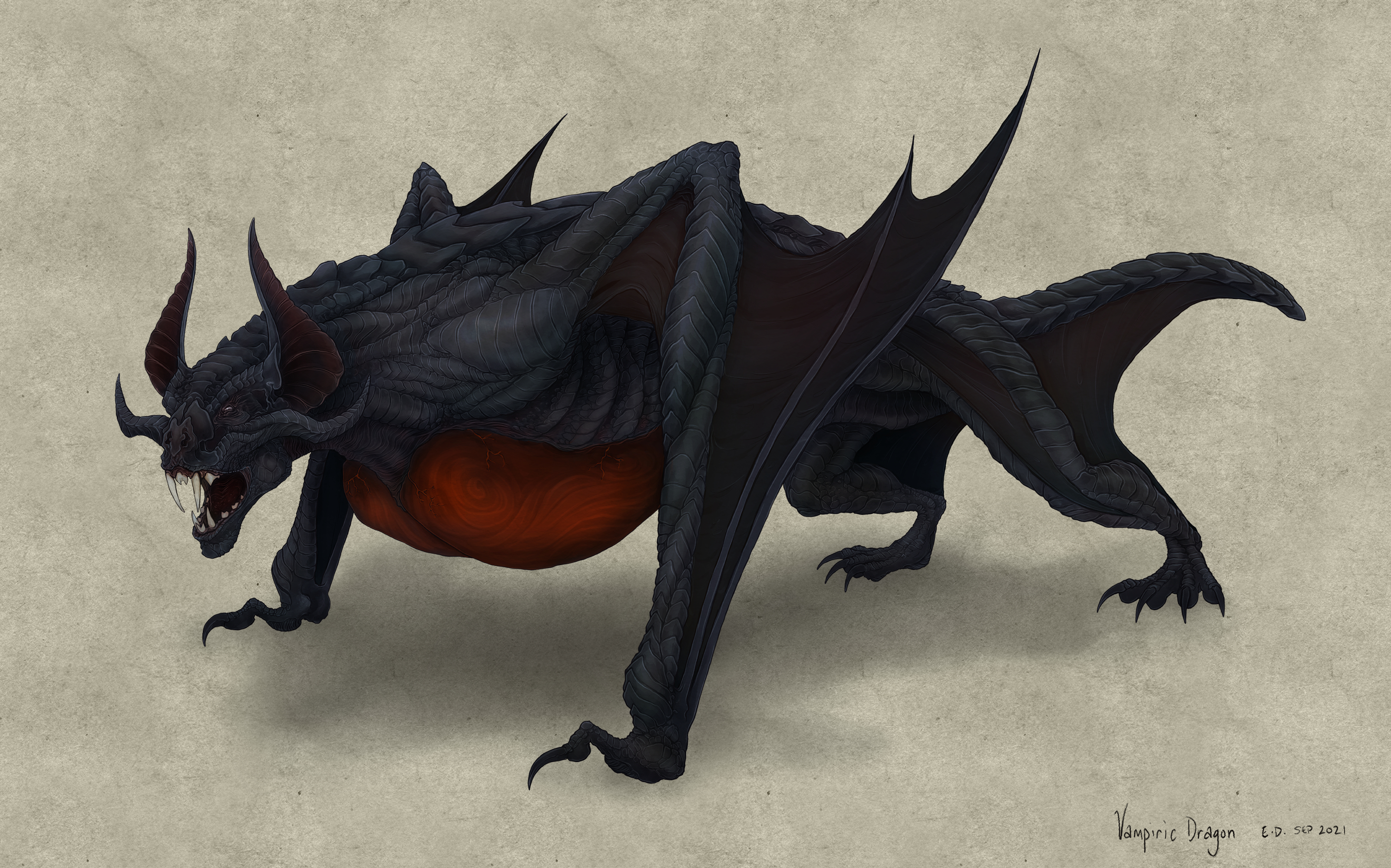
Thankyou, I was trying to keep it very loose, there's a lot that I can see I would change if doing it again but it was fun. I was in another art challenge which isn't due until a couple of weeks but I knocked it out in 3 days and submitted early. no one from the group is a daggers so I figure I'd share it here. It was a secret pairing challenge, we chose either dragon or rider or either and I went with either, then was given Dragon. Once everyone's submitted the challenge creator will put together the submissions into a composite image. I thought it sounded fun and I was given Vampiric Dragon as my prompt :) 
10-06-2021, 05:07 PM
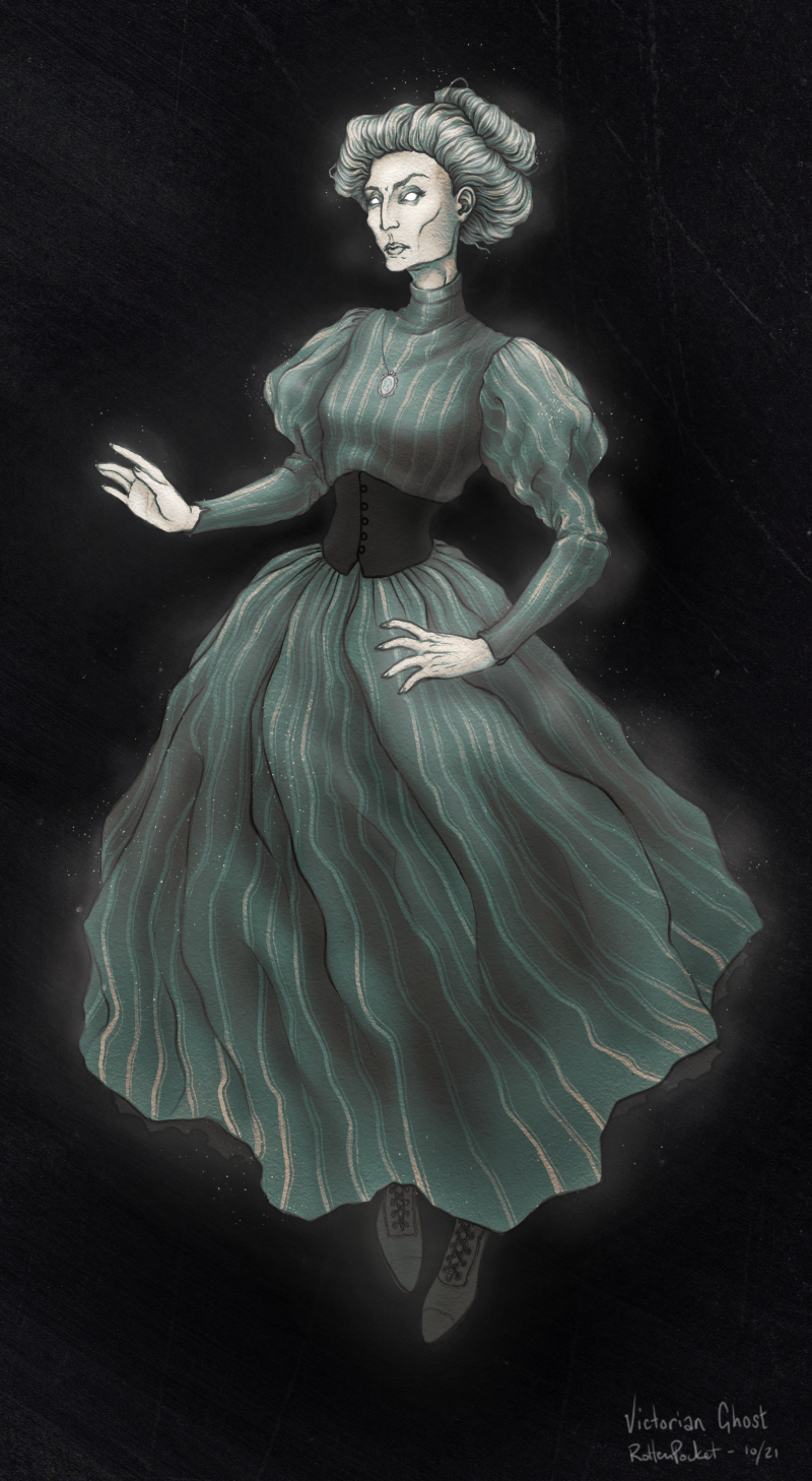
 There's a lot of spooky themes going around as we approach halloween - had some time to kill today so knocked out a generic floaty ghost laday.
10-22-2021, 05:34 PM
Nice updates here, really enjoying your style and level of detail you put into your images. Keep it up!
10-28-2021, 01:11 AM
Awesome work, love the creatures and horror style to your characters! Also I'm a fan of the desaturated color palette too.
Seems like you have a good handle on linework and design. I noticed in some of your illustrations you have more of a value range than others (particularly the storm bird & female creature smoking a joint). This larger value range really shows off the form and structure of your characters. I think doing some value studies with a focus on form as well as the structure of each form (like definition of muscles, plane changes, etc.) could make things read even better. For example, in your Vampiric Dragon piece it seems to stay in the mid-tones and darks mostly, so the turning of the form seems to get a bit lost in this value range. Try to have your value range, even if it's limited to darker tones, have more clear separation in the shadows vs midtones vs lights. When I don't know what to do and think of how to improve my work but feel lost as far as, "what do I do to make my form/color/anatomy/etc. look better?" I find a top professional artist (basically someone you can see doing work for well know companies) in a style that I enjoy and want my work to emulate eventually, then I will do master studies of them or have it up next to my work as I paint to reference brushwork/color/etc. With master studies I usually won't do an entire one for one copy, I will find an area of their painting and focus on that to really hone in on the thing I want to learn (i.e. brushwork). Then I will try to apply that to my piece. Anyways hope this helps, and can't wait to see more!
10-28-2021, 06:55 AM
Solid advice Ben, Thanks.
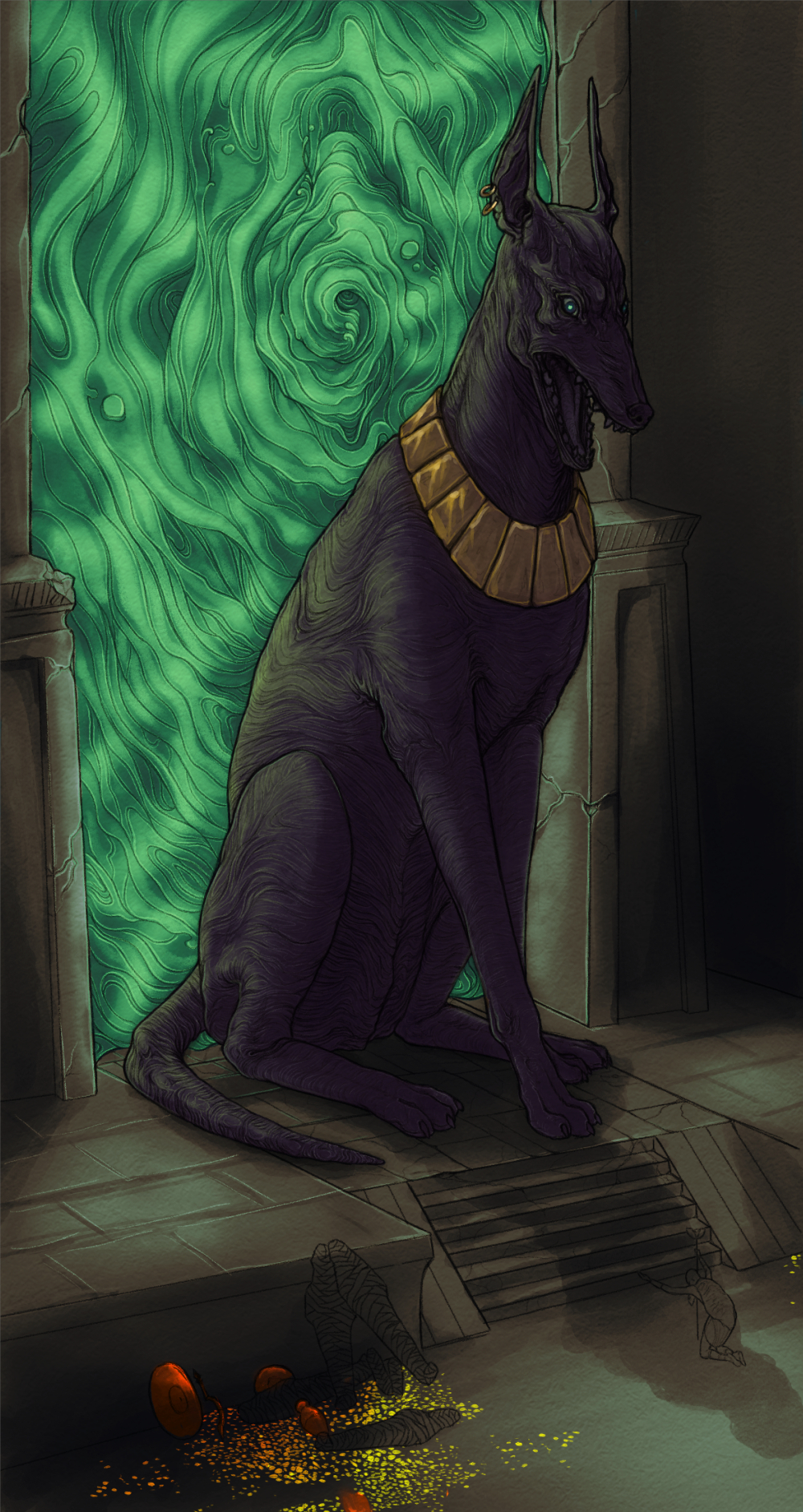
Part of the criteria of the Dragon assignment was we had to use neutral lighting and perspective because at the end we'd be paired up with our secret dragon rider partners. I think we were one of few who stuck to it because ours was the only one that successfully worked with the rider riding and not just posing next to the figure - it was fun. ![[Image: 15._Vampire_Rottenpocket_-_OwlBiscuit.png]](https://cdn.discordapp.com/attachments/884566679647031306/897799412196200500/15._Vampire_Rottenpocket_-_OwlBiscuit.png) I am currently playing around with lighting but may have overworked this piece - WIP:  Each piece I'm asking myself those questions and output is definitely higher. I am having a little bit of burnout lately from my day job but chipping away bit at a time. Am mostly caught up on the lighting and background because I haven't really done any backgrounds for a long while. I think I may wind this back and do it over.
10-28-2021, 08:03 AM
Hey dude I did a little paint-over of your latest piece in hopes of igniting you out of your burnout ^.^ (hope you don't mind)
Just a couple of layer styles (overlay, vivid light and hard light) just to bush those green values up. Try and visualise that light and how it would wrap around a form. Also lights are great to set a mood, its big and intimidating try and use the lighting to push those feelings. Amp it up so to speak, I mean the dogs huge after all make the lighting a big part of the painting too. I hope this helps dude and thanks for the welcome on my SB!
10-29-2021, 01:23 PM
Really digging your latest updates, some great character and dragon/animal designs. Very much looking forward to seeing how the Egyptian piece turns out, looks epic already so it can only get better!
10-29-2021, 09:14 PM
Hey Deebzie,
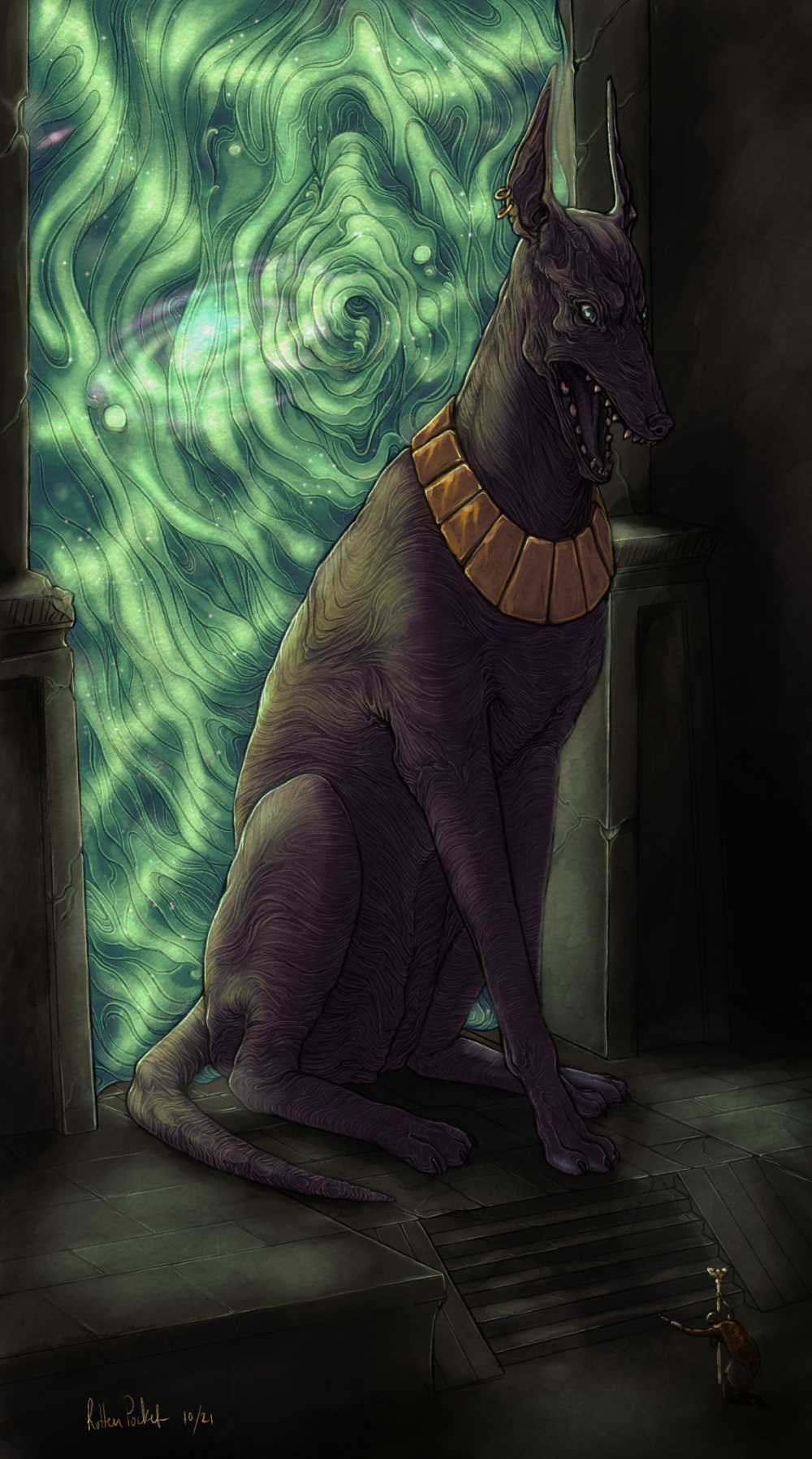
Thanks for taking the time to do that. I think it's definitely a different route than what I had in mind but I will be looking to use stronger light sources/saturations as I go forward. Here's the thing anyway, I have called it done. Went for a heavens/stargate kind of vibe and ditched the treasure/mummies which felt out of place. 
11-10-2021, 02:06 AM
Awesome job on the new piece! The texture on the dog is cool since it helps contour all the forms. Also love the space themes in this! Nice work on the perspective in the scene, is there anything you have studied or use to help better understand perspective?
11-11-2021, 06:34 AM
(11-10-2021, 02:06 AM)Ben Nissen Wrote: Awesome job on the new piece! The texture on the dog is cool since it helps contour all the forms. Also love the space themes in this! Nice work on the perspective in the scene, is there anything you have studied or use to help better understand perspective? Hey Ben, thank you. I didn't do anything too involved, mostly intuitive. I had started with 3 point but it was way too distorted so redid the stone and ended up cropping it close anyhow. I did box in the dog first. I've started another monthly challenge a bit late, due on Sunday. This time it's no secret, it's just taking a dark character/creature/environment and placing it in another period or setting. I don't do much fanart if at all so it took a moment between my very eventful month to come up with a 1920s Flapper Clicker Zombie... WIP,
11-14-2021, 08:28 AM
 My entry into another community challenge.
11-15-2021, 08:28 AM
I think you executed that concept as well as one could hope for. Skin is convincingly warty and leathery and I love the dress design with all the shiny trimming.
11-15-2021, 01:30 PM
(11-14-2021, 08:28 AM)RottenPocket Wrote: My entry into another community challenge. I really like your textures!
11-15-2021, 05:55 PM
(11-15-2021, 08:28 AM)Pubic Enemy Wrote: I think you executed that concept as well as one could hope for. Skin is convincingly warty and leathery and I love the dress design with all the shiny trimming. In the time alotted, yes agreed haha. I should have looked at more photos and footage of dancers, like tap or jazz, I feel like it would have been less stiff. But for the time it took it's good enough. I think I'm going to look at making brushes again, this time for Clip. I couldn't find one for the desired mushroomy peach-fuzz effect. On to the next piece! (11-15-2021, 01:30 PM)Anomily Wrote: I really like your textures! Thanks! I like to make them. |
|
« Next Oldest | Next Newest »
|