Posts: 320
Threads: 2
Joined: Jul 2012
Reputation:
7
Nice going with the detailed lineart and planning before diving into some rendering!
Remember you mentioned an art block on the previous page. Have you tried painting really zoomed out on your canvas, using big brushes and bold strokes? Blocking in the major areas first, getting mood and atmosphere in there before anything else. Feels like a good way also to create something when you have no idea of what to paint, those abstract shapes gets the old imagination ticking :)
Posts: 465
Threads: 2
Joined: Mar 2013
Reputation:
18
Did you do any thumbnailing from imagination for this pose, or just start drawing from the photo? it looks like you grabbed the reference before deciding on what you wanted for the pose and I think that's where the emotional disconnect is coming from. Gotta tell the story before making it look pretty/accurate!
I'd definitely try giving her torso more of a tilt so she's leaning in to be close to the falcon, and maybe tilting her head up so she can look straight at it instead of looking up with her eyes, to me that seems like she's less interested
Posts: 656
Threads: 6
Joined: May 2013
Reputation:
12
(04-27-2014, 04:04 AM)Samszym Wrote: Did you do any thumbnailing from imagination for this pose, or just start drawing from the photo? it looks like you grabbed the reference before deciding on what you wanted for the pose and I think that's where the emotional disconnect is coming from. Gotta tell the story before making it look pretty/accurate!
I'd definitely try giving her torso more of a tilt so she's leaning in to be close to the falcon, and maybe tilting her head up so she can look straight at it instead of looking up with her eyes, to me that seems like she's less interested
Thanks for the feedback! I especially like to hear it in these early phases, when it's still easy to fix stuff. I did do a whole bunch of thumbnails from imagination before heading out with a camera, but they weren't very good. My focus was on the thing the falcon was bringing, rather than her relationship with her bird. That's where I missed the boat!
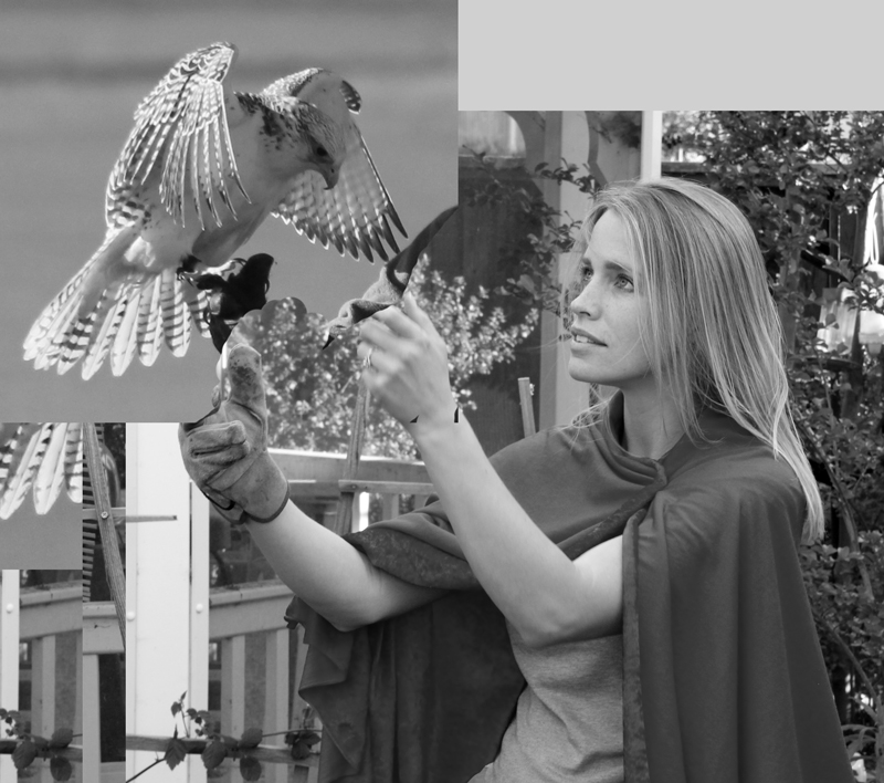
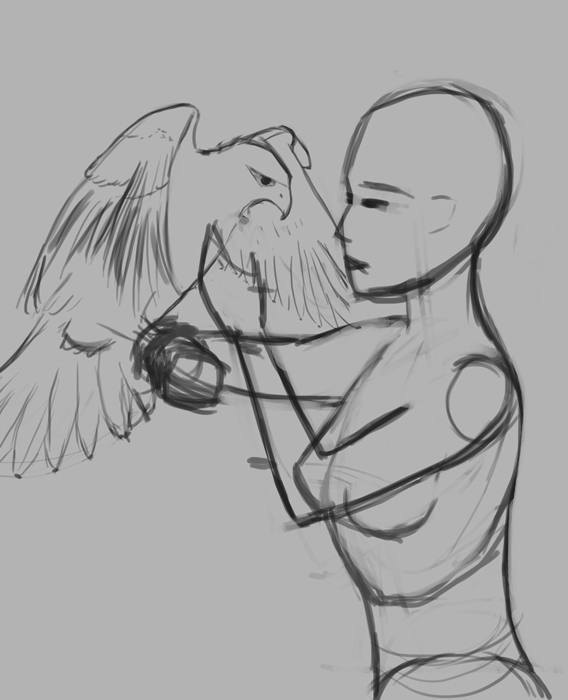
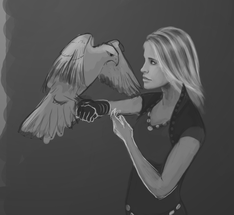
Some more work with this. Even closer with the faces. I moved the falcon down and onto her forearm so they could look more straight on at each other. Anatomy fail--will fix later.

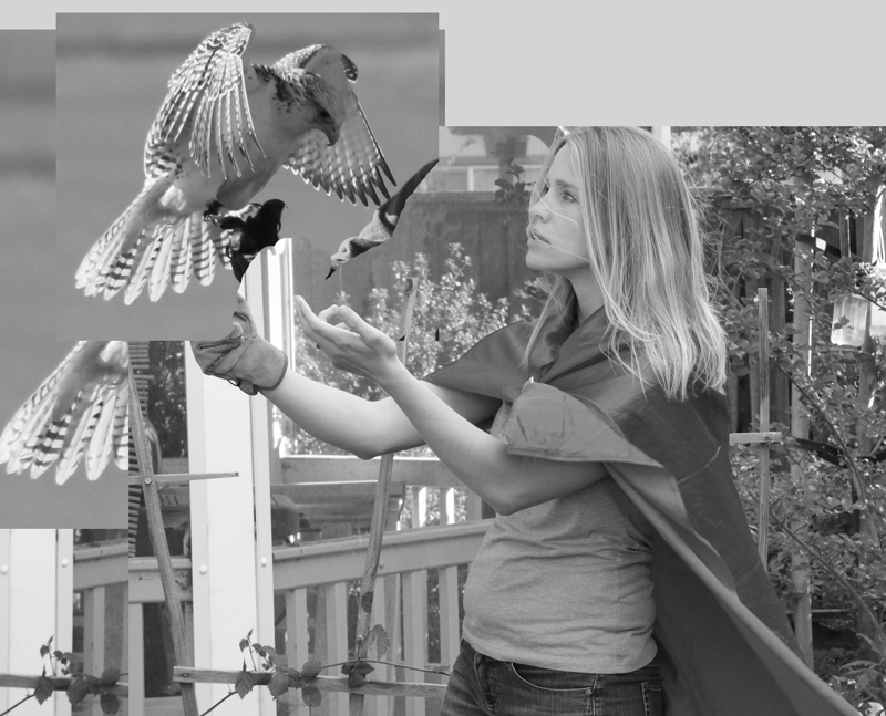
Some of the rejected refs. Maybe they're better. I'm not really sure:


_________________________________________________________________________
The best time to plant a tree was 20 years ago. The second best time is now.
-Chinese proverb
Sketchbook
Posts: 470
Threads: 3
Joined: Dec 2013
Reputation:
9
Hey, thanks for droping by my sketchbook ! :)
So about your WIP, looks good so far and yea, anatomy needs some fixing but remember to not dive into details too soon, it goes first from general stuff, without proper construction, no amount of detailing can fix it..
Posts: 656
Threads: 6
Joined: May 2013
Reputation:
12
Taking it back to construction, sans cloak for now. The cloak was confusing. I'm giving it my best guess before snapping another ref.

Alternate crop

_________________________________________________________________________
The best time to plant a tree was 20 years ago. The second best time is now.
-Chinese proverb
Sketchbook
Posts: 362
Threads: 10
Joined: Mar 2012
Reputation:
21
Following this wips closely - very exciting to see you developing it!
I may add i am mesmerized with your last ref-shot. That slightly dreamy face with the hair strands looks super romantic.
I like the upper crop a bit more because the lower one looks a bit crowded - but of course you have to think how to fill that empty space without distracting from the main focus.
Keep going!
Posts: 654
Threads: 4
Joined: May 2013
Reputation:
22
I'm liking the wip so far. i'm with wolfenkels on the cropped piece, the lower one looks a bit crowded, however I think the original crop was better then both of them, its like the second crowded one but theres more room around them to make it feel less so.
Posts: 850
Threads: 4
Joined: Mar 2013
Reputation:
21
Lovely reference shot! Kudos for taking your own! :)
Right now, in comparison to the reference, the girl is leaning a bit more forward, making her look a bit tense, whereas the photo looks more relaxed and balanced, Obviously depends entirely on what you want to convey. (I drew a line from her throat straight down - observe the difference in her torso/balance. You could in this case draw that line whereever you like, it's just to help you visually compare the relationships of hip, shoulders etc)
I agree with Wokenfels, the cropped version is a bit crowded - if you prefer the landscape format, you could try to leave a bit more space to the bottom, including her elbow, and cut away a bit behind her head (there is not much of interest to be seen there). Might make for a nice composition with intersecting thirds at her eye.
Keep it up! That's going to be a really cool painting :)
Posts: 656
Threads: 6
Joined: May 2013
Reputation:
12
@Lyraina--Yep, you're right about the balance. I'll fix it.
@Wolkenfels--I'll try the vertical. I'm always paranoid about leaving too much blank space, but I think I overcompensated!
@Triggerpigking--Yep, you're right--crowded.
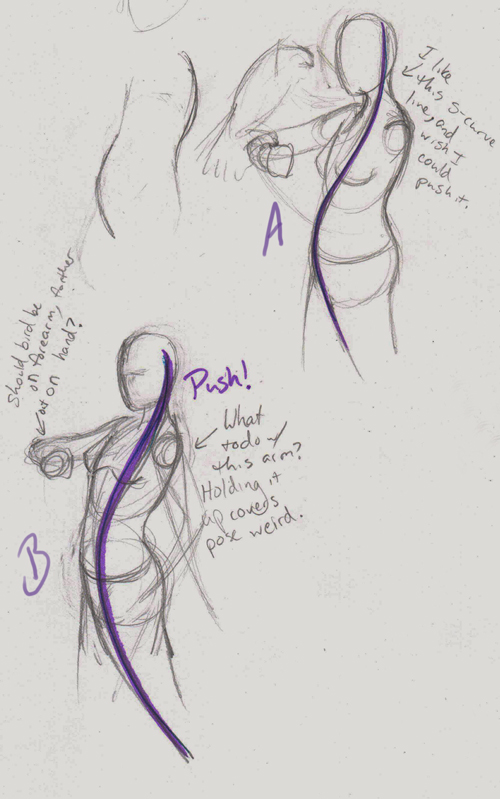
I'm real shaky sketching on the tablet, so I thought to get a better pose I'd go back to pencil. I really liked the pose in the last ref and tried to base it on that. Arms are a stumper.
I guess I kind of have two different paintings in mind. An epic-ish moment, bird landing wings flared, or a close quiet moment between two friends. Gotta pick. I feel like I shouldn't do both.

Yet another thought.

_________________________________________________________________________
The best time to plant a tree was 20 years ago. The second best time is now.
-Chinese proverb
Sketchbook
Posts: 465
Threads: 2
Joined: Mar 2013
Reputation:
18
I think your absolutely right about needing to pick the scene you're going for, I think it would be much easier for you if that had been the first thing you did! Once you decide on what the emotion of the piece is you'll have a standard to help you make decisions about the pose and the composition and everything else.
I still don't think you should be looking at photo reference yet, to me working form a photo from the beginning seems very limiting to the imagination. Really figure out the emotion in the posing and then bring in the photos to make it all look real! See what happens if she's leaning forward to be closer to the bird, or maybe raising her arm above her for the bird to perch on and giving them a more dynamic relationship, or maybe her and the bird are a lot more vertical and stable and at rest. It all depends on what emotion you want the scene to be showing.
I think your reference and sketches right now suggest she's sort of scared of the bird and that it's going wild, maybe getting ready to fly off. To get the mood you want I might draw it right before it lands, and to show it's landing emphasize its feet more than the wings with value contrast and really clear silhouette.
Hope that helps, really looking forward to seeing this piece as you move on, it;s really nice to see how much thought you're putting into it!
Posts: 202
Threads: 7
Joined: Jul 2012
Reputation:
2
Really nice improvement!! Keep it up!!
Posts: 905
Threads: 39
Joined: Sep 2013
Reputation:
51
Thinking of a brief background for them would help with theme and pose and expression I think. Is the bird a messenger? Is the bird hunting for leisure, and she's out enjoying a leisurely break? Is the bird a working bird and its hunt decides if she'll eat well or stale bread tonight? Is the bird a sport bird training for a competition? What does she has depending on the bird? Stuff like that, but don't let it get more complicated than a sentence or two.
I have a problem with doing full painting from concept myself, so I'm rooting for you to make it! Don't give up!
Posts: 656
Threads: 6
Joined: May 2013
Reputation:
12
So after much pondering, I decided to go with the friendship one. Plus, since it's my first fantasy painting in a few years, it's probably a good idea to opt for something simpler. I'm kinda hoping for a night scene in which their pale skin and feathers kind of glow.

_________________________________________________________________________
The best time to plant a tree was 20 years ago. The second best time is now.
-Chinese proverb
Sketchbook
Posts: 656
Threads: 6
Joined: May 2013
Reputation:
12
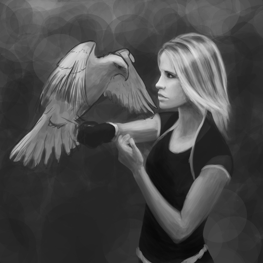
Some more work. I decided the cloak looked like a cover-up for bad anatomy skills, so away it goes. No fudging!
But something is off. The head seems too big or something. I've consulted proportion charts and reference, changed arms and body to make them bigger, but then it looks even weirder.

_________________________________________________________________________
The best time to plant a tree was 20 years ago. The second best time is now.
-Chinese proverb
Sketchbook
Posts: 465
Threads: 2
Joined: Mar 2013
Reputation:
18
I think it's a problem of direction more than proportion, it seems like her mouth/chin forms belong to a head that is is tilted down but her eyes and forehead belong to one that is tilted up. Make sure you've got a consistent angle on everything, it's really east to draw a facial feature at a different perspective or angle than the rest of the head and it throws everything off.
I'd also probably move her neck forward a little, it looks like it connects too far back.
Posts: 656
Threads: 6
Joined: May 2013
Reputation:
12
Thanks Sam, I think you're right. Hopefully the face is moving away from picasso-ness now.
Some more work. They say not to worry about how long it takes...so yep, this one image will be taking a lot longer!

_________________________________________________________________________
The best time to plant a tree was 20 years ago. The second best time is now.
-Chinese proverb
Sketchbook
Posts: 1,109
Threads: 18
Joined: Apr 2014
Reputation:
68
It's looking really nice Tygerson! I'm cheering for you : )
Posts: 227
Threads: 1
Joined: Jan 2014
Reputation:
5
It's really interesting following your steps of this wip! It's already coming along nicely, I really like the expression! Here's a little thing I noticed though, if you look closely at the hair, it looks like a "stripe pattern" a bit, first you have a small strand of light hair, then theres a broader, darker area, followed by the light hair again and so on. To me this looks kind of odd, maybe you could add a bit more variety here to break it up and make it look more natural.
I'm really curious for the finished one (: Keep it up!!
Posts: 54
Threads: 4
Joined: Oct 2012
Reputation:
6
Hey, I've been looking at this and I think I can help you with some advice if you care for it.
First off move the head abit closer to the body, it looks like the first reference shot where the head is glancing somewhat upwards, but not since it's slightly lower, so should the head be lower. Also the head seems big because of the size of the hair, just trim it abit from the top side and that might do it.
And you should definatley put back the cape, it kind of fits a falconeer (if that's the word)
Plus it ties the composition if you try making it like below here.
Cheers, sorryf if I was out of line. Just wanna try to help out :D

Posts: 241
Threads: 3
Joined: Jan 2013
Reputation:
3
Nice work here.
Would like to see you doing more studies, and continuing what you were doing with the figure and gesture studies, making some good progress there.
And perhaps some feather studies and such like would help you with the development of your latest piece.
|


