08-17-2014, 05:35 PM
Hello Daggers!
Welcome to the Crimson CHOW (Character of the Week)! This is a biweekly challenge which was created as a way to hone your skills in design and character creation, in a fun and competitive way. Each challenge, we will give you a short descriptive passage of a character and it is your task to interpret the character as you imagine it, with your own unique spin. The winner will be chosen through a poll in the finals thread, and in addition to being able to pick the next week's topic, his/her work will be featured in a Winners Circle thread and in the banner for the next challenge!
Here is the passage:
"He left footprints in red as he walked away from the gory aftermath, and took a moment to admire the crimson sheen on his blade. He sheathed the bloody dagger and joined his brethren nearby, and together they sank into the pitch-black night."
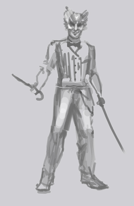
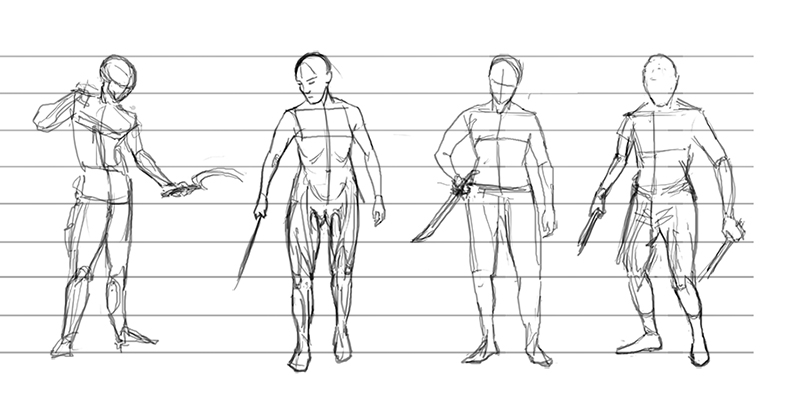
Your task: Design a member of "The Crimson Daggers".
(Keep in mind you are not required to stick strictly to what is in the passage. It is more of a guide in terms of mood.)
Guidelines:
Deadline is Sunday, August 31 @10pm GMT
(*Post your finals here: http://crimsondaggers.com/forum/thread-5369.html )
Welcome to the Crimson CHOW (Character of the Week)! This is a biweekly challenge which was created as a way to hone your skills in design and character creation, in a fun and competitive way. Each challenge, we will give you a short descriptive passage of a character and it is your task to interpret the character as you imagine it, with your own unique spin. The winner will be chosen through a poll in the finals thread, and in addition to being able to pick the next week's topic, his/her work will be featured in a Winners Circle thread and in the banner for the next challenge!
Here is the passage:
"He left footprints in red as he walked away from the gory aftermath, and took a moment to admire the crimson sheen on his blade. He sheathed the bloody dagger and joined his brethren nearby, and together they sank into the pitch-black night."
Your task: Design a member of "The Crimson Daggers".
(Keep in mind you are not required to stick strictly to what is in the passage. It is more of a guide in terms of mood.)
Guidelines:
- Photo textures, 3D, and traditional mediums are allowed.
- There is no restriction on the character's gender, time period, or culture.
- Environment backgrounds are optional.
- Studies are recommended, but not required.
- There is no restriction on image formats (horizontal, vertical, square).
- Finals must be posted in the finals thread before the deadline.
- At least 3/4 of the character must be visible (minimum from the knees up). No back views are allowed without a front.
- Only ONE character please.
- Only ONE submission per person in the finals thread.
- Sketches, WIPs, or rushed artwork will not be accepted into the poll.
- No fanart. We want to see your original, unique interpretations!
- Have fun!
Deadline is Sunday, August 31 @10pm GMT
(*Post your finals here: http://crimsondaggers.com/forum/thread-5369.html )
Sketchbook ~ Blog ~ Deviantart ~ Livestream


![[Image: aGJbHDY.jpg]](http://i.imgur.com/aGJbHDY.jpg)


![[Image: X2ZvNFa.png?1]](http://i.imgur.com/X2ZvNFa.png?1)
![[Image: CHOWIdeas001.jpg]](http://i267.photobucket.com/albums/ii308/Suira/CHOWIdeas001.jpg)
![[Image: CHOWIdeas002.jpg]](http://i267.photobucket.com/albums/ii308/Suira/CHOWIdeas002.jpg)
![[Image: CHOWRoughComp.jpg]](http://i267.photobucket.com/albums/ii308/Suira/CHOWRoughComp.jpg)
![[Image: ChowPainting1.jpg]](http://i267.photobucket.com/albums/ii308/Suira/ChowPainting1.jpg)
![[Image: 1vUG0Vi.jpg]](http://i.imgur.com/1vUG0Vi.jpg)
![[Image: inspo_zps88d73abc.png]](http://i233.photobucket.com/albums/ee268/Charlie342/inspo_zps88d73abc.png)
![[Image: 9A5B1B02-9085-4571-9D77-7432610665D9_zpsxrstg3qv.jpg]](http://i233.photobucket.com/albums/ee268/Charlie342/9A5B1B02-9085-4571-9D77-7432610665D9_zpsxrstg3qv.jpg)
![[Image: 86CFC31F-0F62-4DE1-9882-2EEF58CB10E7_zpsvtumgjrz.jpg]](http://i233.photobucket.com/albums/ee268/Charlie342/86CFC31F-0F62-4DE1-9882-2EEF58CB10E7_zpsvtumgjrz.jpg)
![[Image: 9623847b-d69c-4da6-b939-9c74dfb06eb7_zpsc702ea3a.jpg]](http://i233.photobucket.com/albums/ee268/Charlie342/9623847b-d69c-4da6-b939-9c74dfb06eb7_zpsc702ea3a.jpg)


