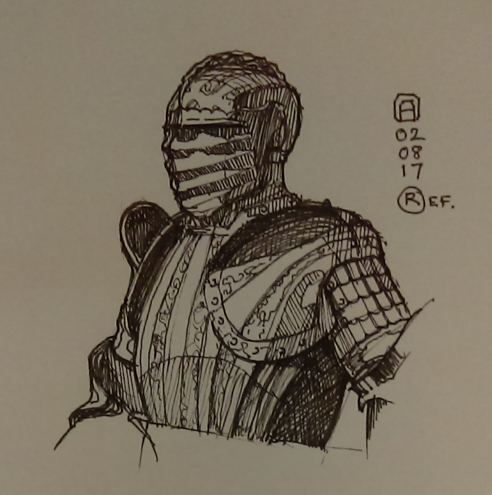
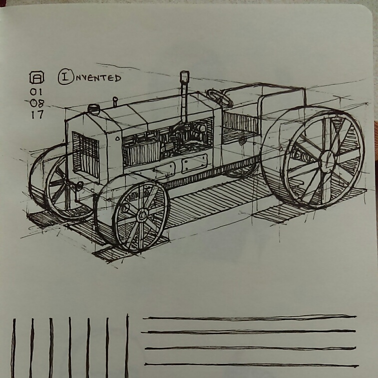
Posts: 54
Threads: 3
Joined: Mar 2016
Reputation:
0
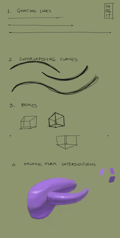
I really like your daily training plan :) I keep trying to make one, too, but then I start wondering if the exercises are actually that helpful and keep changing it. Sticking to more basic exercises, that are undoubtedly helpful, seems like a great idea.
(And I actually find those cubes really appealing! Especially the one on the left.)
Posts: 1,109
Threads: 18
Joined: Apr 2014
Reputation:
68
hey dude, awesome stuff going on! the architectual stuff is hard on your focus right ? takes a lot of patience to do all those repeated details!
Something about drawing on tablet, since I struggled with that a lot, still do but not so much anymore; I think it's good to break away from that 'do a nice perfect line in one stroke' approach, since it's just really hard with a tablet, I think better is to draw the line in little sections. Watch how Scott Robertson draws traditionally and you will see what I mean - it's basically chicken scratching, like you're not supposed to do, but in a more trained hand where you can hit your previous line, strengthen it and continue it, it looks good. Also a few broken lines, even doubled / overlapping, as long as they are drawn with confidence and purpose, will still make the finished cube look nice. Like this: https://rachiemk.files.wordpress.com/201...7159_1.jpg still looks good despite the pencil work.
Hope that's helpful! If not just ignore : )
Posts: 1,424
Threads: 12
Joined: Dec 2015
Reputation:
139
@tinDeer: Thanks for the encouragement :). I kept finding myself going back to the fundamentals so I thought why not build a daily routine around it? Let's see if it helps.
@JyonnyNovice: Yeah I had to take loads of breaks with that last architectural piece. Also that sounds like a smart way to tackle drawing on a tablet dude i.e. not trying to hit the perfect line in one go - thanks. I'm finding that trying to hit the perfect line on a tablet is way harder than doing it on paper. Also I seem to prefer drawing from the wrist with a tablet instead of the elbow or shoulder - gonna keep on with the elbow and shoulder for a while though see if things improve.
Here's my drill for today anyway:
Also I'm done with my first book cover illustration for my author friend. Just emailed it to him for approval:
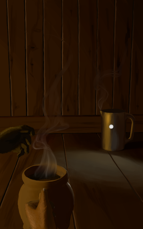
I'm not completely happy with it - slightly untidy in places and the shape of the hands could be better but I need to move on.
“Today, give a stranger one of your smiles. It might be the only sunshine he sees all day.” -- H. Jackson Brown Jr.
CD Sketchbook
Posts: 54
Threads: 3
Joined: Mar 2016
Reputation:
0
Hi Artloader! I really like the look of the wood on the book cover. And the reflections on the jugs look great, too, especially how you considered and incorporated the light the ground reflects back.
And though what's happening on the cover has a mysterious feeling to it, the colours are so warm it seems relaxing at the same time. I think that's a great mix.
You said you already sent it, so I hope a quick note is still alright: is it possible that the white reflection on the ground is a bit close to the rear jug? The little light source seems too high up to make such a strong and immediate reflection on the ground, so it seems a bit as if the light source on the jug was pointing towards the ground, which is doesn't seem to be. I have a feeling the light would only touch the ground very softly, and the shape of the cone would be less recognisable.
I hope I didn't just interpret the light source wrong and this is somewhat helpful.
Either way, I think it's a great peace!
Posts: 1,424
Threads: 12
Joined: Dec 2015
Reputation:
139
Hey TinDeer, thanks for dropping by, yeah I see what you're getting at about the light on the floor in front of the kettle. There's no way that you'd know from that angle but it's a domed (convex) light so it protrudes outwards a little - hence the closeness to the kettle of the reflected light on the floor. I'm hoping the lighting is pretty accurate as I 3D modeled it in Blender.
In the meantime, I've been carrying on with daily drills.
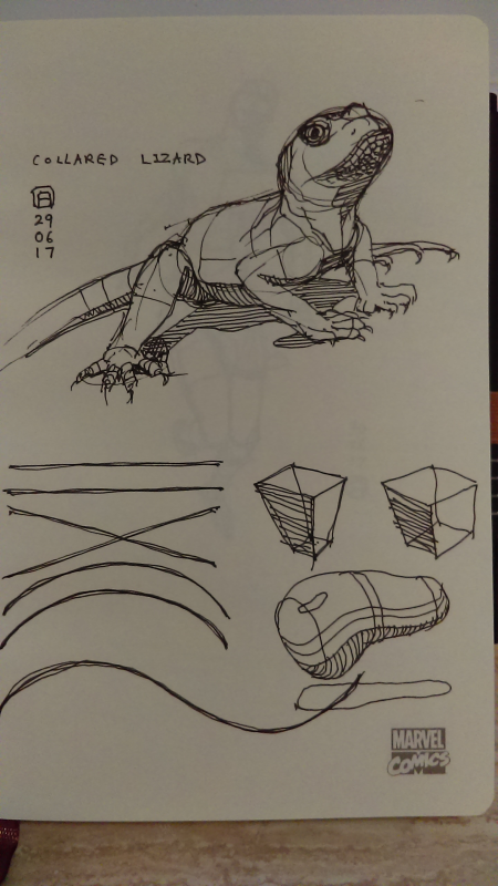
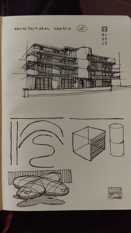
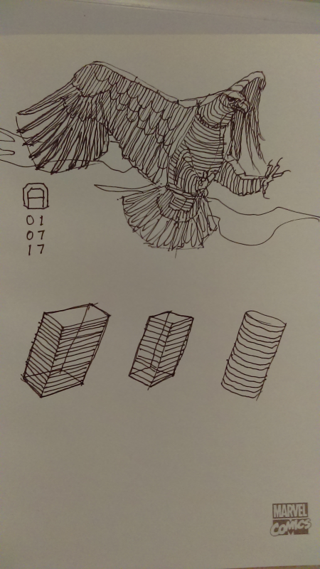
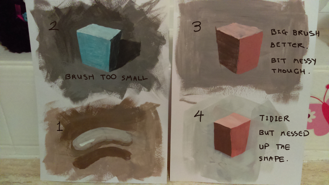
Every day I endeavour to do the following:
1. Drawbox.com style lines, curves, boxes and organic forms.
2. Construction sketch from reference (constructing an animal, human or piece of architecture from basic forms in perspective).
3. A small acrylic painting exercise (at the moment I'm painting basic forms).
Here are some examples - any critiques would be very much appreciated:
“Today, give a stranger one of your smiles. It might be the only sunshine he sees all day.” -- H. Jackson Brown Jr.
CD Sketchbook
Posts: 2,817
Threads: 15
Joined: Jun 2013
Reputation:
109
bro, I think you got a good thing set up. My advice to you, is to really get the shakiness out of those lines. Grab some shitty paper (plenty of it) that ain't pretty, put in a movie or something to keep you from getting bored and just make swift lines, you know all sorts of those basic shapes, straight lines, but go for both speed and accuracy. You know, be fast, but be aware of when things aren't correct, and you will lose that shakiness I'm seeing.
Use shitty pens or pencils too, gotta hammer out that problem, and using nice materials for that will feel depressing. You're close though, I think that would help you alot
Posts: 1,424
Threads: 12
Joined: Dec 2015
Reputation:
139
@Fedo: Yep - thanks for the feedback dude, my lines are still all kinds of shaky - as you say maybe drawing them faster is the way to go. Also found that I really struggle drawing vertical lines from the shoulder on my Wacom, check out today's digital drills:
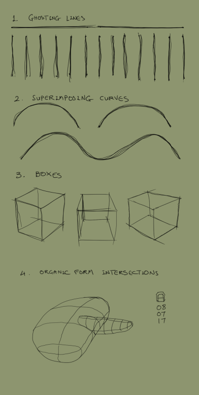
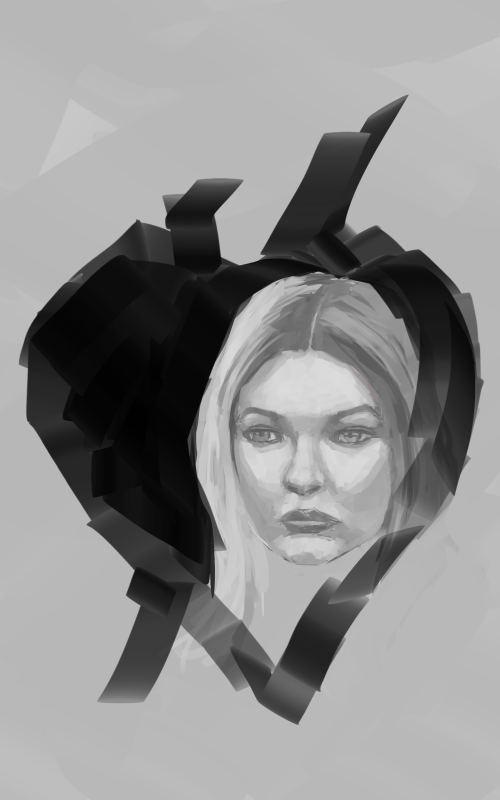
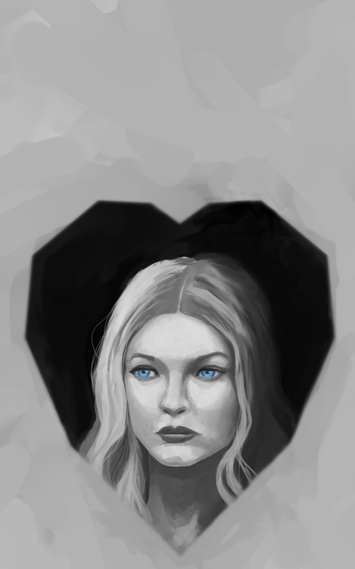
Also, I've made progress on my second book cover, going for a slightly abstract piece here with a cold looking lady on a black heart silhouette (any critiques would be greatly appreciated):
“Today, give a stranger one of your smiles. It might be the only sunshine he sees all day.” -- H. Jackson Brown Jr.
CD Sketchbook
Posts: 364
Threads: 11
Joined: Dec 2013
Reputation:
73
(07-09-2017, 08:46 AM)Artloader Wrote: @Fedo: Yep - thanks for the feedback dude, my lines are still all kinds of shaky - as you say maybe drawing them faster is the way to go. Also found that I really struggle drawing vertical lines from the shoulder on my Wacom, check out today's digital drills:
Also, I've made progress on my second book cover, going for a slightly abstract piece here with a cold looking lady on a black heart silhouette (any critiques would be greatly appreciated): Hey Dude, just thought id give my impression..
i feel you could go for some more interesting lighting on the girls face. alternatively you could just make her super pale and contrast with a very dark graphic heart. the heart itself is a bit confusing, it looks a bit icon heart and bit anatomical. if you didnt mention it was a heart im not sure i would have got it.
so heres a quick take on it, nothing great but thought maybe to keep a bit of abstactness you could merge the shapes of the girl and the heart and stuff haha
hope its worth something despite being crude
im also not sure about what the cover is for, so theres that too
anyway good stuff ;) peeaace
![[Image: paintover_artloader_by_andrew_gibbons-dbg1fto.jpg]](http://orig14.deviantart.net/6d63/f/2017/193/9/5/paintover_artloader_by_andrew_gibbons-dbg1fto.jpg)
Posts: 3,355
Threads: 37
Joined: Aug 2013
Reputation:
234
I don't know if you draw the last sketch on the yellow paper base any on those two video this but if not it almost the same type of exercise explain here maybe they can add some good element atleast there good to see a second time as they touch the fundamental element of drawing the LINES, ELLIPSES AND BOXES
https://www.youtube.com/watch?v=wgDNDOKnArk&t=673s
http://drawabox.com/lesson/1
In the drawbox.com link he explain how you can improve you line quality in the section
What i would advise you as he said it said at drawbox.com and that i also recommend is ghosting line and as he also advise to make dot that you can link with line it a quick exercise that require hand eye coordination and also control.
Posts: 1,109
Threads: 18
Joined: Apr 2014
Reputation:
68
looking good my man! each time I visit there's a few levels jump, keep going dude ^^
Posts: 1,424
Threads: 12
Joined: Dec 2015
Reputation:
139
@xelfereht: Awesome! Thank you for the paint over dude! Some great points there - especially the point about the heart shape not being obvious. Also the story is called "Cold Black Heart" and is about a woman who sells her organic heart for money (it is replaced with an artificial heart). As you said, I've increased the contrast between the face and the black heart. After that I think I'd like to keep things simple so might go down the icon root instead of the anatomical route.
@Darktiste: Yep, I love drawabox and Peter Han - these exercises are based off their teachings - I still have many miles to travel on my art journey though :).
@JyonnyNovice: Thanks for dropping by dude always great to hear from you my friend :).
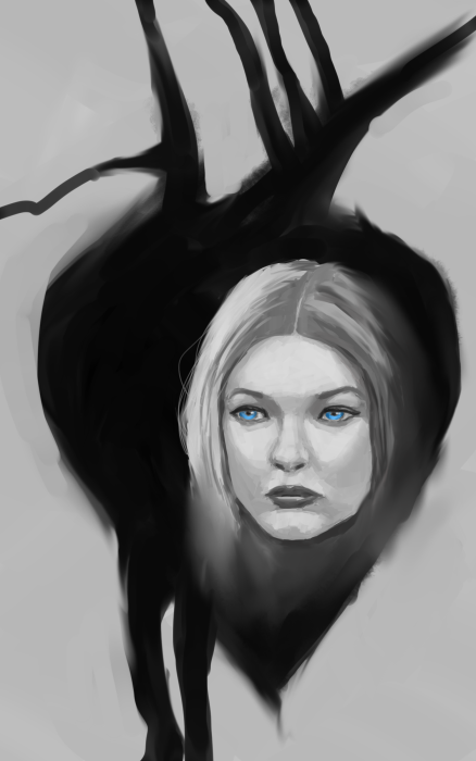
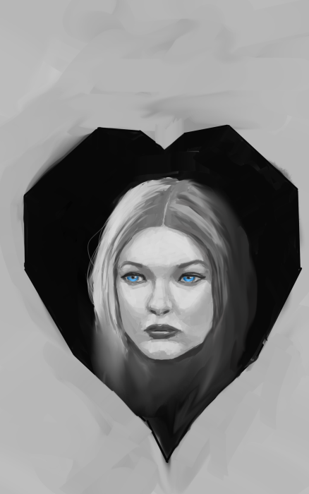
Anyway - some more variations on my Cold Black Heart book cover (the second one is my favourite at the moment - any further advice would be very much appreciated):
“Today, give a stranger one of your smiles. It might be the only sunshine he sees all day.” -- H. Jackson Brown Jr.
CD Sketchbook
Posts: 364
Threads: 11
Joined: Dec 2013
Reputation:
73
cos its a cover youre leaving space for text right?
i dont know how i feel about the slight off centeredness.. i think either more off center or in the center.
the sides of the heart create a bit of a parallel tangent
If you havent seen this i like Sinix's video on tangents
https://www.youtube.com/watch?v=RJIWllIMHsg
i think you could take the expression 2 ways that would help, either having her look forward right at us with a cold blank stare or looking off to the side suggesting she sees/knows something we dont.
i think because of the graphic look of the heart you could also find a more graphic lighting for her face to be more striking at first look.
all just suggestions though, its your piece ;) peace
Posts: 2,817
Threads: 15
Joined: Jun 2013
Reputation:
109
the shape in the top one isnt very attractive, just kinda random assymetrical patterns. If you go for the second one, add some space to the left and right that are just blank because the sides are too close to the border of the canvas ;)
Posts: 1,424
Threads: 12
Joined: Dec 2015
Reputation:
139
@Xelfereht: Yeah the space at the top is for the title text. Good points dude - I tried to make the heart more central and fix the tangents (really useful video on tangents by the way - thanks!).
@Fedodika: Yeah I've gone for a more geometric design for the heart shape now and tried to change the sides slightly. Thanks for the feedback dude.
OK so here's the final version that I submitted last night:
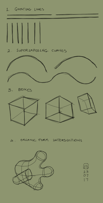
Another daily drill:
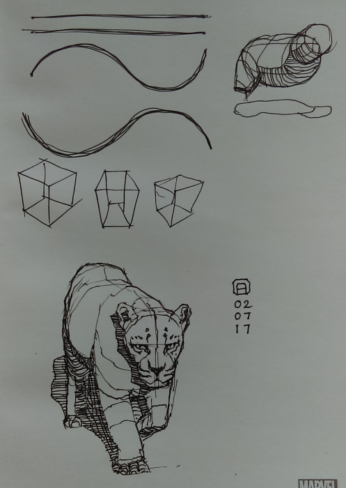
And a daily sketch:
“Today, give a stranger one of your smiles. It might be the only sunshine he sees all day.” -- H. Jackson Brown Jr.
CD Sketchbook
Posts: 1,424
Threads: 12
Joined: Dec 2015
Reputation:
139
“Today, give a stranger one of your smiles. It might be the only sunshine he sees all day.” -- H. Jackson Brown Jr.
CD Sketchbook
Posts: 1,424
Threads: 12
Joined: Dec 2015
Reputation:
139
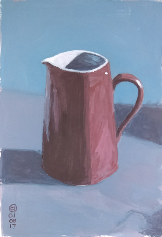
Acrylic painting practice after a Will Kemp tutorial: http://willkempartschool.com/how-to-pain...2-colours/
“Today, give a stranger one of your smiles. It might be the only sunshine he sees all day.” -- H. Jackson Brown Jr.
CD Sketchbook
Posts: 1,424
Threads: 12
Joined: Dec 2015
Reputation:
139
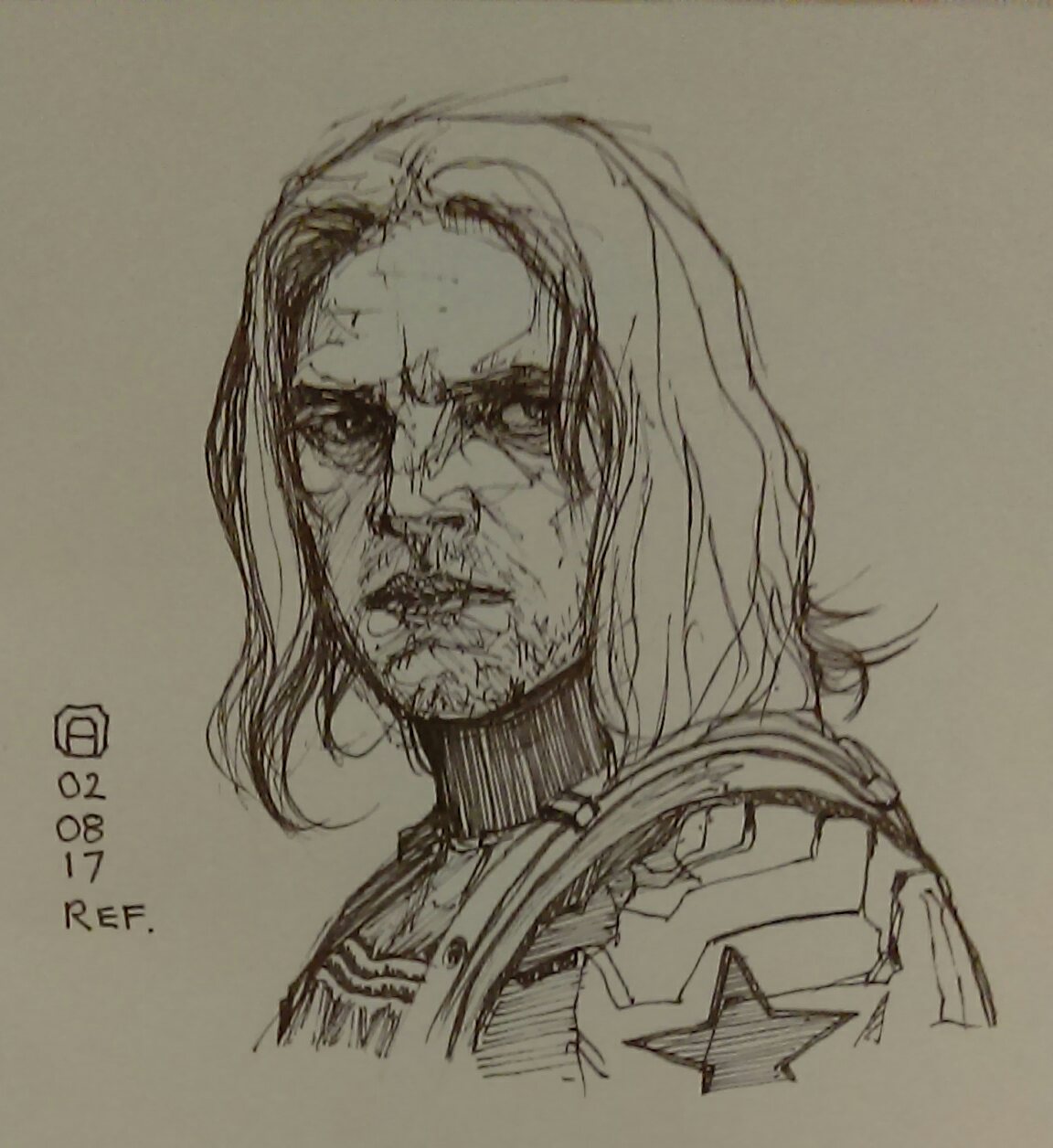
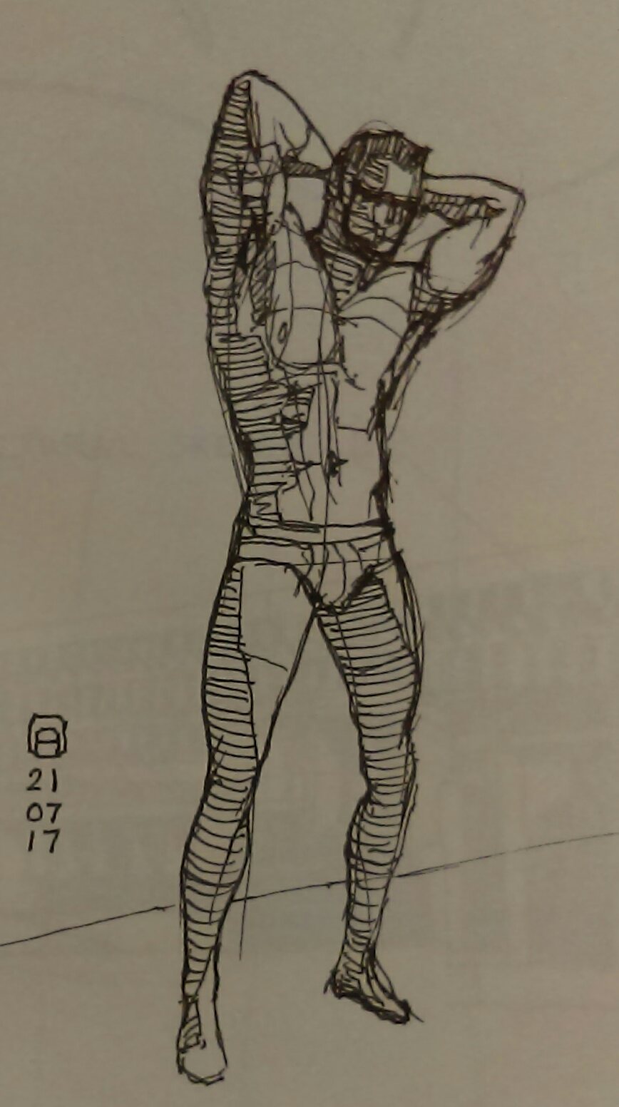
More pen sketching:
“Today, give a stranger one of your smiles. It might be the only sunshine he sees all day.” -- H. Jackson Brown Jr.
CD Sketchbook
Posts: 48
Threads: 2
Joined: Jul 2017
Reputation:
6
Thanks for the critique in my sketchbook, you had a great eye. You're killing it with those pen sketches, I love how you're constantly practicing the fundamentals of line and construction. Sorry, this might be too late, but here are a few things I thought of when seeing the book cover piece:
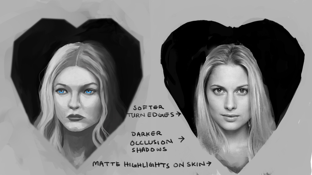
I would have done a paint over but my portrait skills are atrocious, but hopefully, an edited photo would illustrate those points. I think many of these issues can be sharpened by doing a couple of 1 to 1 cast studies or accurate value studies in general. Hope this helps, hope to see more and keep up the great work!
![[Image: dorian-070531-guliano.jpg]](http://www.dorian-iten.com/wp-content/uploads/2015/01/dorian-070531-guliano.jpg)
Posts: 1,424
Threads: 12
Joined: Dec 2015
Reputation:
139
@Ubem: hey thanks for taking the time to drop that critique dude, much appreciated, cast studies sound like a good idea for me, I've been focussing on drawing for a while now, maybe it's time for me to shift gears a bit and focus on values and rendering.
Anyway, here are some more lines in the meantime:


“Today, give a stranger one of your smiles. It might be the only sunshine he sees all day.” -- H. Jackson Brown Jr.
CD Sketchbook
Posts: 656
Threads: 6
Joined: May 2013
Reputation:
12
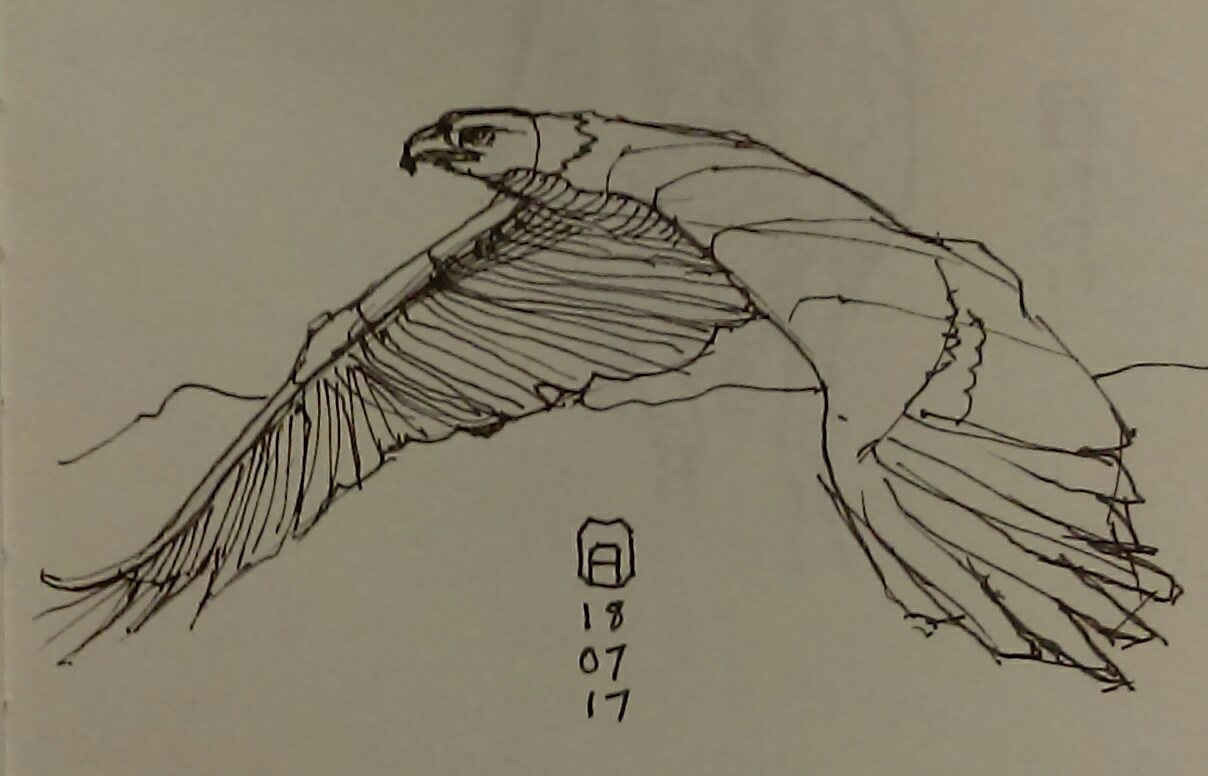
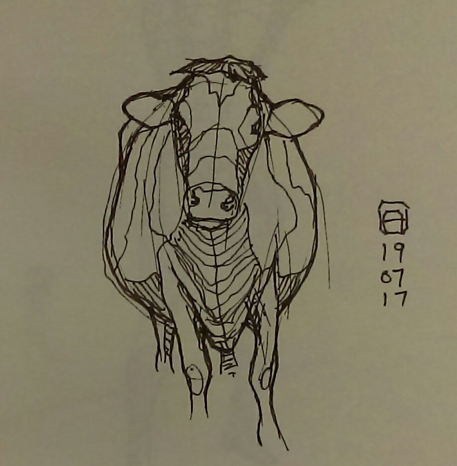
Such a gritty feel to the guy drawn in pen. All the pen sketches are really bold and look great. Those are some hard won straight lines, too.
Great concept with the woman in the black heart.
_________________________________________________________________________
The best time to plant a tree was 20 years ago. The second best time is now.
-Chinese proverb
Sketchbook
|


![[Image: paintover_artloader_by_andrew_gibbons-dbg1fto.jpg]](http://orig14.deviantart.net/6d63/f/2017/193/9/5/paintover_artloader_by_andrew_gibbons-dbg1fto.jpg)




![[Image: dorian-070531-guliano.jpg]](http://www.dorian-iten.com/wp-content/uploads/2015/01/dorian-070531-guliano.jpg)
