Zorrentos Sketchbook
#81
Thats some nice studies man! You working on the right things. : ))

Reply
#82
Cheers man! Really happy that you like my stuff! :)

Allrigth! We finally made it to page 5! It only took 3 years hahaha. Lets hope that we can make it to page 6 WAY faster! I remember in the old CA.org days when I would always get psyked over pushing my sketchbook one page more. I hope I can get that feeling back here.

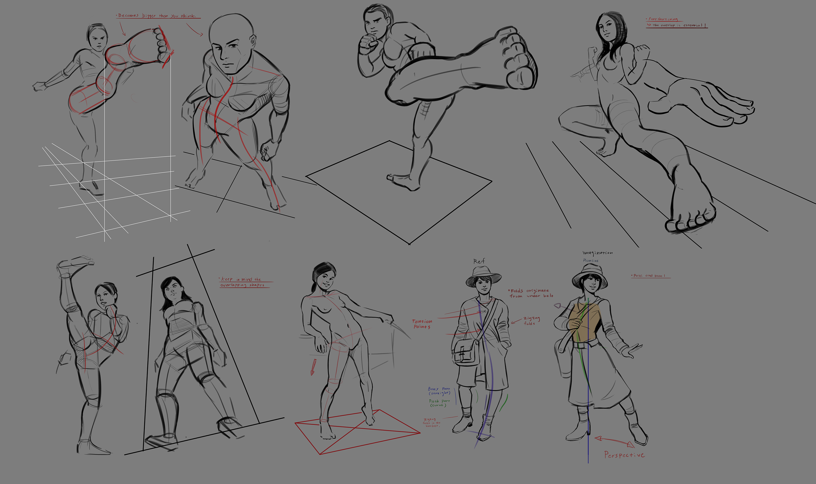
Some more studies and practices. Studied some foreshortening and such this week. I really dont have a lot of free time, but im aiming to update 2 times a week instead of 1 from now on (Inb4 something unexpected happens and completely breaks my update schedule again lmao).


Reply
#83
To separate your subject from the background is always a good idea.Here i apply the concept of contrast in two way.First i use it to bring attention to the character and i also use it to move the eye alterning from light to dark to move the eye around the character


Edit:Ops apparently i thought your first page was your last page i still hope there some value in what i said if not enjoy my paint over.


Attached Files Image(s)


My Sketchbook

Perfection is unmeasurable therefor it impossible to reach it.
Reply
#84
Thanks for the crit darktiste, and dont worry, its still very useful!  Thumbs_up

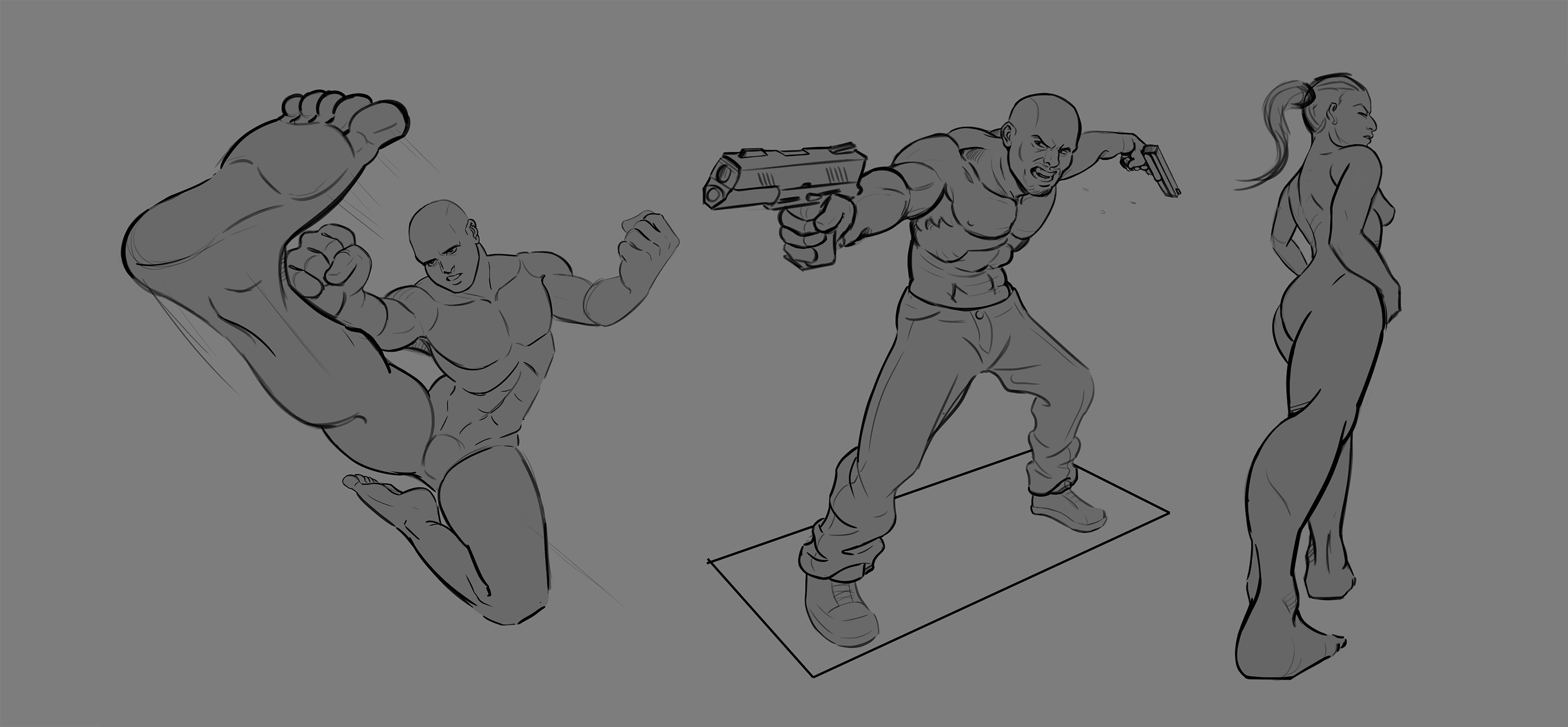
I did some foreshortening studies today. May as well post them now. More this weekend I hope! Lets push to Page 6!


Reply
#85
Wow. Really like that foreshortening practice and the line weight. Great work there :)

---------------------------------------------------------------
Devianart

Sketchbook

Instagram


Cara

Twitter/X

Artstation


Reply
#86
Cheers man! Thanks for dropping by!

Kind of got bit by the lazy bug this week. Ive been oversleeping, not taking care of my courses and workouts and stuff like that. I am also in the process of moving to a new, nice place, so that takes up a bit of my time. Time to step up the game again! We cant allow a backslide at this point!

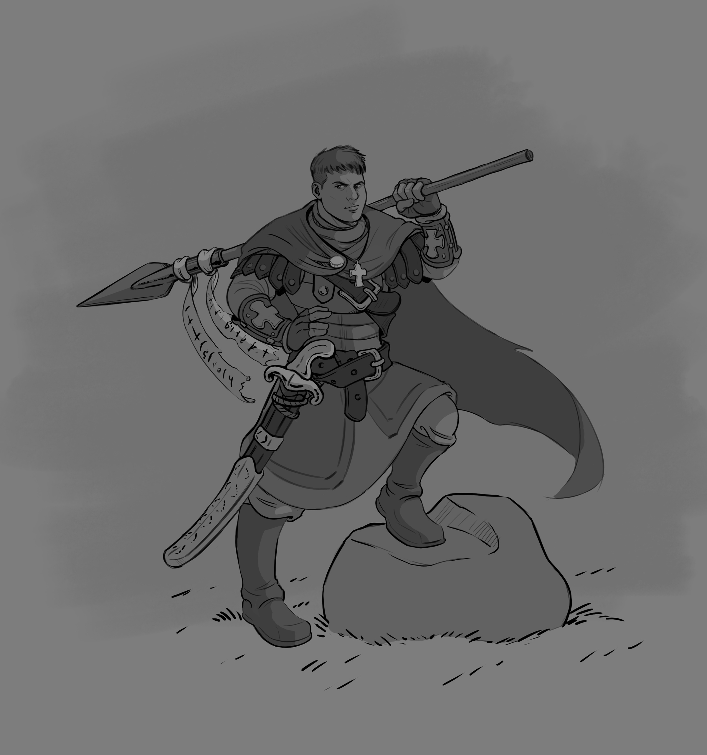
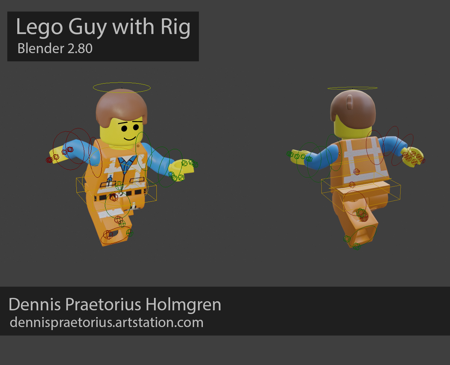
Here is a sketch I did this week outside work. I also continued working on my Emmett model. Built him a rig in blender so that I could animate him. More to come soon.


Reply
#87
Hey guys. Once again, it has been a while since I last posted here. Just got busy with life, and it looks like it can become even busier in the next few weeks, so dont expect me to update this thread until end of July next time. Once Im back, Im hoping to post more frequently as it looks like Im gonna get more free time. Might just begin with daily updates for a while!

Short life update as well. My contract with Luau Games was not extended, so I will be searching for a new job. If I dont find a job within two months, I will go back to school to study Technical Art for one year with a focus in VFX. Hoping to find a job though and actually earn some more money. Wish me luck guys!

Oh, also moving to a new place soon! May have some trouble with internet or whatever, but hopefully not!  Thumbs_up

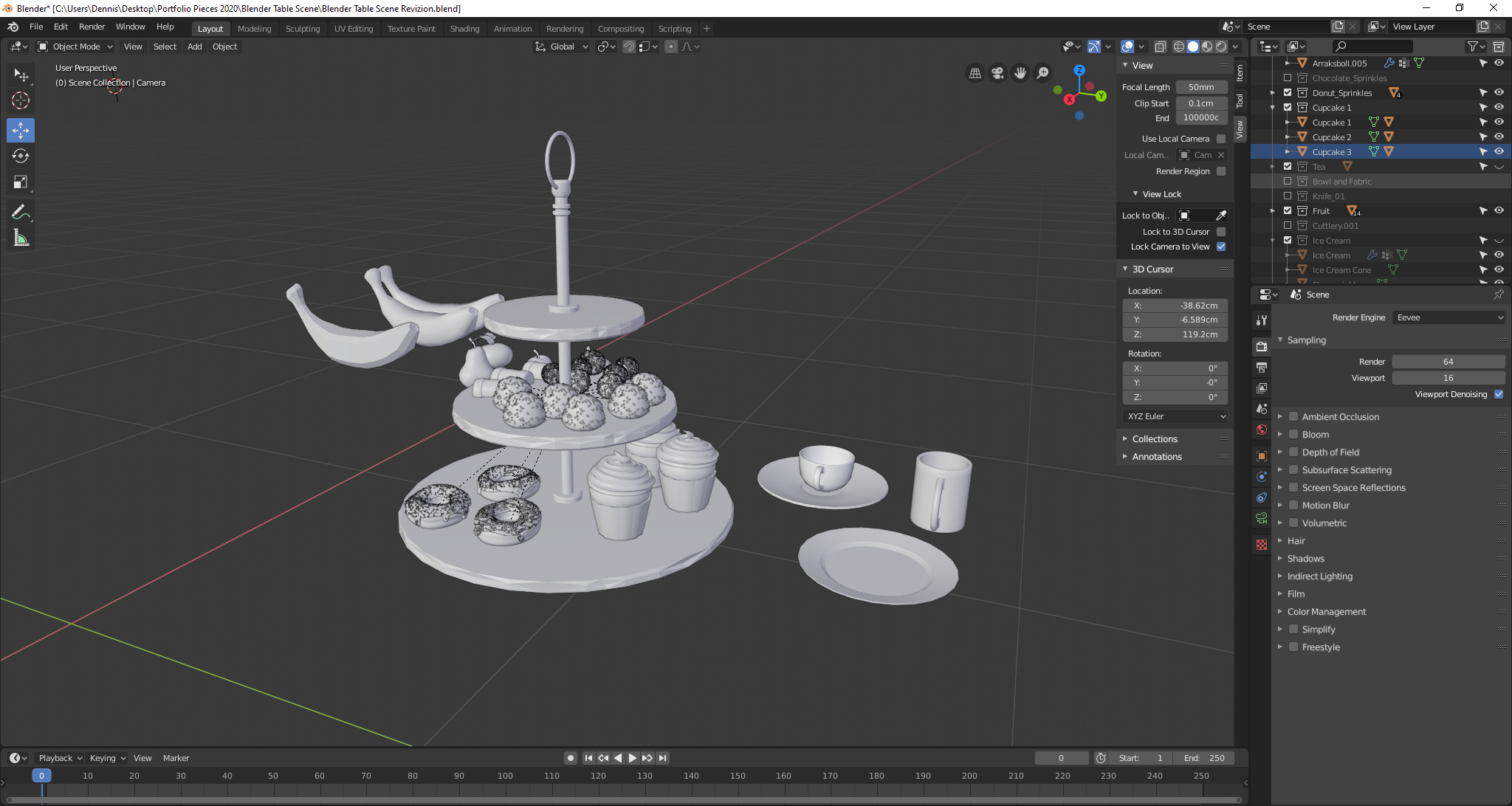
Here is a scene in Blender that Ive begun working on in order to push my Blender/3D skills more. A table with food and pastries.


Reply
#88
I really like the foreshortened studies in post #84 and the Blender render.
Reply
#89
great linework and solid form, also like those foreshortened studies and your character designs, keep up the good work
Reply
#90
@ Zarkatos
@ Nirenia

Thank you so much for the kind words! And thanks for the visit.

Time to post a short update.
I got back from a two week vacation recently. It was great to go away for a bit and just rest after pretty much 1 years worth of hard grind. Now, its time to once again take massive action.

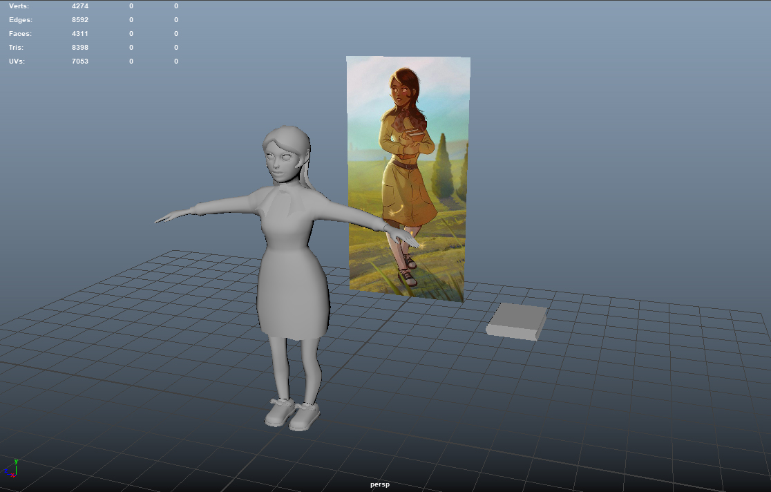
I got an art test coming up for a pretty big company. Its gonna be 3D based, but all I know is they want me to make it in Maya, witch I haven't used a lot the last year (we only used Blender at Luau). I decided to make a character model, texture it, rig it and animate it in order to practice.
 
Here is the model in its current state, its about 8 k tris so far. I want to keep it under 8k tris. I feel a bit silly to jump between projects like this, but I need to focus on the stuff I need to learn AT THE MOMENT for my career. Hoping to finish a lot of half-finished projects after this one:


The design is made by me for a school assignment in 2018.

Reply
#91
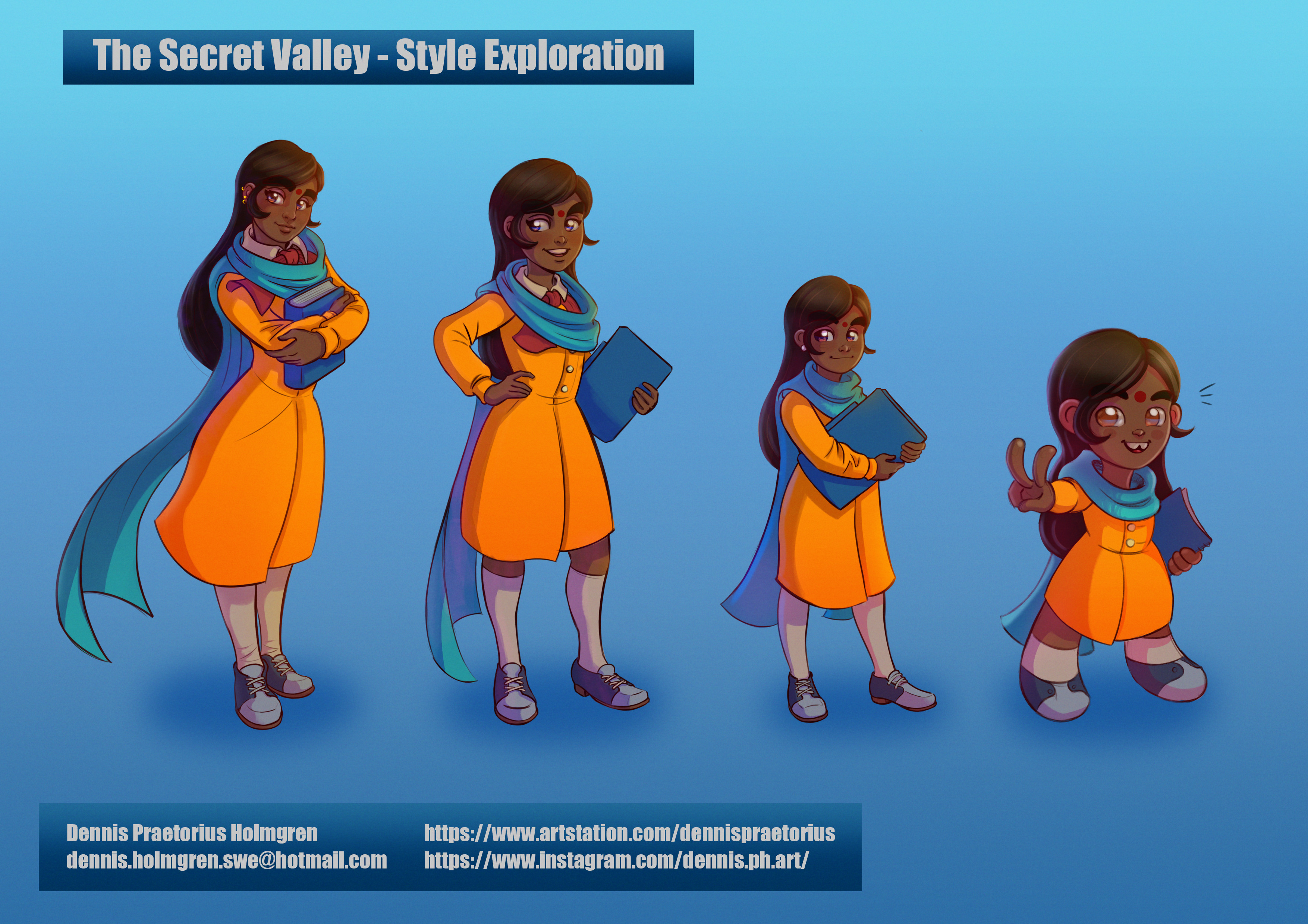
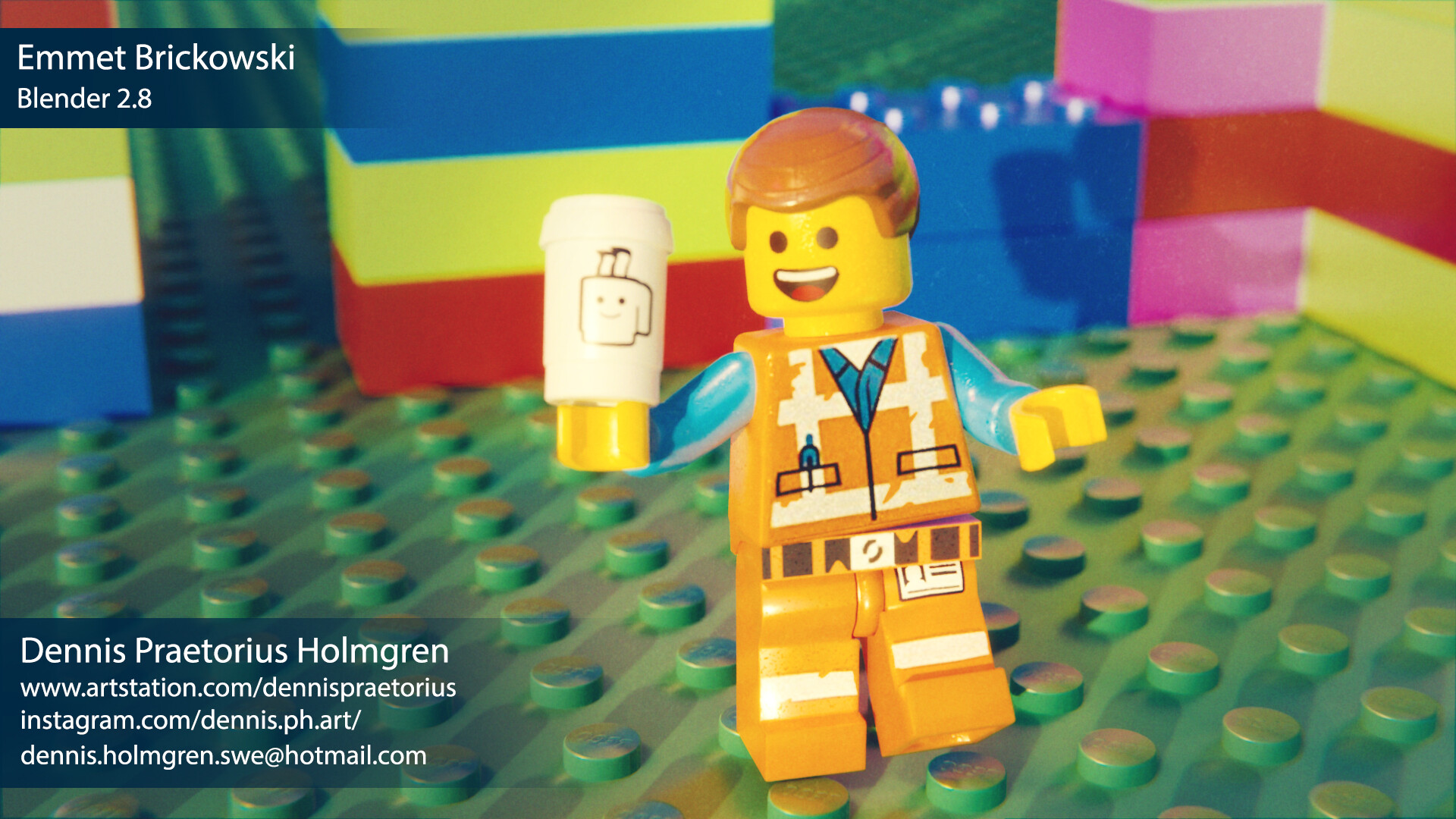
Whats up guys? Just here to drop a couple of recent things Ive made: 

Some character designs and a finished Emmet, rendered in Blender 2.8:


You can also check out a short animation with Emmet over at my Artstation: 

https://www.artstation.com/artwork/d8L5bw

More soon!

Reply
#92
I like the design of the scare-crow like character. Can almost imagine it in a game or a movie.
Otherwise, very good work to look up to. Thank you for sharing.

Reply
#93
Hey everybody. It's time for me to once again come back to this forum/blog. 

So what have I been up to? After I was let go from Luau Games, I was a bit confused about where I should go or what I should do. There was a pandemic going on (still is) and I was not sure about how the job market looked like ...

I decided to try and make sure to have a "backup plan" in case I couldn't find a job, so I applied to education for "Technical Art" at The Game Assembly school. I was thinking that in the worst case, this would be a nice way to enhance my portfolio with expert level rigging, VFX, and shaders.

I applied to every job I could find and also tried to update my websites and portfolio, but there was very little time to do this, and the few weeks between school start and my last day at Luau quickly flew by. I did some tests for companies, but nothing came out of it ...

I started the school with quite high hopes and excitement, however, it turned out to be VERY programming based and math-heavy, two subjects that I have little to no experience or natural talent for. I held out for a couple of months and worked very hard to try and keep up, but each day, I could feel myself sliding back with the school work more and more ... I was not really getting into it, and I could tell there would be NO way I would be able to compete with the other students who all seemed to have strong programming backgrounds already. So just a few days ago I decided to quit.

I am now searching for a job in the game industry (I am focusing on the mobile games industry since that is where I got actual work experience). I set up a very ambitious study/work schedule each day, so expect me to visit this forum quite often from now on.

Your feedback/constructive criticism as well as likes and networking on my websites such as Artstation, Linkedin etc is very appreciated during this time! Hoping to give back with useful feedback as well of course!


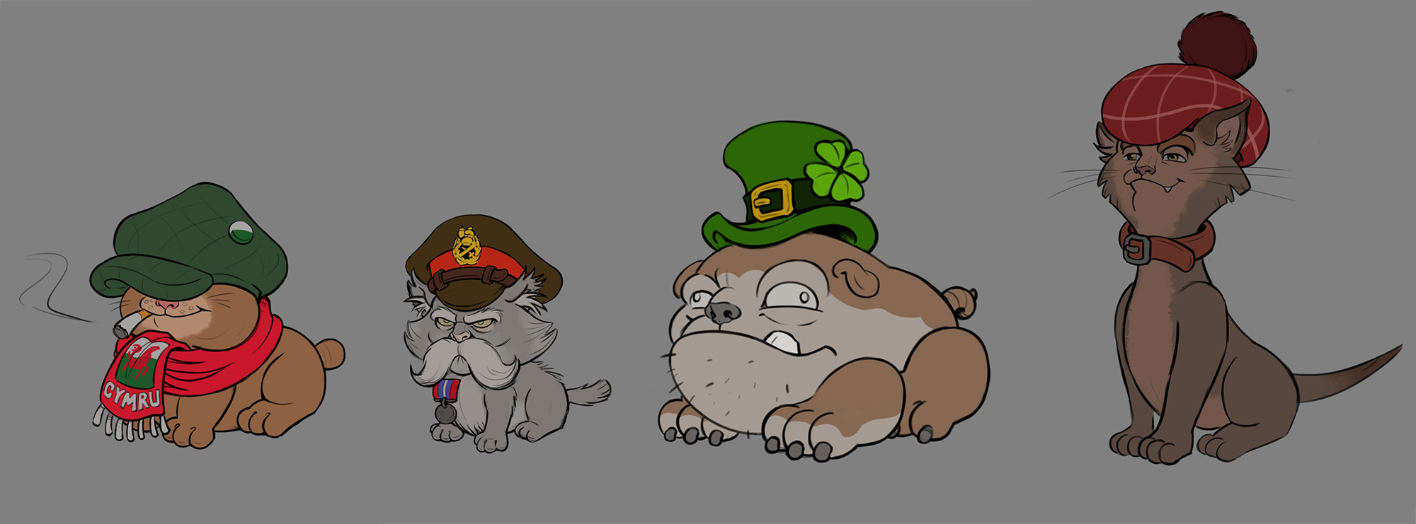
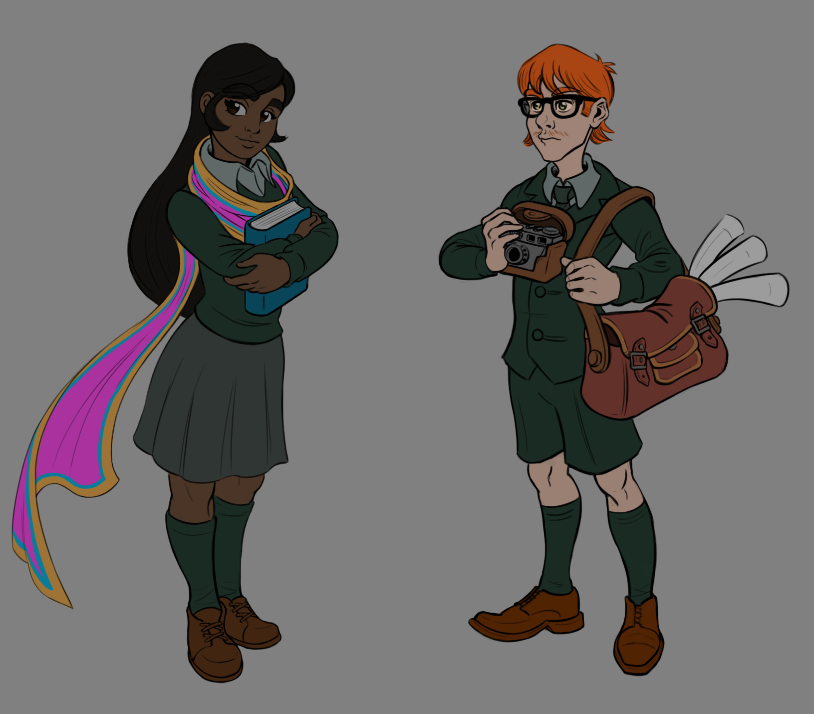
Here are some flat color designs for my upcoming Mobile game mockup project (All of these will be fully painted/rendered):


Reply
#94
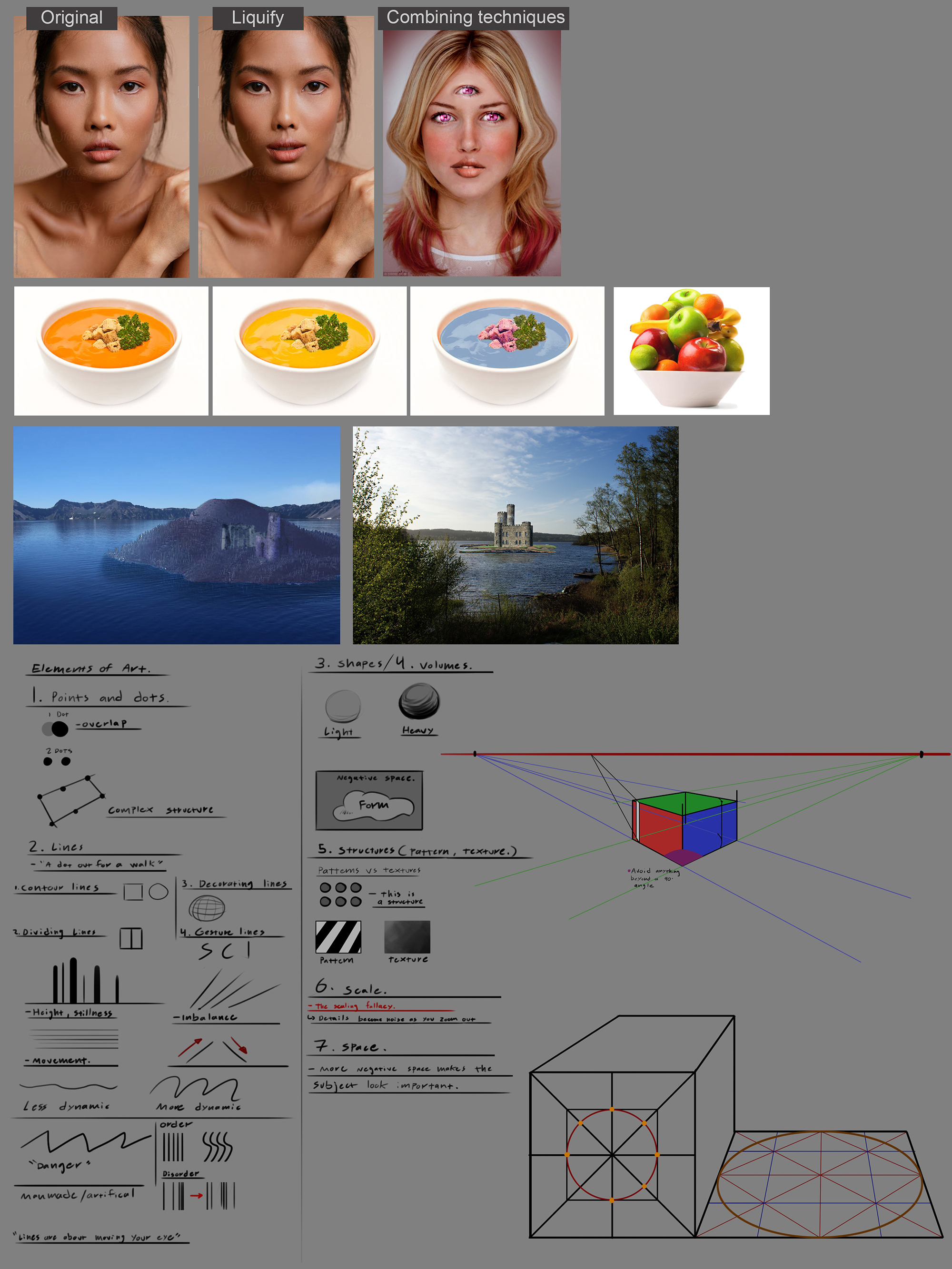
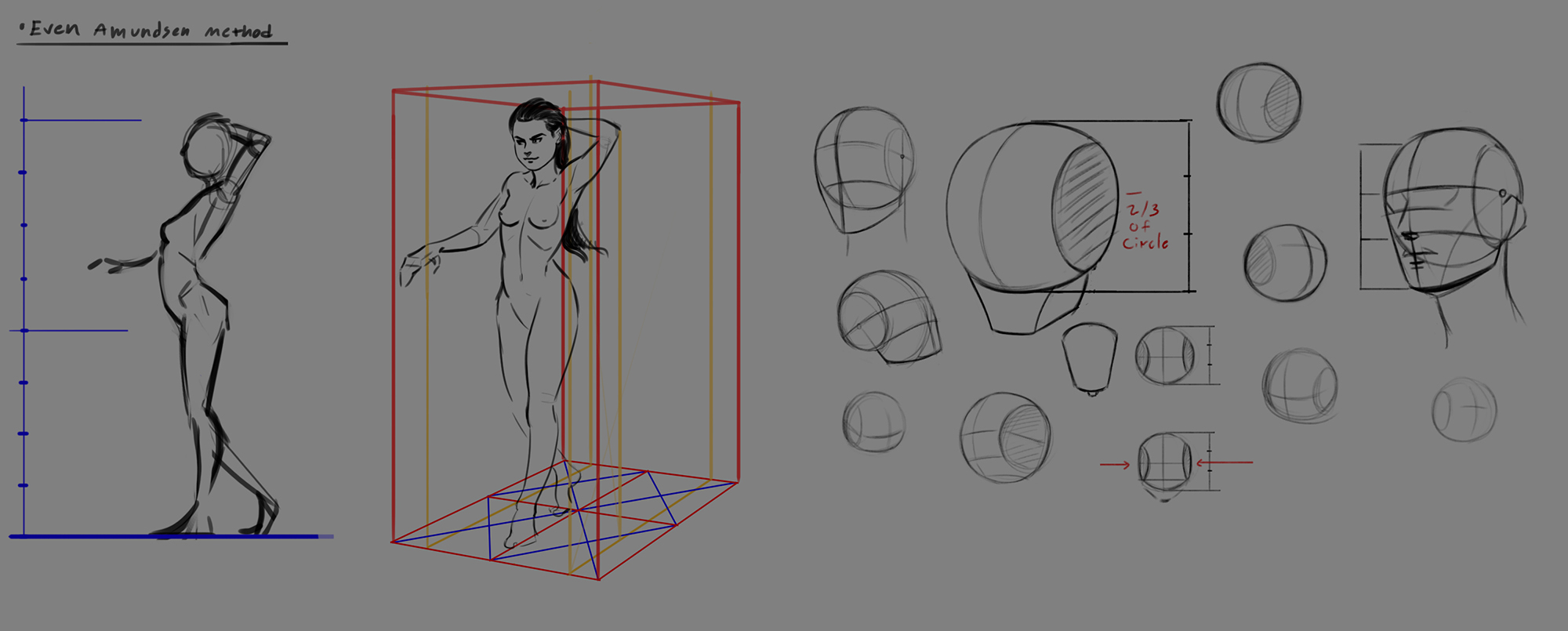
Some studies from Art School Term 1. Im trying to do a little bit every day as a warm up:


Reply
#95
Wow, sounds like you've been through a lot recently. Sorry to hear about your troubles, and hope you find something soon! So is your last post from the art school that you are leaving?

Reply
#96
Thank you JosephCow. It's been a rough time for me, but I guess the same goes for most of the world right now.

The last post is from CubeBrush Art Camp. Im trying to study from it every now and then to continue to improve my skills. The education I attended was NOT art related as I had hoped. 

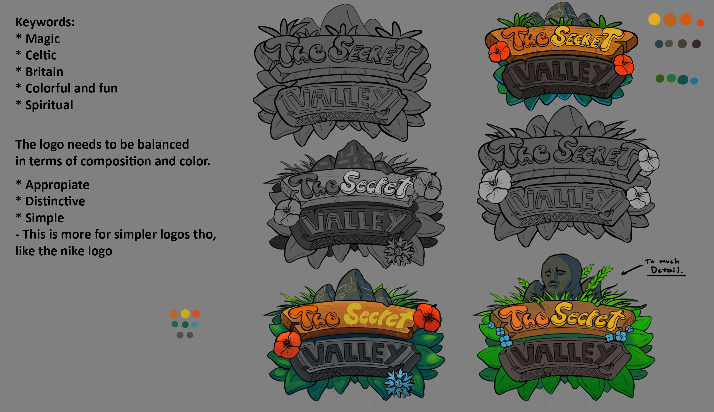
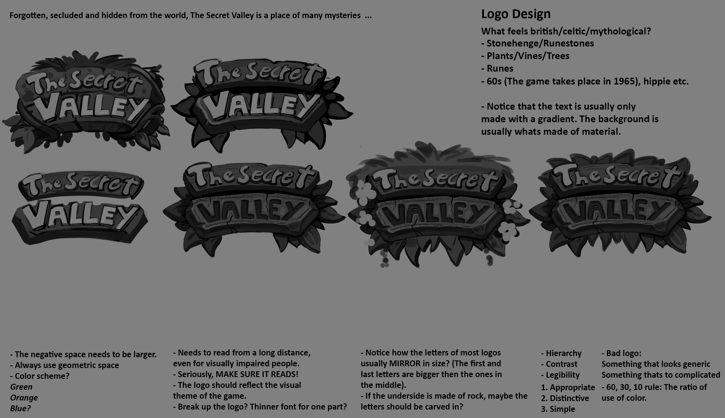
Some more stuff. I am designing a logo for my mobile game mockup. Trying to follow along with a class on designing logos. Some feedback here would be really appreciated:


More soon!  Thumbs_up

Reply
#97
Really digging the logo design! In terms of crit, the main thing would be to make sure it reads on mobile devices. You can see the details on a computer screen, but not so much on a phone. This largely has to do with values and details being too similar in value to the surroundings that they disappear. Like the knot-work under VALLEY can barely be seen. The markings on the rock and the rock face don't stand out as much as they could (and based off the name 'the secret valley' it feels you should lean into these 'mysterious' objects more)

Consider playing around with the sizing of the flowers too. In the left one the red and blue flowers are the same size, despite them not being the same type. Could be more visually interesting if they weren't all the same size (think big - medium - small shapes)

I hope that helps. I think you did nail your keyword of colourful and fun, but there's plenty of room to push it
Reply
#98
Hi Zorrentos i am just here to share a quick tips if you want try when you are about to finish a project to go in image/adjustment if you work in photoshop and play with your adjustment layers to tweak color and saturation you can also try to use the wand or lasso tool to select individual part you think would benefit from being ajusted.I think as i said previously in my comment that you would benefit from thinking more about contrast you generally want your subject to be separated from the background i also don't think it work to your advantage in term of mood to have this none contrast between the character and background it make the character less joyful like they seem to be in term of personality and it create no visual hierarchy for the eye to look at .If you want an idea of how much change some 5min adjustement can make just look at the hand of your male character and compare it to the skin of the face.I also added the desaturated version if you want to compare with your original.

I Wish you the best and i hope this was useful to you.Also just a warning about burn out you might be near one in my opinion i know it hard to hear this from someone else but take care of yourself idk how important it is for you to find a job right now just remember to pace yourself ok?I know your probably eager to have sucess after those misfortune just be aware of how you feel and respect yourself.Sleep well and eat well and surround yourself with positivity and the rest will allign.


Attached Files Image(s)


My Sketchbook

Perfection is unmeasurable therefor it impossible to reach it.
Reply
#99
Dude, I really appreciate how versatile you are. Paintings, 3D models, logos, it's like an art swiss army knife.
Reply
Wow, guys! Thank you all so much for the amazing crits and feedback! You have given me a lot to work with!  In love Party

It's amazing how easy it is to "stare yourself blind" on an image if you just spend all day working on it. Forums like this is great for input and new viewpoints!

@chubby_cat: Thank you so much for the input. Im gonna spend some time today adjusting it and trying the logo on a mobile device to see how it reads. I want part of the logo to include some kind of celtic rune to "sell" the magic/mystery part for sure.


@darktiste: Super valuable feedback man! Thanks a lot! Will try various versions today for sure! 

As for burnout ... Im a bit scared of it, but my back is sorta "against the wall" at the moment. I gotta put the hours in and really make headway towards finding a job.

@mieksta: Cheers! Really happy you like the stuff! 

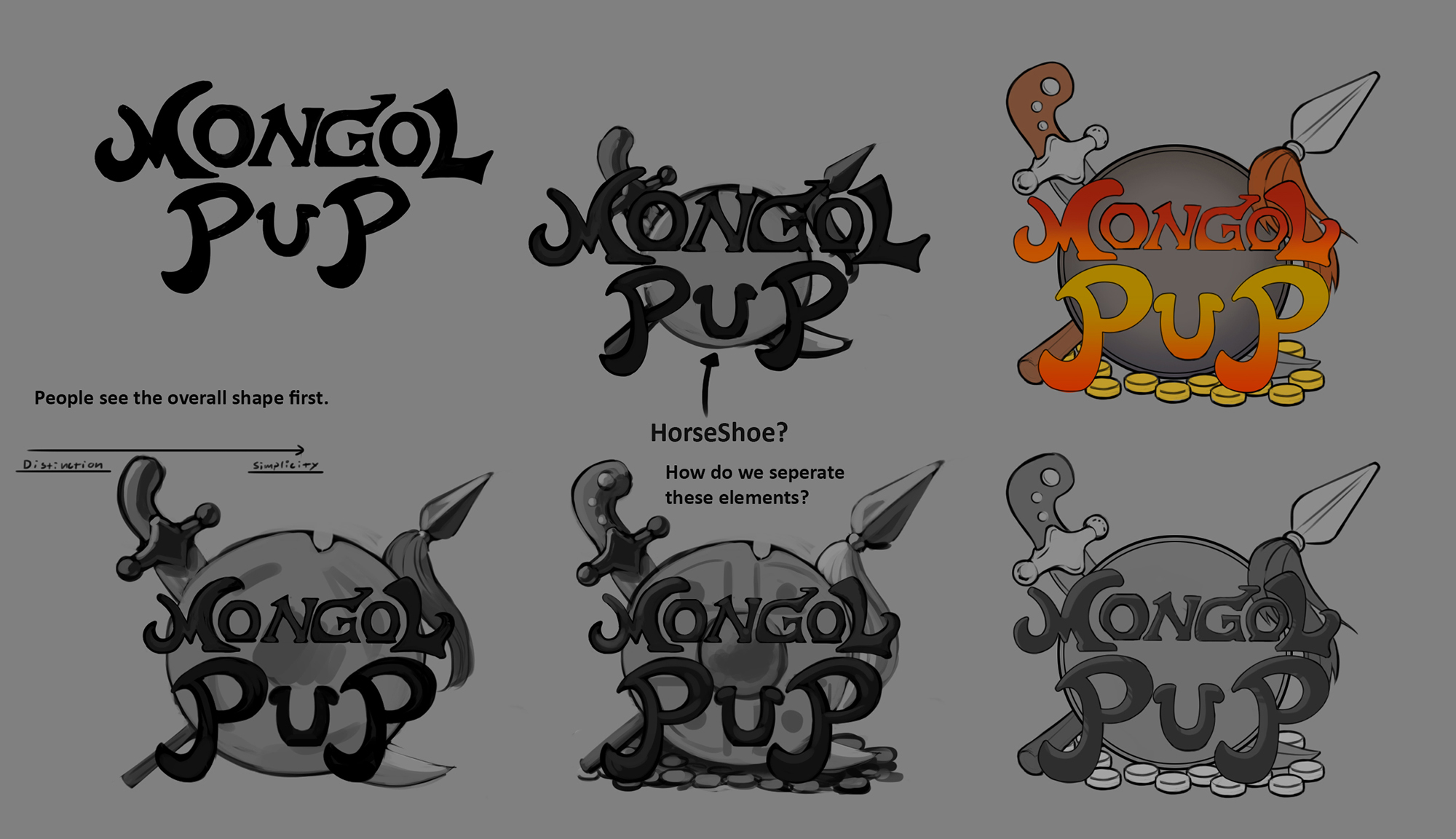
Some recent stuff here. Another logo design I'm working on for a personal project that I plan to return to once I'm done with The Secret Valley. I took a couple of classes in logo designs, so I just decided to get both of them done at the same time:


Some warmup stuff from Cubebrush Art School class. I work on them about 20-30 minute each morning to warmup and just finish them off. A lot of it is repetition, but its great to solidify this info more into your mind: 


More soon!

Reply


Forum Jump:


Users browsing this thread: 76 Guest(s)