Posts: 504
Threads: 9
Joined: Apr 2012
Reputation:
6
I'm pretty sure that's also what i am referring to lol.
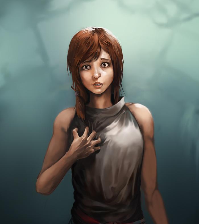
My eye is attracted to her hand first. maybe put something of interest there?
besides that i got nothing along the lines of a crit for you.
this image looks like it belongs as a part of a higher quality anime-styled movie :D
Posts: 227
Threads: 13
Joined: Mar 2013
Reputation:
2
it i sa great picture looks like it could be in a shinikai film :). I think maybe have a secondary focal point other than just the lady cos, everything else is out of focus at the moment, by creating another focal point u will make movemnt in ur pic
Posts: 1,098
Threads: 11
Joined: Aug 2012
Reputation:
34
Thanks a lot guys! yeah i didnt realized that the hand would grab all the attention. Also, it is kinda embarrasing that i put the thumb of her rigth hand is in the opposite side of the hand, lol.
I need to pay more attention to what i´m doing in the future.
I´m so noob with this anime stuff, but it is so fun!
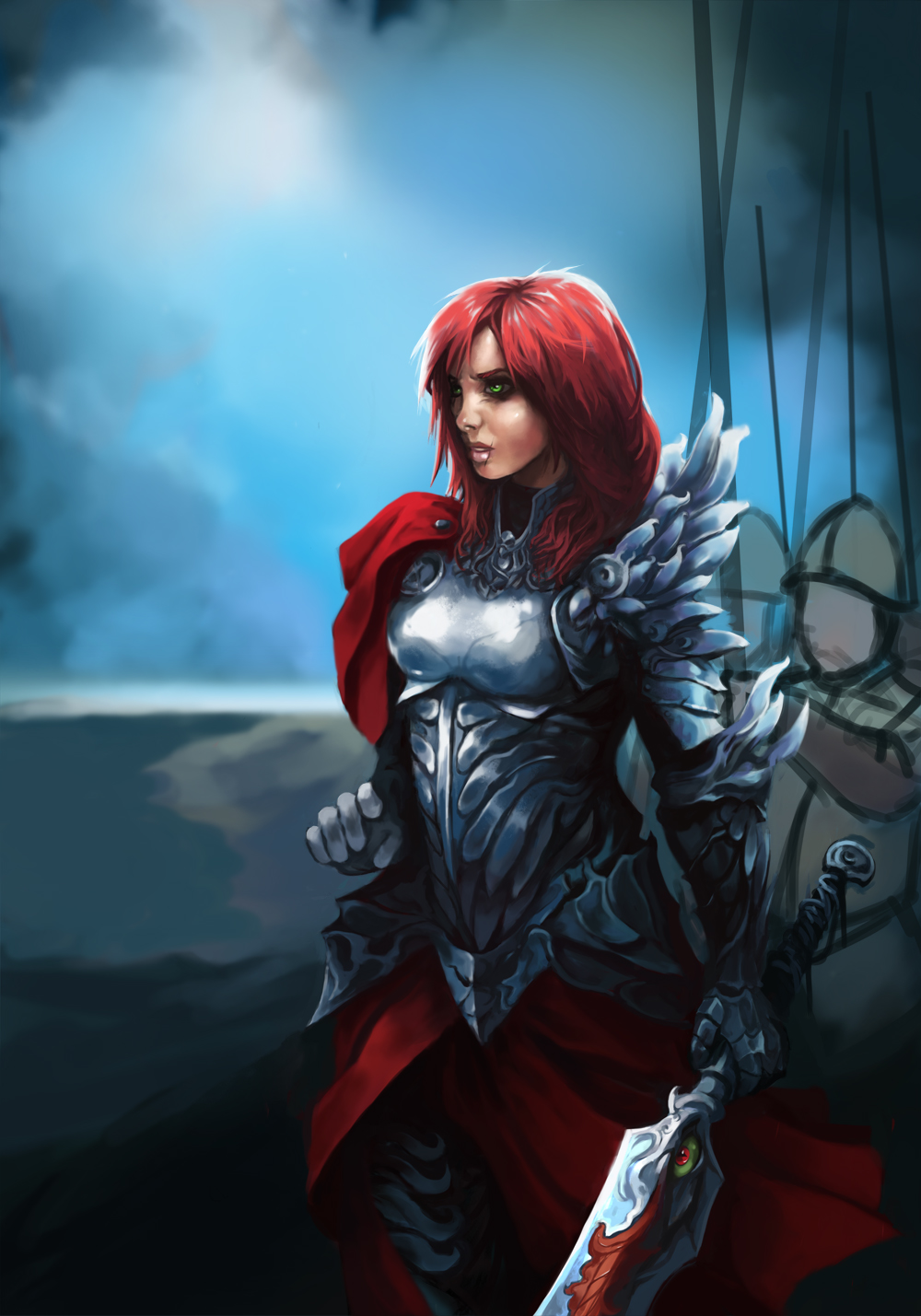
And now, another wip of my current non anime illustration ,been focusing on the armor for a while.
This is taking me forever, but i´m learning tons! Also, i planned to make the soldiers behind her more technologically advanced at first. But since i want this to be a portfolio piece, i went with something less weird and visually confusing.
So the guys behind her are going to be like XVI century soldiers with a final fantasy touch.

Posts: 1,098
Threads: 11
Joined: Aug 2012
Reputation:
34
the soldiers were drawing too much attention so i decided to remove then.
Would you call it finished? maybe i could work more on the background...
But my objective was to learn more about doing different kinds of armours, so at least i achieved that.

Posts: 467
Threads: 2
Joined: Jan 2012
Reputation:
16
Very nice work here lately dude, and it's pretty cool seeing your stuff develop such a unique and interesting style. I like it a lot.
I'm sorry I can't really offer and major crits at this point, you seem to be heading in the right direction and your stuff is ever evolving. This latest piece turned out great, though perhaps one area that could use more attention is her right hand which looks abit arkward. And speaking of hands, the thumb on the wrong side of that chick in your summer pitch piece made me lol :p Hands are hard as fuck to draw, I think we all feel that pain.
keep um coming mate.
Posts: 1,098
Threads: 11
Joined: Aug 2012
Reputation:
34
Thanks mate! your comments always mean a lot to me. :)
Also, yeah hands are difficult, your comment was kinda eye-opener btw, so thanks!, i re did the right hand and other stuff, i also tried to add something to the background.
And now, lets go back to the summer pitch (animuuu!)

Posts: 411
Threads: 1
Joined: May 2013
Reputation:
11
Overall I think this last one turned out well, man. Critiquing fundamental things gets redundant, since we all know what to work on, so just keep working hard and pushing out tons of work.
Posts: 537
Threads: 1
Joined: May 2012
Reputation:
8
I agree on the soldiers getting too much attention in the background! Feels much more easy on the eye as it is right now. Even with the banners and thangs laying around. I like how soft the fabric feels! :D
Though I think the negative space between the arm holding the sword and her side is too symmetrical. I guess it feels kind of unnatural. Overlapping the forms might help, atleast something to break the parallel line.
Posts: 488
Threads: 10
Joined: Jun 2013
Reputation:
38
That came out really great. The new hand looks wonderful :).
Drawing out of perspective is like singing out of tune. I'll throw a shoe at you if you do it.
Sketch Book
Posts: 340
Threads: 10
Joined: May 2013
Reputation:
23
Girls knight looks awesome. Good job!
Posts: 166
Threads: 2
Joined: Apr 2012
Reputation:
1
I really like the style of her armor and her pose, great work man! Keep it up!
Posts: 1,098
Threads: 11
Joined: Aug 2012
Reputation:
34
whoa, thanks a lot for all the comments! i really appreciate them. :)
Mr.Frenik: Thanks! yeah, thats the only option!
Bjulvar: yeah i think the same mate, also, you are right! when i noticed that issue with the negative space was too late, i will try to be more careful with that now.
OtherMuzz: thanks a lot! i know it is far from perfect, but every step counts i suppose xD
Madzia: thank you! i love girls in armor (in actual armor not chainmail bikinis haha, with the only exception being red sonja!)
wla91: thanks! glad you like it!
Now, here is a tiny update, an idea i have for my next illustration.
It will be kinda based on the last anime i watched (but the illustration itself wont be anime)
I will only say that it features a girl with metal powers and naked mole rat like creatures...
It is a pititful update, but i wanted a excuse to respond to your comments haha.
More to come tomorrow!

Posts: 389
Threads: 2
Joined: Jan 2013
Reputation:
13
Everyone has improved so much since I have been on my hiatus! Wonderful! Ed!
Posts: 1,098
Threads: 11
Joined: Aug 2012
Reputation:
34
thanks a lot manny! :) glad your are back, and ready to rock i hope!
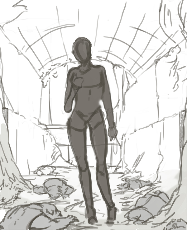
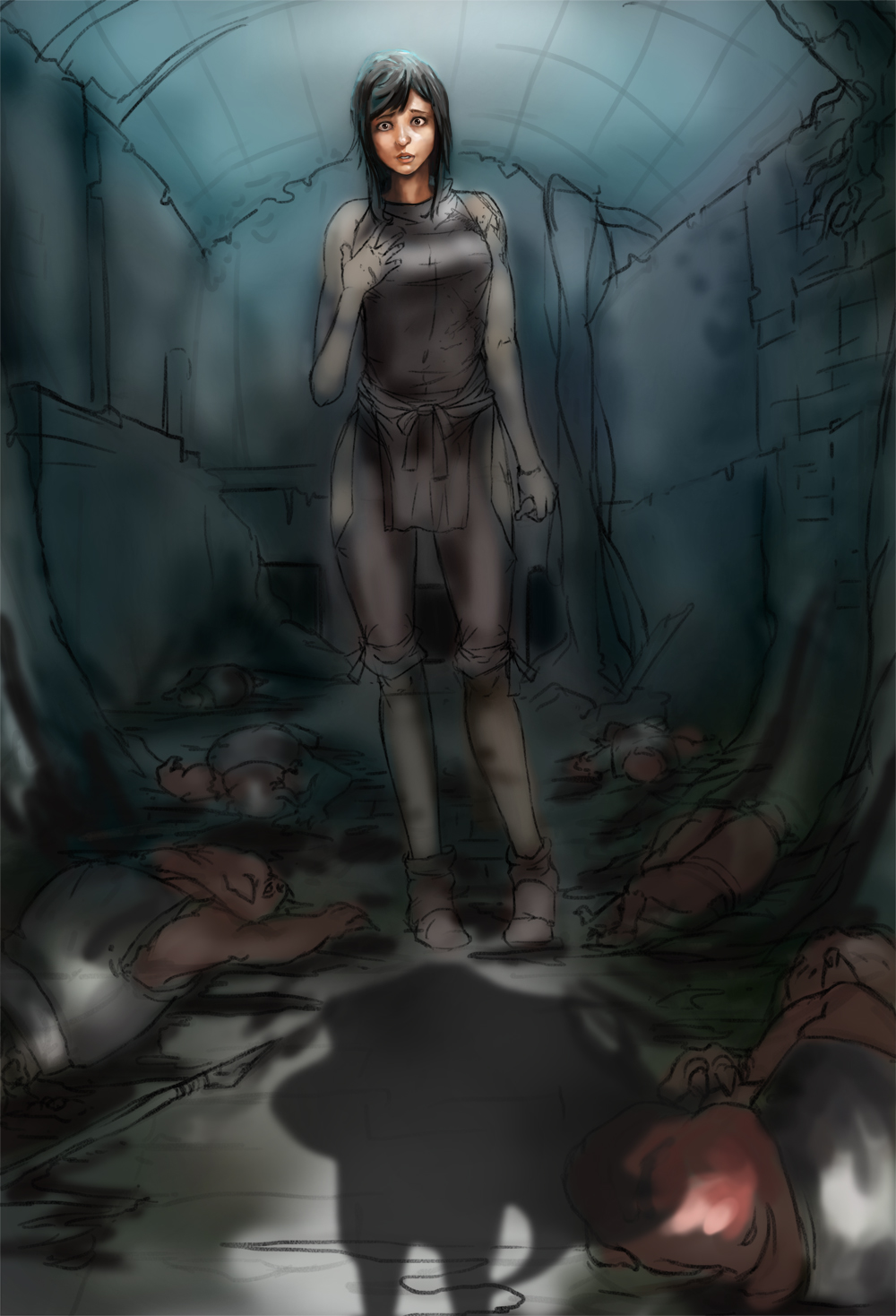
Still busy, so here is a little update of my current piece. Very early wip, i still have a menacing number of things to decide and do, oh well, at least it is super fun!

Posts: 155
Threads: 5
Joined: Mar 2013
Reputation:
5
Awh love the progress man :)
Digging the expression on the wip, she did it right? She killed all them pigs?
Posts: 123
Threads: 7
Joined: Jul 2013
Reputation:
0
That WIP is going to be awesome! Hope you update soon
Posts: 1,098
Threads: 11
Joined: Aug 2012
Reputation:
34
anzhou: thanks! and yeah she did it haha, but those arent pigs, they are more like naked mole rats!
TonariNoPunpun: thaaanks! :)
Not much to show this time, still working on this.
Its exhausting to think that after hours and hours of work i only have like a 9% of the illustration finished. xD
I also think i´m developing a love/hate relationship with hands. (Painted hands)

Posts: 114
Threads: 8
Joined: Jan 2013
Reputation:
5
Nice job, i dont know what emotion you are trying to convey with this girl, but maybe moving her hand to grip her heart would look better.
Posts: 84
Threads: 1
Joined: Feb 2012
Reputation:
1
That last one looks good dude! :D Just watch the positioning of the thumb on that hand. Keep it upppp
Posts: 114
Threads: 7
Joined: Feb 2013
Reputation:
1
Nice work Eduardo, I'm lovin all the stuff you've been doing. You're anime/ manga practice makes me want to do some experimenting, really nice gestures too!
|


