Posts: 537
Threads: 1
Joined: May 2012
Reputation:
8
Hey guys, before starting. I just found this gem again and had to post it;
It's so amazing
ramalooke
Man so kind! Yeah damnit, life is hindering you from visiting my sketchbook! I don't know what's more important to be honest. Don't worry man, I hope life is treating you good though! :) You're so right, I never intended to get stuck on the loose approach. I'll need to vary some more and polish things. The necromancers painting will be the most polished things in months!
Thanks a bunch man :)
EduardoGaray
Thanks, I'm hoping to rock hard!
Great, I realized some things in the middle of it, felt strange but uplifting!
It's not that hard to learn the simple stuff, plus it's reaaally fun to do. I recommend it :D Those subtools drove me crazy though.
Great to hear! I guess Kekai and Jaime can teach you something telepathically while doing studies. If that's the case I'll do some more later. Polished stuff is coming right up man!
THank you! :D
Jaik
So nice that everyone can remind you of what to do! I put off doing studies religiously for a while and I suppose that now is the right time to bring them back in. Ratio's are hard to find, but mixing and varying work tends to help out. Keeping the mind working and improving.
I can't wait, just picked up a spoon to paint! I'll always be the little spoon with you Jaik, so manly and dominant! :D
Kicking things off with some studies. I started doing some gestures of an archer picture I found. Had an interesting pose.

Then I continued on it a little bit, still keeping it rough. After that I read the polished comments and got anxiety! :P

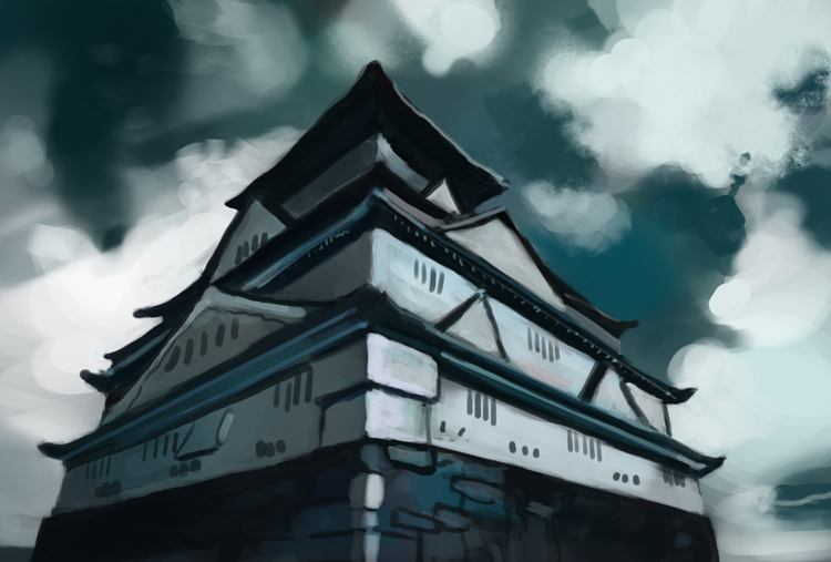
Here's a sweet wall I painted for one of the cards in the boardgame. Stare at iit.

A perspective thing done earlier this week. Totally failed it. I guess I focused on one too many things like value and color. Next time I'll keep it more simple and to the point of the perspective.

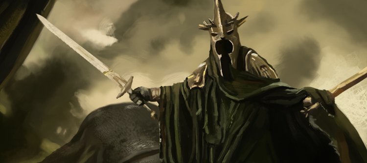
A more rendered out study of the witch king from LOTR, tried thinking about brushworks but still pushing it quite far. Quite happy.

This might be the last WiP for the Necromancer piece!

Another sketch which I'm thinking about how to effectively push forward. Might continue on it, so this is another WiP I suppose!

Have a great one guys!
Posts: 467
Threads: 2
Joined: Jan 2012
Reputation:
16
Wtf dude, you aint messing around are you!? So much cool stuff going on here, it's like a treasure trove of awesomeness :D
It's really cool seeing all the imagination stuff, as well as the studies, I think that's something that gets easily neglected, though it's pretty obvious its helping you out a lot because you stuff seems to have got improved since I last dropped by, especially in your design I think.
Oh and that wall! <3 I think you should do a series of those to go in your portfolio, easily the best piece you've done to date! xD I kid obviously, but it is a nice wall ;)
Posts: 690
Threads: 7
Joined: Jan 2012
Reputation:
12
Damn. I'm waiting for the final of necromancer piece. Can't wait to see how it'll turn out. Great updates and very noticable improvements you have here. Great job!
Posts: 537
Threads: 1
Joined: May 2012
Reputation:
8
Warburton
You're so nice man! Yeah that gets me so excited, really happy that you like it! :D
Oh thanks :D Yeah I hope that it's helping out. Sometimes it's so hard to tell what works and what doesn't. Like everything that goes in wave as well! But I have to work more on my rendering now then if the designs are getting better. Balance things up!
Haha yes it's my magnum opus. Would be really swell to have 10 portfolio pieces with just walls. Maybe I can work as a texture artist then!
ramalooke
Can't wait either, so pumped to do similar pieces after it too! I've been doing other stuff for some days now, getttiiing back ot it. Thanks a bunch man, keeps me going in times of doubt! :D
Starting with some spitpaintings this time around. I want to do more environmental themes but they end up so shitty. So I try to mix it with characters or put a twist on it. Feels like I'm not learning much regarding environments.
Axeman

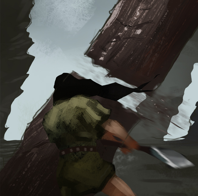
King Frog

Dragon Rider, I fell in love with the composition and having two dragon heads. Could've solved it better. So I might use this in the future.

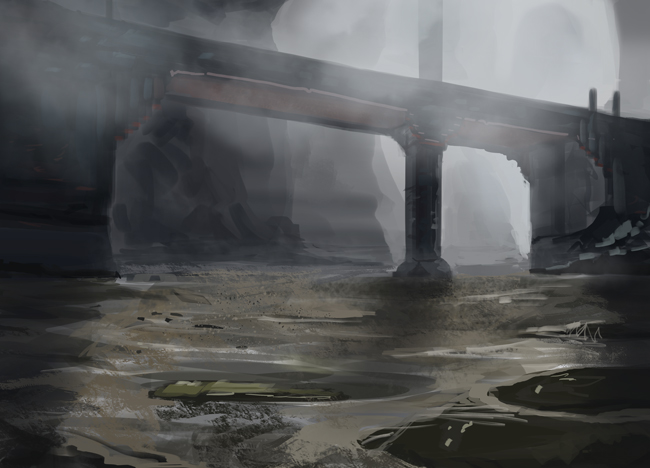
Foggy Bridge

Here's the apply of the Lord of the rings study, it's less rendered.

This is a portrait that I've been working on for a while now. Had a bunch of problems with it and it's been a great learning experience. Atleast now I know that nailing down the drawing before you start painting is worth gold. All I got as reference was a tiny passport photo from the 70's. It was torn too.

And a elemental dude that's not so happy. Sketchyyy thingie

Posts: 848
Threads: 20
Joined: Jan 2012
Reputation:
29
Awesome updates man. Some really nice colours coming out of your work recently. Just letting you know this week I started the spoon still lifes (started yesterday) 30min each day. DEWWWW EEEEET! :P
Posts: 133
Threads: 2
Joined: Jan 2013
Reputation:
2
Cool stuff man, the dragon rider composition is interesting and I agree with jaik, the colors are great in these updates, keep it up!
Posts: 537
Threads: 1
Joined: May 2012
Reputation:
8
Jaik
Thank you man! Finally getting better with colors! Now I need switch of color schemes aswell :P Hah I did it too after you said this! The let the games begin! :D
Blewzen
Thanks man, happy that you like it!
Late night insect-dude, too tired to paint anything good!

Spoon one, 30 minutes for both!

Spoon two!

Posts: 537
Threads: 1
Joined: May 2012
Reputation:
8
Spoon number three! Having some problems with the reflections. While looking back at the spoon now IRL I can see that I've used too soft brushes and not put the values up against each other in a good way. So that's for next time.

Quick values

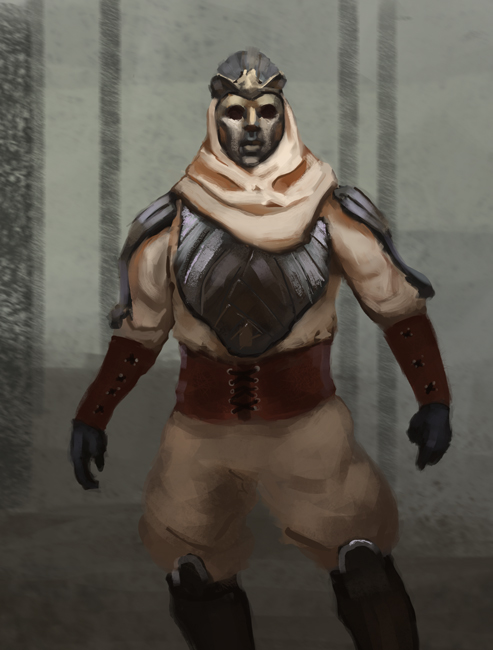
Longer armor study. Tried mixing brushes and edges here. Felt like I learned a lot about how I can go about with showcasing cloth versus metal. Also like using softer brushes in the shadow and having harder more textured brushes in the light.

Posts: 1,098
Threads: 11
Joined: Aug 2012
Reputation:
34
damn, those spoons are looking nice.
Now i really want to see that sharp and shiny look into your armors.
You are doing fine mate, another approach you could use (just to try something different)
Is to stablish the general form of the metallic object, like a pauldron, a chestplate or whatever.
Then add the soft reflections with an airbrush, then the texture, and last you add the hard lights blending them where necessary.
EDIT: nevermind all of this if that is what you are already doing lol
Its just an idea, just to keep the creative juices flowing. :D
Also, i really like that dragon rider comp, i definitely want to see more!
Posts: 537
Threads: 1
Joined: May 2012
Reputation:
8
EduardoGaray
Thank you Eduardo! Damn that's one challenge. Will bravely take it on!
I guess in a sense that's what I do everytime I apply something. But it's never that focused or thought out. So it sounds like a good idea to just apply a spoon in a totally different manner. Will keep it in mind! :D
Aw yeah, now I'll have to do more! One more for the creative juice list :D
The snowplow just drove by and scared the shit out of me. Felt like I had to share that, feel like throwing up haha. That's when you know you have to go to bed.
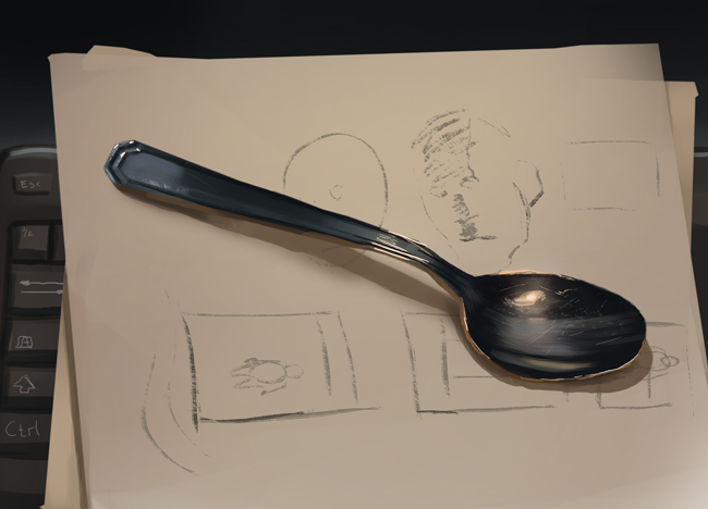
Todays spoon, number foour! Had some fun with cluttered sketchpaper beneath it. Mainly used just one hue for it, so I didn't go in to the subtle shifts there, but then again I'm trying to use a time restriction. Feels like I handled the reflections a bit better. still need to experiment with that concave shape.

Applying yesterdays armor study. Tried using all the things that I mentioned in the last post. More hard edges!

Some quick face studies, not much to it than to explore. Trying to use my brush more confidently

And here I tried mixing up all the studies I've done these past two days. Hopefully it'll show that I picked up something. Wanted to play with colors too.

Good night daggers, you're all beautiful!
Posts: 320
Threads: 2
Joined: Jul 2012
Reputation:
7
Ey! Really sweet to see you apply what you learnt from that armor study so soon into a personal piece, that's what the study is for after all. Makes me get that inner voice that tells me "maybe YOU should do more studies lol". Think it's time I listen heh.
The soft brush in the shadows and harder ones for the detailed areas seems like a nice approach. Have you tried rendering the focal points first? That is, block in the whole thing, establish light direction and all that, and then render the shite out of the focal area(s). Seems like a nice way of going about creating something finished because if the focal area is rendered then you know how much rendering you will have to put in into everything else, since you can compare it to the already rendered focal area. Sometimes things can end up equally rendered and it becomes kinda flat-ish, so a nice way to avoid that me thinks.
Posts: 656
Threads: 6
Joined: May 2013
Reputation:
12
The spoons have that "studied from life, NOT a photo" look that you just can't get any other way. Really sharp and metallic.
So much cool imagination work as well. The two headed dragon really stands out as having potential.
_________________________________________________________________________
The best time to plant a tree was 20 years ago. The second best time is now.
-Chinese proverb
Sketchbook
Posts: 1,342
Threads: 17
Joined: Jul 2013
Reputation:
45
Great workflow Bjulvar, keep it up.
Some characters are a little bit static, them more fluid, in the future. Exaggeration isnt always bad.
Nothing else to crit really, you are doing quite well.
Posts: 537
Threads: 1
Joined: May 2012
Reputation:
8
Adzerak
Yeah I always try to do it as soon as possible! It helps a bunch, then complementing it with notes. Maybe you should, but then again only do it if it's what you really feel! Because it's so easy to always compare yourself!
True, I really like that kind of philosophy that if you have a focal point rendered out, the rest of the piece needs to have that quality.
I'm not really that focused in my pieces, some people render everything out one section at a time. But I just can't do that. So it's more of a jumping around the canvas finding spots to polish all the time.
But there's a great point in establishing everything first, getting the fundamentals right in the beginning. Need to remember that more often, cause damnit, alway find myself pushing sketche further than planned work.
Thanks for the comment bro! :D
Tygerson
Ooh that's awesome Tygerson! Haven't seen that myself in these, but it is truly different in the process of studying. Harder and more rewarding to try and decipher those damn colors.
Thank you! I should play around with it some more then :D
Crackedskull
Thanks Cracked! I will.
Yes you're so right, there's nothing wrong with exaggeration at all. To be honest I try to tell people to exaggerate, but not always doing it myself in practice. Next piece that I do will focus on a more dynamic and fun pose. Movement and all that jazz.
Thanks dude, you're doing well too! :D
Exploding on to the scene with a sketch that still applies what I did in an earlier study. The thing that dragged it down is that I tried something entirely new, which is water. It was a challenge though, even for a short sketch.

An uninspired spitpainting, black skull. I shouldn't look at everyone's entries before painting these. Then it's all about the "originality" and shit P:

Spoon number 6 and 7. Not so much to say. Realized the importance of textures. Sometimes the surface of an object can have two textures. Didn't use an electrical light source for number 7, I did enjoy that more. Had a colder feel to it and at the same time the colors weren't an enigma to solve. I think that many times when you have a very clear source of color/light, it can fix itself in your mind. Not allowing you to interpret it. As is the case for me with orange from my light.
Okay, I had something to say, sorry.


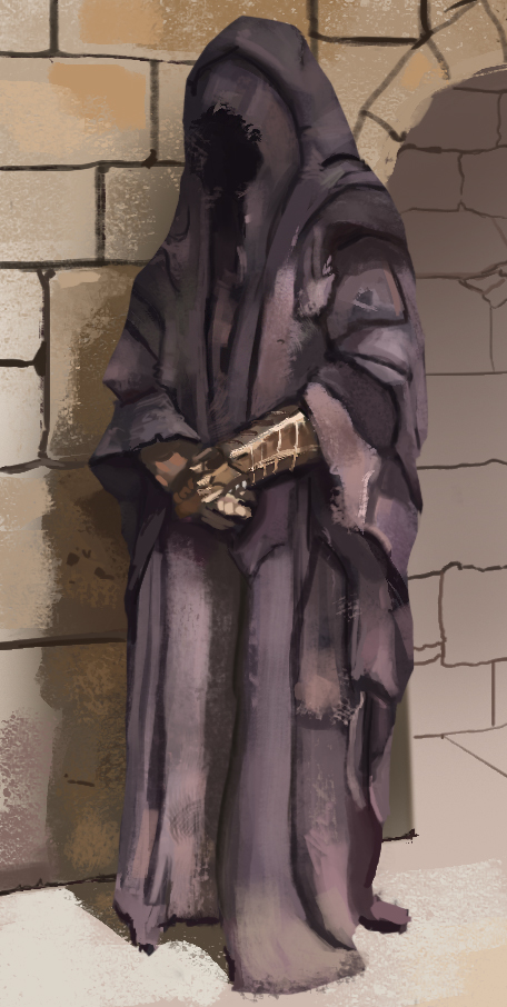
Nazgul study, didn't get a chance to apply it. But I love cloth that's like this. Dirty, textured and hanging!

And the necromancer is now finished, for good or for bad. Initially I wanted it to be a fairly quick illustration but that failed. Atleast this painting was enjoyable all the way through.

Posts: 809
Threads: 2
Joined: Mar 2012
Reputation:
16
Dude you are tearing shit up atm, awesome stuff recently. The dude in the water and the necromancer especially, nice work. You've got some really cool compositions in your sketches as well, loads of depth in a few of them, it'd be cool to see something like that taken to final maybe? Keep it coming man, inspiring stuff :)
Posts: 1,118
Threads: 12
Joined: Nov 2013
Reputation:
63
Not much to say but great sketchbook! You've improved a lot since the first page.
Posts: 848
Threads: 20
Joined: Jan 2012
Reputation:
29
You're killing it with the spoons. I agree with Tygerson, you can definitely tell that they are from life. I didn't get round to doing mine most of the week :( But I will do one everyday this week. No more distractions.
Bloodsports starting tomorrow man. Keep an eye out for a post in the community challenges section so we can all start together. Lyraina will be positing this one up. We are up to number 2 :)
With the last nazgul study, try putting 5% color dynamics on the brush and just continue like normal. The end result has this subtly to it that just brings a tonne more life to a painting. Give it a try and see how it works for you.
Keep on keeping on :D
Posts: 690
Threads: 7
Joined: Jan 2012
Reputation:
12
Awesome udpates mate! Love the necromancer piece =D You really pushed it and now I'm hungry for more ;)
Posts: 848
Threads: 20
Joined: Jan 2012
Reputation:
29
Posts: 537
Threads: 1
Joined: May 2012
Reputation:
8
JakeB
Thank you so much man! Yeah I've had a hard time finding the will to push those sketches beyond sketch! I will try and do it soon enough. Thinking about working more structured though!
Awesome man, you're so inspiring too :D
Hypnagogic_Haze
That's all you have to say to make me blush man! Great to hear, thank you :D
Jaik
What, but there is no spoon?
That's really interesting, maybe there is a point to doing more studies from life then. It's okay man, do them when you have the time! Not a competition :)
Looking forward to seeing more spoons from you :D
Yes I'm soo in, thank you for the link and all. Started doing comps and sketches yesterday. This will be great!
Sounds cool, haven't tried color dynamics out before, so writing that down. I'm going to have the same feel to the fabric for my Swamp Elder, so I'll try and apply it :)
Thank you man, let's rock!
ramalooke
Hurray all I wanted to do was to satisfy you Ram! Thanks a lot, I'm already figuring out another one :D We'll see how that turns out!
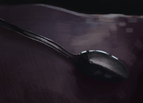
Spoooons, number 8 and 9. I want to find another lightning situation and try to bring in different colors.


A page from my sketchbook, camera really went out of focus, so sorry about that.

Here's compositions for another illustration. I tried working with dropping down silhouettes in different values, not working out that good for me. Much happier with rough lines and then putting down either softer or harder values beneath or over. More natural for me I suppose.
Aiming for something more dynamic.


Thumbnailing characters, really quick ones.

Also joining the new and revived Bloodsports, of course! So here's sketches for the swamp elder

Spitpainting, wanted to try something else. Raven king or king raven, whatevs!

|


