Posts: 782
Threads: 5
Joined: Jan 2013
Reputation:
22
@crackedskull: Thanks very much! :)
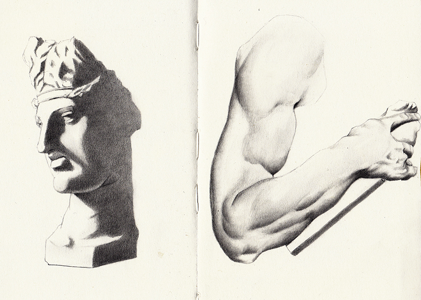
Bargue. Bargue is always good. For me these drawings are not only a way to learn any longer, I really enjoy doing them! And they also help me tremendiously whenever I feel some sort of art block or lack of creativity, you know, these days where you kind of go like: what should I draw, staring at a blank white sheet of paper. Instead of waiting for creativity and not draw at all, get yourself a Bargue. I always carry a few Bargue drawings as study material anywhere I go....you never know
Posts: 782
Threads: 5
Joined: Jan 2013
Reputation:
22
Wanted to try my hand at sketching a sassy, kind of cute girl. I think it turned out ok.

Posts: 782
Threads: 5
Joined: Jan 2013
Reputation:
22
I was watching the movie "The girl with a pearl earring" yesterday while I was doing some sketching and while most people don´t seem too like it because it´s too boring, I really like it because almost every frame in it could be an old master painting. Maybe it´s just a movie for artists :) Anyway, as I recently started painting with oils and I really like the original, I decided to try out copying it in oils, as it is (at least in my opinion) one of the more easier old master paintings to do. So for a start and to get a feel for it (palette used, proportion etc.) I did a digital study. It may take some time till I can pant it in oils, but I´m really looking forward to the end product :)

Posts: 782
Threads: 5
Joined: Jan 2013
Reputation:
22
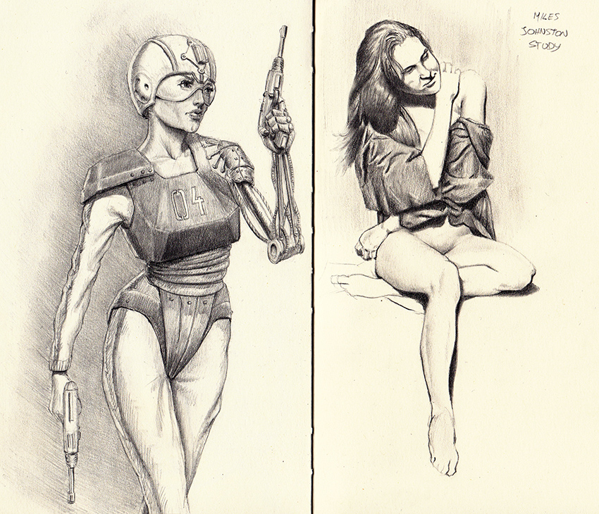
Sketching and studying. This time a modern master: Miles Johnston. If you don´t know him, he is a wizard with the pencil and I love his surreal drawings. I tried to get his contrast and his lighter subtleties in values. Miles original is of course way better, but it was fun to do.
Posts: 1,424
Threads: 12
Joined: Dec 2015
Reputation:
139
Awesome studies Elderscroller! I particularly love your Bargue studies - keep up the awesomeness dude!
“Today, give a stranger one of your smiles. It might be the only sunshine he sees all day.” -- H. Jackson Brown Jr.
CD Sketchbook
Posts: 782
Threads: 5
Joined: Jan 2013
Reputation:
22
@Artloader: Thanks very much!
Too long since I last posted anything, got to take up the habit again despite having too much to do lately. Another Miles Johnston study and a female captain for a sketch

Posts: 782
Threads: 5
Joined: Jan 2013
Reputation:
22
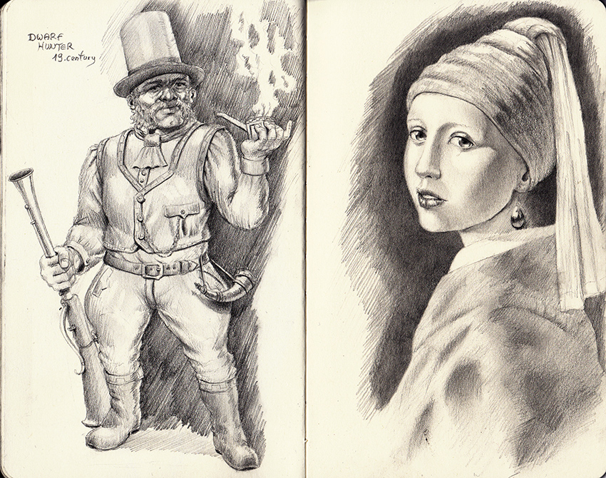
Last week I did a study of the girl with a pearl earring. Today while sketching, I wondered how much of that study was still in my head after almost a week, so I sketched it out from memory. I´m quite happy with it as the most important parts are still in there. Especially the shadow patterns where really quite clear in my mind. Minor details as the exact shape of the mouth and the folds on her dress are not perfect
Posts: 234
Threads: 11
Joined: Nov 2015
Reputation:
17
Great studies on the Girl with the Pearl and it is good to see you are still getting quite a likeness on the imaginary one. I went to the museum in Amsterdam last weekend and spotted 'The Milkmaid' of vermeer there. Where the other paintings where much larger than I expected, the ones from Vermeer were fairly small. The textures and details he gets in that tiny frame is amazing. Sadly they didn't have the 'Girl with the pearl earring' there, but it is on my list to see as well.
Are you going to paint the oil 1:1? I'm looking forward to see it!
Posts: 782
Threads: 5
Joined: Jan 2013
Reputation:
22
@Eyliana: Thanks! Oh, lucky you! I´d love to go there too! I wonder myself, how the girl with the pearl earring will turn out :) We´ll soon find out...
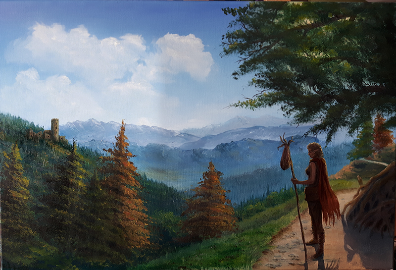
Some sketching and my first oil painting finished. A bit of generic fantasy landscape for practice. It´s ok, but I think I can do a lot better next time.
Posts: 782
Threads: 5
Joined: Jan 2013
Reputation:
22
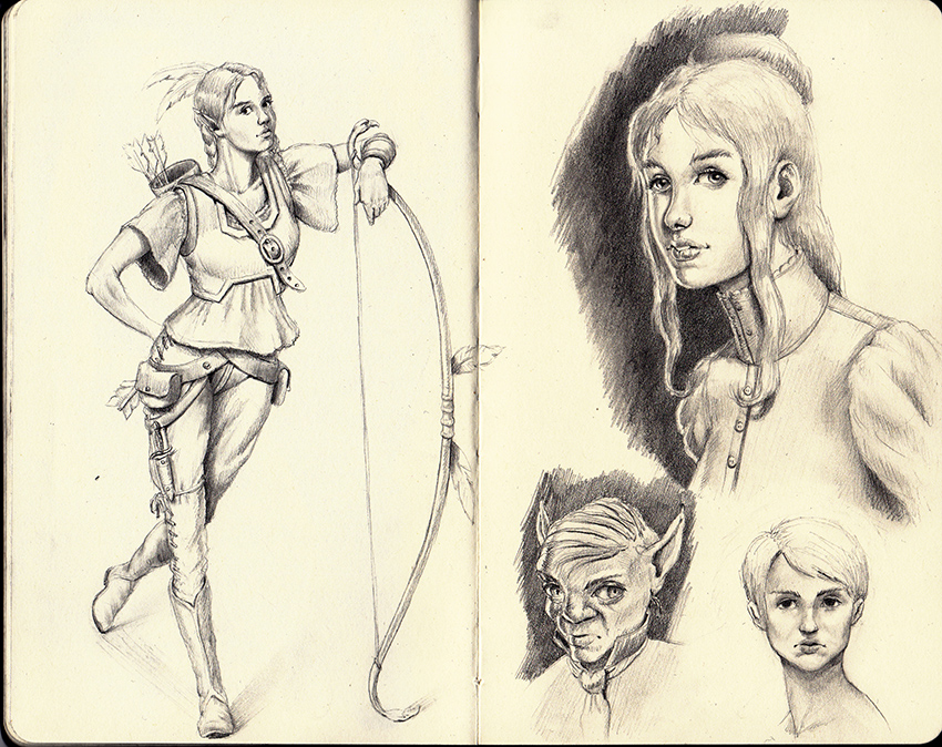
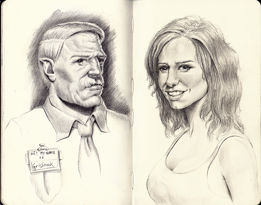
Portrait sketch practice. Taking part in the ILM challenge at artstation, so I´m not sure how much sketching I´ll be able to do for the next weeks and I can´t show my entries and sketches until they were judged unfortunately :( But I´m very exited how that turns out. Not sure if I even make it to the second round, but it´ll be fun!
Posts: 1,527
Threads: 24
Joined: Dec 2012
Reputation:
70
Your sketches make me wanna study hands and feet so bad haha
Good luck on the ILM contest ES!
So long as ya give it your all, you're set <3
sketchbook | pg 52
"Not a single thing in this world isn't in the process of becoming something else."
I'll be back - it's an odyssey, after all
Posts: 782
Threads: 5
Joined: Jan 2013
Reputation:
22
@smrr: Thanks! Hands and feet are really one of the most difficult parts in anatomy. I always have the feeling I get them wrong :)
So, first phase of the ILM challenge at artstation is finished, now the waiting for judgement begins. I can´t show anything while the contest is still on (Lucasfilm copyrights...), so that will take some time...But I think I won´t be allowed for the second phase as my 2 paintings are not really high enough in level to compete. Well, the road to success is full of failures, just don´t give up :) By June 11 winners of the first phase will be notified. But my chances where slim to begin with and I mostly did it to challenge myself and boy did I learn something! Most importantly: I need to have a more effective workflow and I really need to strengthen my rendering to get that up to a more professional look!
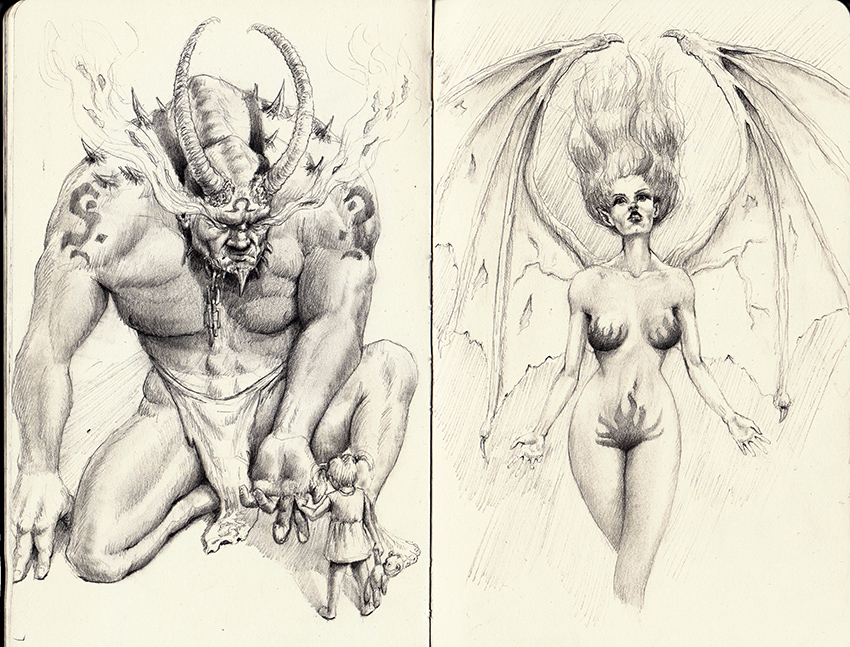
At least I now have time again to update my sketchbooks. Not sketching for over a week really pulls you out of this habit! Must not allow that to happen again. So here are some crappy sketches to start again:
Posts: 5
Threads: 1
Joined: Feb 2015
Reputation:
1
1. workflow is about a means to an end, if your workflow is bad it means you don't have a clear enough focus on your end goal.
2. the rendering isn't really the biggest problem that I see, rendering is kind of a joke anyway...
I'd recommend to start in on learning about perspective and how to simplify what you're drawing into more primitive shapes. You can't really learn how to 'render' unless you first understand form in 3d space anyway. There is a direct correlation between the angle of the plane [3d form] and the respective value. I think doing master studies is a good idea, but I reckon Miles isn't the best choice. You can study someone with a much higher skill level and will be at a lower risk of picking up strange habits.
Posts: 782
Threads: 5
Joined: Jan 2013
Reputation:
22
@ username: I don´t think it´s too little focus on the end goal as that is mostly always clear to me, but it´s more that I try out too much, if I don´t like it, redo that rinse and repeat. And that leads to too much time wasted. So it´s more a lack of focus on how to achieve what with what means.
Rendering as a "finishing approach" to create a highly polished detailed image is as you say a joke, or let´s put it more neutral: just icing on the cake as it´s just a more or less mindless task anyway. What I meant is rendering as a tool to depict form through value and color. I do get the 3D forms, I just need to make it more pop. Learning shapes, perspective and all fundamentals is of course key and I guess I´ll never stop learning that :)
Sargent Study:

Posts: 1,118
Threads: 12
Joined: Nov 2013
Reputation:
63
Accepting the crit that you need the most can be a tough pill to swallow. I think you're brushing off what username said too easily. You've done a lot of value studies. I really commend you on your work ethic but if rendering was really your problem dont you think you'd have figured it out by now? Knowing how to render involves understanding how light falls across a form. If you dont understand the form completely then how will you know how light will fall across it? Looking through your sketchbook I cant see any studies of you tackling perspective head on. You really need to try and construct figures from the ground up with a lot more thought.
Posts: 782
Threads: 5
Joined: Jan 2013
Reputation:
22
(06-03-2016, 07:09 AM)Adam Lina Wrote: Accepting the crit that you need the most can be a tough pill to swallow. I think you're brushing off what username said too easily. You've done a lot of value studies. I really commend you on your work ethic but if rendering was really your problem dont you think you'd have figured it out by now? Knowing how to render involves understanding how light falls across a form. If you dont understand the form completely then how will you know how light will fall across it? Looking through your sketchbook I cant see any studies of you tackling perspective head on. You really need to try and construct figures from the ground up with a lot more thought.
Hi! I´m not sure, I understand what you mean. I didn´t brush off usernames advice and I don´t think it´s harsh critique that is hard to swallow when someone says in a polite way, that I need to work on fundamentals, I was just trying to be more specific and explain what I meant. That crit was really no surprise, as I know that I have weaknesses and you never stop learning/practicing fundamentals anyway. I always accept critique when it is presented in a polite manner and makes sense (as usernames crit does). Even if it makes no sense to me (yet), everyone is entitled to their opinion. What I wouldn´t accept is "crits" like: I hate your stuff or your values suck and you have to do this or that to correct it. But thankfully most people on art forums don´t do that.
Don´t let my posts on my sketchbooks fool you into believing these are the only things I ever draw. First thing in the morning to warm up is gesture drawings everyday. I don´t post things like these or really quick ballpoint pen sketches/studies, geometric forms in various 3D environment/angles ala Scott Robertson etc. any more, because it takes time to scan that, put it together and put that online. Most of that stuff ends up being thrown away anyway, because I don´t need it anymore once it´s on paper. Things that land in my online slketchbooks are just my moleskine sketchbook with ideas and sometimes more elaborate pencil studies, other traditional work that is more or less finished or in the making of being finished and digital studies. I do lperspective stuff, but I admit it is not my main focus.
I also didn´t say, I don´t know how light falls across a form or that I don´t know how to render 3D form. You must have misunderstood that. All I said was that I need to strengthen that (here in regards to competing with the people who entered the ILM competition and ILM artists themsellf as I´m clearly not on their skill level). You surely have come across art done by someone of an ok skill level, where everything was done right. The form is there, values correct, but it feels like you could really bring that out more by introducing more subtleties, be more clear and clean etc. be more in control of contrasts. It´s hard to discribe, but that´s what I was referring to. Just felt I needed to clear that up :)
Posts: 782
Threads: 5
Joined: Jan 2013
Reputation:
22
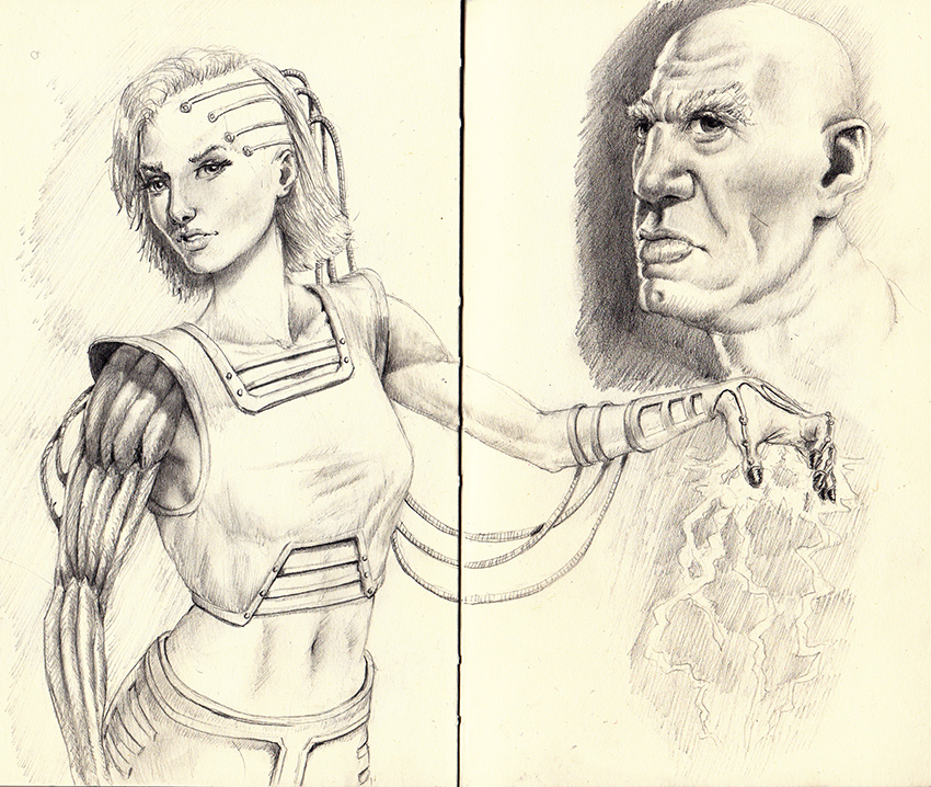
So, Trying to incorporate more elaborate perspective and hard surface stuff into my practice routine, so why not combine that with a life study. Taking what´s just here on my desk, the power supply to my tablet

Posts: 488
Threads: 10
Joined: Jun 2013
Reputation:
38
Quote:" I don´t think it´s too little focus on the end goal as that is mostly always clear to me, but it´s more that I try out too much, if I don´t like it, redo that rinse and repeat. And that leads to too much time wasted."
You totally missed unnamed message. His point is that if you are trying stuff and erasing it, you lacked confidence in your end goal.
Quote:"I also didn´t say, I don´t know how light falls across a form or that I don´t know how to render 3D form. You must have misunderstood that. All I said was that I need to strengthen that "
This is one of the largest struggles any artist has to go through to understand, and is what separates the men from the boys. It's difficult to see what you can't do, and so it seems that a linear improvement in lighting will get you there. It won't.
You need to change your thinking from, where do i put the shadows, to what angle is this plane from the light source. The bargue studies are good, but this is one of those things that you are supposed to learn from them, but for some reason that hasn't clicked for you yet.
![[Image: fuxGZa.jpg]](https://snag.gy/fuxGZa.jpg)
Quote:You surely have come across art done by someone of an ok skill level, where everything was done right.
I've never seen this. Please link.
Drawing out of perspective is like singing out of tune. I'll throw a shoe at you if you do it.
Sketch Book
Posts: 782
Threads: 5
Joined: Jan 2013
Reputation:
22
@ OtherMuzz: Thanks a lot for your insight and especially for your overpaint! I will heed this in the future. One thing I should mention though, this is a sketchbook and as such almost all drawings in it are just that, sketches. When doodling/sketching a character, most of the time I don´t fully draw out everything (why should I), I try to concentrate on different aspects like look, design and most of all foundations like proportions (yes, designs are not that important when learning how to draw, but I also want to get an idea down) So in the example you took where you point out that the values are the same above and below her chest, yes you have a point there, but that sketch hardly has any rendering/depicting of 3D form in it as it was not intended to be so. Basic rendering was only implied, not executed (it actually has values in all the same places you drew in your first sketch when you crank up the contrast). Main focus was an idea of a character, costume and getting a nice looking face down. So you might consider it an extended line drawing.
As you also asked for a link of what I meant by the ok artist that does it right, but could improve by strengthening the rendering, here you go:
http://gaiasangel.deviantart.com/art/Ton...tion_stack
http://miasteingraeber.deviantart.com/ar...-612322981
They are both ok/good, not without flaws, but generally know what they are doing (especially since the second link is traditional artwork). But strengthening the rendering of the form would greatly enhance their work to maybe something like this which has (next to more dramatic lighting) lots more subtleties in value and a better depiction of form:
http://crow-god.deviantart.com/art/Angell01-558998574
http://chasestone.deviantart.com/art/Fel...5675&qo=12
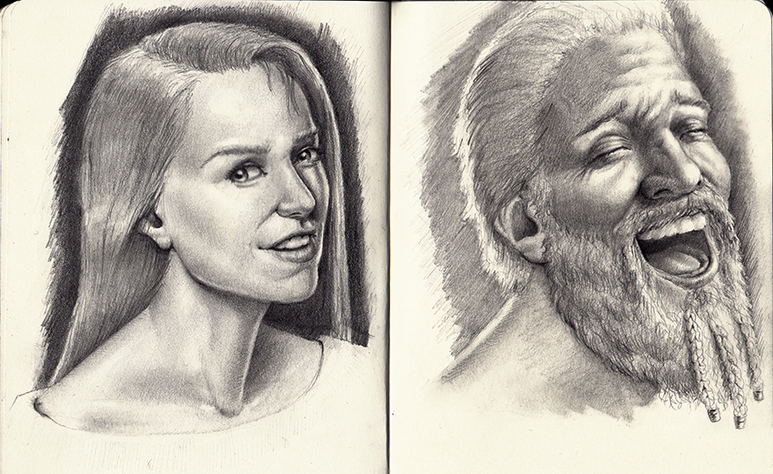
Trying to see, if I learned something from rendering studies like Bargue drawings by doing 2 portraits completely without reference, taking my time, just from the blankness of my page. Looks ok. Guess my brain did get some of that studying. Could use a bit more reflected light to bring out the form better.
Posts: 488
Threads: 10
Joined: Jun 2013
Reputation:
38
Take a step back and have a look at how much you wrote to justify something you just admitted was done badly.
Anything you practice becomes a habit, and if all of your sketches have intentionally bad lighting, you are just going to get really good at drawing terrible lighting.
The guy on the right is an improvement. But you shouldn't be relying on reflected light to indicate form. If your form doesn't read with nothing but 2 values, you have a problem.
![[Image: U1wAnb.jpg]](https://snag.gy/U1wAnb.jpg)
Drawing out of perspective is like singing out of tune. I'll throw a shoe at you if you do it.
Sketch Book
|


![[Image: fuxGZa.jpg]](https://snag.gy/fuxGZa.jpg)

![[Image: U1wAnb.jpg]](https://snag.gy/U1wAnb.jpg)