06-14-2013, 02:58 AM
Cool anatomy studies!
|
Matthias Kinnigkeit Sketchbook
|
|
06-18-2013, 04:07 AM
Jo thanks Nikt!
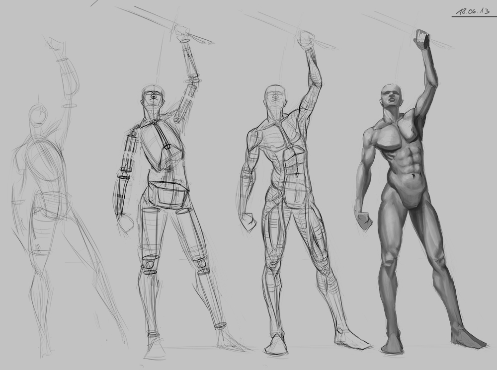
Some stuff from today. Those values really kick my butt! I guess tomorrow is another day! Besides the quick value study and some rendering attempts I worked a bit on balance and proportions today, as these are some of the major weak points of my studies. Again, if anyone of you guys can recommend me some free online resources about value rendering or some good tutorial/video I´d really appreciate it :)    
06-19-2013, 03:29 AM
I think I made some progress regarding rendering today. I have an easier time thinking in value than before. It´s still full of mistakes and also very basic but the first real step forward! :)

06-21-2013, 09:54 PM
I LOVE your figure construction studies, man; so solid. The rendering's turned out okay, but I think you'd benefit greatly from doing a few geometric renderings first. Cubes/cylinders/spheres/cones, in as many different lighting situations that you can. Also cast shadow constructions too. If CA.org wasn't such a flaky bitch I'd get on there and pull up some of my old exercises for you to be able to use. Maybe someday this week, fingers crossed. Keep it up!
06-26-2013, 05:54 AM
Thank you so much for frequently comming by my SB and posting this great feedback MrFrenik! You help me a lot man! Where you refering to the perspective puzzles thread? I checked it out yesterday, so much knowledge! Honestly it´s really cool of you to spend all this time on helping others! I´d really like to repay the favour but you are way more advanced than me so I have a hard time to critique your stuff. Till now... ;) I do follow your work though because I find your Sb very inspirering. So thanks again man! :)
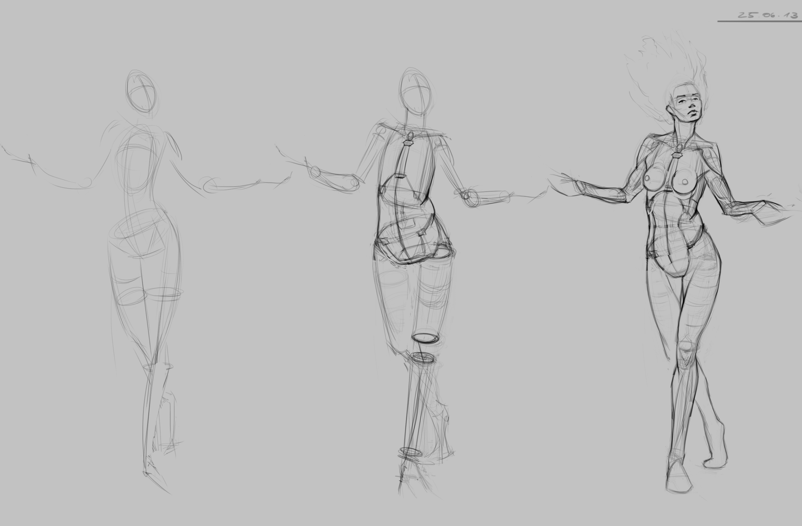
Stuff from these days. A render experiment that I got tired of and called done. Man I really need to work on these hands and feed! :O I guess photostudys of arms and legs also wouldn´t hurt. And some rendering exercises from Scott Robertsons Matte Surface Rendering DVD 1    
06-26-2013, 07:26 AM
Great value studies you pretty nice observed reflected light on them GJ!
Quote:Her core anatomy is really good but you a little exaggerate her head in perspective, her upper part of face, forehead, eyebrows and eyes aren't turned as much as nose and lips so she a little looks like making face not tilting head back, somehow looking like this :D : ![[Image: Obama-not-bad.jpg]](http://therapup.net/wp-content/uploads/2012/11/Obama-not-bad.jpg)
07-04-2013, 05:01 AM
Thanks for stopping by and leaving feedback Madzia! The comparison is remarkably well chosen :D
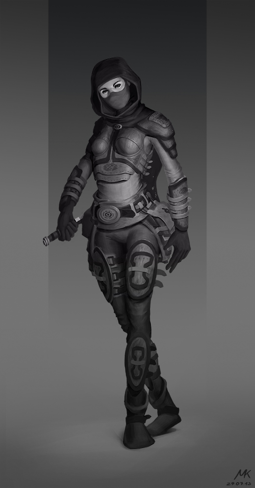
Here is a rendering of a concept, which I had done about two weeks ago. I have been working on it for a few days. With this image I really tried to push to my limits of skill and patience and I learned a lot within the process. It´s going to be the first in a series of other character and creature renderings, with which I plan to apply for an internship in a game studio. If you can spare the time I´d really like to hear what you think. 
07-04-2013, 06:38 AM
If you're not going with colors on the ^^ character design I would suggest to tone down values of tattoo cuz tattoos and blouse is to similar to each other and it's not so obvious what is what . Or darker blouse, that would do too :D
07-04-2013, 03:18 PM
Cool stuff, man, and good work on your geometric renderings. Do more and more. If you have a way to get a simple matte cube you should use it as reference to paint from. Really try and nail down the subtlety in the lighting and form.
07-26-2013, 03:43 AM
Thank you guys for the feedback!
MrFrenik: Yeah I definitely will. In this very moment I don´t have time to do studies because I have to get sth. like a presentable little portfolio going, but when I have less time pressure I paint little cubes and cylinders untill I faint ;) Here another Characterdesign. I worked quite a lot on the rendering and learned a lot in the process. He should be a mechanic dude who works in the hot engine room of a spaceship. I´m not happy with the design at all, though. I didn´t plan the design well enough before I started the hard work. That really came back to bite me in the ass! Here is a turnaround that I did before I started the rendering. It was meant to be the same guy, but as I changed really a lot on the image while rendering, they don´t have much in common anymore. Furthermore some sketches for the next character that I want to work on.   
07-26-2013, 05:38 AM
Hey man, youve got some great gestures going on here. I also really like your character designs.
Might be good to show a colored version as well. It should be a good addition to your portfolio. There seems to be a slight shading problem on that mans biceps. It looks too bulbuous right now. Good luck on the job hunt!
07-29-2013, 07:57 PM
DoubleThink: Thanks! :) I´m going back in, to fix the issue with the arm later, thanks again! I´m actually hunting for internships for now, because I want to improve on my process, rendering, color and productivity before I jump in the pool of sharks ;)
Rendering based on the 3 conceptsketch form the previous post. 
09-13-2013, 06:14 AM
Some sketches to search for ideas for the next design that I have in mind.
 
09-13-2013, 06:52 AM
Great sketchbook so far! I really love your pose and anatomy studies. Very dynamic and fluid
09-17-2013, 03:03 AM
Thanks man!
Some anatomy stuff from today. For the last weeks I had some big artist-block-shit going on but I got over it now. Finally a good productive day and a smoking brain again! :) 
09-19-2013, 05:49 AM
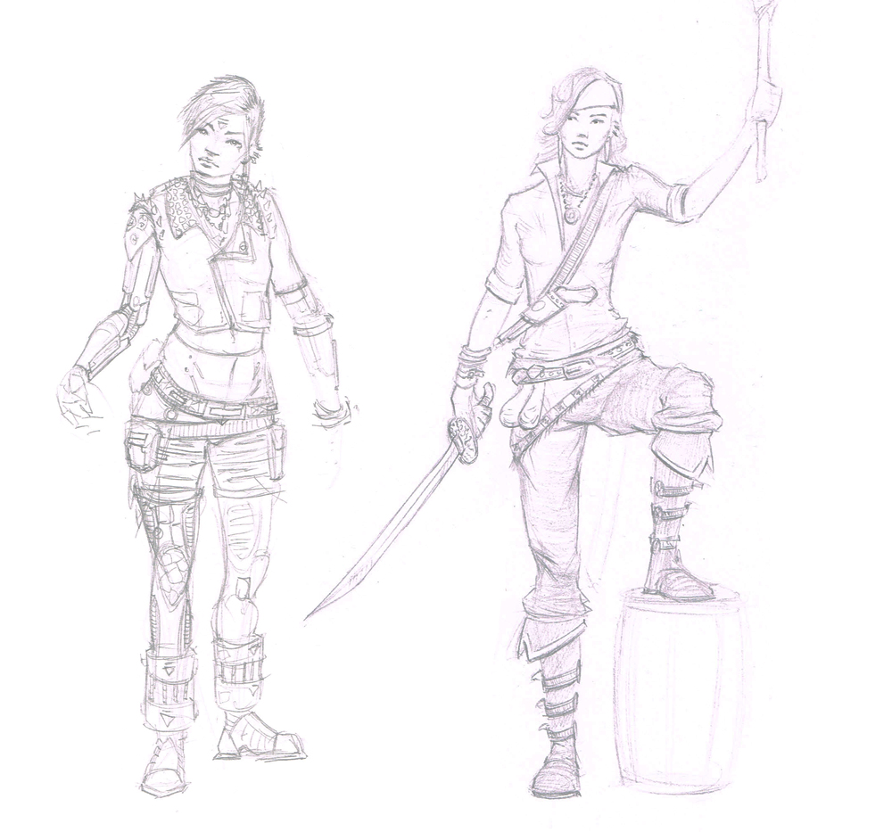
Some sketches from these days.
 I made the left one to search ideas for the next character I have in mind and the right one just for fun and to take a break form perspective constructions. 
09-19-2013, 12:31 PM
Wowzas Matthias!
Your lines are beeeeeautiful! And you create some seriously cool designs! I can't crit you on anything, waiting for more ;D
sketchbook | pg 52
"Not a single thing in this world isn't in the process of becoming something else." I'll be back - it's an odyssey, after all
10-06-2013, 04:54 AM
Thank you guys! :)
Some traditional sketches from my SB and some 30 second gesture sketches. The scans of the pencil sketches turned out pretty bad! :/     
10-06-2013, 05:37 AM
Very nice anatomy studies and characters designs! I really like it!
For the head studies: Be careful with the distance between the eyes. Sometimes it seems like they are a bit too far away from each other. Aside from that nice hairstyles here! ;) Keep it up! :) |
|
« Next Oldest | Next Newest »
|