Poll: WEEKLY THEME
You do not have permission to vote in this poll.
FAMILY(focus on story telling and making the enviro the character/focus)
40.00%
2 40.00%
TEMPLE RUINS
0%
0 0%
WINTER JOURNEY
40.00%
2 40.00%
SCI-FI, WET, RITUAL INSFESTATION
20.00%
1 20.00%
Total 5 vote(s) 100%
* You voted for this item. [Show Results]

LLB - Weekly theme: FREE
#41
Allright, so...
You guys are awesome!
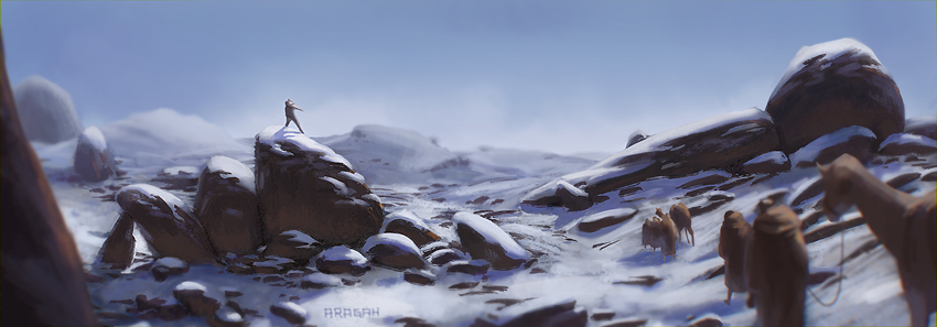
Aragah Great mood and palette! Only thing I'd consider is some bounce light from all that white stuff on the lower areas of the rocks. I think that would make it even more convincing.

Bjulvar Love how you handled the snow and your values direct the attention to the right spot.

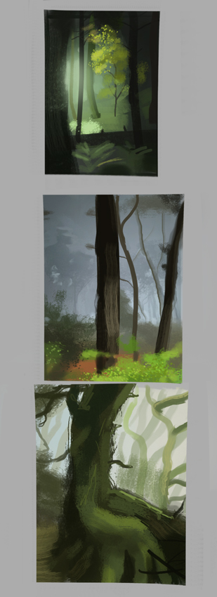
Here's some studies. I had no particular aim which I think is bad conduct. I need to put some more thought behind this stuff. Right now I'm exhausted so I'll do the snow landscape tomorrow if that's allright with you guys. Two successful weeks have already passed, this is not a train I want to be missing!

Just noticed these look atrocious when I adjusted my graphics card settings, the values are all over the place.


Attached Files Image(s)


"It's necessary to act against yourself or nothing will happen." -Phil Hale
Sketchbook|Go Team!
Reply
#42
Markus - there is bounce light there :)
digging the studies man, nice subtle values. would like to see you applying some of that :)

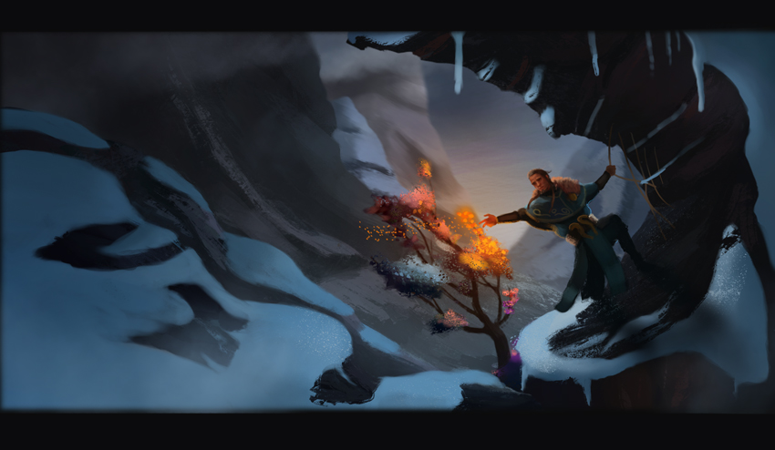
here is the "finished" piece for the week.
i feel like i am over using "post-production" photoshop effects.
and i think i might have made the contrast between the snow and rocks a bit too high. but i was feeling like the piece as a composition needed more contrast...
also ive been completely neglecting skies. and im really confused about foregrounds, and where the landscape "ends" and meets the horizon.
but it was a good run. i learned quite a lot this week. and those rocks were tons and tons of fun to make


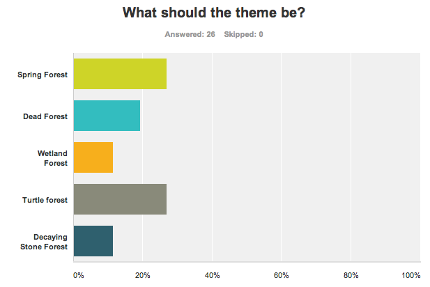
and OHGAWD we have a tie again!
noooooo.


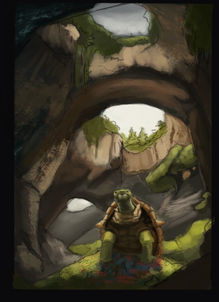
I guess its up to each one to choose what they wanna do. (patrik and his love for turtles)
I think ill stick to spring. even tho i really wanted dead or wetland.

lets start throwing around ideas for the next poll :)
(unless you guys think its bad to let other people decide....)

Reply
#43
Markus Really sweet studies man! Two of them are very dark atleast, not a subconscious aim? :P I think the LOTR one came out nice even if it doesn't drop in value much. Well though out colors!
Looking forward to seeing the piece!

Aragah Awesome man! The blur in the foreground kinda helps in getting the eye into the action. So I like that. Liking the structure of the stones too, pretty simple but it reads well. I get what you mean with the "ending" of the landscape. That's the only part where it gets a bit flat. Maybe it would be possible to seperate it into more layers of depth and varying value. You could possibly even lower the horizon line!

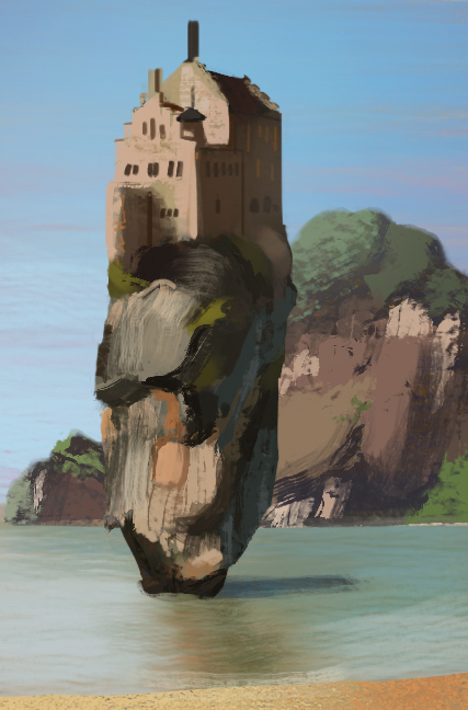
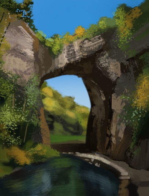
I don't know about this one guuys! But I tried atleast. I felt that I had a problem with the stonetexture in this one, and how much I should render the further away I got. More studies are needed there! Otherwise I'm pretty happy with the concept.


Haha I'm doing the turtle forest! Gonna try and avoid having the forest on his shell :P
I'm throwing down Titan's Rest as a suggestion!

Reply
#44
Patrik - yeah man. i gotta pay more attention to that. ill revise that piece and try to separeta more the values and play with the horizon line. thanks!
you piece is pretty sweet on the comp.
the orange seems a bit strong since theres not orange anywhere else on the piece. as for rock textures i cant really help you there because i know nothing about it. ha. mine looks like crap and all i did was constatly switching brushes, but i didnt found any that worked the way i wanted and the result was inconsistent...

anyways.
here is my take on the spring forest.
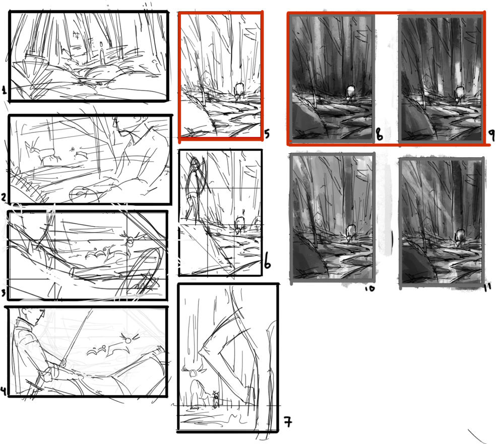
i like both value comps. but i might stick to the right one.


Reply
#45
Aragah, looking good! Really liking 9. aswell.
Bjulvar, on stone texture, I'd just try and create harder edges and more irregularity. I did like the lighter values on the earlier one though, how it kind of framed the spot of interest.

Here's a study and a winter enviro. Grayscale, sorry about that.


Attached Files Image(s)


"It's necessary to act against yourself or nothing will happen." -Phil Hale
Sketchbook|Go Team!
Reply
#46
While doing this I noticed that I get overwhelmed with detail pretty easy. I start scribbling.


Attached Files Image(s)


"It's necessary to act against yourself or nothing will happen." -Phil Hale
Sketchbook|Go Team!
Reply
#47
Aragah Nice that you experimented a bit with foreground there in the thumbnails. I like the one where you see through the legs. Maybe it's a bit too much of the legs in it though, for the next time!
I think that I like 11 and 8 the most. They feel serene in a way and so dramatic. Fits the deer a lot!

might've gone a bit overboard with the orange there. Just wanted to catch the eye :P

Markus I guess now when looking at it again it is a bit white. Taking up a lot of space with those high values! Do I do find the focal point interesting. Obviously still digging the norse snake pattern!

Awesome sketch too, maybe we should've gone with a lava theme! I get what you mean man. I go into detail too quickly often. I suppose that it's easy to scribble lava since you don't see it that often!

Tried Shaddy's technique on this one. I noticed that I didn't really understand his transitions from silhouette to color all that clear. So I messed it up.


Reply
#48
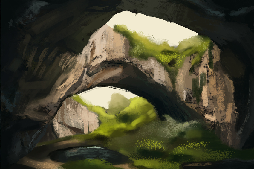
This one was fun. Tried focusing more on the rock and trying to figure out why the colors were as they are. The trees are a bit blurry. But there wasn't much to get from it I thought.
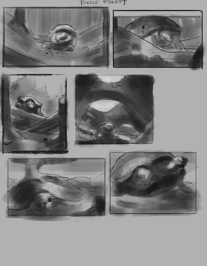
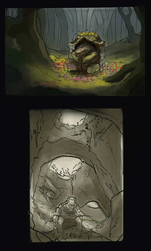
Will post some thumbnails for the turtle forest soon!


Reply
#49
Hey markus! good job on the studies. as for the sketch. i would suggest holding your values a bit more. i feel like everything is overexposed and then on the corners of the image where it gets dark the transitions are confusing. as far as i found out. you can separete snow and rock values pretty strongly.

Patrik! sweet study dude.
yeah. that thing of starting with random colors gets me confused a bit.
i think maybe you just have to slow down?
its one of the huge lessons he gave on that video, that when ever it looks like it was done fast. it acctually took a shit ton of time. and a loooot of though.

but man. that reflection/water is looking pretty right on :)


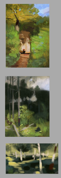
did a couple studies from levitan. i think somewhat between 15 min and 30 for each
green is though.


wtf. i had posted this yesterday but it didnt go trough somehow.

Reply
#50
Really true man. I took that to heart as well and felt really bad when rushing through the study. Might take a while before learning it even.
Nice and simple studies man! The middle one is awesome. Draws attention to the focal point!
Haven't experimented that much with diffrent lightning and values right now. But here they are nonetheless!
I really should post earlier. I'm always too tired to write haha.


Reply
#51
dayum man.
those thumbs are so cool.
i wanna say kawaii and cute, but you might get offended by that.
first three are my favorite. im even having a hard time picking one.


simillar to yesterday. but with photos.
greens are so tough man. like. you cant just lower the brighness because it turns to brown. you have to change the hue with it. and it gets so confusing to maintain color temperature.
i feel like my eyes need more training!

first one took more than twice the time! tried a shit ton of min yum brushes. didnt found any use for ANY of them :/ i dont even know which one he does basic rendering. even after watching his video.
so i made myself a pretty simple one. lots of fun. and pretty cool for these semi-abstract paintings


Reply
#52
You guys are going off like missiles, awesome!
Like I mentioned earlier I'll be taking a hiking trip so that's going to take a good few days off my schedule. I'll take reference pics and do sketching while I'm there though!

"It's necessary to act against yourself or nothing will happen." -Phil Hale
Sketchbook|Go Team!
Reply
#53
:D have fun man!
ill be sitting here in my dark cave painting scenes pretending that im outdoors


yo. yo yo.
yoyoyoyo
yooooooooooooooo

thing number 1
thing number 2
thing number 3

doesnt have much of a "spring" feel to it. just dead branches so far. hahahaha ill add leaves at some point!


Attached Files Image(s)


Reply
#54
Would be really fun seeing some photos later! Steal some references :D
Have fun!

Haha thank you Aragah, I don't mind if they're kawaii! Felt like a pretty diffrent subject matter for me, little cuter.
Looks like yours is shaping up really well. I dig the vertical composition. It feels like it's in the middle of something dramatic happening, lighting up the scene. Like a drunk driver raging through the forest! But seriously, it's awesome.
Spring is the beginning of life, so gogo with all those green little buds!

After watching your quick studies, I'll have to do them again.
But here's today study, struggling with the leaves. But I found that cutting into them with a leafbrush works better. Since leaves are all about the spaces inbetween.


Reply
#55
It almost felt better doing these quicker studies than a longer one. Worked from the background and moved my way up to the foreground in a layered kind of way. Still in one layer though. Had me thinking more about depth.


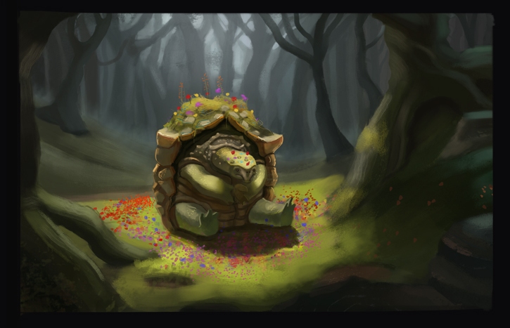
Progress of my turtle forest pieces! Using your own studies as references for color and such is pretty nice. Feels like I'm utilizing my stuff more.
Having a ton of fun though!


Reply
#56
Hat-trick!

Same thing as the last studies.


Reply
#57
man fuck. had forgotten today was the deadline.
this is the study making up for yesterday.
will post the pice soon....


Attached Files Image(s)


Reply
#58
Patrik! yeah i did the same on the studies, working from the bg to the foreground! but on you piece you started from the foreground, why?
looking pretty awesome all the stuff.
on the second turtle piece tho. the one with the lines and some value.
if you are gonna put value man. i think you could go all out and really plan it. because right now you really arent hitting all the potential of composition and information that values can give you!
i forget who said it. but in paintings everything can fail, if there is a good "structure" it will look good.
(strucure was defined by the line construstruction + value arrangement.)
well. your drawing is solid! but you didnt do much with the values :/

my point is. if you get those two. the rest is a piece of cake.


here is mine
not "finished" but close!
didnt do layer separation this thime. worked fine. and saved up time.
isnt really a spring forest.
thinking that i was late and had to finish this ended up in me speeding up my brushstrokes. bad bad idea. so hard to control myself. plus i ended up listening to music anyways. which doesnt help at all.

pretty happy with it tho.
ive been fanboying hard over Min Yum and Craig Mullins. hopefully i learn something uncosiously from staring so much at their work


Attached Files Image(s)


Reply
#59
Ah nice dude, it felt really good tbh! Haha I don't know, you caught me. Probably because I did those studies after I began painting the piece. And that I am a coward. :P
Thank you for that man. I have to say though, the values were under a green layer which I used just to get started with the colors! Otherwise I had already figured out the values. But I still didn't succeed with the painting anyways and I ended up abandoning it.
I do recommend having two pieces to work on. Just switch between them when you start to get bored or don't know where to push pixels!
But thanks man, always need to be reminded of that anyway.


It came out great man, I like that vertical composition. Kicks my butt into gear. I wanted to get a similar feeling with the focal point like you did here. But I think you did a muuch greater job on it.
Well, what defines a spring forest anyways? It's completely up to you! Even if there aren't any leaves I still feel that it's a place of life. Might be the green grass comming in there pretty strong with it's hue. The deer/moose is disappearing a little bit into the tree though. Might be intentional?
I also painted on one layer this time! Fun times :D
Haha let's have a hangout only dedicated to staring out Craig and Min.

Anyways here are mine
I should paint with a harder brush more often. I just realized that 5 minutes before finishing. I'm way more happy with this than the last piece. Still started slow with it though. That's a bummer!
Also posting the one that I didn't finish.


Reply
#60
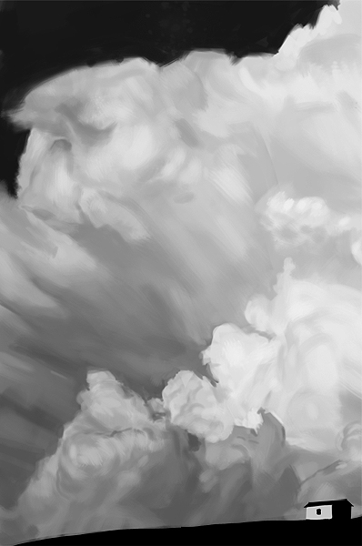
Heya! since the theme is free this week i think i might focus on clouds.
not sure if ill get to do a piece by the end. but studies are something!


patrik! yeah man. looking good.
i oughta try juggling two pieces at the same time. might be interesting.
yours is looking pretty nice.

i feel pretty confotable with how the deer blends and separates from the tree. idk if im quite achieving it. but i was thinking of the windmill concept from gurney.
looking at it again. it IS blending in a little too much. damn.
thanks.

to critique you.....
i think you could put some more though on the "framing" of the focal point. so you can give it more contrast..
just think of what the value of whats around it(visually, not phisically) because on both of them. the focal point is bright. but whats around them is also bright!. a easy solution that you could have applyed to the second one would be to darken the rocks around the turtles head. maybe its pushing a bit of what it would look like in real life. but it would do wonderful things to the composition!
and talking like that is straight up hipocrit of me, beause i really didnt do that good job on framing the focal point. as you called it on me. ughf. we must keep battling!


Reply


Forum Jump:


Users browsing this thread: 15 Guest(s)