Posts: 151
Threads: 2
Joined: Oct 2019
Reputation:
20
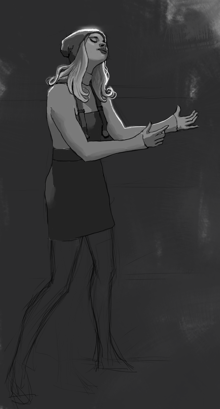
Ugh, I would really want to help out but I have walked the road from the other way around, I think the most useful thing to me was doing construction tho. I think you are getting somewhere with these, interesting thought, painting over linework and bringing it back in, I want to try that sometime. I would say from this last one also the hands, maybe the weakest point as of now, but the lighting looks nice! What are the poses about? This last two feel like a theme, but not sure. Reminded me of "the AO" show? How is that called, dancing something? I forgot.
Posts: 432
Threads: 70
Joined: Mar 2020
Reputation:
69
I'm glad you found those skull pictures useful; I know I did. Lovely expression on the girl; she looks very peaceful. I think you've already figured out an effective process for drawing from imagination, so keep it up!
Posts: 1,424
Threads: 12
Joined: Dec 2015
Reputation:
139
@Chubby_cat: Yeah definitely, invention is hard! Thanks for dropping by - all the best with your inventions :).
@Rotohail: That's useful to hear that you approached invention from the opposite direction - do you mean you started off inventing and then started to use reference? Also thanks for calling me out on the hands - I need to do some hand studies at some point :). These last two are some studies for a painting someone asked me to do - a young woman in a state of adoration to God. I'm not familiar with "The AO" show - what is it about?
@Pubic_enemy: Thanks dude, I'm glad the peacefulness came through :).
Re-did the rendering on this last sketch and then went back and put in some linework over the top. Seems like an inefficient process when done digitally since I could have just rendered on a layer below the linework and got a similar result but I am going to try to do this traditionally next so I wanted to practice this approach.
I think the more subdued rim-lighting works better?
And I think I prefer the lighter dungaree-dress and the darker jumper combo - anyone got any opinions?

“Today, give a stranger one of your smiles. It might be the only sunshine he sees all day.” -- H. Jackson Brown Jr.
CD Sketchbook
Posts: 3,357
Threads: 37
Joined: Aug 2013
Reputation:
234
Be careful with the reflected light on tissue don't generally reflect alot like this.
Posts: 432
Threads: 70
Joined: Mar 2020
Reputation:
69
I'm also partial to the lighter dungaree dress, but it's not a big deal; it depends on whether you want all of the focus on her upper body or not, since the light dungaree dress makes her body stand out more. I agree with the choice of subdued rim light; it's easier on the eyes. What medium are you gonna try to do it in traditionally? Acrylics?
Posts: 413
Threads: 11
Joined: Mar 2013
Reputation:
10
Really like that rim light on the girl. I think is perfectly fine, is not reflecting anything, is just a glow bouncing off of the surface, you see it all the time in this kind of lighting scenarios, good job.
Posts: 21
Threads: 1
Joined: May 2020
Reputation:
0
I really like the design of this piece, the dress and the lighting are working pretty well. my comment would to be to maybe use the lasso tool to build better shapes in values (look up lingy000 on instagram for an over the top example of this). The way you are doing it now seems timid, along with some scratchy lines. It gives the impression like you arent sure if things are supposed to go there
Posts: 151
Threads: 2
Joined: Oct 2019
Reputation:
20
Ugh, forgot to check back for a reply the other day. Yeah I began without a care or knowledge of how I was supposed to draw, I would just do anything that appealed to me at the time or crossed my mind, and I still remember like stupidly spending hours playing around changing legs and arms because they didn't look quite right, redrawing over and over stuff lol, a big waste of time. On the other hand I never had issues jumping into the pool and I was surprised to see people had the opposite problem I had. I had to learn the other stuff tho, paying attention to references, don't just draw whatever, look for the relationships, the fine art stuff you have to learn also.
The AO is sort of a sci-fi thriller-drama with heavy religion inspired themes, beyond that better not say. I honestly just checked a few of the show's early episodes, a bit, but didn't stick with it, it was also cancelled, so the plot was left hanging I believe. The just do a sort of strange dance to trigger, strange things to happen (miracles) heh. So it reminded me of it, state of adoration, yup, that would be it.
I would say, to pitch in, the beanie (I'm guessing it's one?) has a darker value than say the shirt so it shouldn't reach white from rim light, the hair and shirt might, it's all about relationships, and how they are mapped to your value ranges. It doesn't look wrong to me tho, you do get a pull to the face from doing it this way.
Posts: 2,817
Threads: 15
Joined: Jun 2013
Reputation:
109
Im not sure what she's doing? is she kissing an imaginary person?
Posts: 83
Threads: 2
Joined: Apr 2020
Reputation:
4
Good stuff! Just flipped though a bit more and I'm really admiring your acrylic studies. Got a ton sitting in the corner of my room....hmmmmm feeling like picking it up again
Posts: 1,424
Threads: 12
Joined: Dec 2015
Reputation:
139
@Darktiste: You mean the light on her beanie hat? Yeah I understand you but it's not reflected, it is coming from behind her towards the viewer - rim lighting. You ever seen paintings by Michael Malm? He is a master at rim lighting:
http://www.mikemalm.com/
@Pubic Enemy: Thanks for the opinion dude, I think I will go with the lighter dungaree dress :). I keep changing my mind on the medium, I was going to do it traditionally in acrylics but my clients are after a comic book styling with visible linework and I find it easier to do that digitally by just having the linework on a separate layer and painting on the layer beneath.
@sgavrilles: Thanks for the feedback man - yeah my lines and shapes are bit wobbly on this - I was trying to emulate a traditional process with linework added back in after the painting had been done - not very successful :).
@Rotohail: Very interesting approach - I feel like I coming round to where you started now - drawing something from imagination over and over again until I get it right - although I do use reference to nudge me in the right direction now. Good call with the value of the rim light on the hat - I will probably reduce the value a bit on the final piece - thanks man.
@Fedodika: Heheh fair question ... it's supposed to be a piece of Christian art where the girl is in a state of adoration for God.
@_spec: Thanks for dropping by - I think it is good to do some traditional painting too - for me it has taught me patience as things take so much longer when you're working traditionally and mixing the paint by hand. I also like the look of traditional painting even when I am working digitally so I thought what better way to achieve this than to learn to paint traditionally and understand the process involved.
So I haven't been too productive recently in terms of art but have at least managed to keep up some daily drills by using the Mini Habits technique (using stupidly small tasks that are almost impossible to fail at). One thing I have found is that these drills have really pushed me in terms of invention - one of my big goals at the minute is to get better at drawing from imagination.
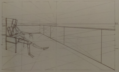
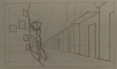
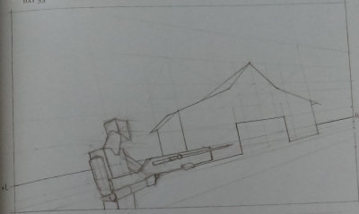
Here are some perspective drills - I probably only drew 3 or 4 lines a day on these:


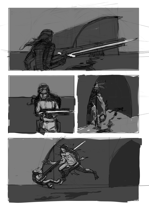
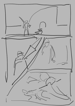
And after some feedback a while back from the amazing Rotohail about doing more storyboards I built a Mini Habit around that and did some storyboard drills:

“Today, give a stranger one of your smiles. It might be the only sunshine he sees all day.” -- H. Jackson Brown Jr.
CD Sketchbook
Posts: 3,357
Threads: 37
Joined: Aug 2013
Reputation:
234
Yes i meant rim light this was an error but what i meant was that the object material reflectivity index had to be consider to properly represent the reflextivity of the material.If there a reference for the piece it might help see if i am over reacting.
Posts: 151
Threads: 2
Joined: Oct 2019
Reputation:
20
Holy shit the sword rifle blew my mind. Like honestly is very Doom stuff or Clive Barker thing to do, loved it. At first I thought it was a beam shaped like a sword ha ha, but it's an actual projectile! You know with that kind of feel I get a Tsutomu Nihei vibe from it lol. Are you drawing inspo from somewhere? I'm interested.
Posts: 432
Threads: 70
Joined: Mar 2020
Reputation:
69
Just looking at that storyboard caused thrash metal songs to start playing in my head, so I think you're doing good, LOL!
Posts: 2
Threads: 1
Joined: Jun 2020
Reputation:
0
New here,
Great sketchbook! Especially a fan of the latest storyboard/comic page!! Has a very Heavy Metal Magazine feel!
First panel establishes the setting, second the character, third the foe, fourth action! Great pacing!
I feel like the first panel has a bit of overlapping focus and is a little weak because of it. The swordgun and the cave/shelter are struggling for attention. Maybe subdue the focus on the swordgun in the first panel, and bring it to prominence in the second panel? Making the character less the focus, such as cropping at the neck making them faceless, could help make the weapon a greater focus too. Making the character faceless also could help make them more mysterious and interesting, like the Master Chief in the Halo franchise!
Keep up the great work!
Posts: 369
Threads: 6
Joined: Sep 2019
Reputation:
23
Yay! Finally a storyboard!
I second what TrevArr wrote.
Here is a too-fast sketch of one variant I imagined when looking at your page. If it doesn't make sense let me know, I'll elaborate in words and make a more detailed one.

Posts: 1,424
Threads: 12
Joined: Dec 2015
Reputation:
139
@Darktiste: I guess the reference would have been this painting by Michael Malm: https://secureservercdn.net/45.40.145.15...tings2.jpg
@Rotohail: Heheh thanks dude, I've been building this world for around 5 years or so - I guess when you've been dreaming things up over that amount of time you accumulate a fair number of ideas :). Also, thanks for introducing me to Tsutomu Nihei, I'm loving his work!
@Pubic Enemy: Thanks for dropping by man, funny you should mention the heavy metal music thing - I'd often imagined a scene with this character striding into battle with some kind of heavy music playing!
@TrevArr: Hey welcome to the forum and thanks for the ideas - I love the faceless hero idea especially - I might cycle back around to this storyboard at some point and try these out!
@Leo Ki: Thanks man - I like the diagonals - makes the sequence feel more dynamic - although I've always been a fan of boring rectangular panels because it requires very minimal effort on the part of the reader to read the panels in the correct order. I think I might prefer to tilt the horizon and increase the dynamism that way but thanks for taking the time anyway dude.
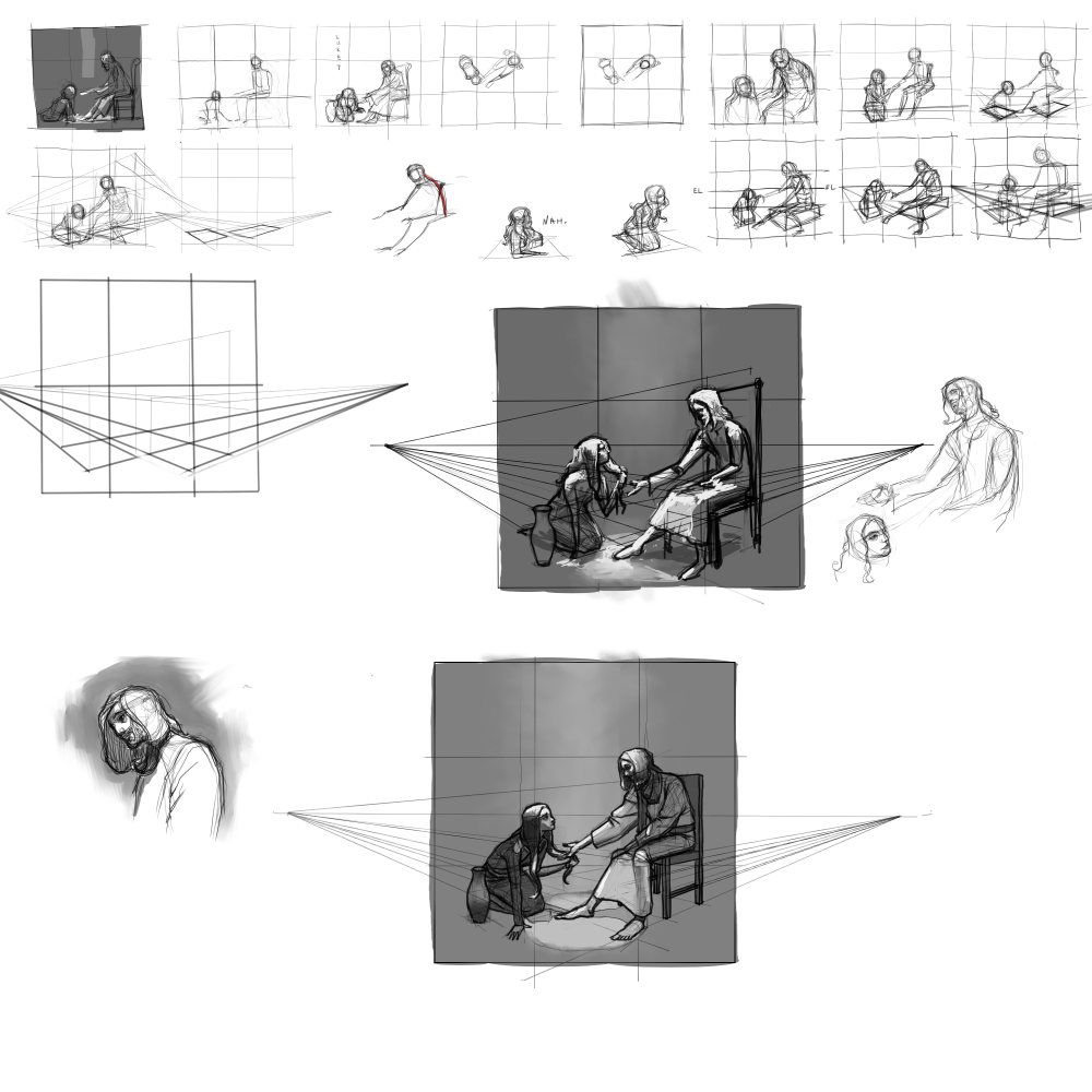
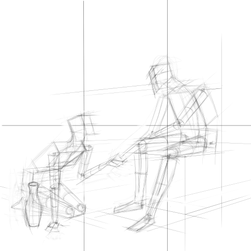
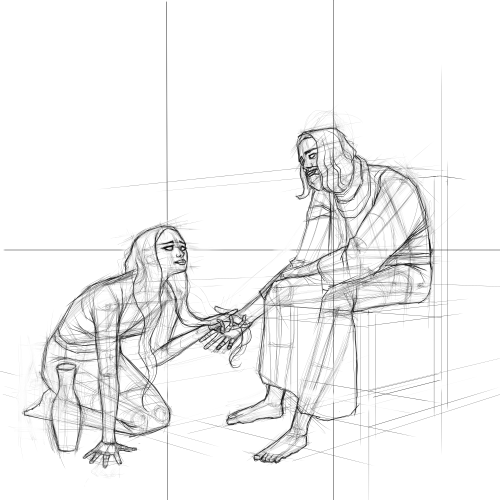
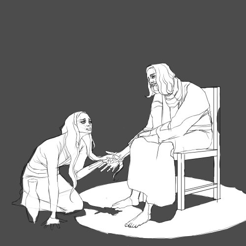
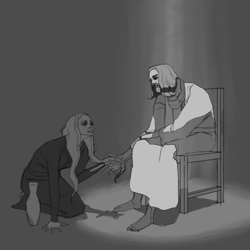
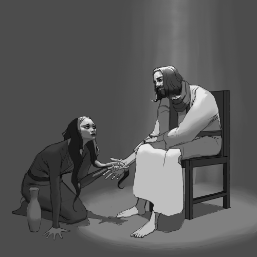
Here's something I'm working on for my church. I've also used this as an opportunity to push my invention process more - basically I take an idea and iterate and refine over and over slowly nudging it towards the finished piece. The keyword in my head is "iterate". Also I want to look into "ideation", I've seen this word before and it seems to describe some of what I'm trying to do here.

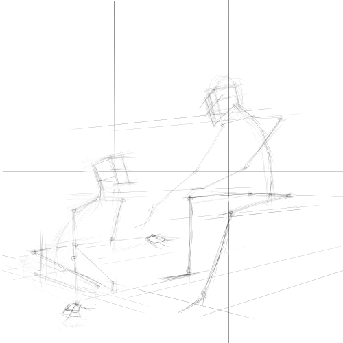
And here's another perspective drill. With these I'm trying to train myself to draw scenes in perspective.

“Today, give a stranger one of your smiles. It might be the only sunshine he sees all day.” -- H. Jackson Brown Jr.
CD Sketchbook
Posts: 1,424
Threads: 12
Joined: Dec 2015
Reputation:
139
“Today, give a stranger one of your smiles. It might be the only sunshine he sees all day.” -- H. Jackson Brown Jr.
CD Sketchbook
Posts: 432
Threads: 70
Joined: Mar 2020
Reputation:
69
I like it. The lighting and shadows are really nice, and I can feel the 3-dimensionality of the figures. All that construction work paid off, LOL!
I get what you're saying about feeling like you should have done more research. It's good to try and solve problems with your noodle without any outside input though. It forces you to be more confident, and it can result in a more cohesive-looking picture, even if there are some knowledge gaps.
So there's yet another reason for why it's good to alternate between invention and studying from reference/life.
Posts: 1,076
Threads: 4
Joined: Jan 2016
Reputation:
43
Looks great, really enjoy how you handled the faces as well as your implementation of light, very dynamic which suites the subject matter. I agree with what you stated regarding the drapery, could definitely have benefited from some research work to apply on the folds/clothing, would have improved the image a bit. Still a strong effort otherwise, great work!
|


