10-23-2013, 05:26 PM
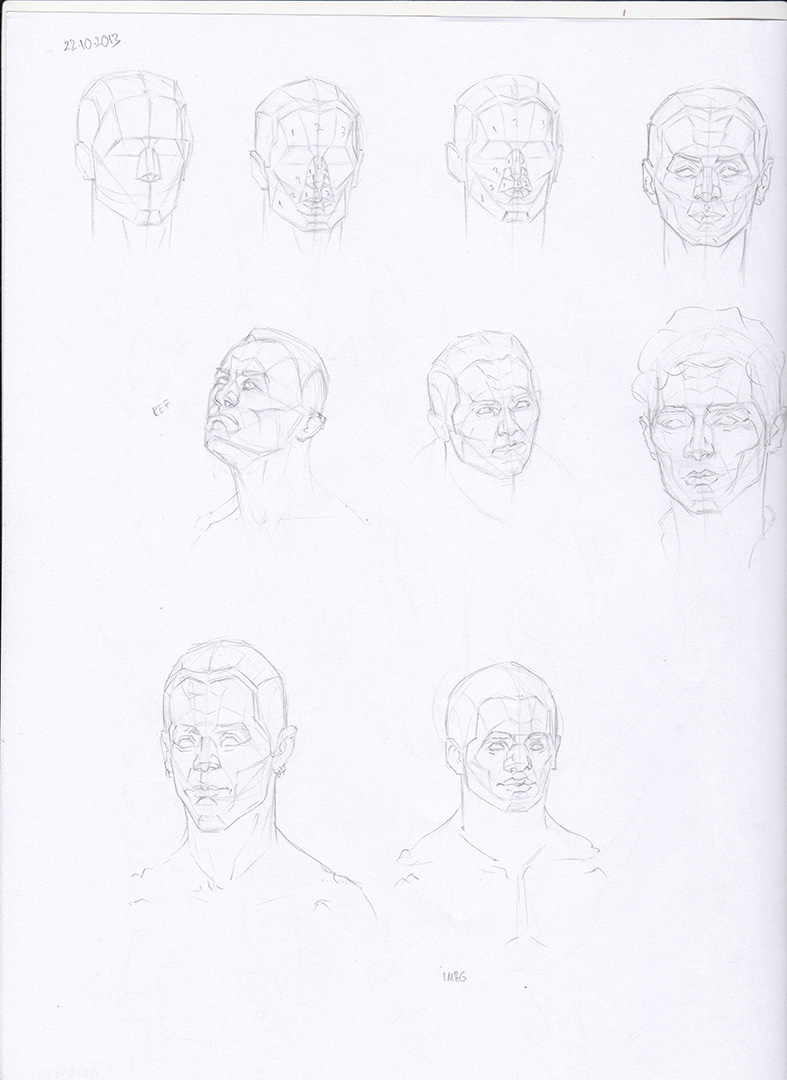
Some warm-up and studies:

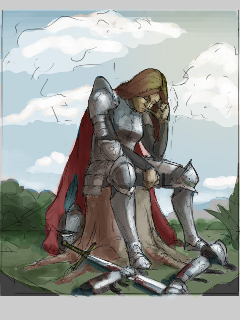
Trying to figure out some colors for this:

And some 60 sec gestures:


Trying to figure out some colors for this:
And some 60 sec gestures:

|
Raz's Sketchbook
|
|
10-23-2013, 05:26 PM
Some warm-up and studies:
  Trying to figure out some colors for this: And some 60 sec gestures: 
10-24-2013, 07:35 PM
soo many studies! this is really inspiring! thanks for that and keep them coming ;)
10-25-2013, 05:33 PM
Thank you Elaeis. I'll keep them coming :).
  A 30 min -theme- heavy armor:  
10-27-2013, 09:24 PM
I really love that armored girl piece! Armor design looks great so far, too, just make sure to add a strap to secure the plates on her upper arm (normally there's one attached to the last segment). Keep up the great work! :)
10-28-2013, 05:55 PM
Thank you for the tip Elif. I added the straps :).
 30 min -theme-human plant  Trying to put in some colors : 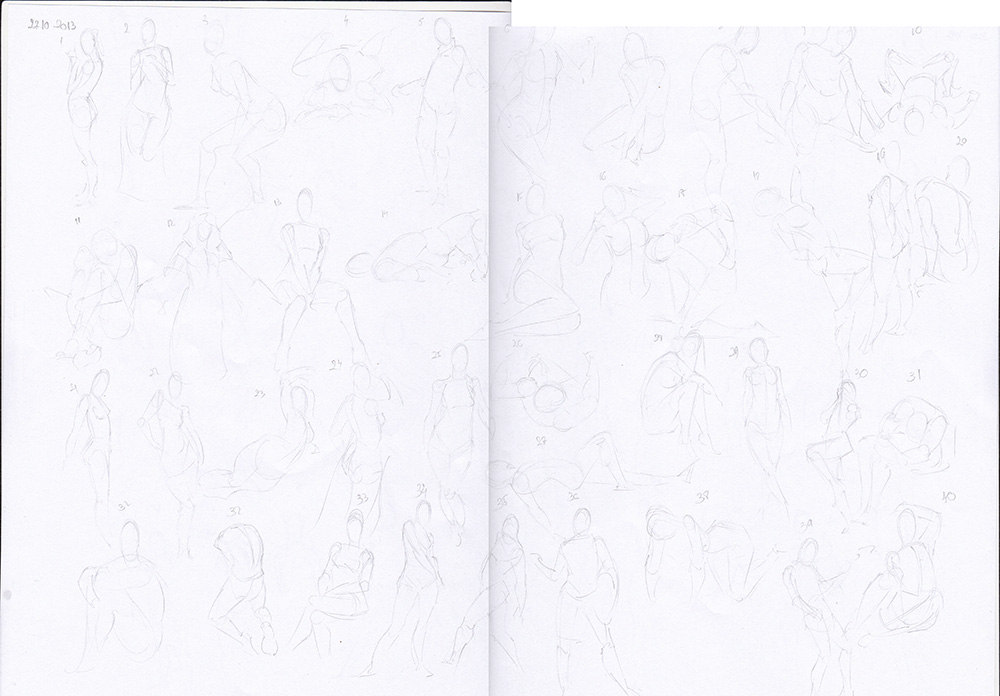
10-29-2013, 06:20 PM
 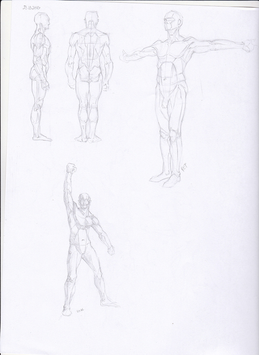 32 min -undead giant  Did some more work on this: 45 sec gestures: 
10-31-2013, 02:17 AM
I really like the balance and sense of movement in the gestures, and that new illustration is coming up nicely, keep it up :D
Sketchbook | Deviantart | Blog
"The difficulties of not knowing are much greater than the effort of learning"
10-31-2013, 03:58 AM
That last page is REALLY hard to see , might want to lower the brightness on it on your scanner setting...also how big(/what is your scanner)is your scanner so that you can scan in both pages ?
My Sketchbook (do help me out)
http://crimsondaggers.com/forum/thread-4216.html And if your rather curious on some older stuff here's my deviantart http://greatdictator.deviantart.com/
10-31-2013, 05:47 PM
Thank you Egbu. Gonna keep pushing the illustration.
@ Greatdictator - My scanner is A4 size and the page I'm drawing on are A3 so I scan the page in 2 pieces. 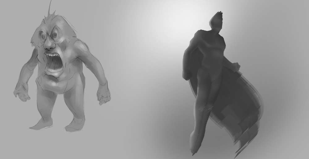 30 min-carnival of the dead  45 sec 
11-01-2013, 06:58 PM
Happy self-portrait day! Gonna be doing one today and posting it here and in atrenr's thread.
 30 min -the white moose:  Some more work on the piece, the rendering is taking a long time: 45 sec 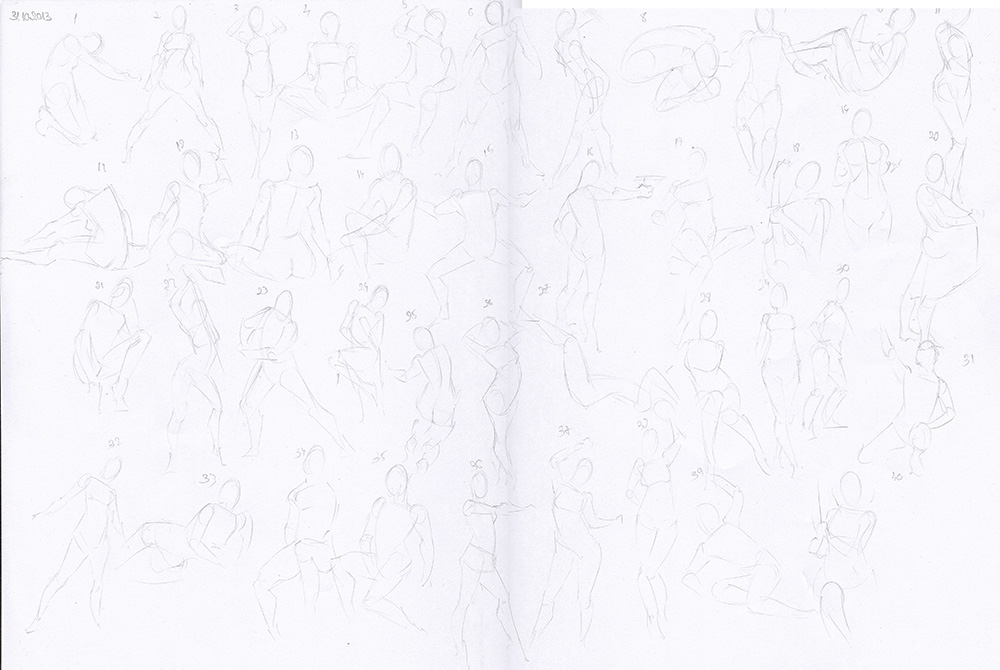
11-03-2013, 06:05 PM
 30 min-dirty chef  Did some more work on this. Going slowly( more time than I expected) 
11-04-2013, 05:54 PM
 30 min-viking marksman  Did some more rendering on this and created some masks for the detail on the armor. 45's 
11-07-2013, 05:32 PM
 30 min -dock crane  Some more work on the illustration, getting there: 30 sec gestures: 
11-08-2013, 04:44 AM
hmm dude, i think you worked so much on the last illustration ( lady with armor ) that you kinda lost it. Tbh, i don't feel like there is something coming from it. Let's sum up : there is a female warrior sitting on a cutted tree, with some armor on the ground, and nothing exept grass around her. Sorry, but it doesn't make sense to me. Is it at the end of a battle ? or is she escaping the battlefield ? we don't know much what's happening/what happened ! We only see that she's looking sad but we don't know why ! When you do a painting, everything must have a purpose ! Just the way you light your painting can tell so much, you can use sunrise for the beginning of a journey, or the end of a battle for example, etc ! You light seems a direct sunlight, but unfortunately, it doesn't appear like that, in sunlight, contrast is really strong, and you have warm light/cool shadow ! keep strongest contrast for the center of interest ( face, creature, etc ) ! Also, don't try to render everything, it gives a kindof messy look, especially for something like grass, with tons of texture ! most of the texture happen between light and shadow, and it's way more interesting and realist to suggest texture, especially in shadow ! check out great painting and look for that !
|
|
« Next Oldest | Next Newest »
|