Posts: 240
Threads: 8
Joined: Dec 2012
Reputation:
39
I'm not a painter so I'm definitely not the best person to be talking about these things but, just in case this helps.
In the sphere painting you aren't accounting for the light bounced off of the ball back into the ground plane, which would be especially noticeable in the cast shadow area, you have the gradient for the general occlusion shadow but it should be more defined than that, also since the top plane of the sphere is much brighter than the top plane of the ground I'm assuming they have a different local value(different materials), in that case you should be able to see the contrast between the parts of the sphere that reflect the ground and the ones that reflect the walls.
You should even see a very subtle reflection of the cast shadow on the ball itself
I also assumed there was some extra light coming downwards, from either a sky, secondary ceiling light, or just a ceiling brighter than the table/ground plane
https://i.imgur.com/GNmZD4L.gif
![[Image: GNmZD4L.gif]](https://i.imgur.com/GNmZD4L.gif)
here's kind of a replication done in blender (a lot of things are different, I made the ground a lot more reflective, but hopefully it still makes sense), you can see how the sphere reflects on the ground plane.
ignore that specular in the shadow area, that's from the lightsource reflecting off of the ground
![[Image: rKSJdLa.png]](https://i.imgur.com/rKSJdLa.png)
I didn't calculate everythin super correctly, reflections on spheres are a pain, but yeah, maaaaybe this helped ? maybe not.
EDIT, fixed it a tiny bit, but yeah, mine is still very sloppy
https://i.imgur.com/ZRIEJBC.gif
Posts: 316
Threads: 3
Joined: Sep 2019
Reputation:
23
Just went back through a couple of pages and it's great to see all your studies and character concepts—and really like your color choices.
Keep it up
Posts: 470
Threads: 3
Joined: Dec 2013
Reputation:
9
Posts: 1,424
Threads: 12
Joined: Dec 2015
Reputation:
139
Lovely stuff Shin :).
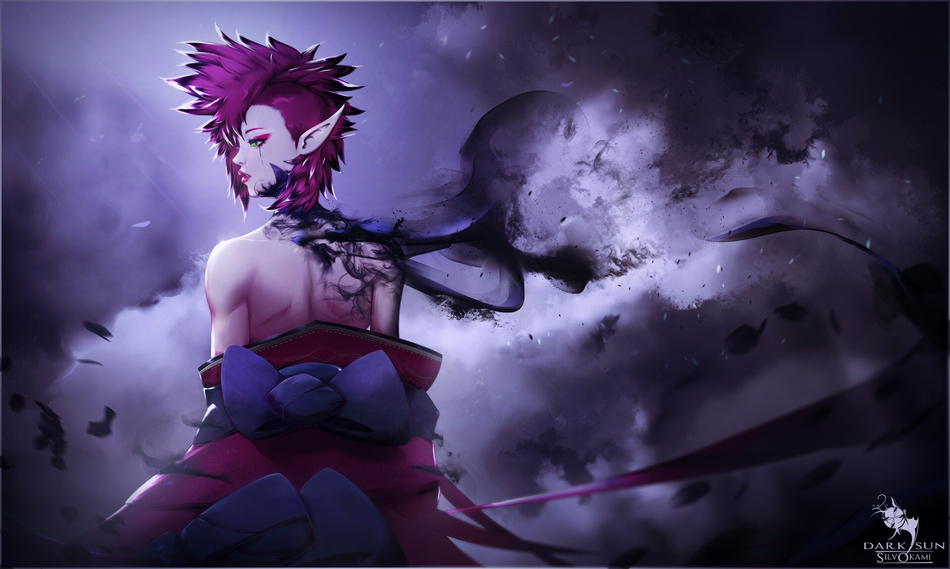
I particularly like the first piece - the cloudy maelstrom background looks great!
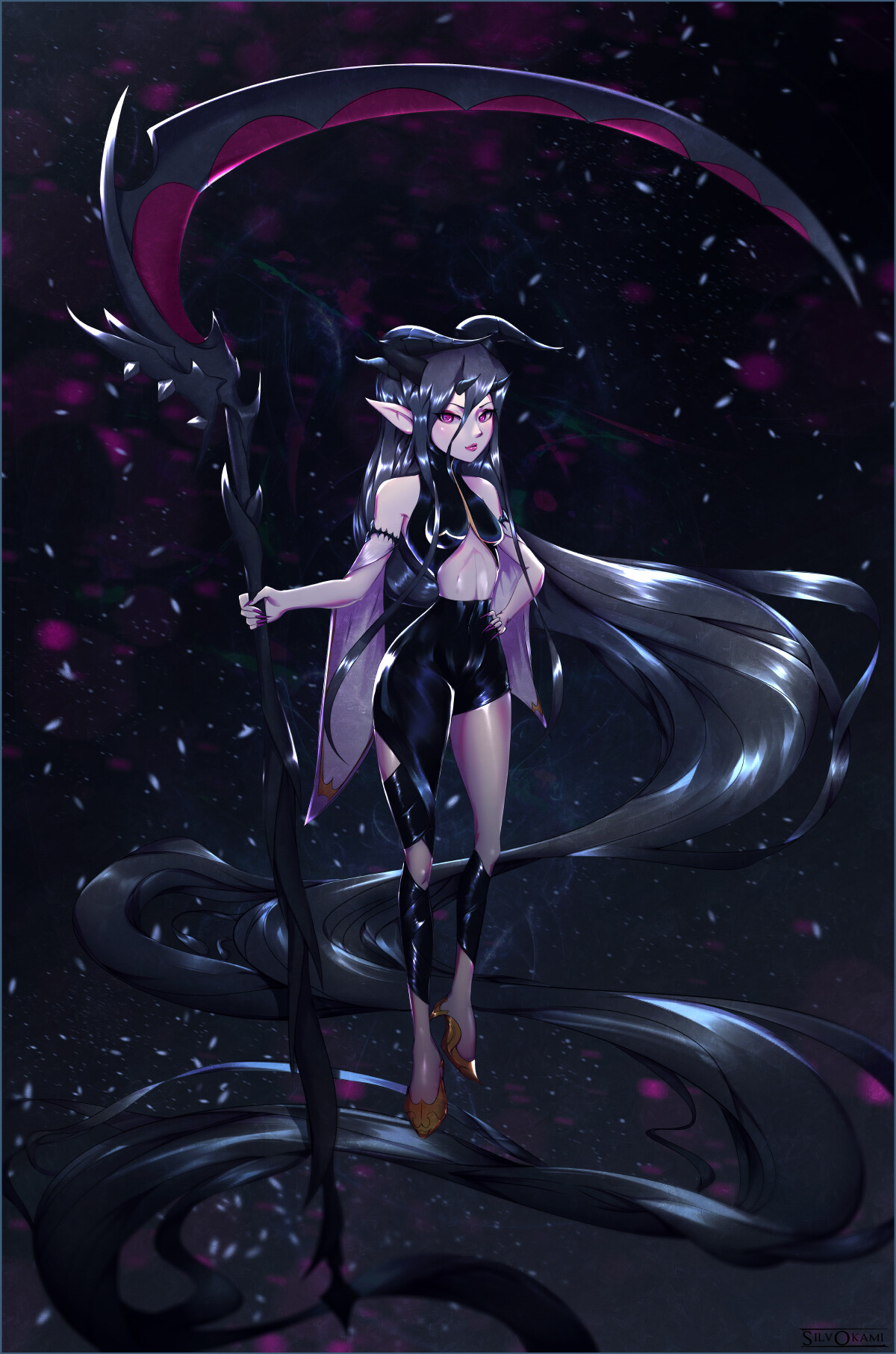
On the third piece (the lady with the scythe) her left leg looks a little short to me - something to watch out for. Maybe your perspective work is a bit off here - I find sketching in a quick horizon-line and perspective grid really helps with that stuff.
Keep posting dude!
“Today, give a stranger one of your smiles. It might be the only sunshine he sees all day.” -- H. Jackson Brown Jr.
CD Sketchbook
Posts: 470
Threads: 3
Joined: Dec 2013
Reputation:
9
(01-26-2020, 05:27 AM)Artloader Wrote: Lovely stuff Shin :).
I particularly like the first piece - the cloudy maelstrom background looks great!
On the third piece (the lady with the scythe) her left leg looks a little short to me - something to watch out for. Maybe your perspective work is a bit off here - I find sketching in a quick horizon-line and perspective grid really helps with that stuff.
Keep posting dude!
Thanks a lot ! :D
Yee I should use more grids in ze future, sankyuu !
----------------------------------------
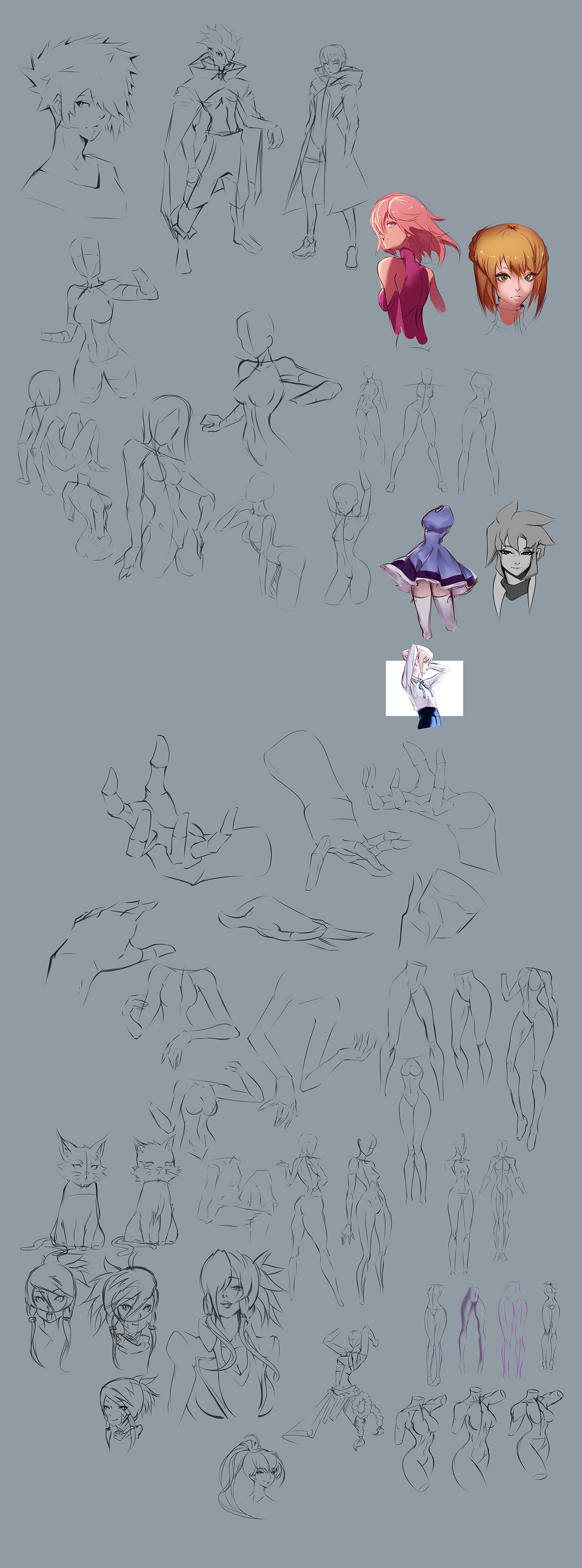
Some study, warm up dumpage~


Posts: 2,817
Threads: 15
Joined: Jun 2013
Reputation:
109
i like how youre stylizing and your design choices are coming along, nice cutting and carving of forms... Keep taggin it, try tougher angles, bend the knees more etc
Posts: 470
Threads: 3
Joined: Dec 2013
Reputation:
9
Posts: 413
Threads: 11
Joined: Mar 2013
Reputation:
10
Really cool stuff! I see you are a huge fan of Zeronis! : D
Posts: 470
Threads: 3
Joined: Dec 2013
Reputation:
9
Posts: 623
Threads: 36
Joined: Jan 2012
Reputation:
50
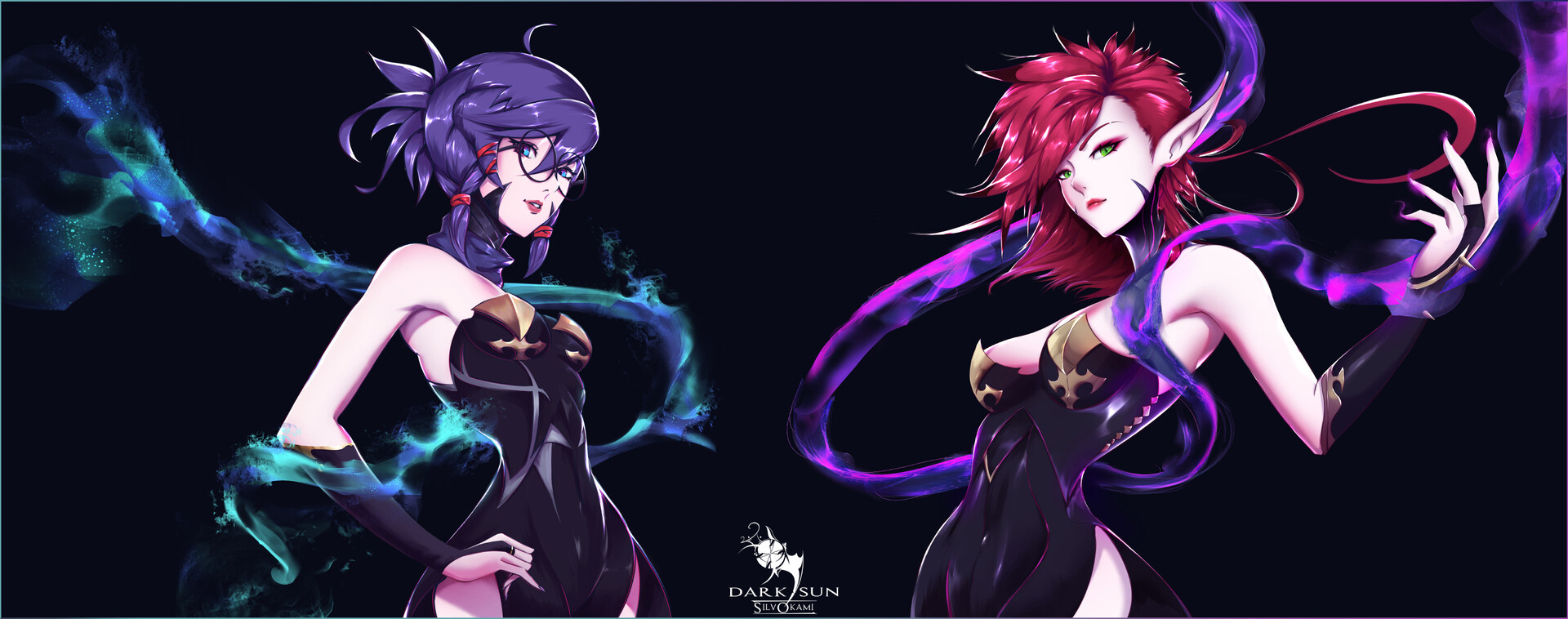
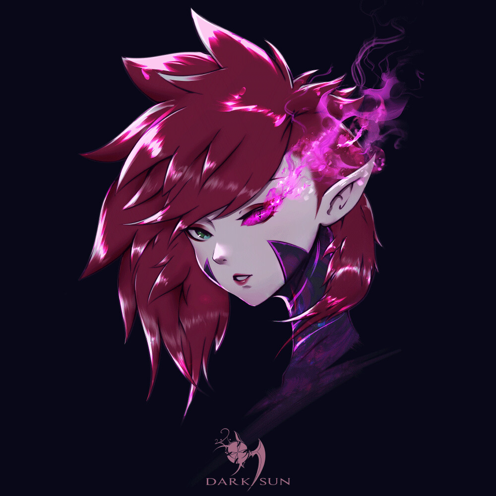
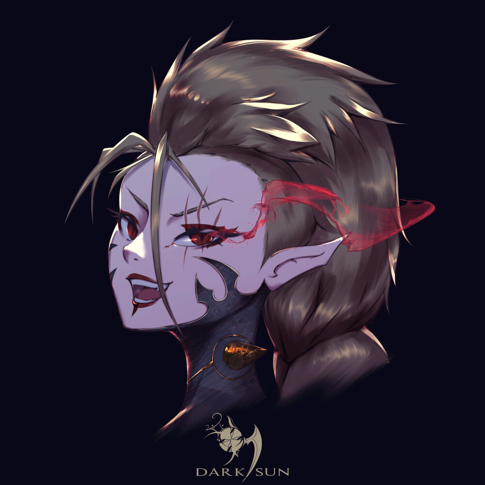
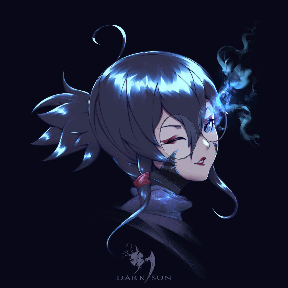
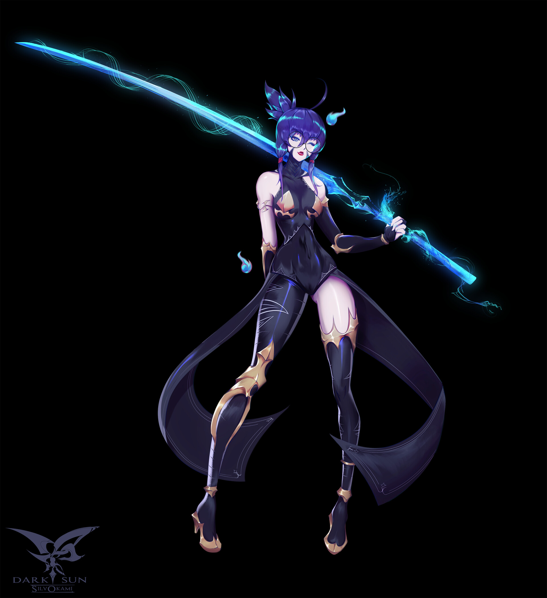
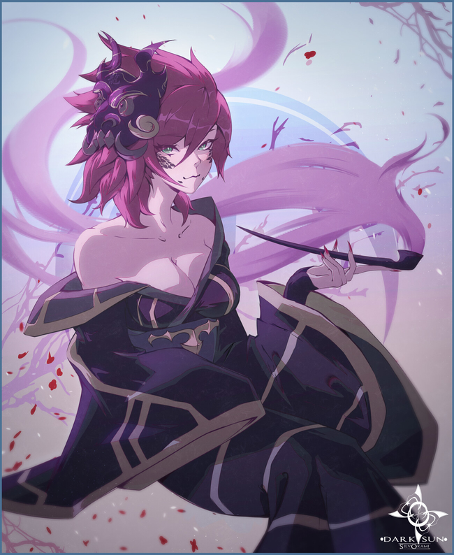
This dark sun project looks quite interesting, lovin the character design+portraits. Only small gripe I have is the way the blue haired girl is gripping that sword, I'd probably get a mirror/google for reference. I'd also include the character names in the image somewhere. Other than that top notch work.
Posts: 58
Threads: 7
Joined: Jun 2020
Reputation:
2
Man, the last post and this whole last page of this sketchbook is so inspiring!
(and even a little bit discouraging, but thats my problem; at the same time encouraging to see whats possible.)
Very very inspiring!
Posts: 470
Threads: 3
Joined: Dec 2013
Reputation:
9
(08-17-2020, 10:03 AM)Dennis Kutsenko Wrote: This dark sun project looks quite interesting, lovin the character design+portraits. Only small gripe I have is the way the blue haired girl is gripping that sword, I'd probably get a mirror/google for reference. I'd also include the character names in the image somewhere. Other than that top notch work.
Thank you so much ! :D
The project is also a means to push myself to do stuff I don't usually dare to so hopefully I'll improve them.
Hands yes... hands, what to say about them thats not said yet~ :V
--------------------------------------------
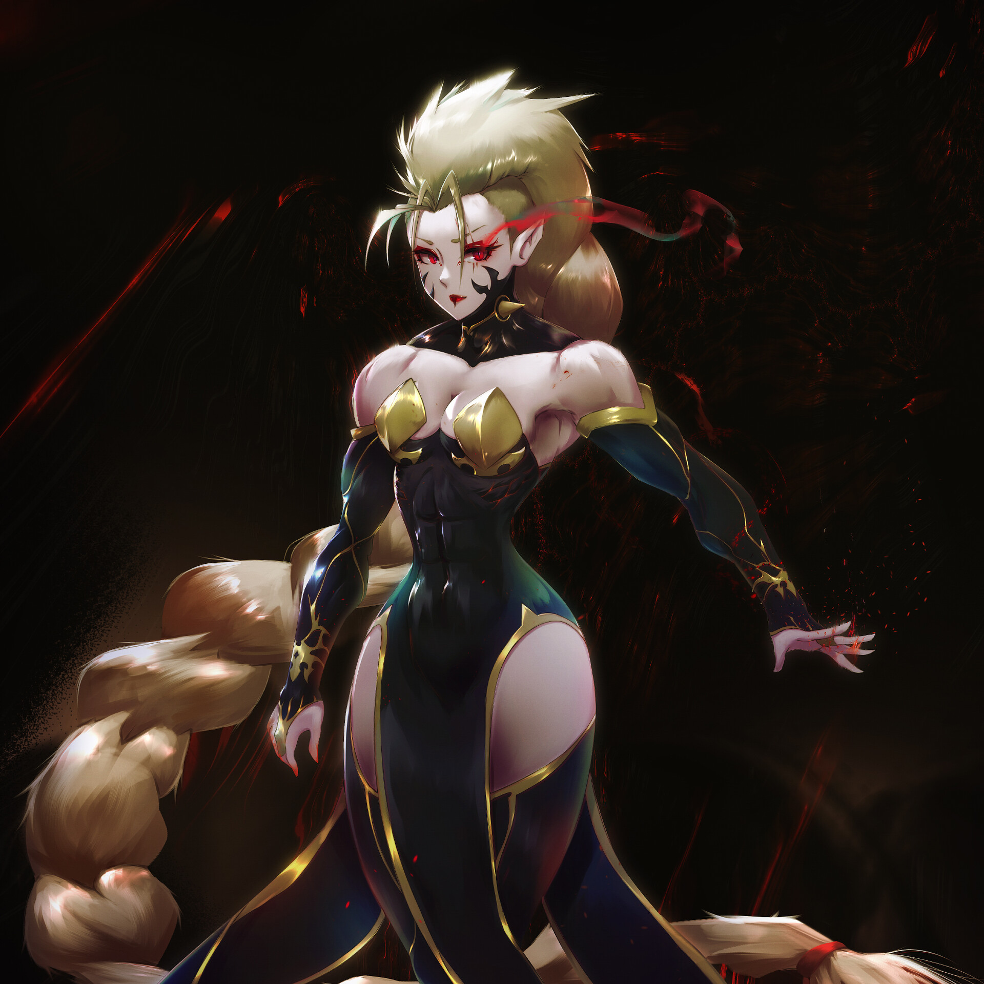
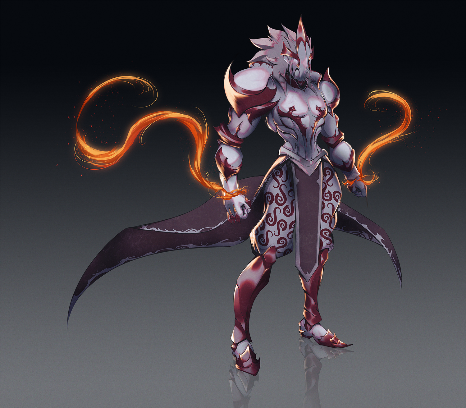
Small update, just trying out armor design. I find it difficult to keep my patience while rendering and also the smooth transition between colors. Still, I'll keep trying !

Posts: 1,109
Threads: 18
Joined: Apr 2014
Reputation:
68
Been a few years since I saw your sketchbook! Such amazing progress, looking so pro : ) I totally get you about rendering & patience, I think you went plenty far enough though, it looks sophisticated enough without being overworked. Maybe those red transitions around the shadow shapes are a bit too strong? Supposed to be subsurface scattering type of thing? It's too weak to be purposefully stylised transitions, and too strong to be realistic skin. Whatever tho! the image still looks 100% awesome.
Maybe more of the flame glow on the skin and a few cast shadows from the armour to really sell those flames, but yea it totally works as it is : )
Posts: 470
Threads: 3
Joined: Dec 2013
Reputation:
9
(10-28-2020, 01:29 AM)JyonnyNovice Wrote: Been a few years since I saw your sketchbook! Such amazing progress, looking so pro : ) I totally get you about rendering & patience, I think you went plenty far enough though, it looks sophisticated enough without being overworked. Maybe those red transitions around the shadow shapes are a bit too strong? Supposed to be subsurface scattering type of thing? It's too weak to be purposefully stylised transitions, and too strong to be realistic skin. Whatever tho! the image still looks 100% awesome.
Maybe more of the flame glow on the skin and a few cast shadows from the armour to really sell those flames, but yea it totally works as it is : )
Sankyuu !! :)
It's funny how you say it's either too weak or too strong, usually I don't know what I'm doing 90% of the process so having those happy accidents happen and get notices make me happy too :3
-----------------------------
A bit older work, trying different process and realizing that I need to balance between working big to small. Maybe I'm being redundant but I really don't have the patience to detail and "fix" stuff but I'll try to fix that too~~ :p

Posts: 470
Threads: 3
Joined: Dec 2013
Reputation:
9
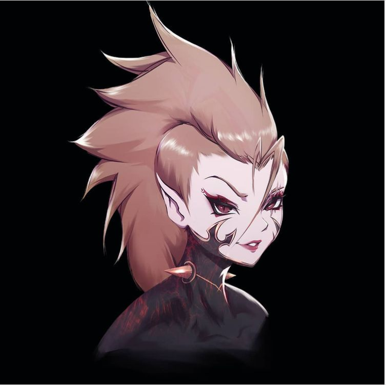
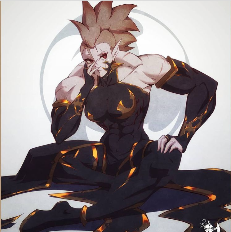
A bit more work of one of my project characters. :)
What I noticed recently is that I'm losing touch with thinking about 3d forms, resulting in subconsciously avoiding any input of similar properties that my work can benefit from. I am getting more relaxed by using different coloring methods, if I get pass the 'ugly stages' xD
So for the next year, I plan to get back to fundamentals and try to expand of what I can do. :v
Of course- doubt is always present.
It's been almost 7 years since I started drawing and I barerly get any commissions, requests or invites to projects but hopefully that will change soon as well.
Hope y'all are doing well and happy new year of art endeavour !
Posts: 470
Threads: 3
Joined: Dec 2013
Reputation:
9
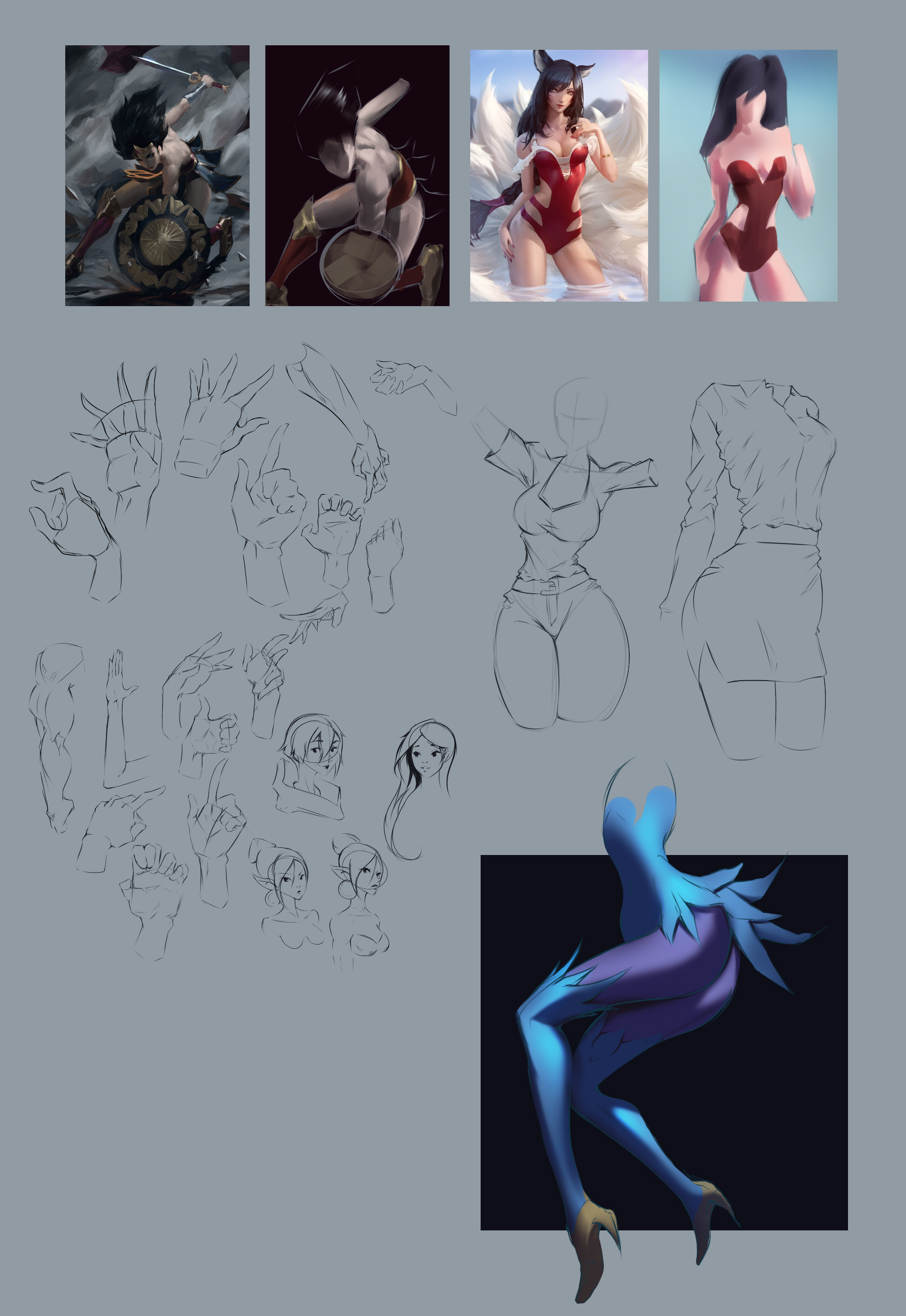
Still trying to squeeze some time into doing actual studies but in the end, 80% of that time goes into actually trying something new and implementing it into creating a new piece. ^^'
So here's another practice run, trying to be concious about my choices in the process. I'm definitely seeing and simplifying steps towards the finished piece. The only other step I barerly invest time in is detailing so gotta work on that.
Hope you like her ! :)

Posts: 3,357
Threads: 37
Joined: Aug 2013
Reputation:
234
Strong silhouette with a strop shape language is more important than detail in my opinion.There is way more to story telling than detail like facial expression, color, gesture,mood.Sometime less is more.Specially if your into animation or comic choosing the level of detail will greatly affect how time consuming the project will be.
I got an idea for you if you up for a challenge try your style with some photobashing see if you like it or not.
Posts: 470
Threads: 3
Joined: Dec 2013
Reputation:
9
(02-25-2021, 12:37 AM)darktiste Wrote: Strong silhouette with a strop shape language is more important than detail in my opinion.There is way more to story telling than detail like facial expression, color, gesture,mood.Sometime less is more.Specially if your into animation or comic choosing the level of detail will greatly affect how time consuming the project will be.
I got an idea for you if you up for a challenge try your style with some photobashing see if you like it or not.
I agree, if you can tell a point with less details, anything additional is just for show :) But I guess sometimes it comes down to personal flavor~
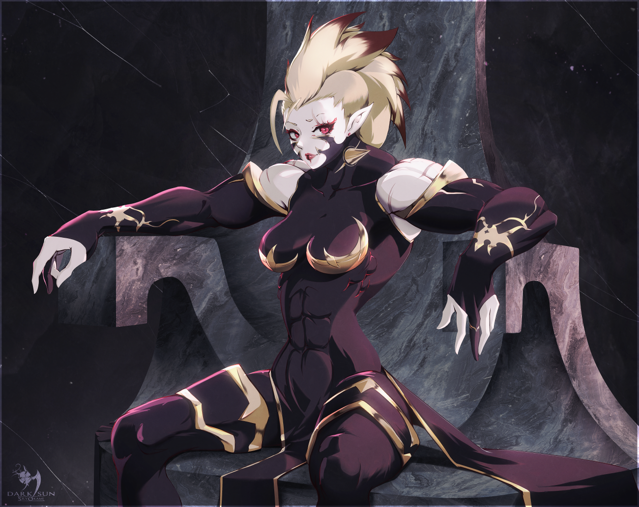
Photobashing is something I do use but sparingly. On my latest post here, you can clearly see the texture of the throne is a pattern and that's the only place I used it. :)
Thanks for checking out my SB ! <3
Posts: 50
Threads: 2
Joined: Feb 2021
Reputation:
5
I'm really impressed by your astonishing progress since the beginning. I like your style! That armor design is just wow!
Posts: 470
Threads: 3
Joined: Dec 2013
Reputation:
9
(02-25-2021, 09:19 AM)Kassatay Wrote: I'm really impressed by your astonishing progress since the beginning. I like your style! That armor design is just wow!
Sankyuu- I try ! uwu
-------------------------------------
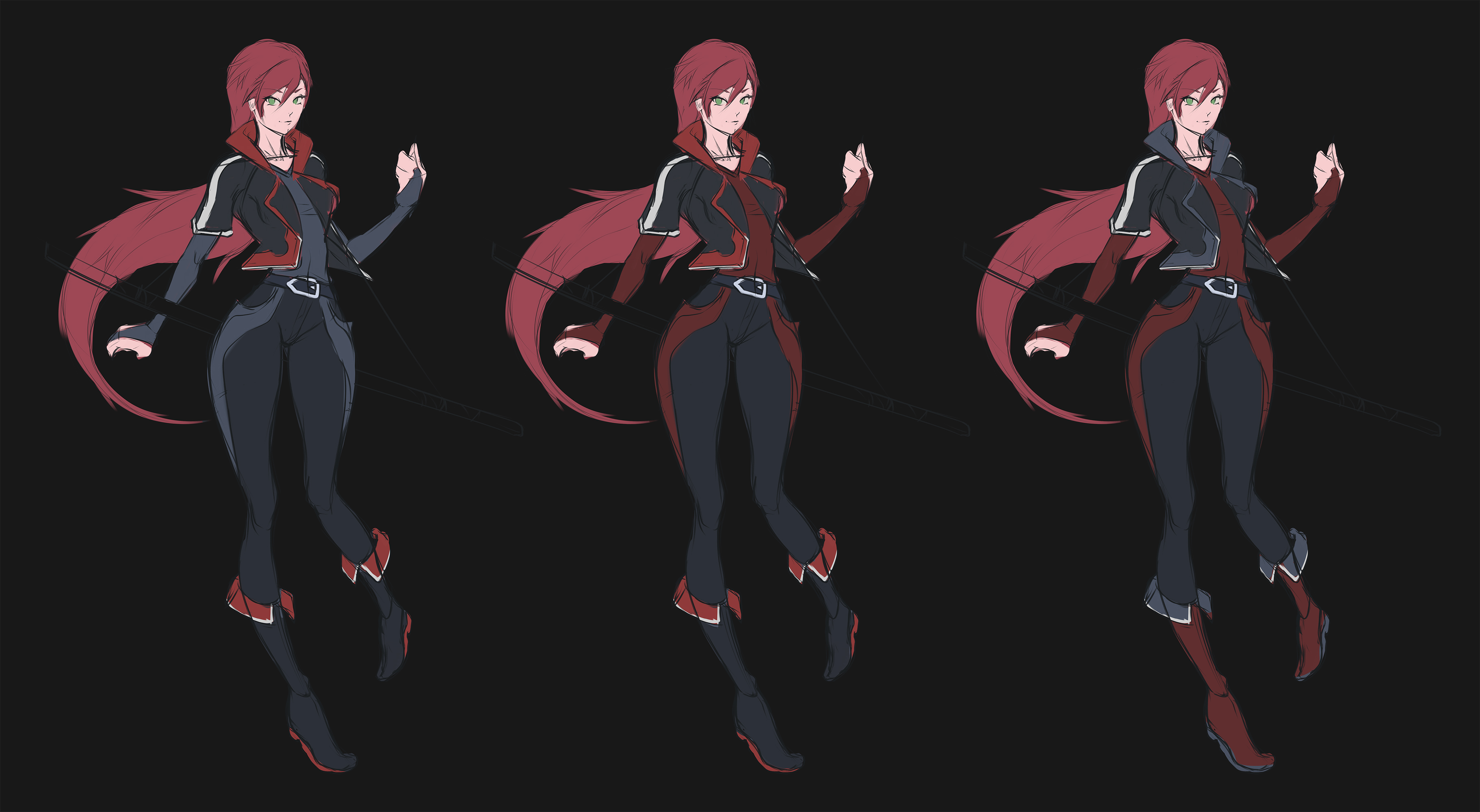
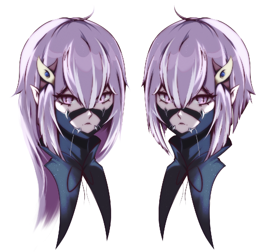
Small concept for my next project characters- really got me into thinking of balancing design vs detail.
I feel opressed, depressed and caressed by meaning of life.

|
![[Image: GNmZD4L.gif]](https://i.imgur.com/GNmZD4L.gif)
![[Image: rKSJdLa.png]](https://i.imgur.com/rKSJdLa.png)
![[Image: GNmZD4L.gif]](https://i.imgur.com/GNmZD4L.gif)
![[Image: rKSJdLa.png]](https://i.imgur.com/rKSJdLa.png)


