08-27-2016, 07:10 AM
@Smrr Thanks!
Dean Cornwell is interesting
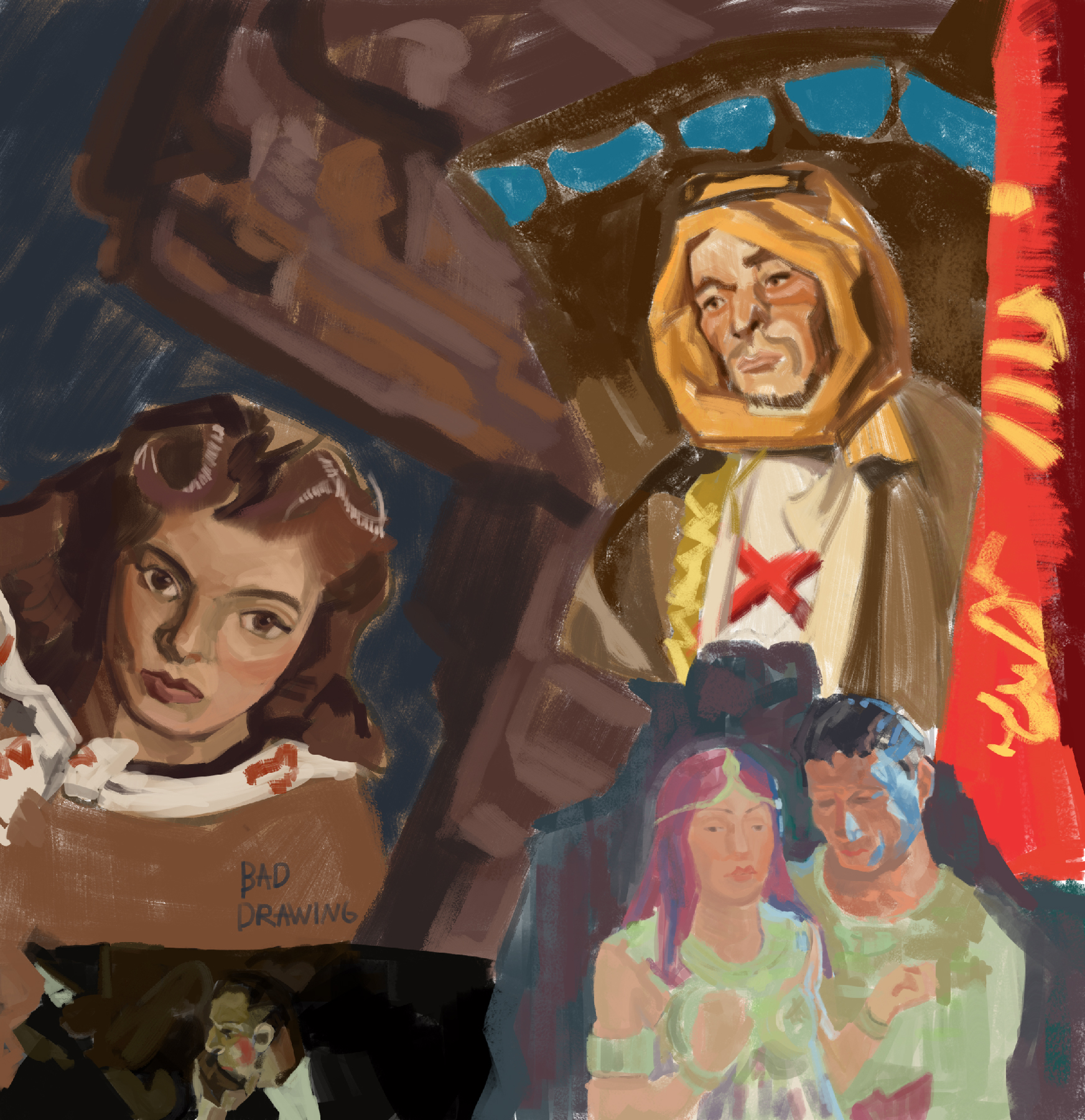
Dean Cornwell is interesting

|
Hobitt-hole
|
|
08-29-2016, 09:37 PM
Alright change of policy ill update often and try to implement and improve my ideas,methods etc.
still life , diffuse neutral light. 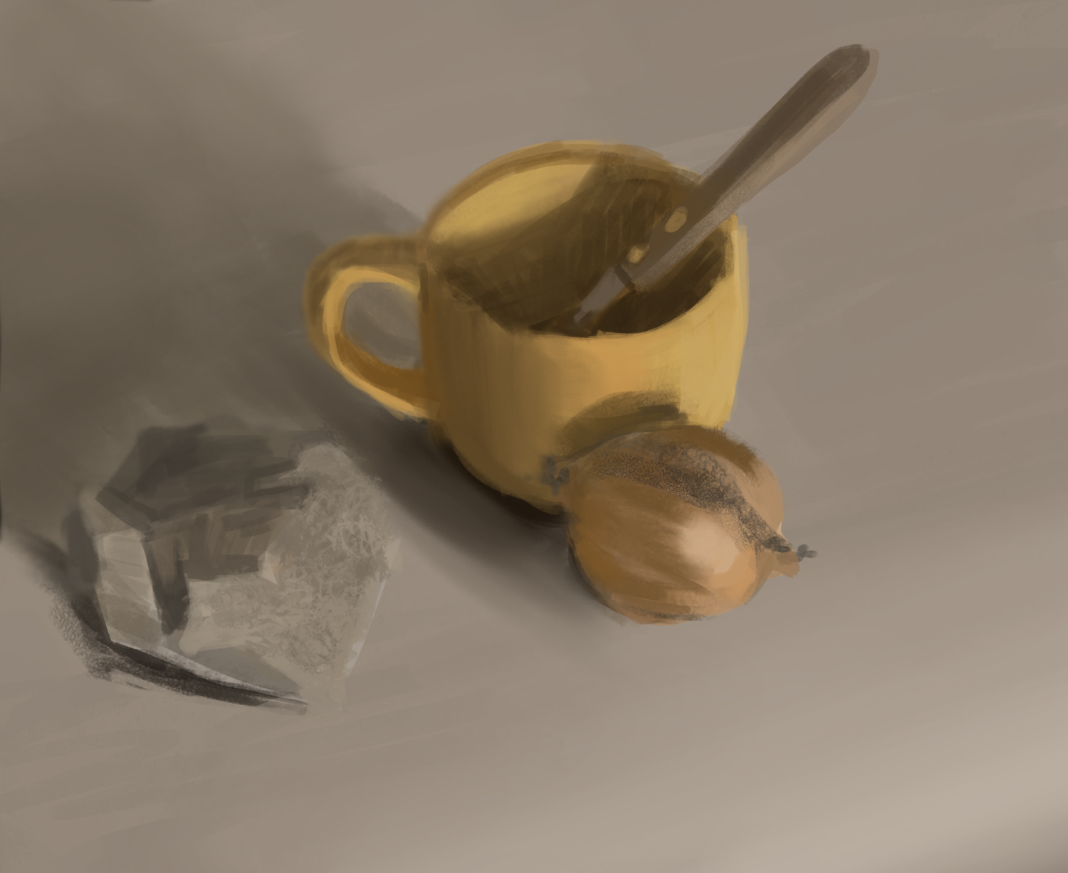
08-30-2016, 11:51 AM
Nice!
Is this a quick sketch? Is there a reason why the drawing is loose?
08-31-2016, 08:43 AM
@Dodeqaa yeah it was done under an hour wanted to get the basic information in there and leave it at that
Was practicing freehand cubes decided to render some 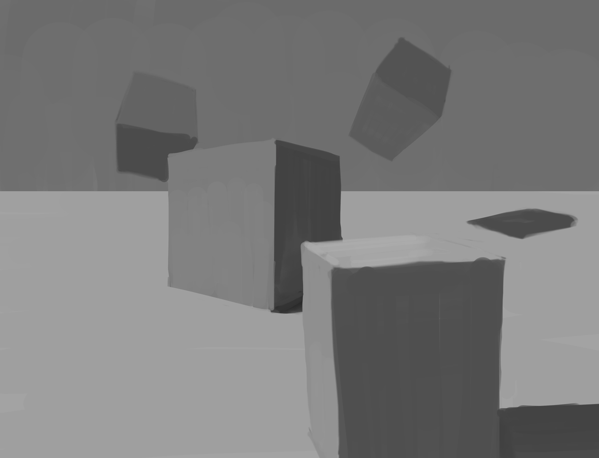
08-31-2016, 08:51 AM
I see, thats a good way to train too.
like the shading effect on the last render, the cubes are too tall though, doesn't feel like they are equal in all faces Also, if strongest light is from the side, then cube closest to view should have brightest surface on side and not top. Keep on the sweet learnin!
09-02-2016, 08:24 AM
@dodeqaa Thanks! i guess they are less cubes more boxes since plotting identical cubes is quite tricky to do freehand
,but im practicing! Quick sketches working on perspective and colors. 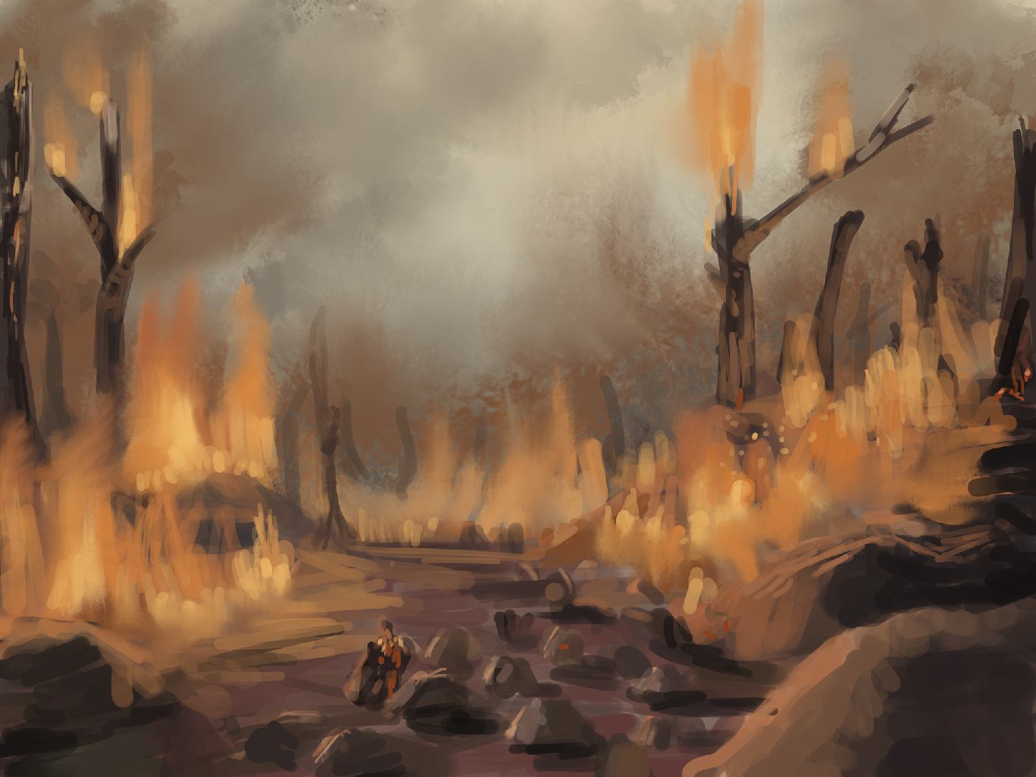 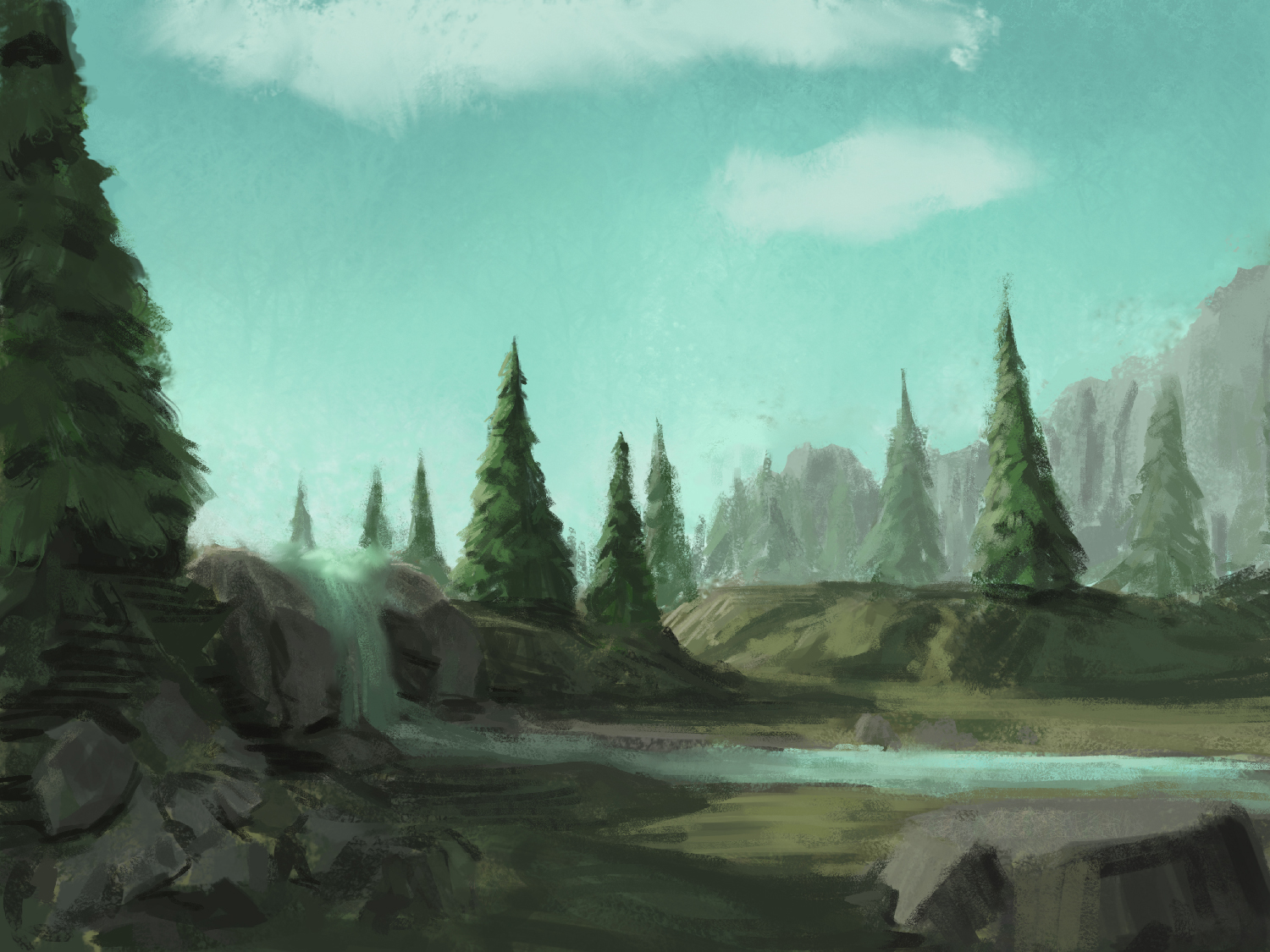
09-04-2016, 08:07 AM
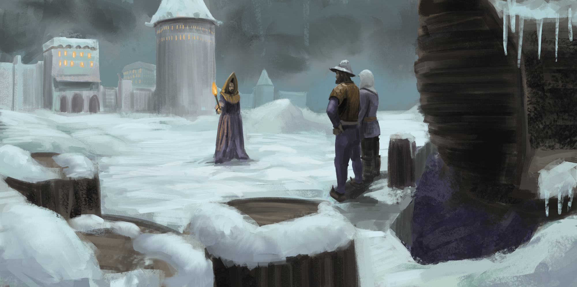
Here is a piece i did not finish ,it did not go the way i wanted to, and i lacks technically, not sure what, unsatisfied.
09-04-2016, 03:15 PM
Heya,
Keep up the practice, analysis and experiments. Its hard mode to paint something right from the word go, but it can teach you so much about your limitations. Stay positive and learn like a hungry man. I did a paintover of the piece you posted in the discord, with some notes that will hopefully help! Step one is linework and flat colours (diffuse lighting) used to achieve to important goals: 1. Working out the shape design of the character+environment you have in mind, the composition of the image 2. Working out colours whilst they are simply rendered and free from colour shifts, which means changes are easier. The more you can work out in this stage the less you have to deal with in a later stage. Regardless of whether you practically execute these steps, Working out the Shape, Composition and Colour design of the scene are the tasks that need doing to make a successful image. 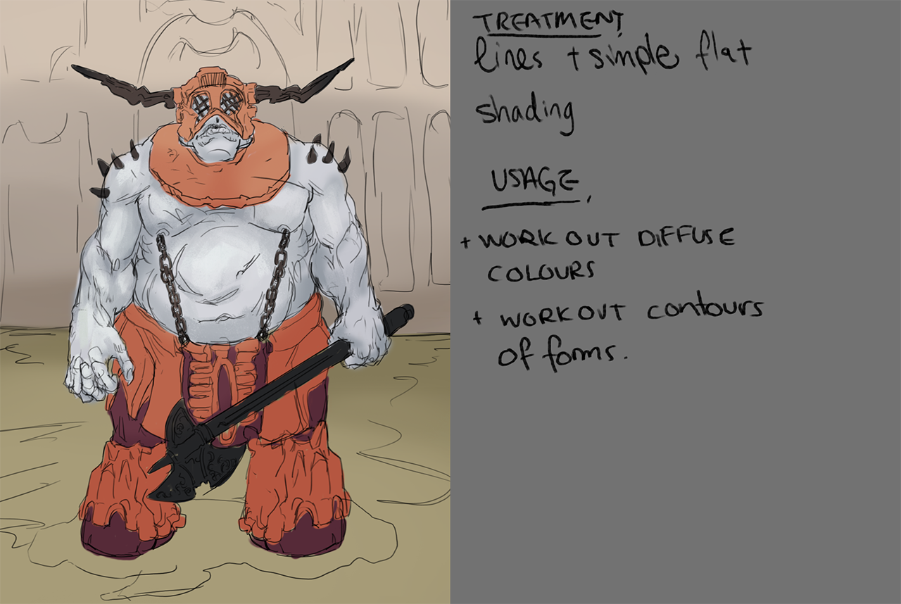 Step two is to use curves and and other adjustment layers to shift your colours to match the lighting of the image you had in mind. In this case it felt like a blue-ish moonlit scene to my eyes. Planes of darker and lighter colour are added to indicate the direction of the lighting, which in this case is from above. 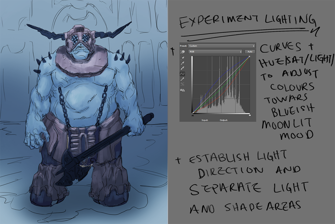 Step three is to collapse the layers (or not) and paint the image proper, taking care to express the volumes in light and space. If your painting makes the volume flatter than it was when it was just line work, then you need to indicate the planes' transitions from light to dark better. Take care to workout the light and colour design before you go into rendering details. 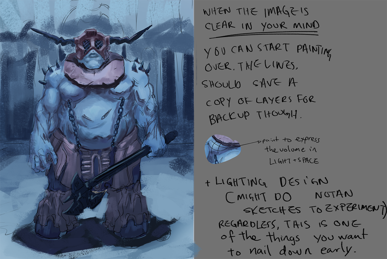 Its not all painted over but this is good enough to illustrate my suggestions. Your fundamentals are there to aid you to do these little jobs/tasks that add up to a successful illustration. This is a basic list, you will most likely have more tasks to add to it. I recommend making it up, so you can see at the end of the painting, (successful or no), your choice of actions and whether it be effective or no. Then revise your learning and keep on improving! Hope it helps and keep trucking!
09-06-2016, 10:21 AM
First time stopping in!
Amazing progress in this book! Really really nice!
09-08-2016, 01:46 AM
@dodequaa Thanks for the overpaint! i really appreciate it!
@Sublimus Thanks! Experimenting. 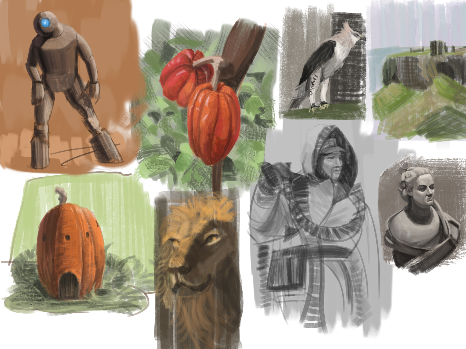
09-23-2016, 04:21 AM
I like these last studies, I need to improve on getting my forms more accurate as well. Seems like a good exercise.
Also I'd advise you to do a bit less personal pieces and do some material/texture studies and value studies (not a full painting, small portions just to understand it better). Sketchbook | Gallery | Twitch
10-06-2016, 08:36 AM
@Piotr Thanks! and yea that was the plan!
Ill jump into colour for a bit. And here are some value studies (ill do more,but a bit later) 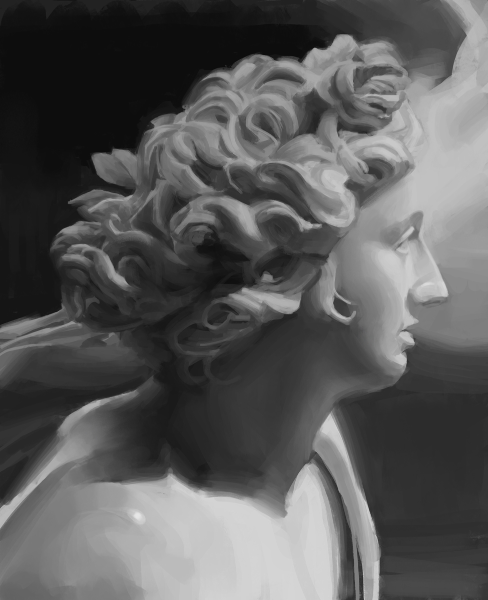 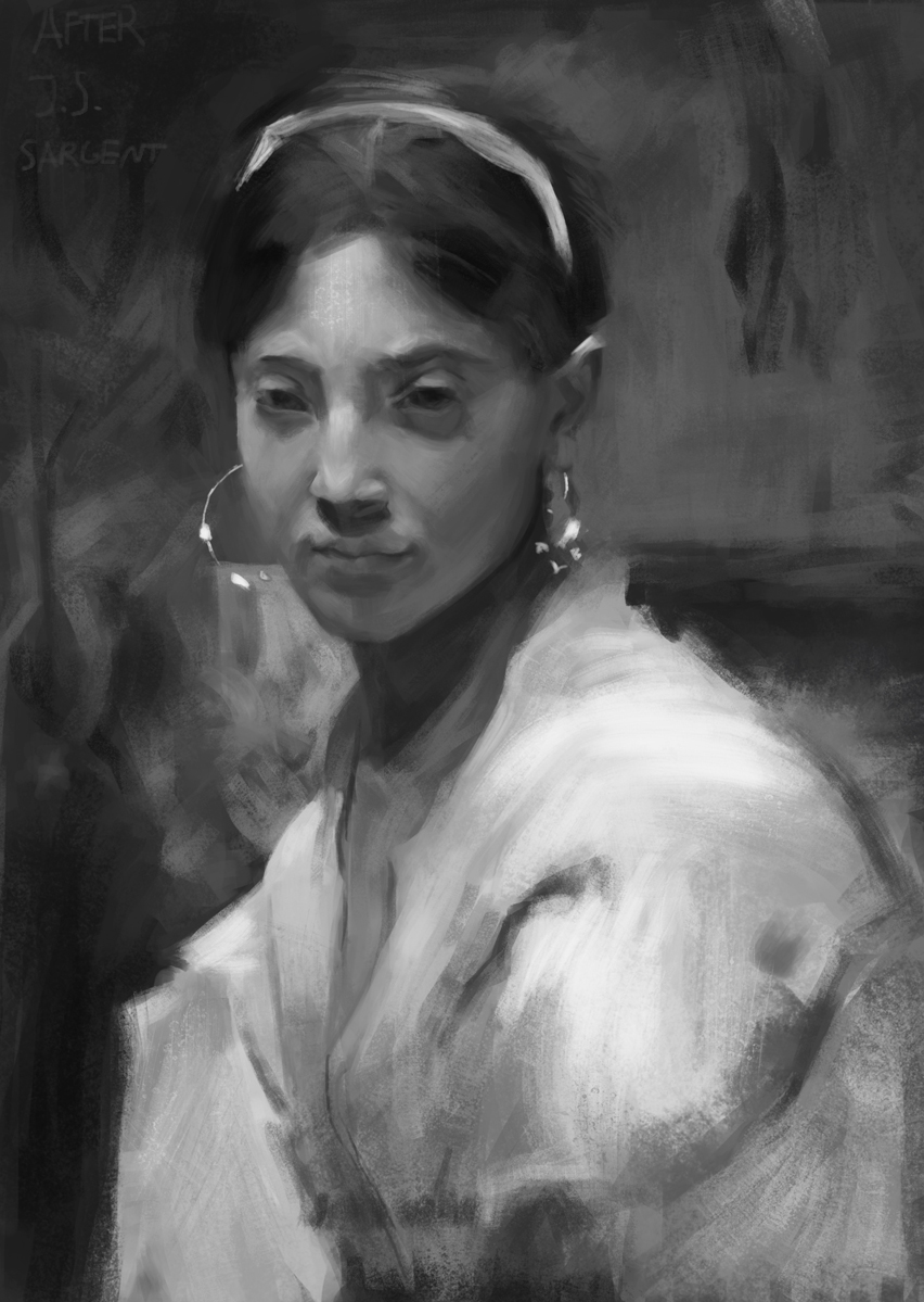 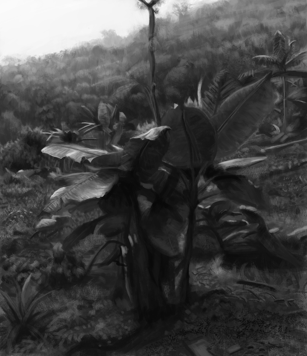 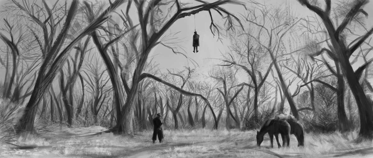
10-16-2016, 11:45 PM
Color studies, the different color versions is me picking a random color and making it work for the painting.
And i think its time to apply all this stuff ive learned over the past month, i learned a ton of stuff perhaps some of it will have to take time to fully sink in, ill keep doing studies, but not so regularly. Kind of exited to start applying this! 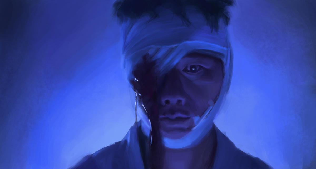 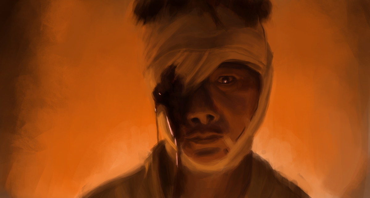 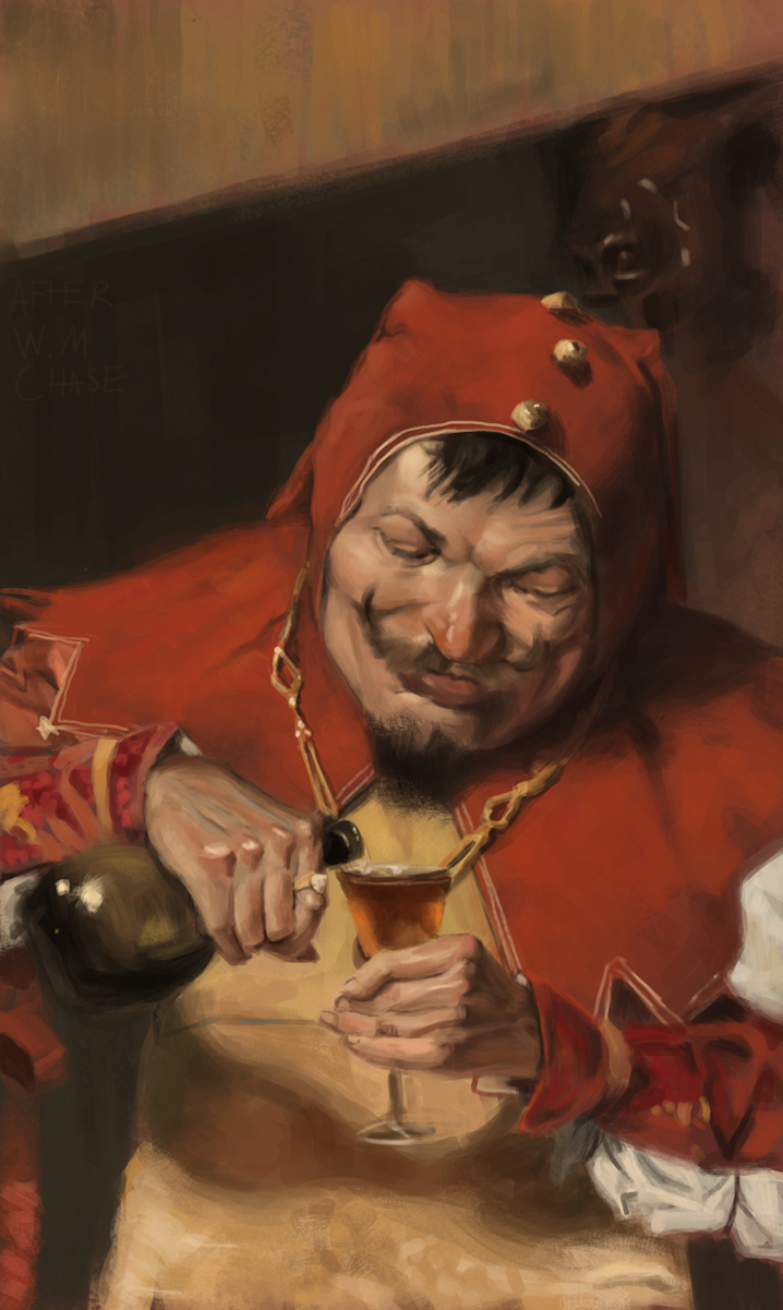 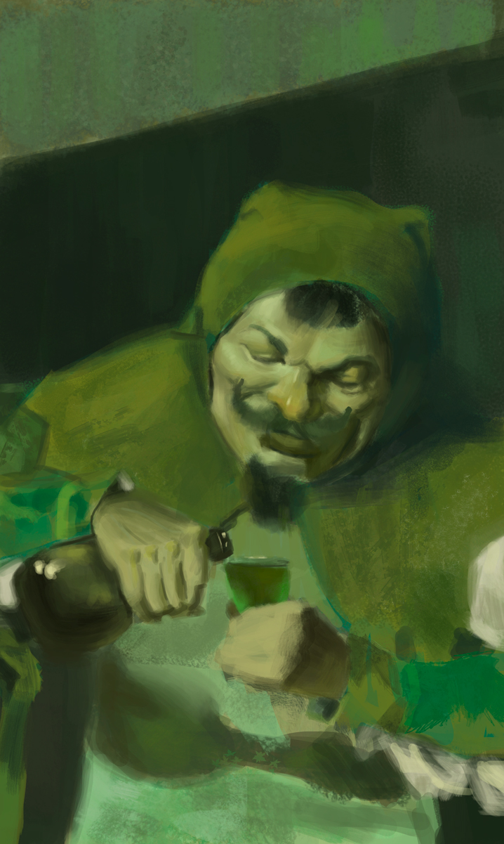 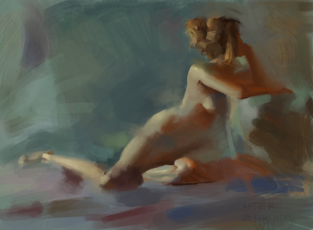
12-03-2016, 12:40 AM
Hey Hobbit, Nice to see your stuff has really come on since page 1! I like those 'accuracy' single line sketches! I do similar thing sometimes - choose a shitty flat brush with no pressure, force yourself to commit - it's a powerful exercise for improving focus. Keep up the good stuff :)
12-03-2016, 03:15 AM
Hobbit, your value sketches look wonderful. You have a lot of great stuff recently!
The biggest thing I see holding you back is your shape language. Sometimes you'll make pretty nice and interesting brushwork (the snow land) other times it looks blobby and uninteresting (like the firescape). The shapes you're using contributes a lot to this. In nearly all of your pieces, your shapes have a severe symmetry to them, the fire for example has very symmetrical and controlled shapes. I see the same thing in your portraits, angles and shapes even out to be nearly symmetrical becoming more round and oval in the head. Your robot designs are made of very symmetrical shapes. Even the squashes and the hawk you drew have been simplified into symmetrical ovoid shapes. Everything always feels very even, so there's no particular area of emphasis to grab on to and look at. I would challenge you to pay extra attention to looking for and adding apexes on each of your individual shapes. In general, anything we look at due to perspective or laws of nature, everything we look at has an area of "less" and "more." This will give your work and designs more "meat" and interest to look at. When I'm thinking about composition and design, I find that making every shape more triangular (bigger on one end, smaller on another) consistently helps the flow and composition. Your very best work here has more attention paid to angles and values. Your grayscale work looks really good, especially your black and white plant, and the snowscape stand out to me. These pieces all have stronger angles and triangular compositions when compared to your other work. Even these could be made stronger still with more areas of shape gradation to lead and interest the eye. Keep up the good work!
12-05-2016, 12:13 AM
@Bledley Yes! i do love doing that kind of stuff really makes you focus on whats important instead of fancy textures and other stuff
@Vic Thanks! i haven't considered shape design before, or at the very least did not consider it very important, ill try to look into it! I usually don't post this kind of stuff but why not, wanted to concentrate on the subtle modeling of forms , at some point i got carried away and painted too strong value transitions so painted it over and started again. 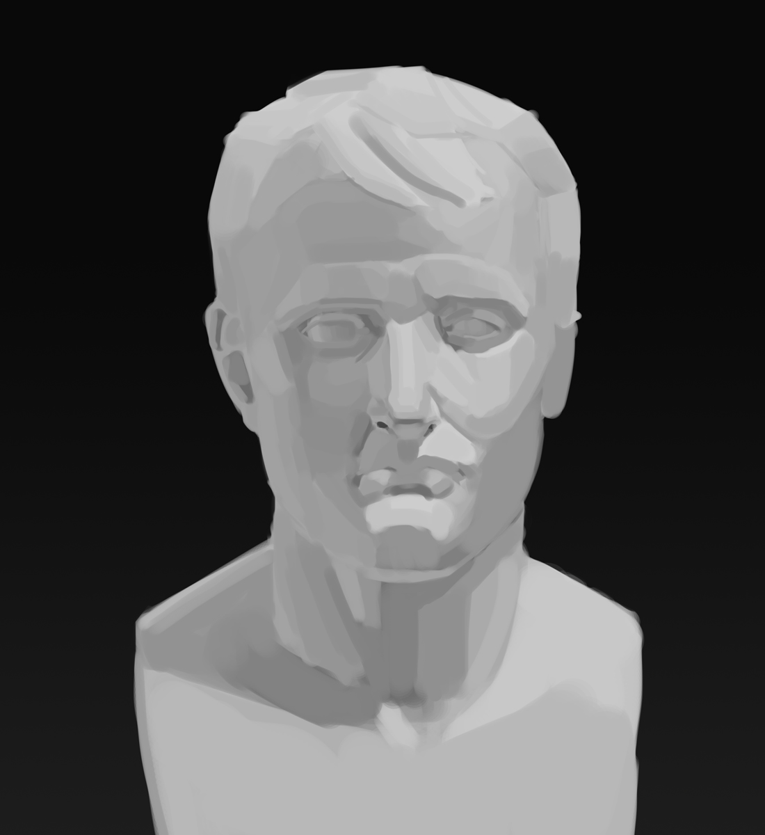 |
|
« Next Oldest | Next Newest »
|