Posts: 488
Threads: 10
Joined: Jun 2013
Reputation:
38
Yay more stuff! Great to see.
With the sketching thing. I totally get your gripe with it. I find it helps if i make my sketch layer a lot less visible, so that i'm not judging if it looks good with the sketch layer below it. The line art has to look great without the sketch as a value support. if that makes sense?
Drawing out of perspective is like singing out of tune. I'll throw a shoe at you if you do it.
Sketch Book
Posts: 537
Threads: 1
Joined: May 2012
Reputation:
8
Bunch of lovely stuff going on in here! Your fashion stuff looks great :D
And for being your first (liar!) serious attempt at sci-fi, I'm pretty impressed!
I always have that problem with the sketching. I found that it's easier if you don't just fill in the original sketch, but create something new from it. I think the problem comes from that the initial sketch is being very loose and dynamic, then the lines become stiff, because it's basically a "copy".
Otherwise I usually do what Muzz is talking about! The overlapping has to read instead of the value.
Posts: 537
Threads: 1
Joined: May 2012
Reputation:
8
That sci-fi dude came out great! To be honest I really think that you do awesome designs. I suppose that this one looks a tiny bit fantasy though if that helps. If it's armors and such you want to get better at, the obvious is looking at existing ones. But the less obvious is checking out natural armor from animals. Just patterns from nature etc!
Dropping it into my inspirational folder anyways :P
Posts: 89
Threads: 2
Joined: Mar 2013
Reputation:
2
that face render turned out so goooood
i know that the focus is on design. but giving it a little more value contrast wouldnt hurt. ;)
awesome stuff in here
Posts: 227
Threads: 13
Joined: Mar 2013
Reputation:
2
O man thats so frickin cool. They look fantastic!
Posts: 1,098
Threads: 11
Joined: Aug 2012
Reputation:
34
Awesome looking portfolio, looks like an artbook!
Also, after seeing that sci fi dude you did, i wanted to tell you that if havent done it yet, you totally should take a look at the designs of Metal gear solid by Yoji Shinkawa. (Especially the ones from MGS4: Guns of the patriots) if you are going for that militaresque style of sci fi.
Posts: 360
Threads: 10
Joined: May 2013
Reputation:
5
Beautiful stuff. Your pallets always get me.
Posts: 1,970
Threads: 22
Joined: Apr 2012
Reputation:
243
Neat sketchbook. Great work with your cartoony style. That scifi guy has a very interesting design, not your usual full body armour deal that we see everywhere, so keep that up!
Posts: 465
Threads: 2
Joined: Mar 2013
Reputation:
18
Oh man I love the work you've got here, your stuff is a lot of fun to look at! I think your designs are really interesting and well researched. Can't wait to see more, thanks for sharing!
Posts: 429
Threads: 0
Joined: May 2012
Reputation:
7
awesome works madzia :) the book is looking kick-ass and the colors are great
Posts: 182
Threads: 2
Joined: Jun 2012
Reputation:
2
Woah those colour studies are really beautiful, really liking a lot of the work being posted in this sketchboo, please keep posting :D
Posts: 649
Threads: 5
Joined: Jan 2012
Reputation:
3
wow great stuff in here ;O
Posts: 690
Threads: 7
Joined: Jan 2012
Reputation:
12
Whoa, I love you work! Keep on rockin' ;)
Posts: 1,527
Threads: 24
Joined: Dec 2012
Reputation:
70
Wow that's one sexy looking portfolio!!
Really awesome sketchbook Madzia. It's as if you're teasing us by sharing these gold nuggets. :3
Keep up the super work! :D
sketchbook | pg 52
"Not a single thing in this world isn't in the process of becoming something else."
I'll be back - it's an odyssey, after all
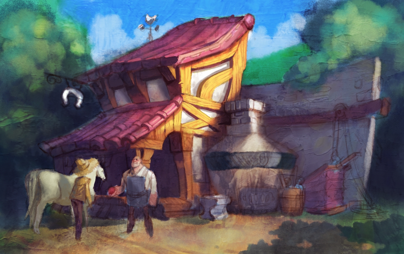
Eeep! Amazing sketchbook. Those medieval house color practice sketches are awesome. I love the purple one, but I actually like the green one even more.
Plus, the printed out portfolio looks great, you could probably sell that. :)
![[Image: tumblr_mqaowuJko11rw215do1_1280.png]](https://24.media.tumblr.com/f7b19bb039ac7eff92d595c8370e467d/tumblr_mqaowuJko11rw215do1_1280.png)

![[Image: tumblr_mqaowuJko11rw215do1_1280.png]](https://24.media.tumblr.com/f7b19bb039ac7eff92d595c8370e467d/tumblr_mqaowuJko11rw215do1_1280.png)


![[Image: tumblr_mqlwoau4so1rw215do1_r1_1280.jpg]](https://25.media.tumblr.com/31bf8fd9ffe75641dd996da3bbfcd657/tumblr_mqlwoau4so1rw215do1_r1_1280.jpg)
![[Image: tumblr_mqv0jtF4XT1rw215do1_1280.jpg]](https://31.media.tumblr.com/a46ad00f291ac2acd429fa1552273334/tumblr_mqv0jtF4XT1rw215do1_1280.jpg)


