Posts: 654
Threads: 4
Joined: May 2013
Reputation:
22
Nice pen sketches dude!, the wheels on the last one look a bit wonky but ellipses are the devil :P.
I'm kinda curious though, with pen sketches how do you deal with the construction aspect?. it's been reccomended that I try drawing in pen but I haven't ever been able to figure out how to deal with construction or gesture(since you can't just erase it unlike pencil).
Posts: 1,424
Threads: 12
Joined: Dec 2015
Reputation:
139
@Tygerson: Thank you for stopping by and for the kind words :).
@Triggerpigking: Yep you're right about those ellipses, more work required here I guess :). As for construction with a pen, if I'm sketching from reference I do minimal construction - maybe a few basic lines and angles but then the rest is careful observation. If I'm constructing from imagination I put in the construction lines but increase the line-weight of any lines I want to emphasize. By the time I put in the shadow shapes using cross hatching - the construction lines aren't so obvious any more.
I haven't posted much lately - I've been busy migrating my website to a free host as I got tired of shelling out the annual fee. Turns out the free host seems to perform just as well as my old paid one :).
I've also been trying to achieve more of a balance in my life - health, family, work and art. I've been a bit too focused on art at the detriment of the other areas and this in turn had a negative affect on me enjoying my art. Now that I've put a bit more effort into my health, family and work, I feel that I'm enjoying my art more which hopefully will mean that I make better art.
Enough of my ramblings - good night and keep on loading those art skills my friends!
“Today, give a stranger one of your smiles. It might be the only sunshine he sees all day.” -- H. Jackson Brown Jr.
CD Sketchbook
Posts: 1,424
Threads: 12
Joined: Dec 2015
Reputation:
139
I read the War Of Art by Steven Pressfield a while back and it is helping me kick procrastination in the ass!
One of the key things is not to concern myself about how good or bad a piece of work is going to turn out - my job is just to turn up and put brush to canvas again and again.
Then I go to bed and force myself not to be concerned about whether I made good art. I turned up, that is enough.
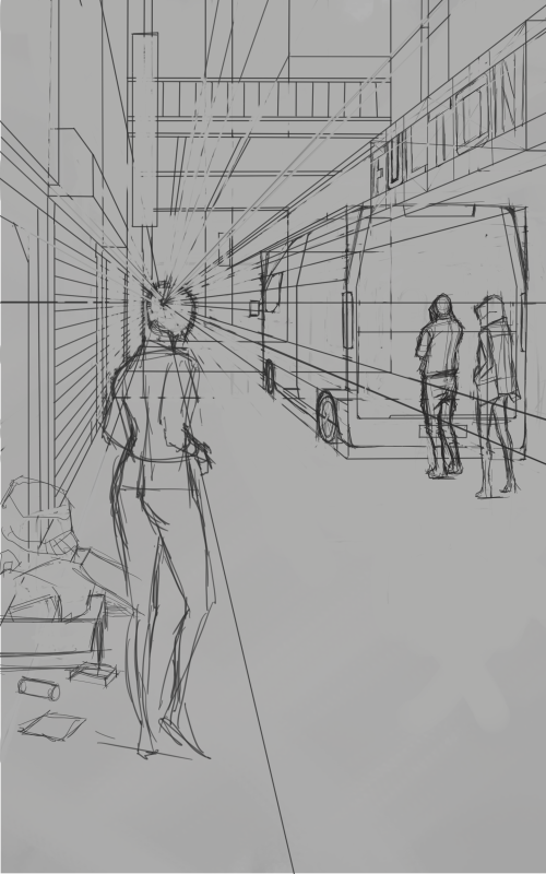
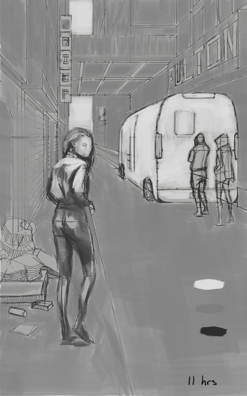
So for the past couple of weeks I've been working on another book illustration. This is a futuristic, cyberpunk style street scene. A woman is heading over to a mobile organ transplant van where she can make load of money by swapping her organic organs for artificial ones. It will be a greyscale painting so I have to be on the ball with my values. Any critiques would be appreciated.


“Today, give a stranger one of your smiles. It might be the only sunshine he sees all day.” -- H. Jackson Brown Jr.
CD Sketchbook
Posts: 656
Threads: 6
Joined: May 2013
Reputation:
12
Intriguing story line to the image, and the alley already looks kinda sketchy. Like, you're seriously going to climb in that van and let them pull out your organs?
I wonder if it would add to the image if the van had doors on the back, with maybe one open to show a wheeled hospital bed and IV bag, or some sort of medical thing, or maybe you're planning to paint something on the side of the van to hint at it?
_________________________________________________________________________
The best time to plant a tree was 20 years ago. The second best time is now.
-Chinese proverb
Sketchbook
Posts: 1,424
Threads: 12
Joined: Dec 2015
Reputation:
139
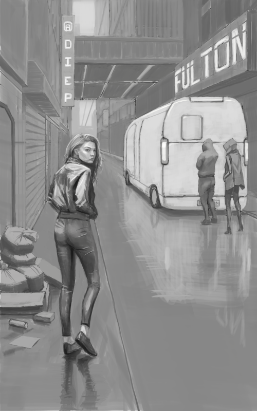
Hi Tygerson, thank you so much for the idea about showing the inside of the van - that would have really told the story I wanted! Unfortunately I had to call time on this piece and submit it to my writer friend already but I really appreciate your input, I will try to think more about story telling in the future :).
Anyway, here is the final piece:

“Today, give a stranger one of your smiles. It might be the only sunshine he sees all day.” -- H. Jackson Brown Jr.
CD Sketchbook
Posts: 14
Threads: 2
Joined: Jul 2017
Reputation:
3
Thanks for dropping by my sketchbook. I definitely can see your improvement here! I wanted to read all of the pages but whoa this whole thread is a gold mine(I can say that about the whole forum too)! I'll surely come back here to read and study.
For your newest piece I'll suggest to add some more details in the background, behind the car. These buildings could use some doors, more sings etc. I like the way how you started it though, keep it up ^^
The War Of Art seems like an interesting lecture, I'm adding it to my "books to read" list(since procrastination is a good friend of mine too :/)
quick edit since you wrote an update while I have been writing my post: really good texture of her trousers ^^, sad that you had to submit it already but anyway, keep up the good work!
Posts: 1,424
Threads: 12
Joined: Dec 2015
Reputation:
139
Hey no problem Yumi, thanks for dropping by here :).
Yeah I think you're right, the shop front to the left of the van could probably use a bit more detail, although I got a bit lazy there. Noted for my next piece as I've already submitted this one, but thanks a bunch anyway :).
The War Of Art will teach you to take Procrastination seriously. On any given day I know Procrastination has the power to take me down, I know I must not give it a chance or it will kick my ass! Say a prayer, wear your lucky shirt, use your lucky pen, do what it takes to maximise your advantage over Procrastination. Sorry if that sounds a bit crazy, but it works for me :).
“Today, give a stranger one of your smiles. It might be the only sunshine he sees all day.” -- H. Jackson Brown Jr.
CD Sketchbook
Posts: 656
Threads: 6
Joined: May 2013
Reputation:
12
The final piece looks good. I like the addition of rain/reflections. What's your friend going to use it for?
_________________________________________________________________________
The best time to plant a tree was 20 years ago. The second best time is now.
-Chinese proverb
Sketchbook
Posts: 1,424
Threads: 12
Joined: Dec 2015
Reputation:
139
@Tygerson: Thanks :). Well it's a joint project - we're hoping to publish a collection of short stories on Kindle and based upon how that goes, we might try getting them printed. My friend has completed 9 short stories so all I have to do is come up with a book cover for each.
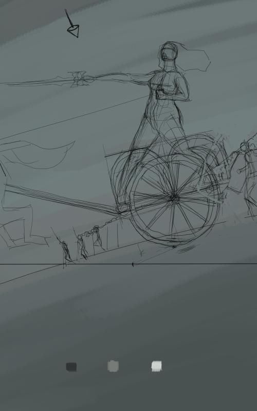
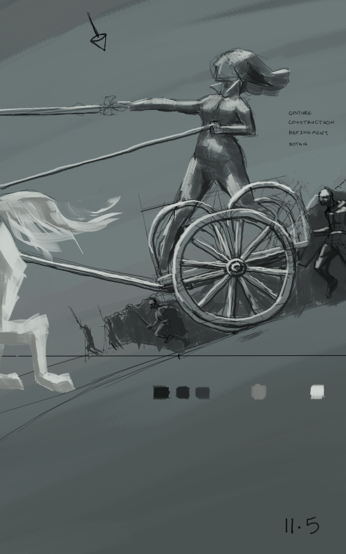
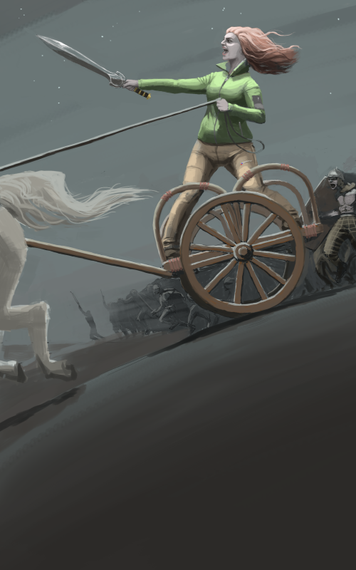
Speaking of which here's another book cover in progress, the story is called "Holiday In Camulodunum" and it's a story about a couple in modern day England who go on holiday and find themselves back in Roman England - the woman suddenly realises that she is Boudica, warrior queen!
I'm going to add a twist - the woman is still dressed in modern day clothes - a fleece and walking trousers etc. but she is surrounded by authentic celtic warriors!
Critiques always appreciated - thanks!


“Today, give a stranger one of your smiles. It might be the only sunshine he sees all day.” -- H. Jackson Brown Jr.
CD Sketchbook
Posts: 19
Threads: 3
Joined: Aug 2017
Reputation:
0
You know what I like about your sketchbook the most?
Two things: first the architecural sketches which you did in your traditional sketchbook. That looks awesome.
And besides that, when you show Work in Progress in different stages, so that one can see what you did, instead of just posting the finished stuff. Also very interesting!
About your goals- did you already produce (even finish) the digital comic, that one could read?
Posts: 656
Threads: 6
Joined: May 2013
Reputation:
12
I like the dramatic tilt to the image. Have you tried pushing it a little more extreme? The celtic hordes look good.
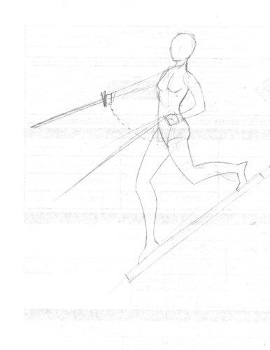
Ignore the following if you were going for stylized proportions: Boudicca's legs might be a head or so short if you're going for an 8 head tall person with the midpoint at the crotch. The top of her hips could probably be pushed somewhat down from the ribcage. Her pelvis area seems vertically large compared to the rest of her torso even accounting for a viewpoint. I tend to make torsos too long (the space between ribcage and pelvis), so take that with a grain of salt.
_________________________________________________________________________
The best time to plant a tree was 20 years ago. The second best time is now.
-Chinese proverb
Sketchbook
Posts: 656
Threads: 6
Joined: May 2013
Reputation:
12

I tried to draw what I was saying there, but as you can see, my drawing skills fall short. Oh, that we could all draw what was in our heads!
_________________________________________________________________________
The best time to plant a tree was 20 years ago. The second best time is now.
-Chinese proverb
Sketchbook
Posts: 1,424
Threads: 12
Joined: Dec 2015
Reputation:
139
@LK Crown: Thanks for the kind words dude, and yeah I like to focus on process above result, for me a good process is the true treasure since it will help me achieve consistently good results.
@Tygerson: Thanks for dropping by again, some intriguing ideas there, thanks! I will ponder.
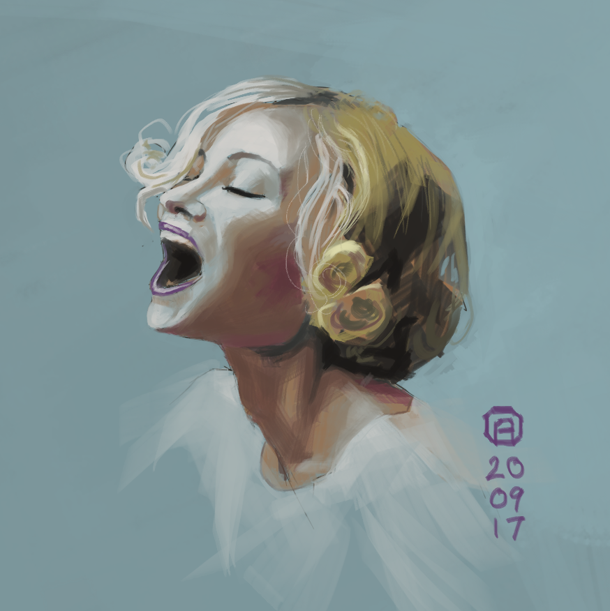
I'm still working on the above piece but have stalled a bit on the woman's head so I did a tilted head study to help me work through some stuff:

“Today, give a stranger one of your smiles. It might be the only sunshine he sees all day.” -- H. Jackson Brown Jr.
CD Sketchbook
Posts: 1,424
Threads: 12
Joined: Dec 2015
Reputation:
139
Still plugging away at this Boudica piece. It's been hard going but I'm using it to train myself to stay focused.

“Today, give a stranger one of your smiles. It might be the only sunshine he sees all day.” -- H. Jackson Brown Jr.
CD Sketchbook
Posts: 1,424
Threads: 12
Joined: Dec 2015
Reputation:
139
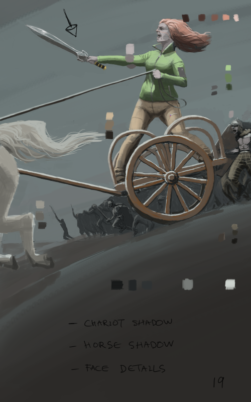
I'm calling this Boudica book cover piece done now because I need to move onto the next piece. Took me around 20 hours from start to finish, including research, thumbnailing and reference gathering. Quite a lot of my time was spent stopping to find reference images even though I thought I'd already gathered enough before-hand.
I feel like I'm a bit of a slave to references at the moment, feeling like I need to copy a reference instead of simply using it to inform my design decisions. Not sure how to beat this - maybe I need to do something like this:
1. Do a straight forward copy of a reference image as a study.
2. Do another study from the same reference image where I'm changing the composition slightly and using more of my imagination.
Any ideas would be appreciated - thanks.

“Today, give a stranger one of your smiles. It might be the only sunshine he sees all day.” -- H. Jackson Brown Jr.
CD Sketchbook
Posts: 2,817
Threads: 15
Joined: Jun 2013
Reputation:
109
the trick is to "understand" the reference. You have to be able to break whatever you're looking at into its more basic and core shapes and structures. Take your reference, trace on top to find the big volumes in spheres boxes and cyllinders then redraw those same boxes and spheres in different angles and perspectives.
I think you understand the principle of this, but haven't fully internalized it.
A big thing you might also be sweating over is anatomy, which is a legitimate crutch when it comes to reference. If you turn things just a little, you can't imagine what it'd look like because the information is just not there for your brain to materialize. So it is important to learn the anatomy.
The anatomy is a off on this one; I'm not sure what I'm supposed to think about her. I see you're going for like a gag with the contrast of the eras in clothing, but i'm not sure what to feel looking at this piece. Her stomach is like fat looking the way it plooms out in that sweater; and she has a really big crotch area.
The wheel of the chariot isn't following the perspective of the scene as its in perfect front view and everything else seems to be trying to be dynamic in like an upward tilt. The horse's legs are tangenting with the side and it feels like you tried to cheat not having to draw a full horse (which I'm currently learning animal anatomy so i can't blame ya lol)
The fighter I can see with his neck jutting out that far looks quite silly to be honest like, who's neck can go that far out haha?
I'll be 100% real with ya artloader my old friend and say you're trying to do way too much here. I think it'd be best if you really try to get just one character to look anatomically correct with a good gesture/anatomy before we start going for this really ambitious multi figured dynamic camera stuff. I know people always say Push yourself! Test your limits! which is good you're trying this, but maybe your weaknesses are more clear in this piece so you know what to work towards more!
Thanks for commenting btw, and keep going with the hard work my friend <3
Posts: 364
Threads: 11
Joined: Dec 2013
Reputation:
73
I recommend trying some multiple reference studies,
applying one lighting conditions to another image
I have only been doing this more recently but it's helped by being a manageable task for my brain
when i do longer projects I do the same but with heaps of reference and gets hella confusing
so a simple 2 pic study is quite relaxed by comparison
this is one i filmed for a few guys im mentoring for
I was honestly surprised how much i felt i took from this than doing a 1 to 1 study but i think they both have their place
with anatomy ill sketch the pose before referencing, then have multiple refs to satisfy the pose,
ill look at both refs to try to understand how for example the arm in a certain pose affects the rest of the body
its forsure slow going but it helps.
I feel ya cos I use allot of reference and sometimes get paranoid if things are right if i cant confirm them with reference lol
so i think this comboing of references may be a good way to ween yourself away from them too much.
im finding a way through the same struggle
another thing when it comes to posing and anatomy, dont forget to use yourself
getting into the head of your character and acting out the motion can inform you instantly on whether the pose you've drawn feels natural enough.
rendering wise i think you can get more across if you try to make mood more of a priority,
i know youre done with it but the chariot piece, the guy on the very right is moving in a real awkward way
the chariot itself looks incredibly impractical to ride like that and what takes my attention is the stick going up the hose bum that doesn't give the sense of motion i think was desired. the whole image looks stiff like its a model on display.
this may work is it was more of an epic shot and staged differently but as it is looks more like it would benefit from getting across the idea of movement and the charging thats happening. at least some dust being kicked up by the horse..
please dont feel like im trying to put down your work.
I can see you are very capable and with a bit of leveling up your thought process youl be on another level in no time
power to you bro
Posts: 1,424
Threads: 12
Joined: Dec 2015
Reputation:
139
Cool guys, really appreciate the feedback.
@Fedodika: Heheh you are so right about that soldier's neck, it kinda looks ridiculous! I shall have to be more careful in future. The woman is supposed to be a little on the larger side but from what you've written I sense that what I've done is make it look like I've tried to depict a slim woman but failed. I think to make it more obvious, I should've made the rest of her a bit chunkier as well. Maybe a slight double chin or something. Not sure what I could've done about the horse though as my page format is predetermined - maybe I could've zoomed out a bit and fitted the whole horse in?
Also I am glad that I attempted something that has shown up my weaknesses and I am again grateful to you for your honest feedback - thanks my friend.
@Xelfereht: Man that looks like such a good exercise to do! One of the issues I've had in the past is finding a reference that fits what I need in almost every way except for the lighting. This feels like such a useful skill to develop, thanks for the vid and the tip. Also, good call about how static the piece feels, it is supposed to be dynamic but doesn't feel like it, good spot dude. That soldier is in a bit of an awkward pose, I used reference, but didn't think about whether it would fit in with the action of this piece, again, good spot. By the way I don't take this stuff personally so you don't have to worry about hurting my feeling, I just appreciate you taking the time to give honest feedback - thanks to you to my friend.
OK so you guys have made me think about how to improve my process and I'm just going to stream my thoughts onto the page:
- My mistakes with anatomy and construction were partly because I wanted to get down to the painting too quickly. Like I see some oil painters just make a few marks to get the positioning right and then they dive in with blocking in shapes.
- When working from imagination I feel that I have to major on construction and get a good line drawing in before going in with painting. If I try to paint too early, my focus shifts away from structure and onto values and colour. This means that it is easy to mess up the structure (anatomy, perspective etc ...) because I have stopped paying attention to it.
- Focussing on construction should also boost my invention skills and move me away from slavishly copying reference images. My goal is for my work to be 80% imagination and 20% reference whereas at the minute it is more 80% reference and 20% imagination. I want my work to be informed by reference not enslaved by it.
Anyway onwards and upwards, I've got 6 more of these pieces to do *whip-crack-myself-on-the-back*!
“Today, give a stranger one of your smiles. It might be the only sunshine he sees all day.” -- H. Jackson Brown Jr.
CD Sketchbook
Posts: 1,424
Threads: 12
Joined: Dec 2015
Reputation:
139
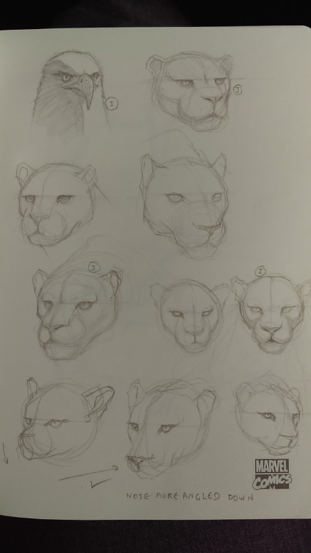
Been a bit under the weather recently so my art time has dropped to around 10 mins a day but I tried to do at least a bit of sketching every day.
Some creature head sketches:

“Today, give a stranger one of your smiles. It might be the only sunshine he sees all day.” -- H. Jackson Brown Jr.
CD Sketchbook
Posts: 2,817
Threads: 15
Joined: Jun 2013
Reputation:
109
|


